The Simple System Designers Use to Choose the Right Paint Color the First Time
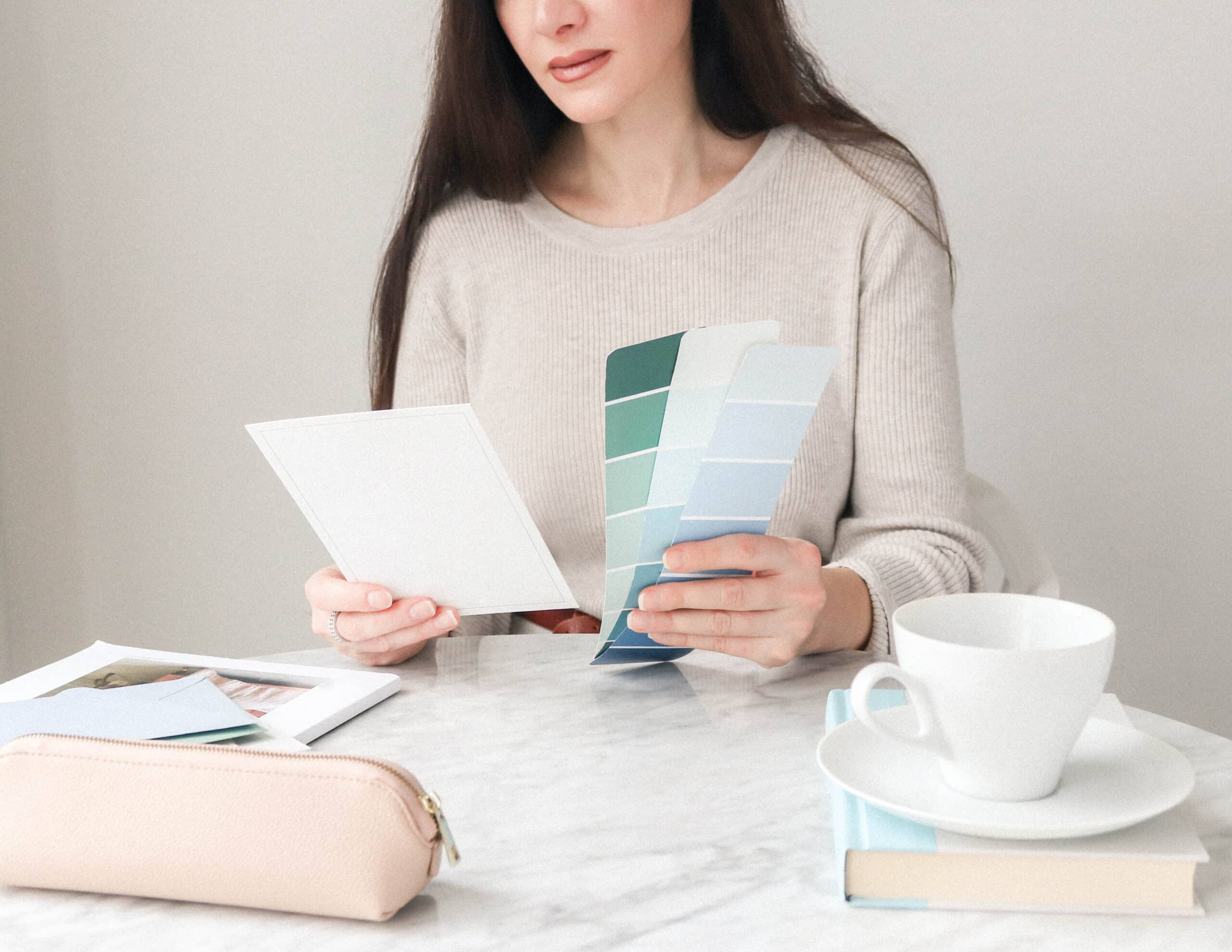
If you’ve ever brought home a paint sample that looked perfect in the store, only to watch it turn blue, yellow, or muddy in your home — you know how frustrating choosing paint can be. Now your wall is covered in samples…and you’re afraid of making an expensive mistake.
In this step-by-step course, you’ll learn the exact process professional designers use to confidently choose paint colors that work in real homes.
If Choosing Paint Colors Feels Overwhelming, You’re Not Alone
You pick what looks like the perfect color at the paint store.
You bring the sample home, and suddenly it looks:
too blue
too green
too dark
or just completely wrong.
So you try another sample…and another.
Before you know it, your walls are covered in paint swatches — and you’re more confused than when you started.
Most homeowners think choosing paint colors should be easy.
But paint is actually one of the trickiest design decisions in a home because lighting, undertones, and surrounding materials can completely change how a color appears.
That’s why so many people end up repainting rooms…sometimes more than once.
This course was created to fix that.
Paint color overwhelm is incredibly common.
Most homeowners experience some version of this:
- “I feel paralyzed every time I stand in front of the paint wall.”
- “I thought I picked a warm neutral, but it looks weird and pink.”
- “I’ve spent hundreds on samples and still don’t love anything.”
- “I want my home to flow, but every room feels disconnected.”
- “I’m afraid of making another mistake—and wasting money.”
Imagine Walking Into the Paint Store With a Plan
Choosing paint colors shouldn’t take 10 trips to the paint store!
Instead of staring at hundreds of swatches and hoping something works, you’ll finish this course knowing:
- which colors to test
- how to spot undertones immediately
- how lighting will change your paint color
- how to create a whole-house palette that flows beautifully
That’s what this course gives you…clarity and confidence when choosing paint.

Introducing: “How to Choose Paint Colors with Confidence”
This digital course shows you the exact process designers use to confidently choose paint colors that work in real homes.
No more guessing.
No more repaint regret.
Just a clear system for narrowing down the right colors for your home.
Here’s what you’ll get inside the course:
Inside this course you’ll learn how to:
- confidently choose the right white without it turning yellow or gray
- identify undertones before they ruin your room
- test paint colors correctly in your lighting
- create a whole-house palette that flows beautifully
- stop wasting money on endless paint samples
Plus helpful worksheets & tools:
- Color planning worksheets to go along with each lesson
- Paint testing checklist to pick the perfect color

Hiring a designer to help with paint color decisions can easily cost $300–$500 or more.
Inside this course, you’ll learn the same decision process for just $97.

Avoid Expensive Paint Mistakes
Choosing the wrong paint color doesn’t just create frustration. It can also cost hundreds of dollars and multiple weekends repainting a room.
Many homeowners end up:
- buying dozens of paint samples
- repainting rooms more than once
- second-guessing every decision
Inside this course, you’ll learn how to make paint decisions with clarity and confidence, saving both time and money.
Enroll Today And You’ll Also Get These EXTRA Bonuses

Favorite Paint Colors eBook
$24 VALUE
If you’re feeling overwhelmed by all the paint color options out there, this bonus is the perfect starting point. The Favorite Paint Colors eBook is filled with tried-and-true designer-approved paint colors (organized by color family), so you can skip the second-guessing and go straight to the best. It’s especially helpful if you don’t know where to begin or want a shortcut to picking great colors.

10 Whole-House Color Palettes
$27 VALUE
This beautifully curated guide features 10 gorgeous color palettes that work together across an entire home. Each palette takes the guesswork out of combining paint colors and gives you a plug-and-play system to create flow from room to room. It’s a great way to reinforce what you’ve learned in the course, and it provides instant inspiration for real-world application. If you’re unsure how to create a cohesive look, this bonus will help you visualize the end result with confidence.
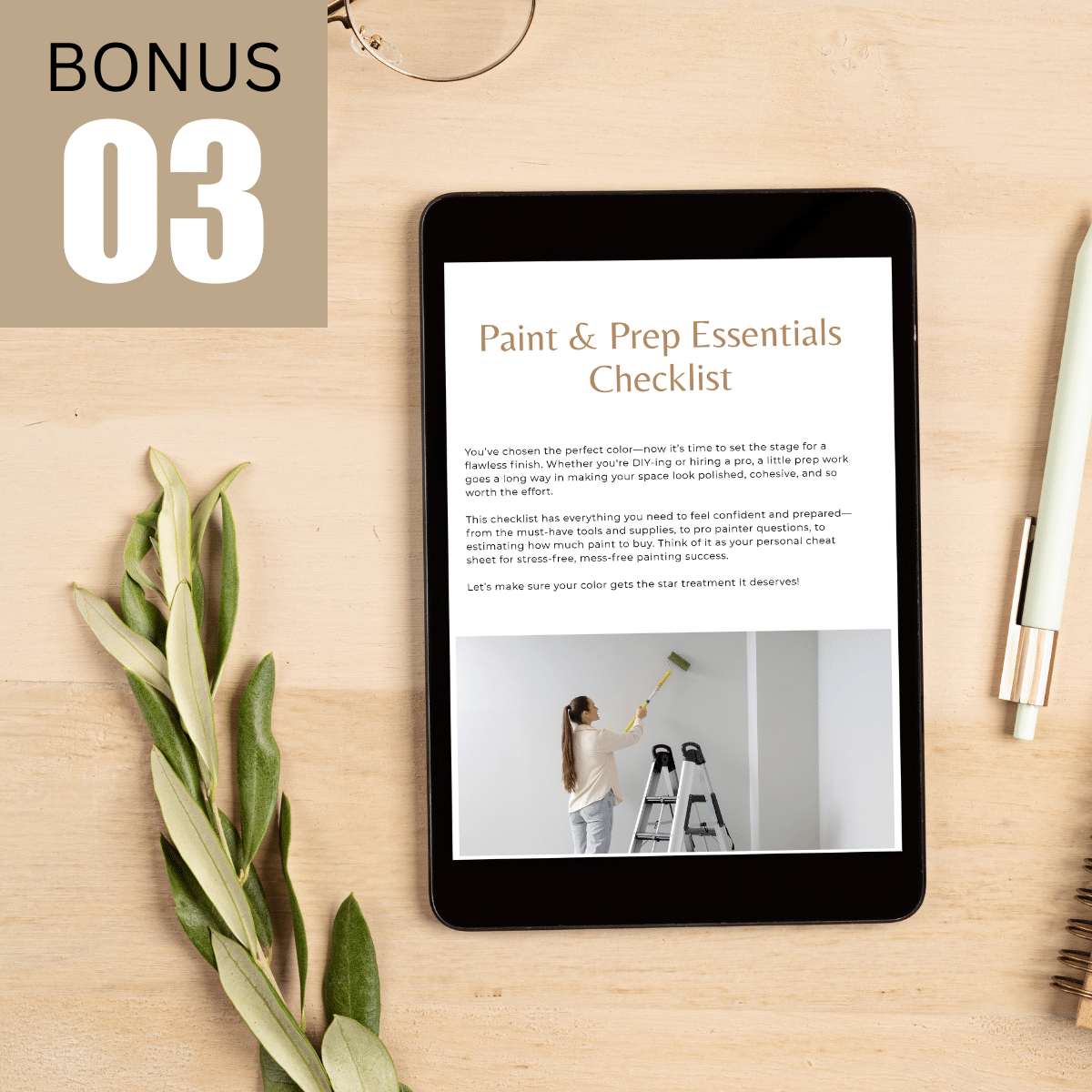
Paint Supplies & Prep Checklist
$12 VALUE
Painting can go from fun to frustrating real fast…unless you’re fully prepared. This checklist bridges the gap between planning and action by walking you through everything you’ll need for a successful painting project. Whether you’re hiring a pro or doing it yourself, it reduces stress, eliminates last-minute trips to the hardware store, and ensures you don’t overlook the not-so-obvious steps. It’s a small but mighty tool that makes the painting process feel doable.

Video Mini-Tutorial – My Favorite Paint & Mockup Tools
$25 VALUE
Seeing is believing, and this quick tutorial pulls back the curtain on how I visualize and choose paint colors digitally. I’ll show you the exact tools I use as a designer to compare paint colors, test color combos, create mockups, and make smarter decisions before a drop of paint goes on the wall. If you’re a visual learner (or just want to avoid color regret!), this behind-the-scenes bonus is a game-changer. It’s an easy win that can save you time, money, and stress.
See How Paint Decisions Become Clear
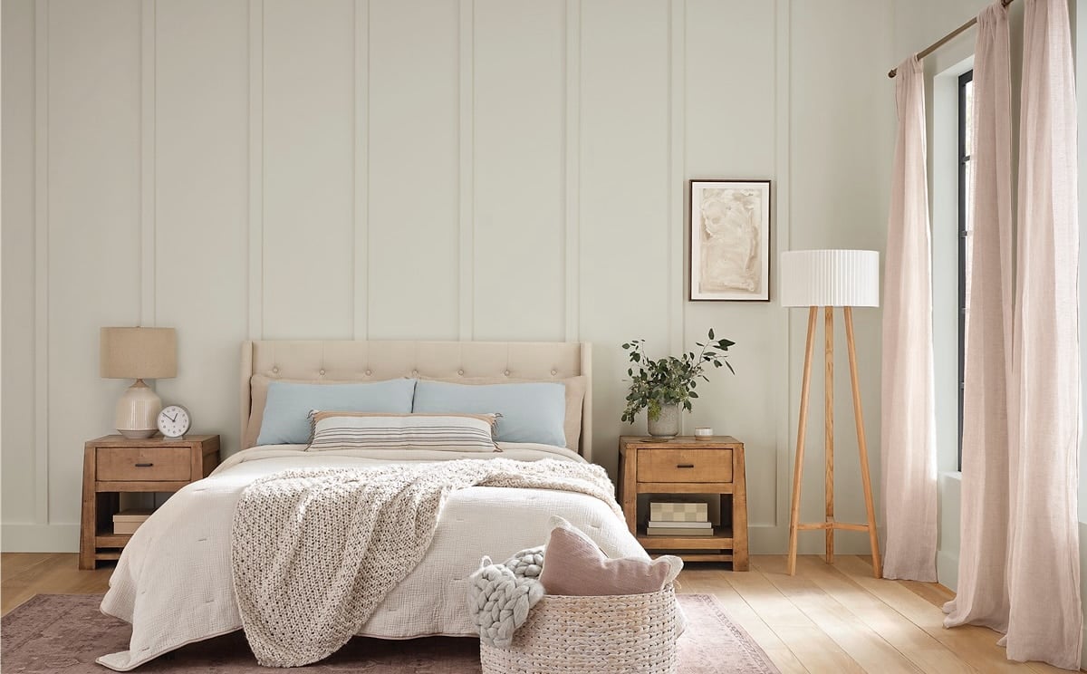
Small undertone differences can dramatically change how a paint color feels in a room.
The truth is, there isn’t one “best” white paint color. A white that looks perfect in one home can suddenly look yellow, gray, or slightly blue in another.The difference comes down to undertones and the materials already in the room.
Warm White Undertones
Warm whites contain subtle hints of yellow, cream, or beige.They tend to work best in rooms with warmer finishes like wood flooring, warmer countertops, or creamy trim colors.
When the undertones align with your materials, the room feels soft, cohesive, and inviting. But if the undertones clash, the paint can suddenly look too yellow or muddy.

Cool White Undertones
Cool whites contain subtle hints of gray, blue, purple, or green. They often work beautifully with marble, quartz, gray flooring, and cooler cabinetry finishes.
When everything works together, the result will feel fresh, crisp, and balanced. But if the undertones of your paint color fight your finishes, the paint can look cold or slightly blue.
The Key Insight Most Homeowners Miss
The real question isn’t:
The real question is:
“Which white works with this room?”
Inside the course, you’ll learn how to quickly identify undertones and choose colors that complement your flooring, cabinets, countertops, and lighting — so your paint looks right the first time.
“Which white paint is best?”
Once you understand how to complement your fixed materials, choosing paint colors becomes dramatically easier.
And the same principle applies to grays.


This is exactly the process designers use to narrow hundreds of colors down to the few that will actually work in a room.
The Designer Paint Selection Framework
Professional designers don’t choose paint colors by guessing. They follow a simple process that removes the overwhelm and narrows hundreds of options down to a few great choices.
Inside the course, you’ll learn how to follow this same step-by-step framework in your own home.
Step 1: Narrow
Define the mood and work with your fixed materials to narrow down colors that work in your home.
Step 2: Undertones
Avoid mistakes by identifying the hidden colors that change everything.
Step 3: Lighting
Understand how your home’s natural and artificial light affect color.
Step 4: Testing
Sample colors the right way before committing, and learn how to pivot, when needed
Step 5: Final Choice
Choose your final color with clarity, knowing you’ve found the best one for your home.
Real Homeowners…Real Results!
Emily’s Story:
“After wasting at least $200 on samples and paint and supplies, and then repainting our bedroom twice, I finally have a process and steps to follow that basically guarantee I’ll find a color I love, rather than guessing. I now understand the importance of undertones and testing. I recently picked a new color for our bedroom, and nailed it. My husband even commented on how much easier it was this time around. :-)”
Sophia’s Story:
“I had 12 samples taped to my walls for months because I was paralyzed. This course gave me a process, and I chose my living room color in one weekend. At my daughter’s graduation, three people complimented me on how good the house looked.”
Karen’s Story:
“I was terrified of making another major mistake after a previous ugly green disaster. With this course, I learned how to test the right way and picked the perfect green color that looks great both day and night. No regrets this time!”
Still have questions? I’ve got you covered.
I’m a beginner. Will this be too advanced?
Not at all—it’s explained in everyday language with worksheets and examples that make it simple to follow.
What if I waste my money?
This course costs less than a single gallon of paint—and it will save you from the much bigger expense of repainting mistakes.
My house has tricky finishes. Will this still help?
Yes. You’ll learn how to test colors in your lighting, against your cabinets and flooring, so the results actually work in your home.
Do I need a good eye for color?
Nope. The process works whether you’ve never trusted your instincts or you love decorating but struggle with color.
I don’t have much time. Can I fit this in?
Yes. The lessons are short, actionable, and designed to get you results fast. Most students can make confident decisions after a weekend.
Get started today for just $97!