
Last week, someone asked me a great question. They said, “I picked out colors I like for my living room, but how do I know how much of each color to use in the room?” While there are never definitive “right” or “wrong” answers when it comes to interior design, which I know can be super frustrating, there are rules and guidelines to follow. So, I explained the 60-30-10 Color Rule to this DIY decorator, and I made a note to myself to share it with all of you. Not only is it a great design rule to know, but it can really help you pull a room together with color.
The 60-30-10 Color Rule
The 60-30-10 rule is meant to balance out the colors used in your space in a pleasing way, by assigning percentages to the colors that you use. Here’s the rule:
60% main color + 30% secondary color + 10% accent color = FABULOUS!
OK, I added the “FABULOUS” part, but you get the idea. Here’s how to use the rule:
- The 60% main color of the room includes things like your walls, your sofa, the main color of your area rug, and perhaps even your cabinets or tile (if we’re talking about kitchens and bathrooms). If you squinted your eyes when you walked into the room, this would be the predominant color you would see.
- The 30% secondary color includes things like accent chairs, bedding, drapery, an accent wall, and maybe even painted doors or furniture. The main purpose of the secondary color is to provide contrast. This color will show up about half as much as the main color in your space, so think of it like a great supporting actor in a film. It’s different enough from the main color to provide interest, but not steal the show.
- The 10% accent color is the fun stuff – decorative accessories, throw pillows, artwork, lamps, picture frames, candles, florals… It’s the pop of color you want people to see in your room. Could even be a metallic finish, like gold or brass…just sayin’
Now, you don’t need to go measuring and using exact percentages to make this rule work for you. Just think of it as using one dominant color throughout most of the room, a second color for approximately half of the room, and a third accent color for those fun little pops of color around your space.
How to Use the 60-30-10 Rule in a Room
Let’s walk through an easy example of using the 60-30-10 color rule in a bedroom. 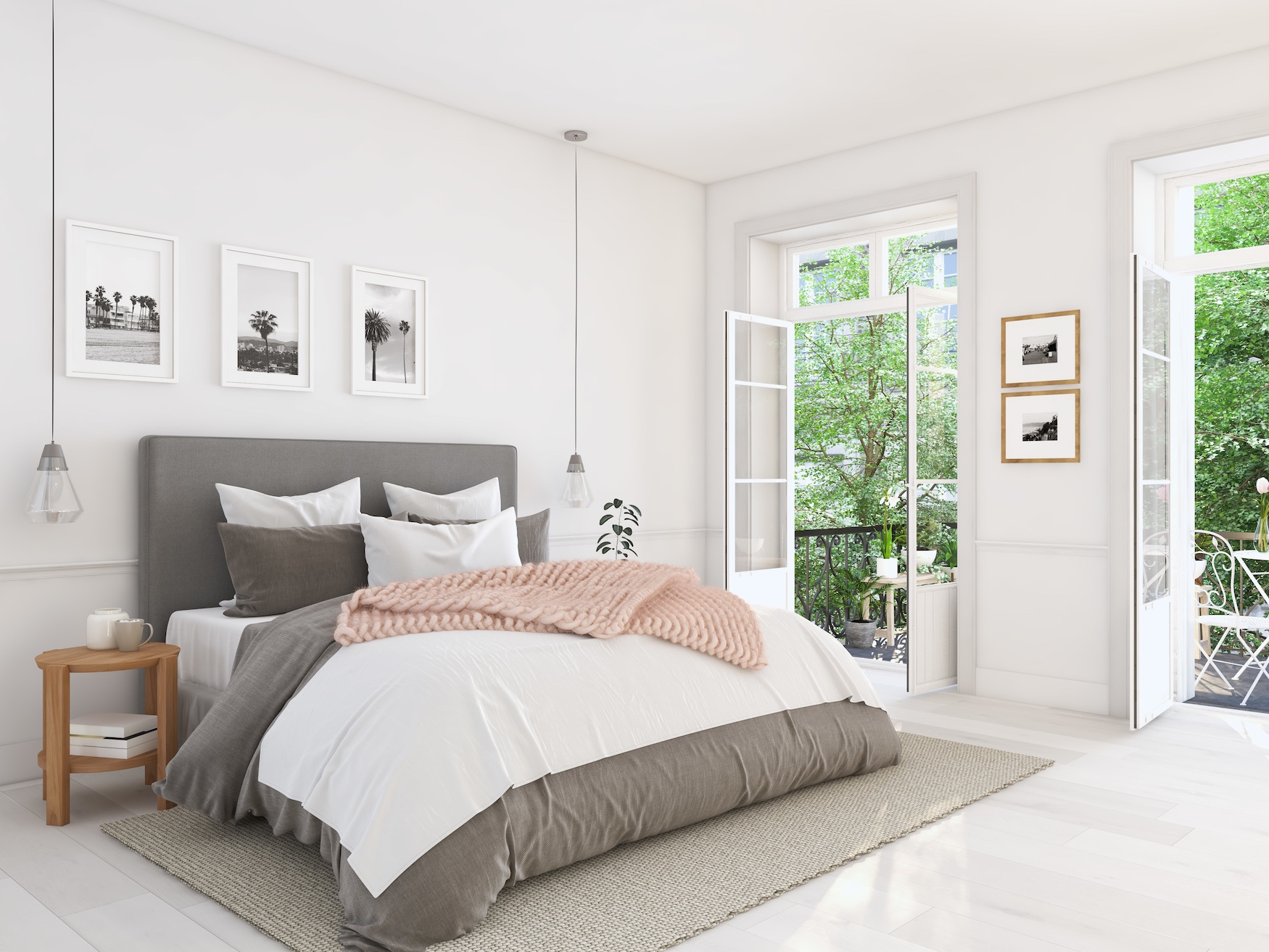
In this case, you can see that the dominant color of the room is white. The walls, doors, floor, and much of the bedding are all white. White clearly occupies at least 60% of this room.
The next most prevalent color is gray, which is our secondary color. The rug, headboard, pillows, artwork subjects, and comforter are all gray, and represent about 30% of the color in this room..
Finally, our 10% accent color is pink. The pink is complimented by the gold frames and wood furniture, which have tones in the same color family. Even though these colors are not used very much in the space overall, they do a great job of providing interest, and helping to move your eyes around the room.
Want to see another one? Let’s take a look at this cute bunk room!
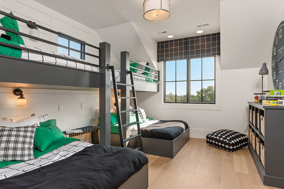
In this example, we see white as the predominant 60% color in the room. It’s used on the walls, and the bedding, and the light fixtures. The secondary color is charcoal/black, which does a great job providing a strong contrast with the white walls. This color is taking up at least 30% of the room as part of the furniture, window treatments, clock, and bedding. Finally, those pops of Kelly green look fantastic as a 10% accent color. Such a fun room!
A Few More Tips for Using the 60-30-10 Color Rule
While the 60-30-10 color rule is a fantastic basic rule for home decorating, I have a few tips to share for how to use it in a more sophisticated and advanced” way.
- You don’t have to use the same shade of each color. You can use a combination of light blue and navy blue, for example, if one of the colors you’ve chosen in your palette is blue.
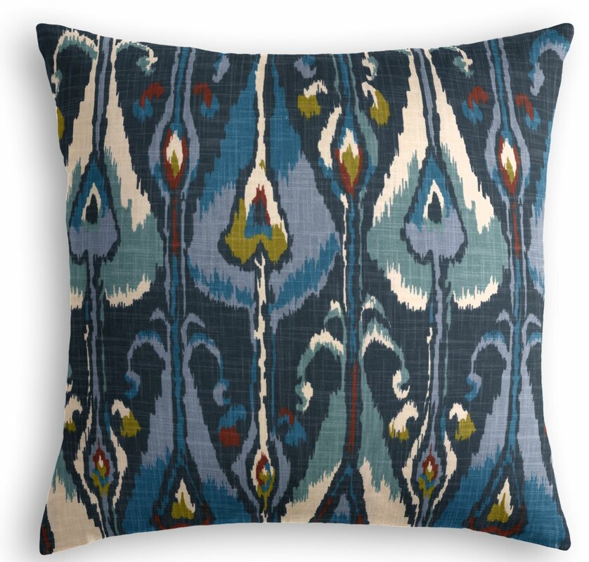
- It’s OK to use patterns that include additional colors outside of your three-color palette. For example, if your color palette is white, gray, and navy, you can still use a pillow that has navy, with other colors in it. Take a look at this pillow. See how it has red, teal, and even some chartreuse in it? However, when you squint your eyes, the dominant color you see is navy. Therefore, it will work great in your color palette!
- Your 10% accent color can be two different colors. Crazy, I know! If you want to use two colors as your accent, just think about using each of them in 5% quantities.
So, there you have it! The 60-30-10 Color Rule is easy to follow, and one you should keep in your back pocket for decorating any space. BUT WAIT! Some of you might be wondering, “how do I go about choosing a great color palette for my space?” Click here for our post on How to Choose a Color Palette for my tips.


I enjoyed reading it.. it’s illustrative and ideas have been delivered.
Helpful read!