
A beautiful and cohesive room doesn’t just happen by itself! It requires a little upfront planning to determine how you want the room to feel, what style you want the room to be, and what color palette you’ll use. In some cases, you may have the perfect combination of colors already in mind before you start decorating. But sometimes, we all need a little inspiration, and today’s post is all about how to choose a color palette. I’m sharing four methods that I like to use when I need some fresh color palette ideas.
This post contains affiliate links for your shopping convenience. See my Privacy Policy for details.
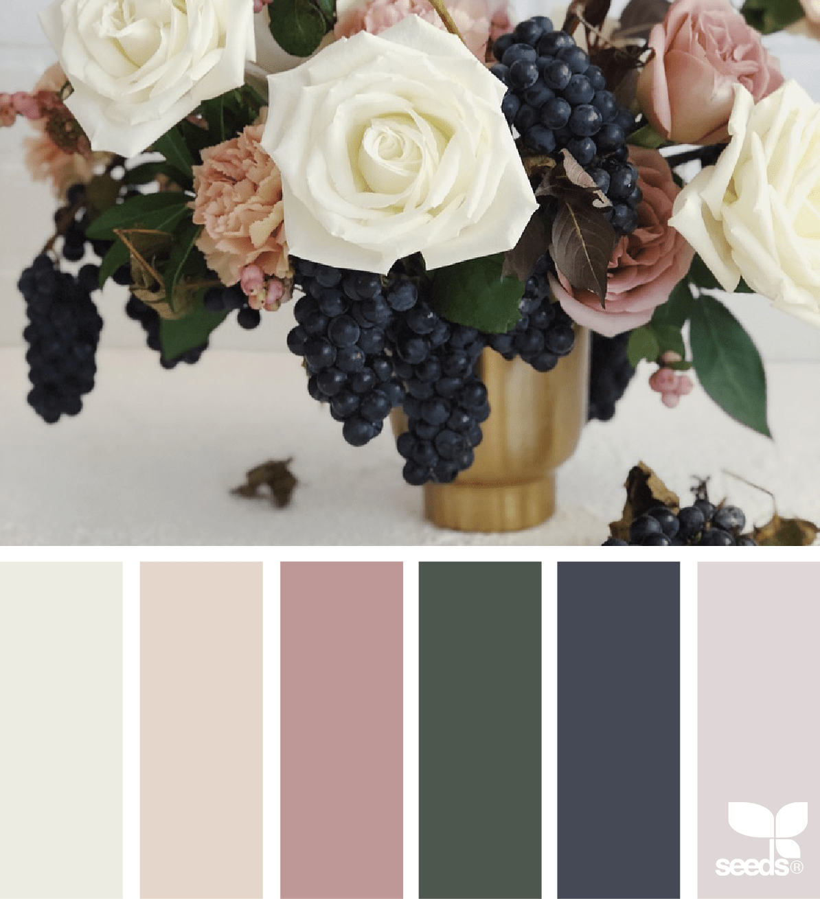
#1 – Design Seeds
I came across Design Seeds several years ago, and I just love browsing through their gorgeous images and color palettes. One of the best ways to view their palettes is on Instagram, but I also like going to the Search By Color page on their website, when I have a certain color in mind. Their color palettes are based on photographs of nature and other items, and you’ll find some beautiful combinations that would be perfect for interiors on this site.
#2 – Artwork
Artwork is a great place to look for color palettes, because most artists have a knack for choosing color combinations that are visually stimulating and pleasing. Take this impressionist piece, for example – the blue, green, gray, white, and brown shades make a beautiful combination that would work great in any room. Check out Art.com, Great Big Canvas, or Minted for inspiring artwork.

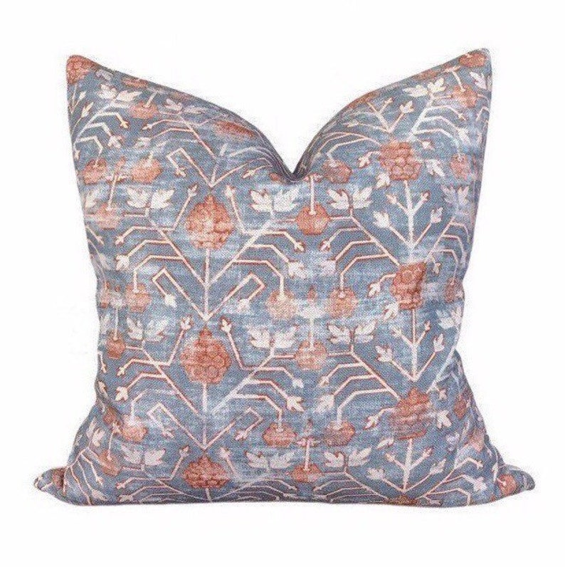
#3 – Fabrics
Just like artists, textile designers understand how to mix and match colors and patterns to create unique and pretty designs. You can find some beautiful upholstery fabrics online at places like Decorators Best and Tonic Living. You don’t have to buy the expensive fabrics, just use them as your inspiration! Or, shop at your local Joanne Fabrics, if you like to see things in person. OR, go shopping (or just looking) for throw pillows at your favorite home stores, Fabric is a fantastic way to create a color palette!
#4 – Color Wheel
The color wheel is an essential tool for artists and designers that is organized to show exactly how colors combine and contrast. I won’t go into all the science of the colors, or the various ways to use a color wheel (that’s a good subject for a future video), but I will say that there are certain color combinations that are popular and used all the time by designers.
 Monochromatic Color Scheme – varying shades of the same color. For example, you could use navy blue, a medium blue, and a pale blue. In the last few years, we’ve seen monochromatic shades of gray used for a lot of room designs, warmed up with wood tones.
Analogous Color Scheme – colors that are next to each other on the color wheel. For example, one popular analogous pairing is blue and green.
Complementary Color Scheme – colors that are opposite each other on the color wheel, like red and green. These colors create a high-contrast, energetic color palette. You don’t have to use the primary colors – you can mute them with white or gray for a more subtle look.
Triad Color Scheme – colors that form a triangle on the color wheel. For example, the primary colors of red, yellow, and blue form a triad. Like complementary colors, often times the best way to use triad colors for interiors is to find a more subtle shade of each color.
These four methods of choosing a color palette have worked really well for me over the years. When it comes to choosing a color palette, there isn’t really a prescribed process you should follow, or magic source. I once found a color palette I loved from a store’s shopping bag! Color inspiration is all around us…you just need to look.
Now that you know how to find and choose a great color palette, it’s important to know how to apply the colors. Check out our post on the 60-30-10 Color Rule!


