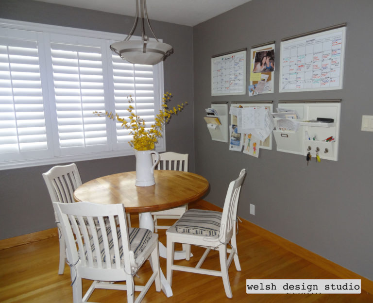
One of the biggest challenges homeowners face when decorating is making the entire house feel cohesive. A living room might look beautiful on its own, and a dining room may feel perfectly styled, but when the colors from one space to the next don’t relate to each other, the home can feel a little disjointed. That’s where a whole house color palette comes in.
A whole house color palette is simply a group of coordinating colors that work together across your main spaces and individual rooms, creating a visual thread that runs throughout your home. When your palette is well-defined, every decorating decision becomes easier, and the house begins to feel thoughtfully designed rather than randomly put together. The color palette will also help you narrow down your choices for wall color, rugs, textiles, furniture, art, and accessories, making decorating feel much easier.
In this post, I’ll walk you through exactly how to create a cohesive whole house color palette in a way that works in real homes, not just in perfectly polished inspiration images.
What Is a Whole House Color Palette?
A whole house color scheme or palette is a curated group of colors that work together throughout your home.
That doesn’t mean every room has to be painted the same color. It also doesn’t mean your house should feel repetitive or boring. It simply means there’s a common thread running through your home so the spaces relate to each other.
A strong whole house palette usually includes:
- One main neutral or foundation color
- A few supporting paint colors
- One consistent trim color
- A handful of accent colors that repeat in different ways
The goal is cohesion, not sameness. You can think of it this way…your rooms should feel like they belong to the same family, not like complete strangers.
Designers often use the color wheel and principles from basic color theory to build interior color schemes that feel balanced. This doesn’t mean you need to memorize art-school rules, but understanding concepts like complementary colors, undertones, and how different shades of the same color relate to each other can make choosing paint much easier.
If you need some help choosing colors for your palette, check out my posts on How to Choose a Color Palette and Places to Find Inspiration for your Home Color Palette.
Why Homes Feel Disconnected Without a Color Plan
Most homes feel disjointed for one simple reason…rooms are decorated one at a time, without a plan for how they connect to the rest of the house.
That usually looks something like this:
- You choose a paint color for the dining room because you like it
- Then you pick a different color for the bedroom because it looks pretty online
- Then you repaint the bathroom later based on a trend you saw on Pinterest
- And suddenly each room is doing its own thing
Individually, the colors might all be fine. Together, they don’t flow.
This is why a whole house color palette matters so much. It gives you a framework for making decisions that feel intentional instead of random.
Step 1: Start With the Feeling You Want Your Home to Have
Before you choose paint colors, decide how you want your home to feel. This is the part people often skip, but it makes everything easier. Ask yourself:
- Do I want my home to feel light and airy?
- Calm and grounded?
- Warm and inviting?
- Soft and organic?
- Crisp and tailored?
- Moody and cozy?
Your answers will guide your palette. For example:
- If you want a calm, serene home, you may lean toward soft neutrals, muted greens, and dusty blues.
- If you want warmth, you may be drawn to creamy whites, warm greiges, and earthy tones.
- If you want a fresh, clean look, you may gravitate toward brighter whites, soft grays, and cooler colors.
Color is emotional. So start with the mood before you start naming specific paint shades.

Step 2: Start With What You Already Have
Most homeowners are not building a house from scratch. They already have things they need to work with. That might include:
- Flooring
- Kitchen cabinets
- Countertops
- Bathroom tile
- Wood furniture
- Rugs
- Sofas or other upholstery
These permanent or semi-permanent items and finishes should be considered part of your color palette. If you’re not replacing them anytime soon, they need a seat at the table.
This is especially important with wood tones, stone, and tile because they all have undertones. If your floors are warm and golden, a cool gray palette may feel disconnected. If your countertops lean cool, a heavily yellow wall color may look completely off.
You do not have to love every existing finish in your home to build a cohesive palette around it. But you do need to understand what tones are already there, and not fight against them.
Step 3: Choose a Neutral Base for the Main Connected Areas
Many designers begin with neutral colors such as warm whites, greiges, or soft taupes because they act like a blank slate for the rest of the home. In fact, white walls are often a great place to start if you’re unsure about your palette. From there, you can layer in deeper tones, earth tones, or cool colors in different rooms.
The easiest way to build a whole house color palette is to start with a neutral base in the main connected spaces. This is especially important in:
- hallways
- entryways
- open floor plans
- living room / dining room / kitchen combinations
- stair landings
A neutral base helps create visual breathing room and gives the eye a place to rest. That base might be:
- a warm white color
- a soft greige
- a light taupe
- a quiet beige
- a subtle gray, if it works with your fixed finishes
The best base colors are usually not too stark and not too colorful. They’re flexible, timeless, understated, and easy to build from.
This does not mean the whole house needs to be painted one color. It just means the connected spaces should establish a clear foundation.

Step 4: Pay Close Attention to Undertones
This is where so many whole house color palettes fall apart. You can absolutely use different colors throughout your home. But if the undertones fight each other, the house will never feel cohesive.
For example:
- a warm beige next to a cool gray can feel disconnected
- a creamy white trim with a cool blue-gray wall can look dingy
- a green-gray in one room next to a pink-beige in the next can feel like they’re competing against each other
The colors may all be beautiful on their own. But if they don’t share a similar undertone story, the flow breaks. This is why undertones matter more than the color names. A good whole house palette usually stays in one general undertone family:
- mostly warm
- mostly cool
- or mostly balanced / neutral
That consistency is what creates harmony.
Step 5: Walk the Sightlines of Your Home
This is one of the most useful exercises you can do. To check your sightlines, stand in:
- your entry
- your hallway
- your kitchen
- any doorway or opening between rooms
Then look at all the spaces you can see at once, and ask yourself:
- Do these colors make sense together?
- Does one room feel too intense compared to the next?
- Is there a room that visually interrupts the flow?
- Do the transitions feel soft and natural, or abrupt?
This step is especially important in homes with open floor plans, but it matters in traditional homes too. Even in a more closed floor plan, you often see multiple rooms at once through hallways, cased openings, or stair landings.
A whole house palette should work in motion as you walk throughout the home, not just in isolated snapshots.
Step 6: Build a Color Map for Your Home
One of the best ways to create a whole house color palette is to literally map it out. You don’t need fancy software. A simple sketch of your floor plan or even a rough room list works.
Write down:
- your main neutral
- trim color
- room paint colors
- wallpaper or large color moments
- major repeating tones
This helps you see:
- where you have too much repetition
- where you need more connection
- where one room may feel too abrupt next to another
A color map is also a great way to prevent decorating one room in total isolation from the rest of the house.

Step 7: Repeat Colors in Different Ways
A cohesive home doesn’t rely on the exact same color showing up the exact same way in every room. That gets boring fast. Instead, repeat colors in different ways.
For example:
- a soft green might show up as bedroom walls, kitchen accessories, and artwork in the dining room
- a pale blue might appear in a rug, throw pillows, bedding, and a painted vanity
- a rust accent might repeat in a chair fabric, a vase, and a patterned runner rug
This is what makes a house feel cohesive. The repetition doesn’t need to be obvious. In fact, subtle repetition usually looks more sophisticated. But, you have to have repetition to create cohesion.
Step 8: Work Within a Color Spectrum, Not Exact Matches
This is such an important concept. A cohesive whole house color palette does not mean you use the exact same shades everywhere. Instead, work within a color family or spectrum.
For example:
- light clay in one room
- muted terracotta in another
- deeper rust in a third
Or:
- pale sage green in a bedroom
- olive green in an office
- medium gray-green in a powder room
These rooms relate because they’re speaking the same language, even though they’re not identical. This is one of the easiest ways to create depth without losing cohesion.
Step 9: Think Differently About Shared Spaces vs Private Spaces
Shared spaces usually need more flexibility and flow. These include:
- living room
- dining room
- kitchen
- hallways
- entryways
These are the spaces where your whole house palette should feel the most grounded and connected.
Private spaces, like bedrooms, powder rooms, offices, and kids’ rooms, can handle a little more personality. That’s often where you can get bolder, moodier, or more playful, as long as the undertones still make sense with the rest of the house. This gives you freedom without losing the whole-house story.
Step 10: Use Trim, Doors, and Casings to Create Consistency
One of the simplest ways to unify a home is to keep trim and doors a consistent color throughout the home. Using one trim color throughout creates a polished look, helps transitions feel cleaner, and makes the palette easier to manage.
This is also where casing and door decisions matter. If you have different wall colors meeting at a doorway, think about which color the inside of the casing should be. In many cases, keeping the casing tied to the more neutral connecting space helps maintain flow.
These details may seem small, but they make a big difference in how finished a home feels.
FREE Resource for You!
Struggling to choose the perfect paint colors for your home? Grab my FREE guide “5 Steps to Choosing the Perfect Paint Color” and learn the exact process I use as a designer to select colors that actually work in real homes.
No more guessing. No more swatch overload. Just confidence!
👉 Click here to download it now

My Whole House Color Palette Story
In my own home, I actually work with a larger palette of about seven to ten colors that repeat throughout the house in different ways.
I don’t use the exact same colors in every room. Instead, I use different combinations of colors pulled from the same larger palette. For example, a light blue-gray shows up in my office and primary bedroom. A deeper version of that color shows up in the living room with the rug and pillows, and again in my son’s room.
We use a dark gray-green in our laundry room and again in the guest bedroom, along with a lighter sage green. Shades of terracotta are seen in our living room, my office, and the guest bedroom. The flooring and door/trim colors are the same throughout, with a main neutral color that shows up just about everywhere in the house.

The colors relate to each other because they all come from the same whole home color palette story. Even though each space has its own personality, the undertones and color families stay consistent.
This approach allows the house to feel cohesive without making every room look identical.
Whole House Palettes for Smaller Homes vs Large Homes
In a smaller home or small space, using fewer colors often creates the most cohesion. Many designers recommend limiting the palette to four or five colors so the home feels calm and connected.
In a larger home, you may have more flexibility to introduce a few bold colors in certain areas while still maintaining a consistent base palette. Larger homes could have 7-10 colors in their whole house palette, mixing and matching different colors throughout the home.
Whole House Color Palette Example Ideas
To make this more practical, here are a few examples of designer-loved color palettes.
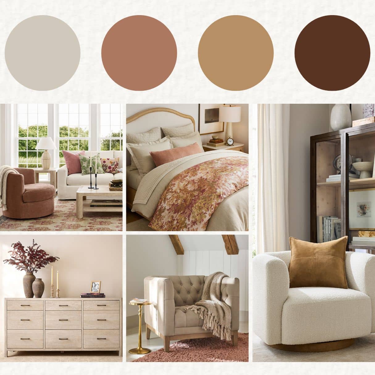
Palette 1: Warm and Organic
You can never go wrong with an earthy color palette.
- Main color (living room, dining room): warm greige
- Secondary colors: sage green tones, muted clay
- Trim color: soft white
- Accent color: rust or olive

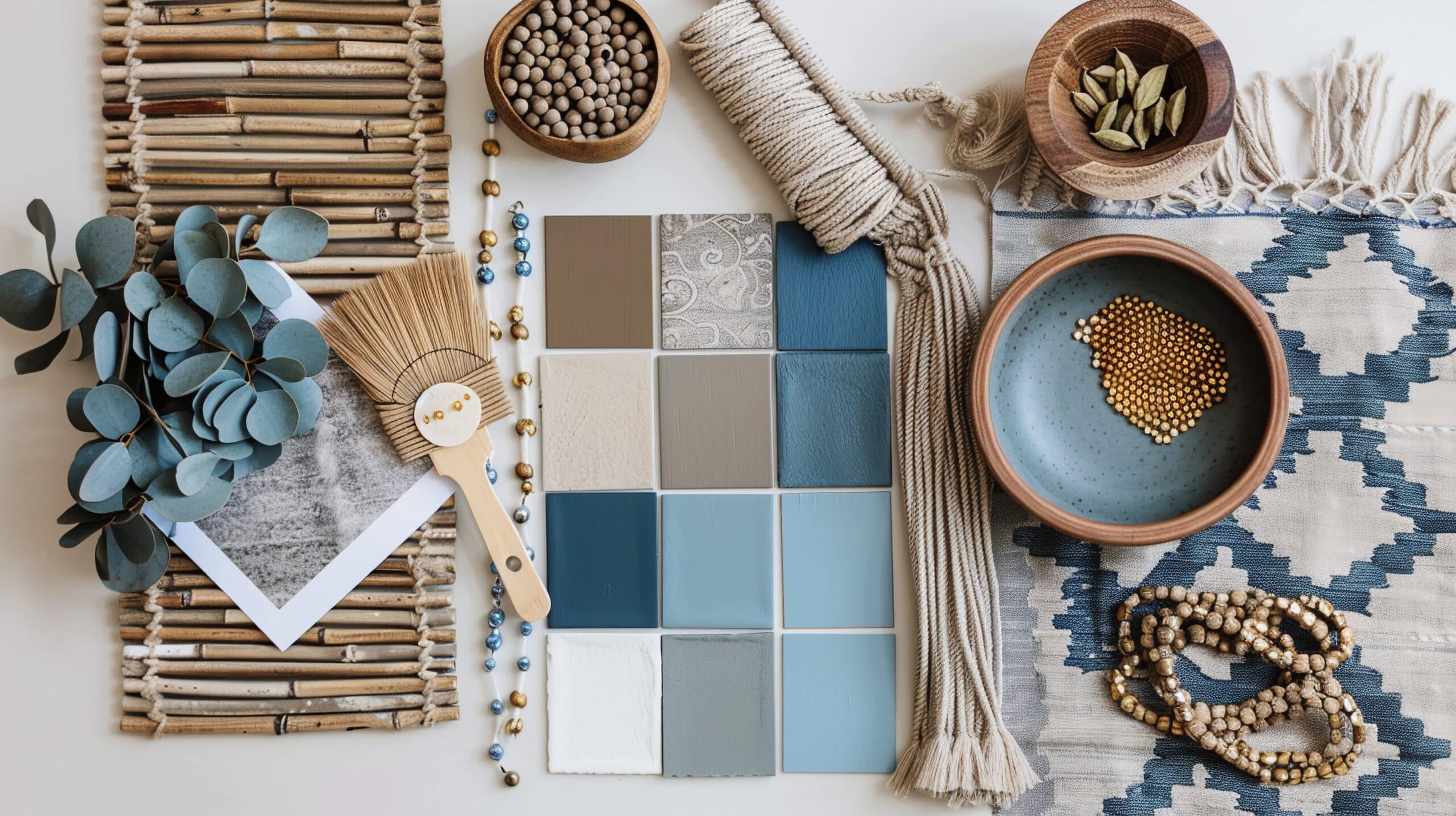
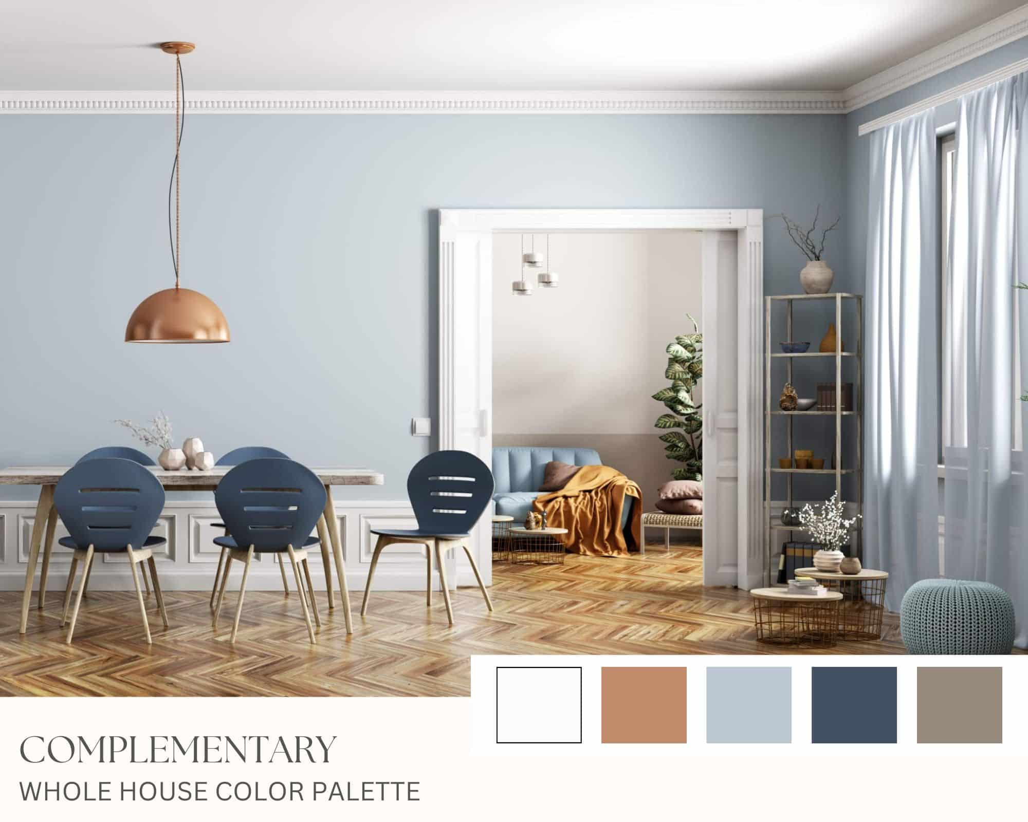
Palette 2: Light and Airy
- Main color: off-white or pale neutral
- Trim color: crisp white
- Secondary colors: pale blue-gray, soft green, light greige
- Accent color: navy or charcoal, taupe
You might use one shade in the living room, a softer version in the guest room, and a deeper variation in the master bedroom. The exact shades change, but the palette stays consistent.

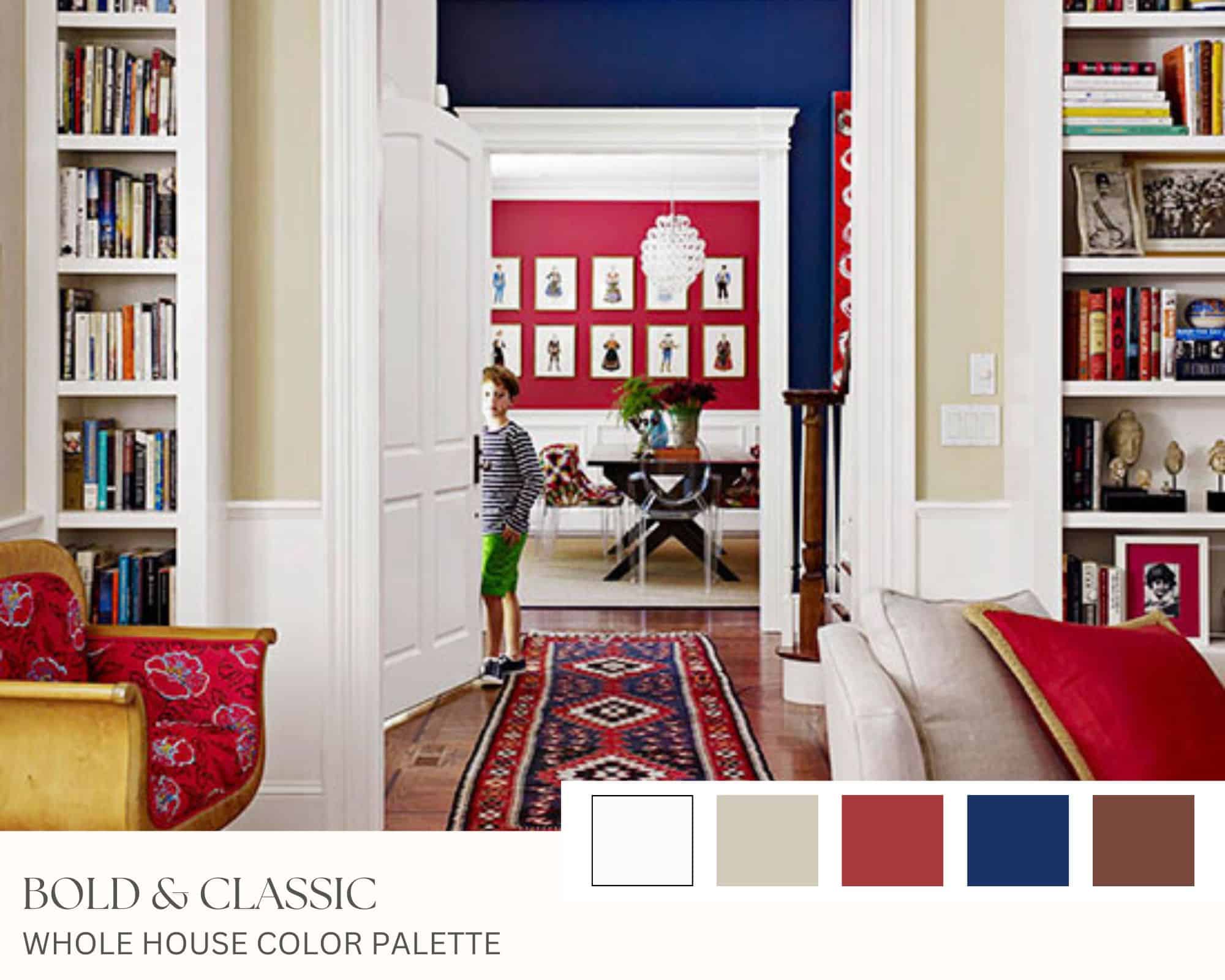
Palette 3: Classic and Timeless
- Main areas: warm greige or taupe
- Bedrooms / office: dusty blue, soft olive, deeper mushroom tones
- Trim: balanced white
- Accent tones: navy, camel, antique brass, walnut

You do not need dozens of colors. Most homes can feel beautifully cohesive with 4 to 6 core colors plus a consistent trim color.
Common Whole House Color Palette Mistakes
Here are the mistakes I see most often when it comes to creating a cohesive color palette:
1. Choosing rooms individually with no plan
This is the fastest way to create a disconnected house. Every room may look great on its own, but if your goal is to have a cohesive home, you need to consider how each space fits in with the whole.
2. Mixing undertones unintentionally
Warm and cool neutrals can play nicely together, but this isn’t always the case. It requires some upfront planning when mixing warm and cool colors to ensure the undertones work well together.
3. Ignoring sightlines
A powder room can be bold. A hallway visible from three rooms needs a little bit more thought. That’s why using neutral colors in main spaces is usually your best bet.
4. Using too many colors
More color options does not create more cohesion. Narrow down your color choices to a manageable size (5-7 colors for the whole house)
5. Forgetting the fixed finishes
Your floors, countertops, cabinets, and furniture matter. It’s important to choose paint colors that compliment the undertones of your fixed materials…you don’t want your colors to clash with your home.
6. Repeating the exact same accent colors everywhere
Using the exact same colors everywhere in the house can make it feel flat and forced. Variation within a color family (shades of light to dark) works better, and complementary colors add some visual excitement.
How to Test Your Whole House Paint Color Palette
Once you’ve narrowed down your palette, it’s important to test it in real life.
I recommend you use:
- paint samples (peel-and-stick from Samplize is my go to)
- large swatches or poster boards
- samples placed in multiple rooms
When you begin testing different paint colors, it helps to narrow your choices to a few trusted brands such as Benjamin Moore or Sherwin Williams. Instead of choosing colors directly from a tiny paint chip in the store, bring samples home and test them in your space. Paint colors often look very different once they’re applied to your walls and viewed throughout the day.
Be sure to evaluate your colors at the following times:
- morning
- afternoon
- evening
- in natural light
- with lamps and overhead lights on
The goal is not just to like a color in one room. It’s to see how the palette behaves throughout the home. That’s what makes it a whole house palette.
Final Thoughts
As an interior designer, I’ve seen how dramatically a planned-out color palette can transform a home. The right palette helps every room connect, even when the colors themselves change.
Remember, a cohesive whole house color palette isn’t about making every room look the same.
It’s about creating connection.
It’s about walking from one room to the next and feeling like everything belongs together, even when each space has its own personality.
When your color decisions are made as part of a larger plan, decorating gets so much easier. Shopping gets easier. Styling gets easier. And your home starts to feel like it was planned out instead of pieced together.
If your home has been feeling disjointed, you probably don’t need more decor. You need a better color plan.
And if you want help building one, that’s exactly the kind of thing I teach inside my room decorating framework. My Room Design Recipe program is the place for expert advice about choosing cohesive colors for your home and personalized decorating help when you need it,
Explore the Paint Hub Page
If you’re researching paint colors, undertones, or whole-home palettes, I’ve organized all of my best paint resources in one place.
From white paint guides to exterior color combinations, you can find everything inside my Paint Hub page.