Have you ever painted a room, only to realize your “perfect gray” suddenly looks blue, or your creamy white looks yellow against your trim? If so, you’ve met the tricky world of paint undertones. They’re the subtle color shifts hiding beneath the surface of every paint color, and they’re the reason your paint sometimes doesn’t look the way you expected once it’s on the wall.
If you’ve ever stood in the paint store holding a handful of chips, wondering which one is the right paint color for your living room, you’re not alone. Understanding undertones is one of the best ways to make sure the color you choose works beautifully with your flooring, trim, and other finishes.
In this guide, I’ll walk you through what undertones are, why they matter, and how to spot them before you commit to painting.

What Are Paint Undertones?
Every paint color has two parts: the main color (what you first see – gray, white, beige, blue, etc.) and the undertone (the subtle secondary color that influences how it actually looks).
For example:
- A gray paint may have blue undertones, giving it a cool cast.
- A beige might have pink undertones, making it feel rosier.
- Even white paint colors have undertones — they can lean creamy (yellow undertones), crisp (blue undertones), or soft (green undertones).
The challenge? These undertones aren’t always obvious on the tiny paint chip at the paint store. They usually reveal themselves when compared to similar colors side by side, or when placed next to trim, flooring, or other fixed elements in your room.
Why Undertones Matter So Much
Choosing the right paint color isn’t just about what looks pretty on the chip — it’s about how that color interacts with your space. Undertones are especially important because they:
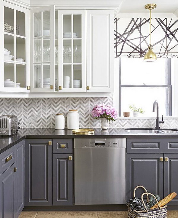
- Need to match existing finishes. Your paint color should complement the undertones in your trim, countertops, flooring, carpet, or stone. If your hardwood flooring has warm undertones, a wall color with cool undertones may clash.
- Behave differently in lighting. Undertones can shift depending on whether your room faces north or south, or whether you’re using warm or cool light bulbs.
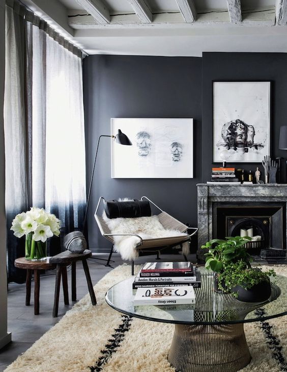
- Matter most in neutrals. Whites, beiges, and grays are especially tricky. The subtle undertones in these shades are what make them look fresh and modern — or mismatched and muddy.
Getting undertones right is one of the most important steps in creating a cohesive home design.
Warm vs. Cool Undertones
One of the easiest ways to start spotting undertones is by looking at temperature:
- Warm undertones: Yellow undertones, red undertones, or orange undertones. These create warm paint colors that feel cozy, inviting, and energetic.
- Cool undertones: Blue undertones, green undertones, or purple undertones. These create cool paint colors that feel calm, fresh, and modern.
- Neutral undertones: Some paint colors have subtle undertones that can swing either way depending on lighting and surrounding materials.
Understanding whether your wall color (or trim color) has warm undertones or cool undertones is the key to making sure it doesn’t clash with the rest of your home design.
How Lighting Affects Undertones
Lighting has a huge impact on how undertones show up:
- North-facing rooms bring in cool light that enhances blue undertones or green undertones in gray paint colors.
- South-facing rooms bring in warm light that makes yellow undertones more visible.
- Artificial lighting also matters. Incandescent bulbs bring out warm undertones, while fluorescent or LED bulbs may highlight cooler undertones.
This is why it’s so important to test a paint sample in your actual room before deciding. What looks like a soft neutral at the paint store can look completely different under your home’s lighting.
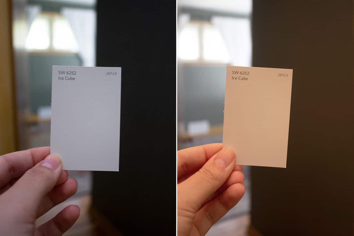
Check out this next image to see an example of how artificial lighting changes the look of a paint color. On the left side is SW Ice Cube viewed in cool lighting (from a 60-watt LED bulb). On the right side is the exact same color, but it’s subjected to warm lighting from a 100-watt incandescent bulb. Crazy the difference!
🎨 Free Resource for You!
Struggling to choose the perfect paint color? Grab my free guide: 5 Steps to Choosing the Perfect Paint Color and learn the exact process I use as a designer to select colors that actually work in real homes.
No more guessing. No more swatch overload. Just confidence!
👉 Click here to download it now
The Best Way to Detect Undertones
So how do you find undertones before painting your whole living room? Here’s a simple trick I always recommend:
The White Paper Test
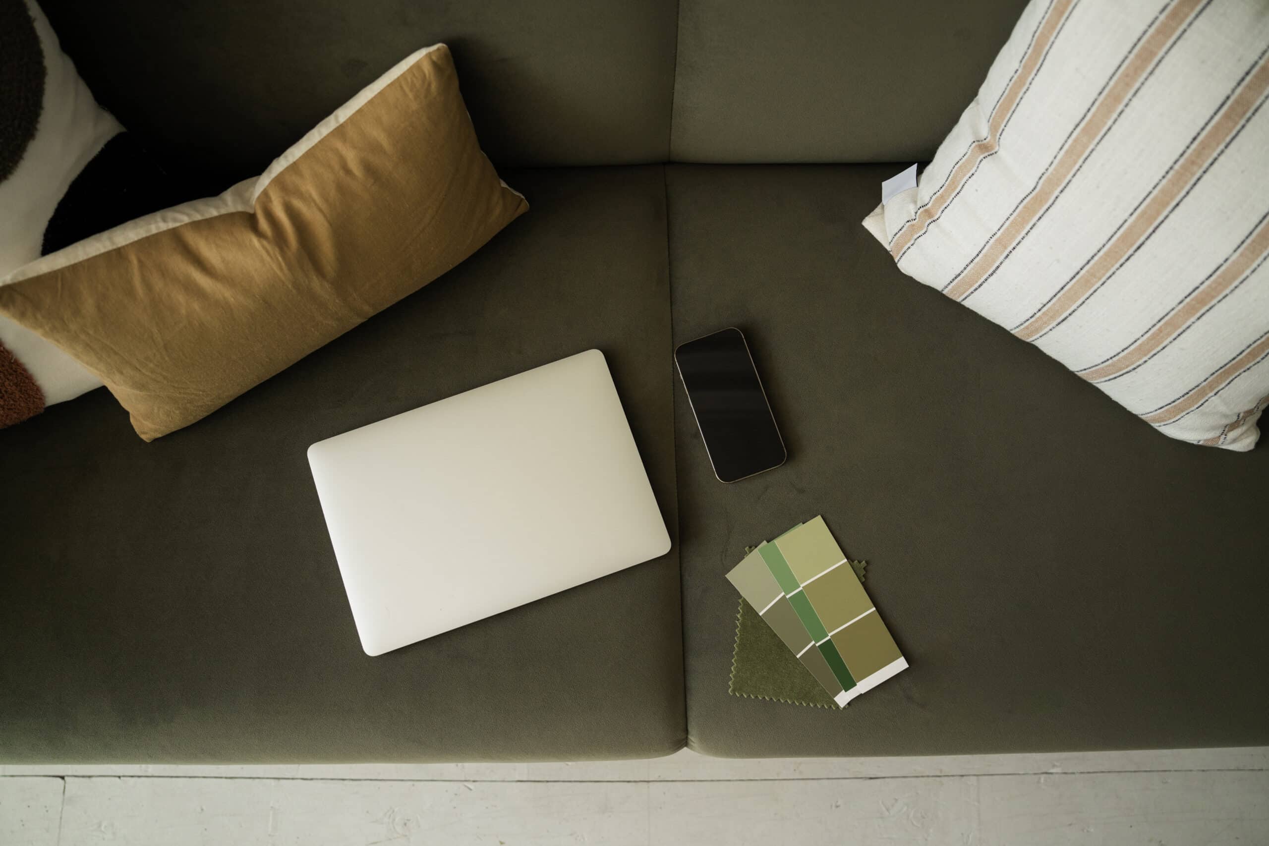
Place your paint chip on a sheet of plain white printer paper. Against the pure white, the undertones become much easier to see. That “neutral” gray might suddenly reveal a blue undertone or a green undertone, while a soft beige might show its pink undertone.

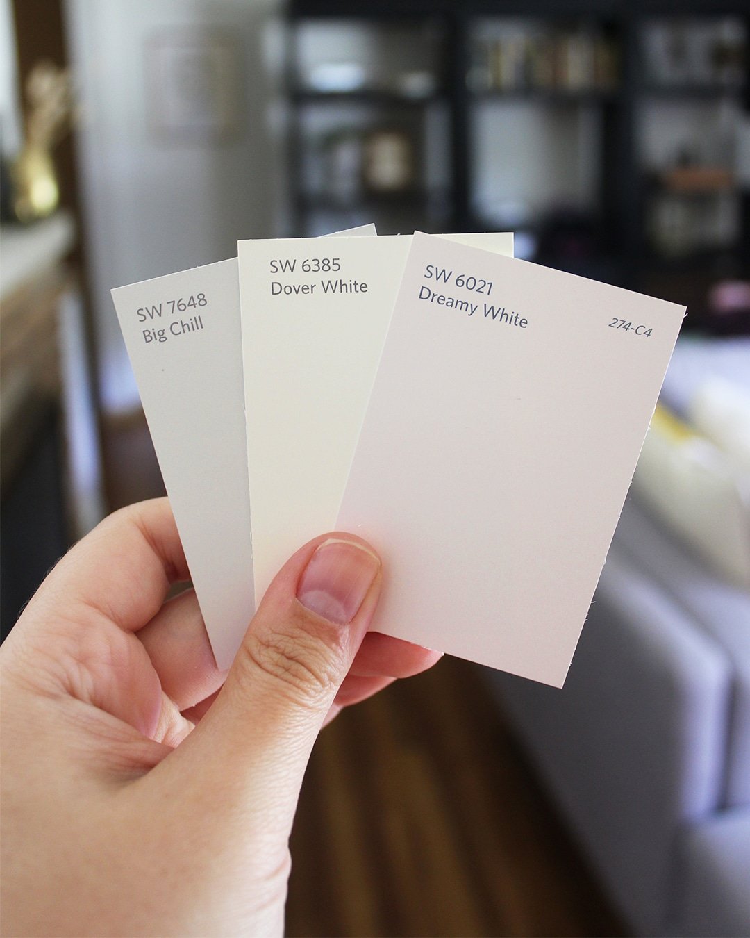
You can also compare your chosen color against similar colors on the color wheel or paint strip. Seeing them side by side makes the undertones much more obvious. Check out the next image to see how clear the undertones become when you hold color chips next to each other.
👉 In my How to Choose Paint Colors with Confidence course, I teach additional methods to spot undertones, but this simple white paper test is a great starting point.
Common Undertones in Neutrals
When working with a neutral paint color, here are the undertones you’ll run into most often:
- Gray paint colors → blue undertones, green undertones, or purple undertones
- Beige paint colors → pink undertones, orange undertones, or yellow undertones
- White paint colors → can lean warm (yellow undertones) or cool (blue undertones)
- Greige paint colors → often have subtle green undertones
These small shifts are why some grays will look crisp and modern on your walls, and others will feel more traditional. It’s why some grays look blue or purple on your walls, and some whites look yellow. Once you understand undertones, choosing colors becomes so much easier!

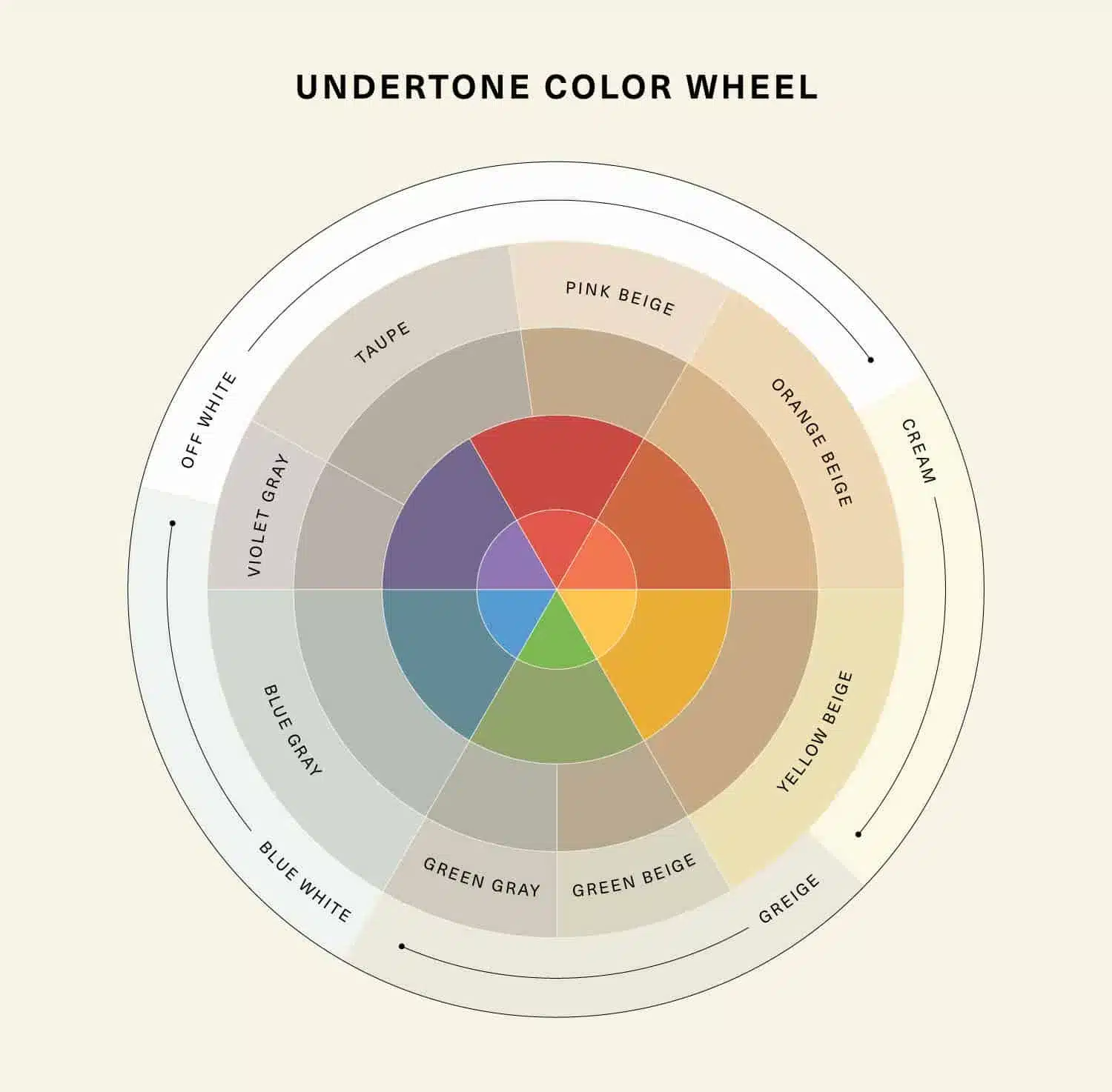
Using the Color Wheel to Help
The color wheel is one of the best tools for seeing how undertones interact.
Primary colors include red, yellow, and blue, and these colors can’t be created from other colors. Warm colors are your yellows, oranges, and reds. Cool colors include blues, purples, and some greens. Colors across from each other are called complementary, and they can create a striking contrast (sometimes too much of a contrast if undertones clash).

For example:
- A beige with pink undertones may clash with green undertones in your carpet.
- A soft gray with blue undertones can look even bluer next to a warm wood dining table with orange undertones.
When in doubt, compare your paint sample with white paper or with similar colors to spot subtle undertones, and check it against your flooring, trim, and furniture.
FAQ: Quick Answers About Paint Undertones
Can undertones change depending on lighting?
Yes. Undertones can look different in north vs. south light, or under warm vs. cool bulbs. Always test in your own room.
What’s the best way to see paint color undertones?
The white paper test and comparing against similar colors are the best ways to spot undertones before painting.
Are undertones most important in neutrals?
Yes. Undertones matter in every color, but they’re most noticeable (and sometimes problematic) in neutral paint colors like whites, grays, and beiges.
Do undertones need to match existing finishes?
This is the safest way to go! Your trim, tile, flooring, carpet, and countertops all have undertones too. Make sure your paint color’s undertones coordinate with those fixed elements for a cohesive look. You CAN use paint colors with a different undertone than your fixed finishes, but just know that the difference will be obvious. Sometimes that intentional design choice can look great…other times it looks terrible. When in doubt, play it safe, and match your undertones.
Final Thoughts on Paint Undertones
Undertones are the subtle yet powerful details that can make or break your wall color. They explain why one white looks fresh and clean, while another feels dingy, or why a gray can suddenly look blue in your living room.
By paying attention to paint undertones, comparing samples, and testing in your own space, you’ll avoid costly repainting mistakes and choose colors that give you beautiful results.
And if you want to dive deeper into color selection, including additional methods for spotting undertones, be sure to check out my course, How to Choose Paint Colors with Confidence.