
Which is best – neutral or bold wall colors? One of my most popular blog posts from 2019 shares a list of 20 of the Best Whole-House Paint Colors. Most of the time, when people are looking for a single paint color for the main areas of their home, they opt for a neutral color. So, the post is filled with beautiful, designer-favorite neutrals that you can use throughout your home. I didn’t think this would be a controversial post when I wrote it, but there have been several comments from people who seem downright angry that I would recommend all of those “boring” neutrals. I’ve got thick skin, so it really doesn’t bother me, but it has been eye opening! It made me remember something very important…
When it comes to choosing wall colors, there seems to be two groups of people out there. The first group prefers neutral, timeless shades that can adapt to different color palettes and different styles. They prefer to keep their walls neutral, and add pops of color with their pillows, artwork, furniture, and accessories.
The second group prefers to use bold, saturated color on their walls to express their personality, and bring “life” to their rooms. They embrace color, and want their walls to be vibrant reflection of the colorful world around them.
So, which one are you?
For me personally, I fall into both groups…depending on the room and the overall look I’m going for. I prefer to use neutrals in the main areas and bedrooms of my home. I find them relaxing, and I like the idea of being able to change up my colors, pillows, bedding, and overall style in the room, without having to re-paint my walls. However, I love to go bold in dining rooms, offices, and powder rooms. To me, those spaces are just begging for a more unique and dramatic design.
Regardless of which group you relate to, there are a few things you should keep in mind when it comes to decorating. Here are my design tips when using neutral versus bold colors on your walls.
Tips for Neutral Walls
- Use neutral wall colors in the main, connecting areas of your home to create good flow and a bright, open feel
- Neutral wall colors are great if you want to change up your color palette from time to time, and don’t want to repaint your walls
- Neutrals are a good choice if you want your furniture or decorative items to take center stage.
- Neutral walls are best for minimalist and traditional styles.
- Choose neutrals if you want your space to feel calm and relaxing
- Add cheerful pops of color, pattern, and different textures to add visual interest to a neutral space.
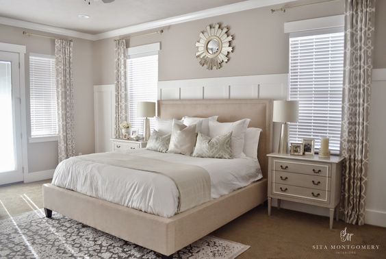
Here’s an example of a bedroom with a very neutral color palette. It works because there are a variety of textures and patterns in the room to create visual interest (not to mention a gorgeous board and batten wall for added character). A really neutral room needs lots of pattern and texture to overcome absence of color.
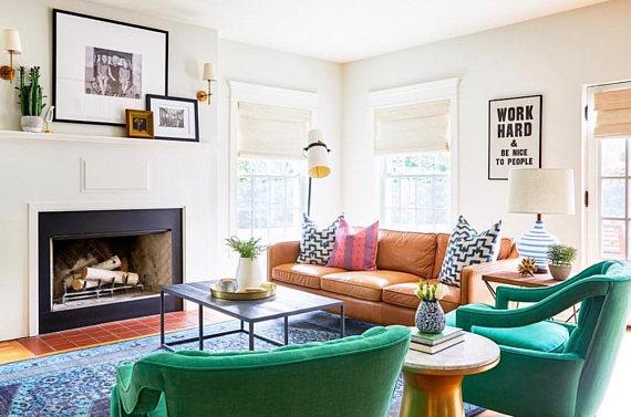
Here’s another example of a neutral white wall color, but this room is anything but boring. The bright pops of color from the furniture and accessories add excitement and energy! And, if the owners ever decide to change up their furniture or go with a different style, they won’t necessarily have to repaint those white walls.
Tips for Bold Colorful Walls
- Use bold wall colors to create drama!
- Great choice for dining rooms, offices, dens/libraries, and powder rooms.
- Bold colors are great for highlighting an accent wall or architectural feature.
- Bright, colorful walls can create a feeling of energy and excitement in your space, but can also feel overwhelming to some.
- Choose more neutral furnishings and accessories so you don’t compete with a bold wall color
- Carry your bold wall color into adjacent rooms with the same color accessories, pillows, artwork, or furniture to improve flow.
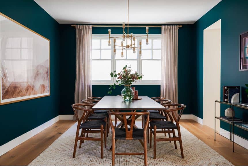
I love the sophisticated and cozy feeling a beautiful teal wall color brings to the design of this dining room.
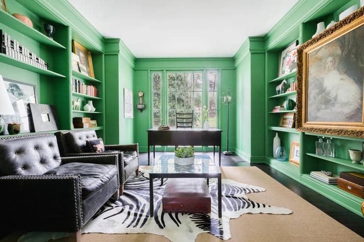
This next room uses bright green walls in an office setting, and the result is both stunning and invigorating. Keeping other elements in this space neutral helps to keep the room from becoming visually overwhelming.
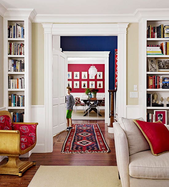
One challenge in using bold colors on the walls has to do with creating good flow between rooms. In this next pic, you can see how each bold color was carried into the adjacent room, creating a sense of cohesive design throughout.
When it comes to design, the most important thing to remember is that your home should be a place that you enjoy spending time in, and that reflects your personality – regardless of what the current trends are. If you love neutral wall colors, great! If you prefer to use bold, saturated colors on your walls, that’s great, too! There really is no right or wrong when it comes to choosing whether or not to use neutral or bold wall colors in your home. Just follow my tips above to help your bold and neutral rooms look their best.


I just bought a place with a large living room with a minty green-gray wall color (which I like), One whole wall has a built-in glossy white bookcase. I like the bookcase, but glossy white would not have been my choice, The bamboo floors are walnuty-brown. I would like a teal sofa but it seems too jarring with the bright white bookcase. I also want linen casual drapes on either side of a large sliding door opening parallel to the white bookcase wall. I am ok with a white draperies. How do I get a teal sofa or 2 leather recliners without being too jarring and without violating the 60-30-10 palette rule?
Hello, thanks for the experiences on the blog, we are very committed
What color teal is this one ?
Anika1952@aol.com and what store can I purchase it from? I love the teal in the dining room picture
According to the designer, the teal color used in the dining room is Benjamin Moore Sherwood Forest.