Choosing paint colors is one of the biggest challenges that home decorators struggle with. There are an overwhelming amount of colors out there to choose from, and so many different paint brands! Let’s see if this story sounds familiar to you… You’ve found what you think is the perfect paint color. You buy the paint, roll it onto your walls, and stand back to admire your work. But, your heart sinks as you realize the color is all wrong! I know how frustrating this is, because I’ve been there. What happened? Typically, paint color mistakes fall into one of three categories. You either got bitten by undertones, lighting conditions, or you didn’t test drive the paint color in your home. I’ll go deeper into each one of these common paint color mishaps in this post, so you can avoid them in the future.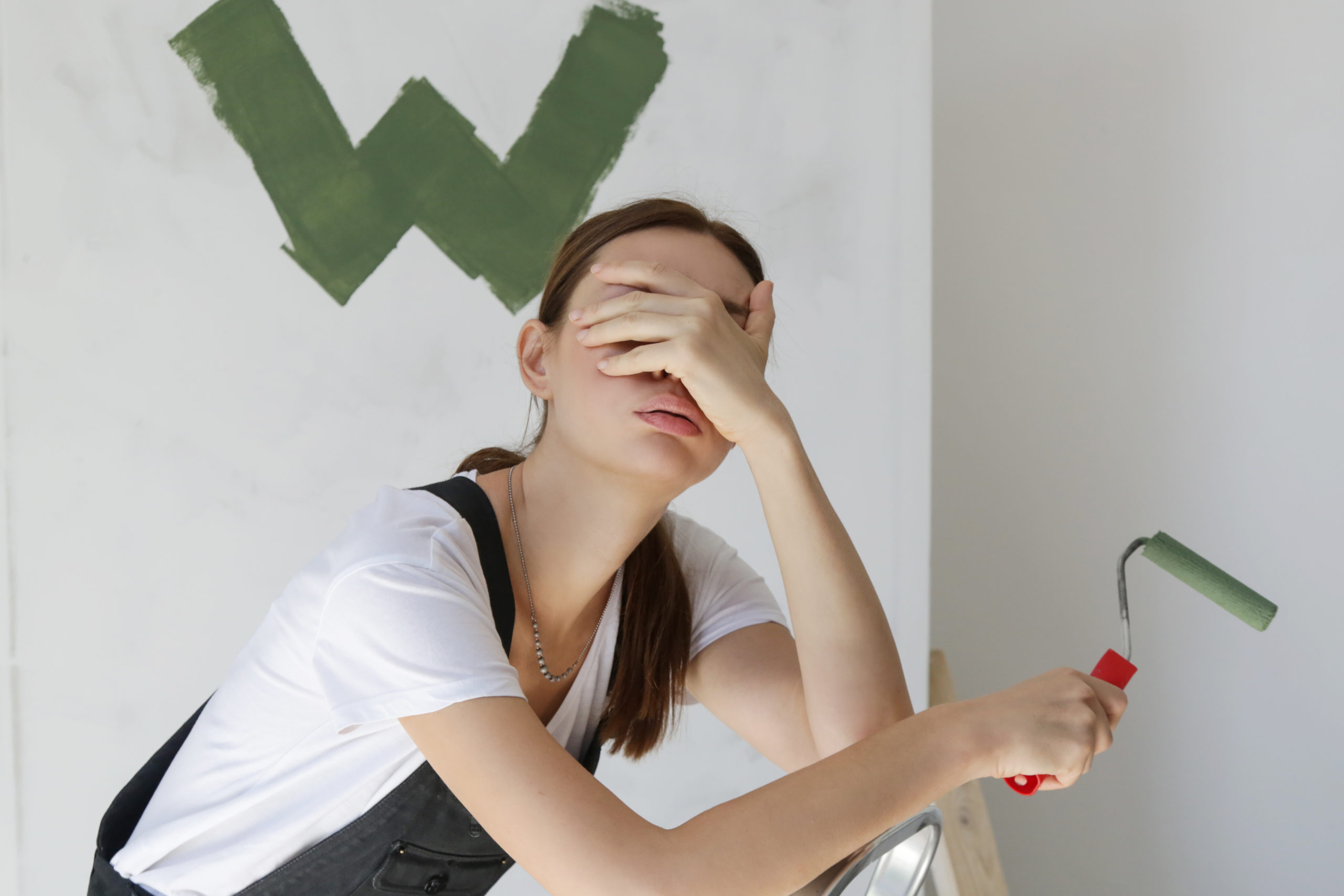
Mishap #1 – Hidden Undertones
You choose what you think is the perfect gray paint color for your living room. But, when you put it on your walls, it suddenly has a slight baby blue tinge to it. Not the look you were going for! Ugh!
The reason for this mishap is undertones.
Every paint color has undertones, which are subtle colors that hide beneath the surface of a paint color. Under certain conditions, those sneaky undertones can drastically affect the way the paint color looks in your home.
Undertones fall into three categories – warm, cool, and neutral.
Paint colors with warm undertones have subtle yellow, orange, red, or brown colors mixed in. On the other hand, paints with cool undertones have hints of blue, purple, or green. That gray paint color you chose, that ended up looking baby blue, had blue undertones that you didn’t notice when you chose the paint color. Paint colors with neutral undertones are the best kind, because they have no detectable undertones!
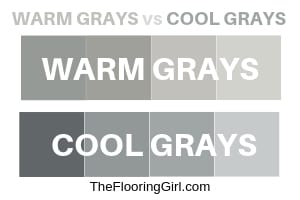
Check out this next picture showing the difference between gray paint colors that have cool undertones versus ones with warm undertones. The warm grays have beige and brown undertones, while the cool grays have predominantly blue undertones. Makes a big difference!
How do you know what your paint color undertones are? There are a couple of easy ways to figure it out:
- First, you can compare your paint chip to plain white paper. This will help you visually detect the undertones in the color.
- Second, you can rely on paint color experts, like one of my favs Kylie M. Interiors, who shares her review of paint colors and talks at length about their undertones. I think she has reviewed practically every paint color out there, so just do a search for your paint color on her site, and read her review.
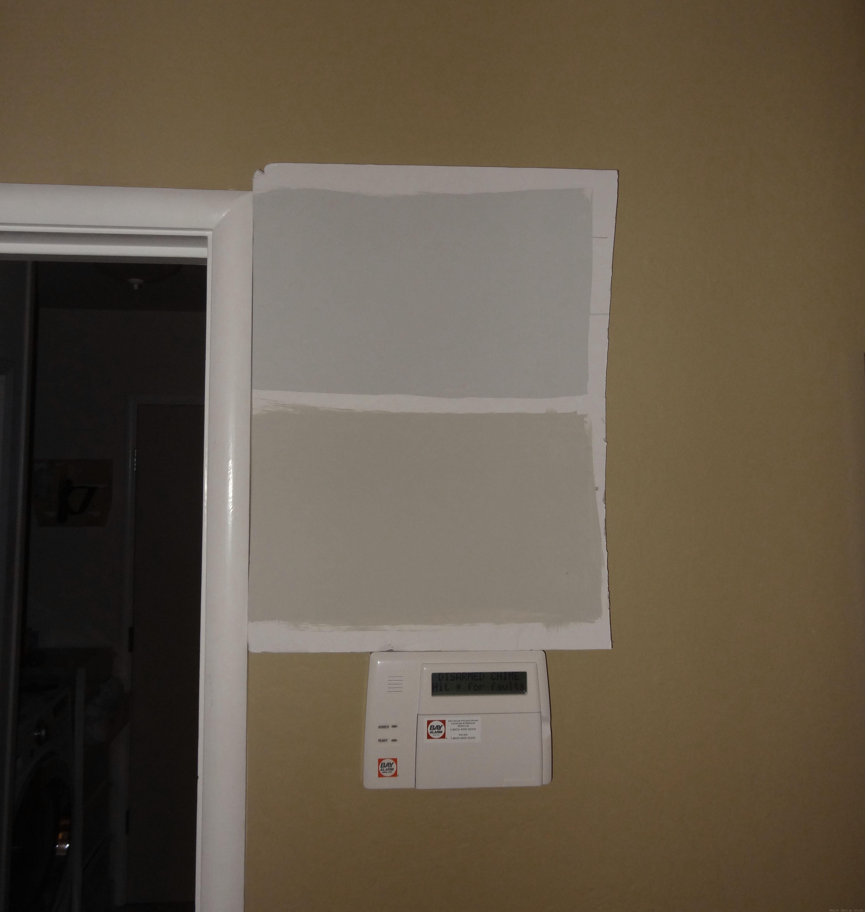
- Third, you can look at the darkest shade on the paint strip to get an idea of the undertones for the lighter shades (where undertones are less obvious). For example, what color would you say this is?

At first glance, it looks like a nice neutral tan with maybe a hint of gray to it. But, when you see it in a paint strip with its darker cousins, you can clearly see that it has green undertones. If you paint this color on your walls, it could end up looking much greener than you expected.

Mishap #2 – Lighting Conditions
Different lighting conditions bring out different undertones. Not only do you need to worry about the undertones of your paint color, but you need to worry about how the lighting in your home will affect your chosen paint color.
A while back, we completely remodeled the dining room in our home. We created a gorgeous custom built-in buffet and added white board and batten wainscoting throughout. Then, we painted the walls Sherwin Williams Mindful Gray, and it looked fantastic in there. A month later, we decided to paint our family room the same gray color. It already looked great in our dining room, so this should be an easy choice, right? Wrong! We painted the family room, and it looked purple! Purple!! What the heck happened? This was before I went to school for interior design, so I had no idea where I went wrong at the time. After that, I embarked on a months long search for the perfect gray paint color. I could have saved myself a lot of time and effort if I had known then what I know now.
You see, my dining room faced west, while my family room faced northeast. West-facing rooms get warm afternoon sun, which tends to bring out warmer undertones in paint colors, or neutralizes cool undertones. North and east-facing rooms tend to get cool light, which often brings out the blue or purple undertones in a paint color. Mindful Gray is known to have a very slight blue undertone. Another factor in our situation, was that we had burgundy colored cabinetry (not by choice) in the kitchen, which was open to the family room. The burgundy reflected a reddish-purple light into the family room. So, the combination of a northeast facing room and burgundy cabinetry was the perfect storm to bring out a purplish undertone in my paint color. What I needed was a warm gray paint color in the family room, not a gray with cool undertones.

North-facing rooms have cool, gray light coming in, with subtle hints of blue. If you paint your north-facing room a cool gray, blue, green, or purple, you may find the cool undertones are amplified! You can balance out the cool light in a north-facing room with warmer paint colors.
South-facing rooms get a lot of bright light which tends to get warmer into the afternoon. Warm paint colors will look warmer in a south-facing room, so choose neutral or cool colors to balance out the light.
East-facing rooms have soft, white light coming in, which can have the effect of toning down paint colors and making them feel a bit flat. Neutrals and colors with slight warm tones are a great choice for east-facing rooms.
West-facing rooms have warm light, that gets even warmer in the late afternoon. Warm paint colors may feel intensely warm at the end of the day. Choose neutral or cool colors to tone down the warmth in a west-facing room.
Take note of the direction your room is facing. Be sure to consider how your room’s lighting could bring out any undesirable undertones in your paint color, and adjust accordingly.
Mishap #3 – Not Testing it Out First
If you ordered a new pair of jeans online, you wouldn’t rip off the tags before trying them on, right? Paint is the same way. You have to “try it on” before you commit to painting your walls. I can’t tell you how many stories I’ve heard about people who see a paint color online, or at their friend’s house, and just start painting that color on their walls without ever testing it first. More often than not, they end up completely disappointed that the paint color they’ve chosen doesn’t look anything like the pictures online, or completely different than their friend’s house. It’s certainly possible that same paint color will look great in your home, but it’s more likely you’re making a huge mistake! One that will cost you time and money to fix…
In order to choose a great paint color for your home, you absolutely must test it out in your home first.
When it comes time to sample, you’ve got to check out Samplize. They offer convenient, affordable peel-and-stick paint samples that are much easier to use than traditional methods. Here are just a few reasons why I always recommend Samplize to my clients…
- Samples arrive quickly (1-3 business days, or even overnight, depending on location)
- They’re more affordable than buying the samples paint/rollers/foam boards that are needing for traditional paint sampling
- You can move them around the room, and test them in a variety of lighting conditions

Another method you can use is to gather up several paint samples, painting large swatches on white paper or foam board, and placing them in your room. I prefer to use foam board because it is easier to work, and doesn’t curl up like paper will. Keep a little white border around your paint swatches so you can really see the color, and place the foam board next to your trim (door or baseboards).
Regardless of which sampling method you choose, look at each sample in the daytime and at night, and move the samples to various different locations around the room (try it out in full sunlight, and in shadow, too). You’ll quickly be able to narrow down your choices, seeing right away which ones don’t work well with your home’s lighting conditions. Eventually, you’ll be able to narrow it down to one choice, and feel confident that your paint color selection is the right one for your room.
How to Choose Paint Colors FREE Guide
I know from experience that finding the right paint color can be frustrating! And, I admit that I’ve been guilty of one or more of these paint color mishaps in the past. This is why I created a FREE guide explaining the 5 steps everyone should take to choose the perfect paint color for you home. Grab your copy of the guide here.

Now that you understand the three most common paint color mishaps people make, you can avoid making the same mistakes. Along with my handy guide on “How to Choose Paints Colors,” you now have everything you need to be able to choose paint colors with confidence!