When it comes to interior design, it’s the subtle details that can make a world of difference in transforming a space from ordinary to extraordinary. One design trend that has become very popular over the past few years is contrast trim. The contrast trim paint trend involves painting baseboard trim, door casings, and interior doors in a darker color than the walls, creating a striking visual impact that adds a ton of character to your home. Of course, white trim will always be a solid choice, but if you want to try something a little different, contrast trim might be for you. In this blog post, we’ll explore the world of contrast trim, from choosing the perfect paint color combinations to expert tips that will help you achieve a professional-looking design.
What is Contrast Trim?
Contrast trim is a popular trend today, where the walls are painted a light color (usually white), and the trim (baseboards, window frames and door frames) is painted a darker shade (typically a light greige or gray). Traditionally, most people choose to paint their interior trim white, and their walls another (often darker) color. However, by painting your trim a darker shade than your walls, you can draw attention to the architectural details of your trim, and add some major wow factor and sophistication to your home.

Paint Colors for Contrast Trim
The key to mastering contrast trim lies in selecting the right paint color combinations. In this post, I’ll be sharing some designer-favorite pairings for white walls with a subtle contrasting trim paint color (light gray or greige). But that’s certainly not the only option!
When it comes to painting your trim and doors, you can choose any color that speaks to you, from a dark charcoal or black (for a high-contrast look), to an earthy gray-green. As a general rule, painting your walls and trim two different shades of the same color is a great way to create a subtle contrast that looks amazing. For example, you can choose a light blue for your walls, and a darker blue for your trim.
Pro tip: Look for two colors on the same paint strip for color pairings that are guaranteed to work well together. You can visit your local paint store to view the paint chips and flip through paint color fan decks to find the right color combination.
The Best White Paint Colors
When choosing a white paint color for your room, there’s a few things to keep in mind. If you’re planning to use a warm trim color, like a warm gray, beige, or greige, it’s best to choose a white that has some warmth to it. A few of my favorite warm whites are:
- Benjamin Moore White Dove
- Benjamin Moore Cloud White
- Benjamin Moore Swiss Coffee
- Sherwin-Williams Alabaster
If you’d rather use a cooler gray as your trim color, be sure to choose a more neutral white paint color for your walls. I don’t typically recommend using cool whites on your walls because they can make the entire space feel cold and sterile. Here are a few of my favorite neutral white paints:
- Benjamin Moore Chantilly Lace
- Sherwin-Williams Pure White
- Sherwin-Williams Extra White

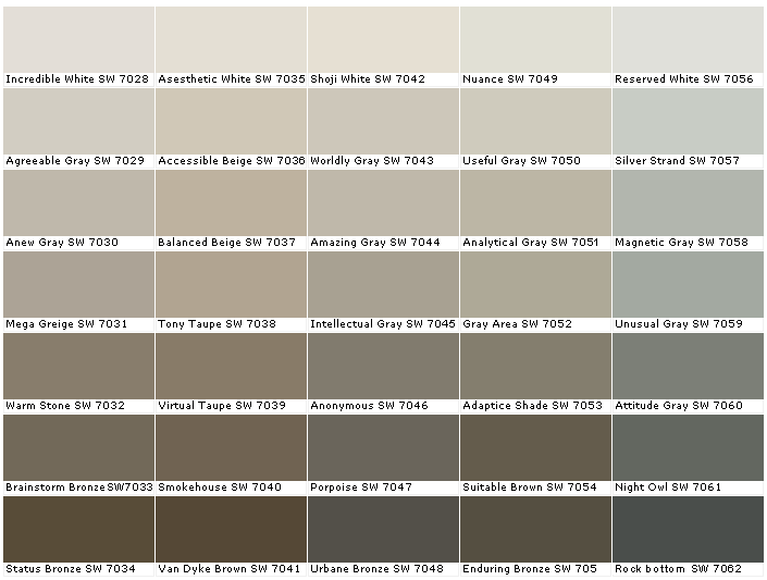
The Best Contrast Trim Colors
My favorite colors to use for contrast trim are greiges because they are so versatile. They have the perfect amount of warmth to keep them from looking cold, while staying nice and neutral with their gray tones. Here are some popular choices for greiges that are perfect for creating the contrast trim look:
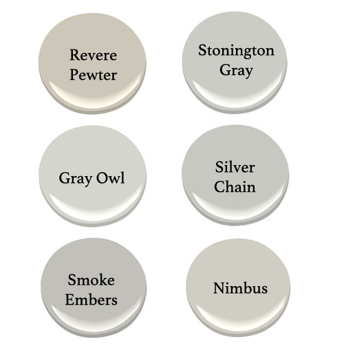
- Benjamin Moore Revere Pewter
- Sherwin-Williams Accessible Beige
- Sherwin-Williams Agreeable Gray
- Benjamin Moore Edgecomb Gray (aka Baby Fawn)

If you’d prefer something a bit cooler, or more of a neutral gray, here are some great options:
- Benjamin Moore Stonington Gray
- Sherwin-Williams Gray Screen
- Sherwin-Williams Colonnade Gray
- Sherwin-Williams Repose Gray


Not sure which paint color is right for your space?
Grab my FREE guide: “5 Steps to Choosing the Perfect Paint Color”
This free checklist breaks down the 5 essential steps to picking the perfect paint color…the way a designer does. 👉 Download the free guide here »
Inspiring Color Combinations for Contrast Trim
Hit the easy button with these four gorgeous, tried-and-true contrast trim color combinations!
Combo #1 – White Dove and Revere Pewter
This is probably my all-time favorite combination for contrast trim. BM White Dove is a fabulous warm white with greige tones that works with almost any color scheme. It pairs beautifully with the timeless classic greige BM Revere Pewter, as you can see in the swoon-worthy picture below.
Combo #2 – Chantilly Lace and Seapearl
If you’re looking for a very subtle contrast, start with BM Chantilly Lace on your walls and use BM Seapearl for your trim. Chantilly Lace is a bright, crisp, clean white that will work with pretty much any other color, including off-whites for a barely-there contrast.

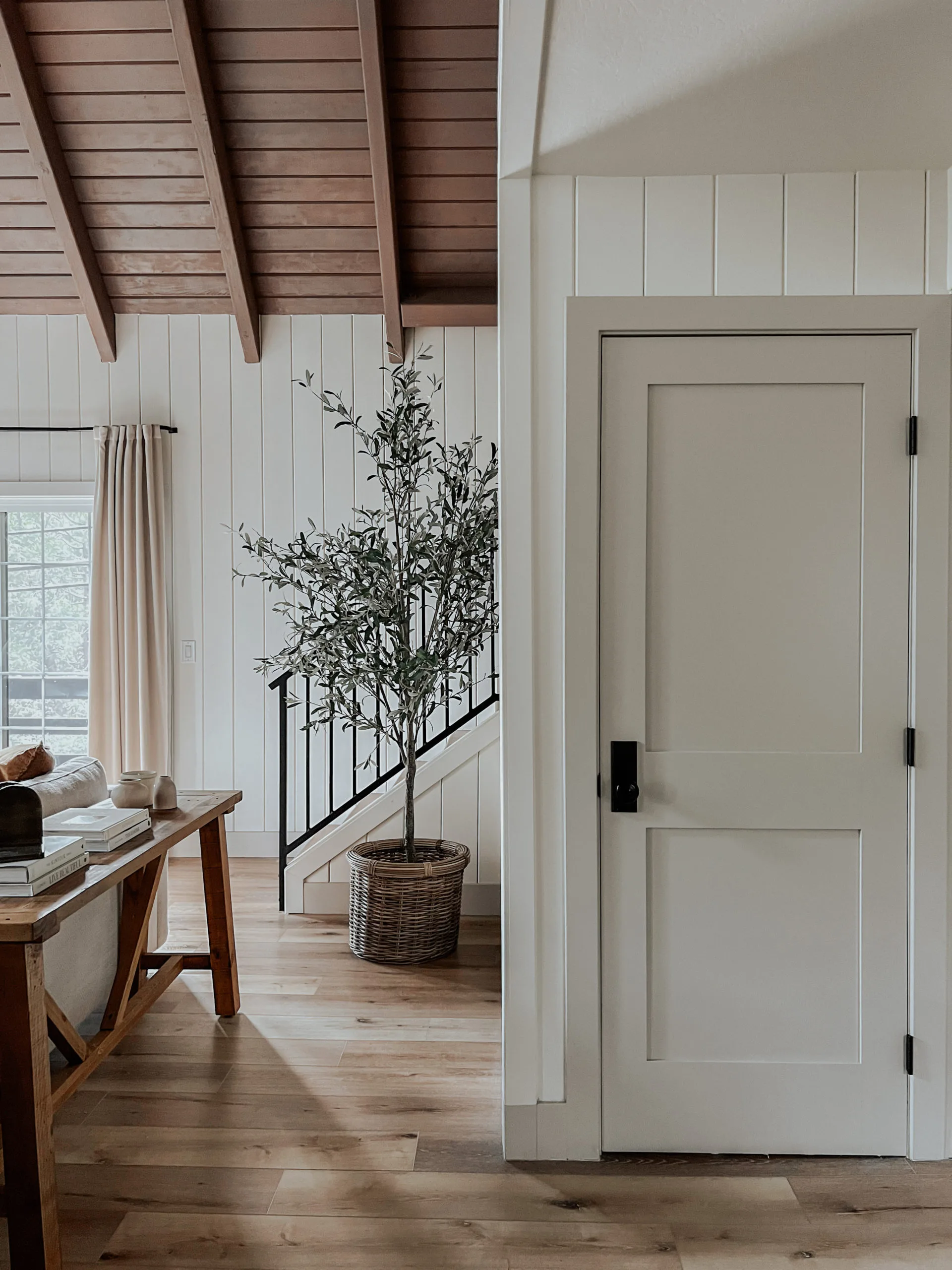
Combo #3 – Extra White and Agreeable Gray
If you want to stay away from creamy whites, or your whites are leaning yellow, give SW Extra White a try for your wall color. It’s a crisp, cool white, and pairs well with light grays or greiges that lean more gray. In this next picture, you can see SW Extra White on the walls, and SW Agreeable Gray on the trim and wainscoting. Such a gorgeous look!

Combo #4 – Alabaster and Accessible Beige
For a warmer option, use the creamy SW Alabaster on your walls paired with the warmth of SW Accessible Beige on your trim and doors. Even though it has the word “beige” in its name, Accessible Beige has enough gray in it to keep it nice and muted. This is a great combination for north-facing or east-facing rooms that could use a little more warmth with their paint colors.

Combo #5 – Pure White and Accessible Beige
SW Pure White is a great option for a soft white with a hint of warmth. It’s one of my go-to white trim colors because of its neutral appearance and versatility. Pairing Pure White with a warmer greige, like SW Accessible Beige is a winning combination, as seen in this living room and hallway from @oliveandoakhome.

Tips for Using Contrast Trim Like a Pro
- Select the Right Colors: Choose colors that complement each other and align with your overall interior design style. Test samples in different lighting conditions before making your final decision.
- Consider Room Proportions: While contrast trim can make a room feel more spacious, it’s essential to balance the proportions. In larger rooms, bolder trim colors can be used, while smaller spaces may benefit from subtler shades.
- Maintain Consistency: Extend the contrast trim to all the trim elements in the room, including baseboards, door casings, and interior doors, for a cohesive and polished look.
- Highlight Architectural Details: Take advantage of architectural features such as crown molding, chair rails, and wainscoting by accentuating them with your chosen trim color.
- Personalize with Accessories: Complete the look by incorporating decor items, such as curtains, rugs, and throw pillows, that echo the trim color, creating a harmonious and well-coordinated space.

As the contrast trim trend continues to be popular in the world of interior design, there’s no better time to transform your home with paint! By using a darker trim with light walls, you’ll create a beautiful visual contrast that brings depth and character to your living spaces. Whether you’re drawn to the elegance of charcoal and white or the warmth of beige and espresso, the possibilities are endless. With a list of great colors to try and some expert tips, you’re well on your way to creating a stunning bedroom, dining room, or living room space with contrast trim.
Choose Paint Colors with Confidence
If you want a deeper, step-by-step system for choosing paint colors that actually work in your home — lighting, undertones, coordinating rooms and all — I created a full course called How to Choose Paint Colors with Confidence.
Inside, I walk you through how designers approach color so you can stop guessing and start choosing with clarity.
👉 Learn more about the course here.
What’s the Best Paint Finish (Sheen) to Use?
When it comes to trim work, the best paint sheen is either satin or semi-gloss. A satin sheen has a little less shine than semi-gloss paint, and is a more popular option for today’s trends. For walls, the best option is a flat sheen to hide imperfections. You can also use a satin or eggshell finish for walls, but it’s a really bad idea to use a higher sheen (like semi-gloss) on your walls.
Don’t Forget To Sample Your Paint Colors!
Just remember…no matter what you’ve read or how many gorgeous photos you’ve seen online, it’s super important to sample paint colors in your own home before committing! Samplize provides real paint samples that are easy to move around your home, and cheaper than buying a gazillion paint pots! It’s the only place I buy paint samples, and the best way to test colors in your home.

Need some more paint color recommendations?
If you’re overwhelmed by endless paint swatches, I’ve already done the narrowing for you. My Favorite Paint Colors eBook includes my go-to designer picks in every color family — complete with specific names and codes from Sherwin-Williams and Benjamin Moore.
Instead of sorting through hundreds of options, you can start with colors that are tried, tested, and consistently beautiful in real homes.
👉 See what’s inside the eBook here.

Paint Hub Page
If you’re researching paint colors, undertones, or whole-home palettes, I’ve organized all of my best paint resources in one place.
From white paint guides to exterior color combinations, you can find everything inside my Paint Hub.
*This post contains affiliate links. If you click on an affiliate link and make a purchase, I may receive a small commission at no cost to you.


Where are the color combinations? Variations of white are nice but bring on some color because nice is just nice nothing unusual which your title indicates you were offering.
Hi Doris,
The term “contrast trim” has recently been used to mean painting a white paint color on the walls, and a slightly darker color for the trim. That’s why you’re not seeing a lot of color in the post. Sorry for the confusion! 😉
Combo #3 is SW Extra White not Pure White.
Ah, thanks for the correction! You’re absolutely right, and I updated the post to share the correct colors.
Hiya Melissa-
I have just painted my interior walls in Sherwin Williams Snowbound.
Struggling to find that perfect contrast for my trim.
I welcome any suggestions please.
SW Agreeable Gray or Colonnade Gray are beautiful with Snowbound. You could also do SW Drift of Mist for a lighter, more subtle contrast.
Thank you for this post. Most helpful. If I paint the walls SW Alabaster and the trim SW Agreeable Beige, will I need to paint the my ceilings? They are SW Pure White?
SW Pure White is a great ceiling color to use with SW Alabaster, so I wouldn’t repaint your ceiling.
I used Sherwin Williams Cotton on my walls and Accessible Beige for my doors and trim and we love the look. Accentuates the trim
Hi Melissa – I’d love your feedback on a soft white for a south facing/ocean facing room with a large picture window. I am considering a few: Aesthetic white SW, Shoji White SW, Greek Villa SW, Swiss Coffee 75% BM, Balboa Mist BM and White Dove BM – of course, open to any others that you suggest! Thank you!
Hi Mary! It sounds like you’ve picked some great options for your room. Any of those options could look lovely in a south-facing room. My only recommendations would be to add BM Pale Oak to your list. It tends to be a little more neutral than Balboa Mist (which can sometimes flash purple). SW Alabaster is another great option, and I also like BM Classic Gray (especially if you find that some of the options look too yellow/creamy).
Great post; really appreciate this help with the whites in particular! I have light, creamy (much lighter than intended 😓) carpet in my condo so I’ve been worrying about what to put on the walls… maybe white with a contrasting gray will work? Or will everything still look washed out?? – current beige walls look terrible and dirty. TIA!!
Hello, I love the white dove with revere pewter!! My question what color should I paint the ceiling? This is a new built.
White Dove would be perfect for the ceiling color!
Hi there!
I have been painting my walls the BM Seapearl and would love to know what would be a nice contrasting color for trim? Also would painting my white window pane boarders black look good for resale?
Thank you!
*borders, whoops!
Thank you for this wonderful piece! I don’t see large crown molding along the ceiling in these photos. Would I keep that white or would it have to be the same darker color we use for the doors and floorboards?
Thanks for your comment! Typically, you would paint the crown molding the darker color that is used for the doors and baseboards, and the walls would be white.
What is a soft green-gray contract trim that you like with BM Cloud White? And what trim would you suggest for a BM Gentleman’s Gray dining room? Thank you so much!
I currently have Ben Moore linen white on all trim which is also on all doors and moldings as well as same color in bathrooms toilets sinks showers etc. Too much to repaint the trim sadly made this mistake 22 years ago but still in great shape. Can you please suggest on what white colors you would use. Thank you!
I’m so excited to run across this post! My home is ready for a paint refresh and I love my current combo of revere pewter on the walls and white dove trim. I thought I’d just do the same but was feeling like I wanted a bit of a change/update. I’m now going to swap the two colors and refresh with contrast trim this winter. I’m really looking forward to seeing the results! Thank you.
That’s a fantastic idea, and you already know the colors work well in your home!
Currently, I have all white walls and trim, including built-in cabinets in my living room and my kitchen cabinets. Not sure of the white color exactly, but it’s creamy, not stark. I want to paint my trim, built-ins and doors a greige. What color would you suggest with Brazilian cherry floors?
Check out SW Egret White (looks great with cherry wood floors) and SW Accessible Beige (a bit warmer greige that works well with both creamy whites and cherry wood).
While all theses rooms are lovely and fresh looking, I personally feel this look has seen better days. Grey, greige, tan, white…. getting stale. I love the contrast trim/ wall ideas but now look for more color warmth. Your thoughts?
We’re doing Greek villa walls and natural linen trim by sherwin Williams. What color floors do you think would go best with that?