If you ask a designer for a fabulous greige paint color, they are very likely to recommend Sherwin Williams Agreeable Gray (SW 7029), with good reason. Greiges are a very popular paint color choice for any room in your home, because they’re neutral, and blend the best aspects of gray and beige to create a versatile and timeless wall color. If you’re looking for a greige for your home, Sherwin Williams Agreeable Gray needs to be on your list of paint colors to try! Order a peel-and-stick sample sheet of SW Agreeable Gray HERE.
Note: This post contains affiliate links for your shopping convenience. See my Privacy Policy for full details.
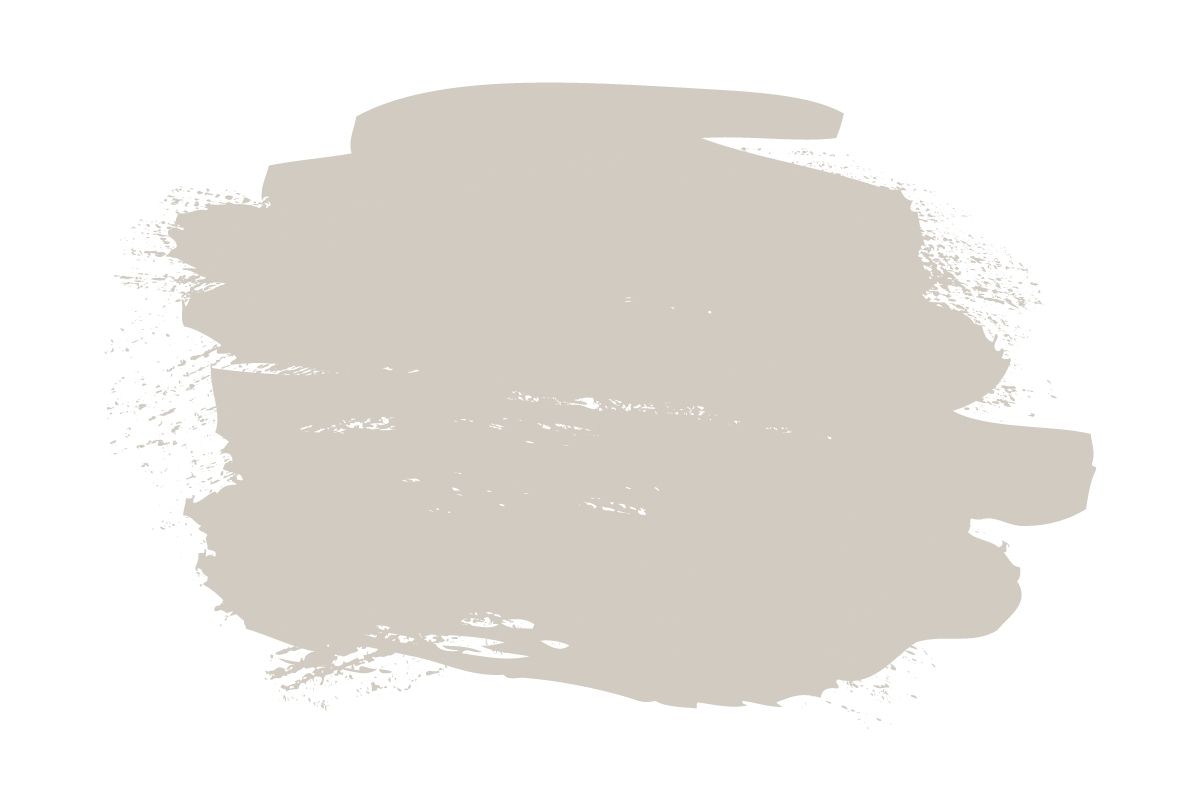
Sherwin Williams Agreeable Gray (SW 7029)
What Undertones Does Sherwin-Williams Agreeable Gray Have?
Agreeable Gray is a greige, which means that it’s a blend of gray and beige. In this case, Agreeable Gray leans every so slightly more toward gray than beige, but the overall balance is gorgeous. Now, depending on your lighting conditions, it can appear more beige or more gray in a room, just like all greiges do. For example, in a north-facing room Agreeable Gray will often look more gray. However, Agreeable Gray is a paint color that tends to look neutral and amazing in a wide range of spaces, which makes it a go-to greige for designers and homeowners.
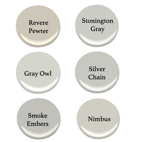
Several years ago, Benjamin Moore’s Revere Pewter was considered the most popular greige around. But, with today’s trend toward lighter wall colors, Agreeable Gray has surged in popularity. BM Revere Pewter is known for having a slight green undertone, which can make it look a tiny bit muddy in some light. Agreeable Gray doesn’t have any noticeable green undertones to it, so it tends to look much more neutral.
If Agreeable Gray seems too warm for you, and you want to go more toward gray, a great choice would be SW Repose Gray. On the flip side, if you want to go slightly warmer and more toward a beige, BM Edgecomb Gray is a solid option. In any case, be sure to sample your paint colors on your walls before committing to one.
Light Reflectance Value
Light Reflectance Value (LRV) is a measure of how dark or light a paint color is on a scale of zero (darkest) to 100 (brightest). SW Agreeable Gray has a light reflectance value (LRV) of 60, which puts it into the “light” paint color category. An LRV range of 60-70 is very popular for paint colors today, giving the room a light, airy look. In rooms that get lots of natural light, an LRV of 60 can look even brighter, pushing the apparent LRV up higher. If you find that Agreeable Gray is too light or too dark for your space, look into a paint color with a slightly higher or lower LRV to get the look you want.
Where to Use Agreeable Gray
For a whole-house color, Agreeable Gray is one of the best options out there! It’s the perfect light neutral for a great room, dining room, and other main areas of your home. The best thing about Agreeable Gray, however, is that it is also soft enough for bedrooms, offices, and even kids’ rooms. It’s not a hugely popular choice for cabinetry, but I’ve seen it used on kitchen and bath cabinets very successfully. It’s also a great option for exteriors, when you want something light enough to almost look white, but not quite.
Here you can see the power of Agreeable Gray as a whole-house color. If you need a color for a rental property, or for resale, Agreeable Gray is a solid choice. It looks great with white accents and wood tones, and is flexible enough to pair with a wide variety of colors.
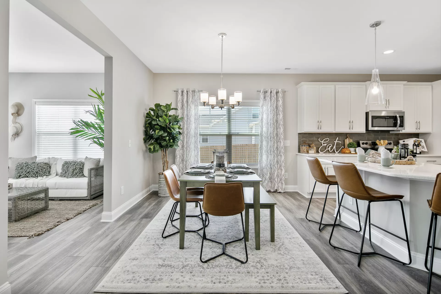
Agreeable Gray can give you just a hint of soft color in a bedroom, and is a lovely shade for a neutral color palette. In this beautiful bedroom, you can see how Agreeable Gray works equally well with both the beiges and grays used in the room, tying them all together…the superpower of a greige.
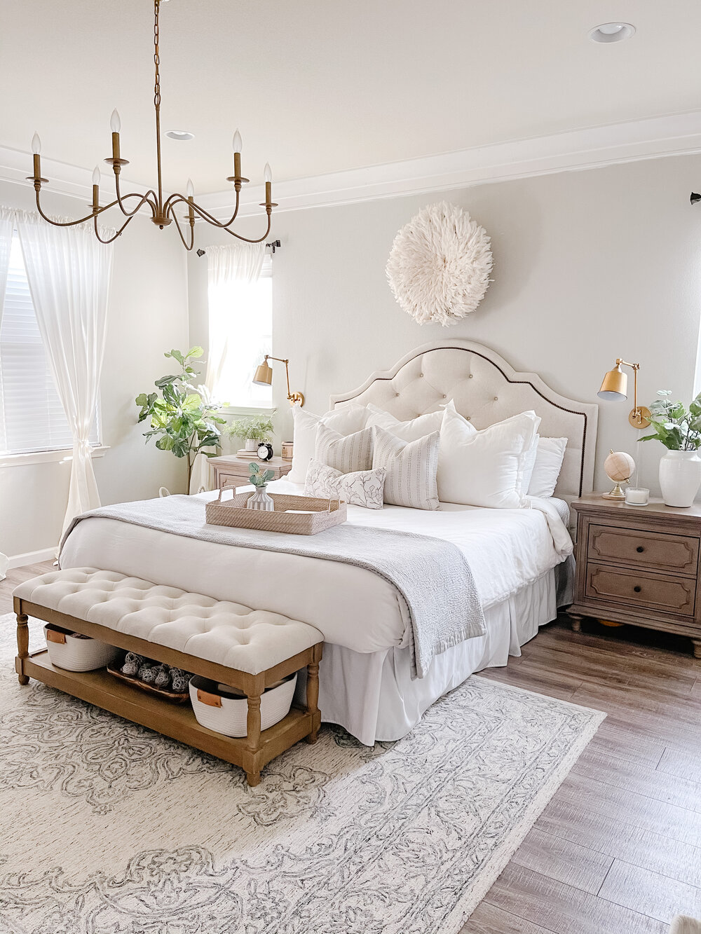
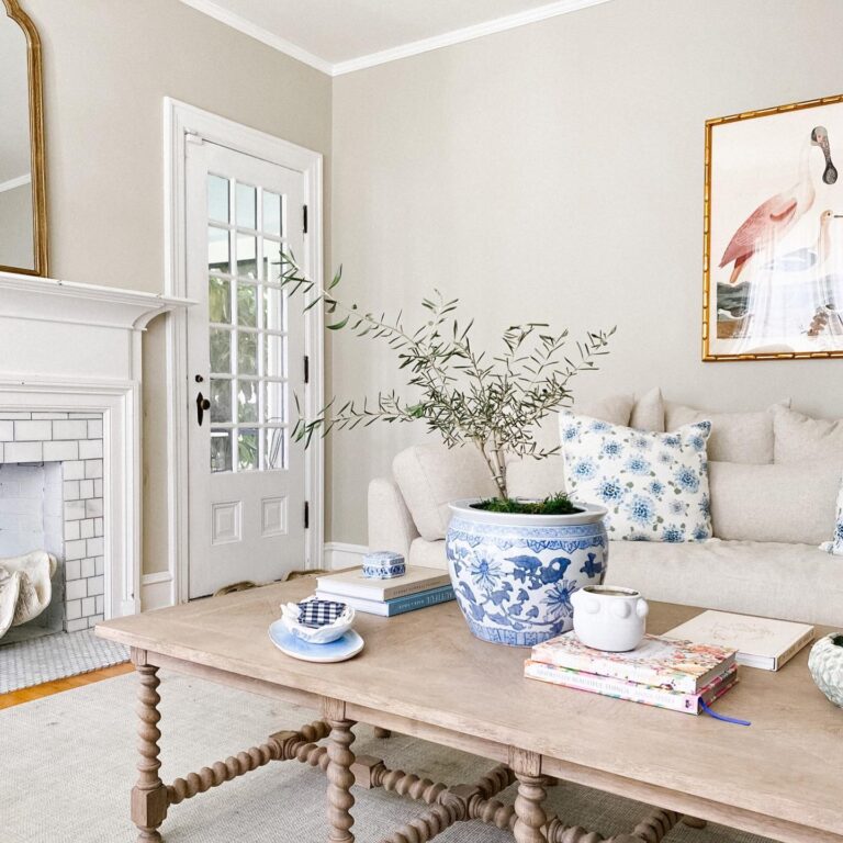
If you love a blue and white color palette, Agreeable Gray can be the perfect complimentary wall color. In this living room, I love how Agreeable Gray provides such a nice bridge between the brighter whites of the furniture and trim and the dark navy around the fireplace.
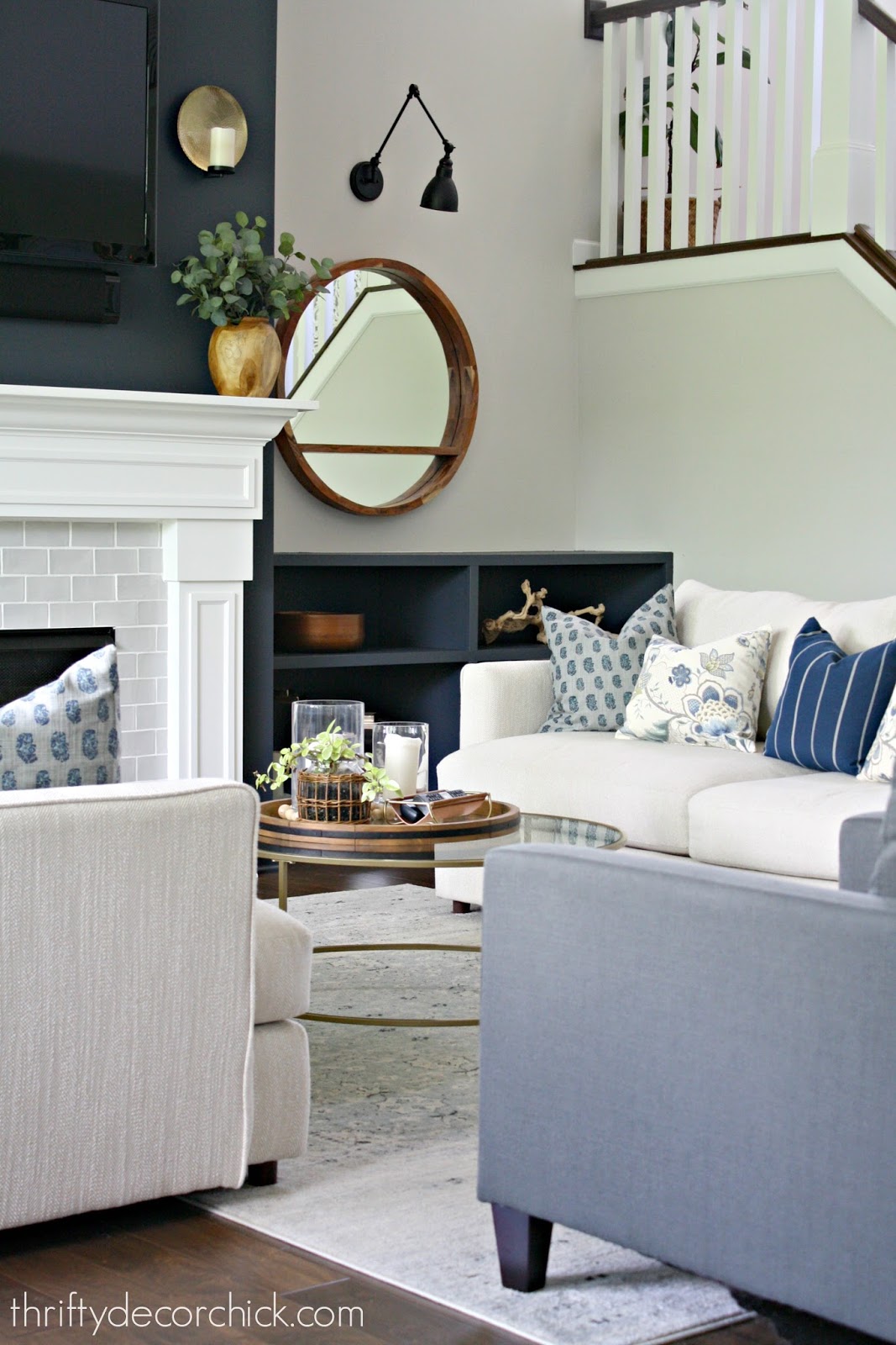
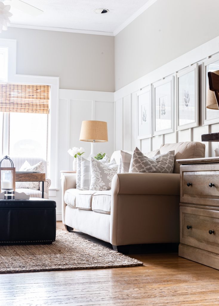
When you already have warm tones in your furniture, flooring, and rugs, then adding in a paint color with a slightly cooler tone can be a welcome relief. I love the addition of Agreeable Gray above the wainscoting in this next living room. It’s light enough to keep the room bright and airy, but dark enough to showcase that beautiful trim work.
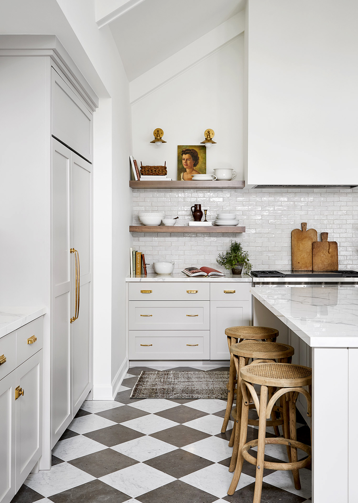
I mentioned earlier that I don’t see Agreeable Gray used a ton for kitchen cabinets. I think this is because people tend to choose colors that are lighter/whiter, or a bit darker, and Agreeable Gray lies somewhere in between. But, there are some lovely examples of Agreeable Gray used on kitchen and bath cabinets, and here is a great one from reDesign Home. I particularly love how well Agreeable Gray ties in with the warm gray tones in the backsplash.
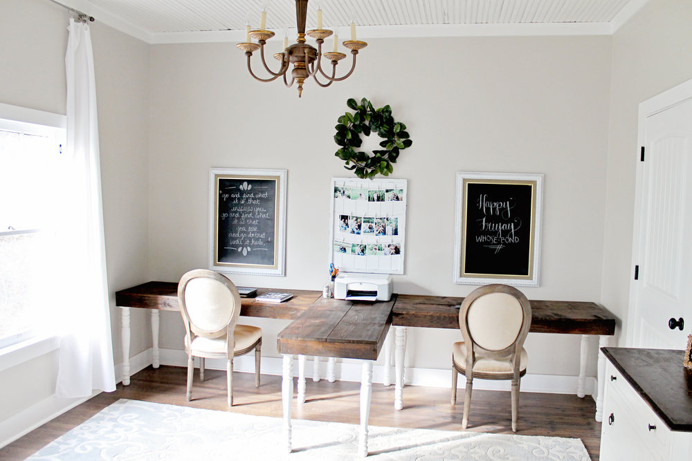
Here’s a nice office with Agreeable Gray on the walls, crisp white trim, and rustic wood accents. If you have family members sharing an office space, this would be a great paint color for a gender-neutral space!
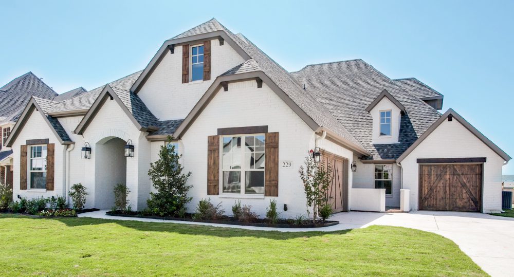
If you love the idea of painting your exterior a lighter color, but aren’t quite on board with a bright white, Agreeable Gray could be a great choice for you! On exteriors, it can almost pass as a soft off-white, but will never look too light or blinding. As you can see in this picture, it also looks great with wood shutters and doors, and gray trim.
Agreeable Gray Coordinating Colors
Since Agreeable Gray is a light greige, it is versatile enough to work with a wide range of colors, and I’ve seen it used in many different designer color palettes. The warmth in Agreeable Gray allows it to work with warmer wood tones and other paint colors with warm undertones, like browns and reds. Its neutral gray tones allow it to coordinate with other gray colors and cooler shades, like blues and greens. I like to think of Agreeable Gray as a fabulous “bridge” color between warm and cool colors, and I often turn to it when I need to create that perfect, light neutral backdrop in a room.
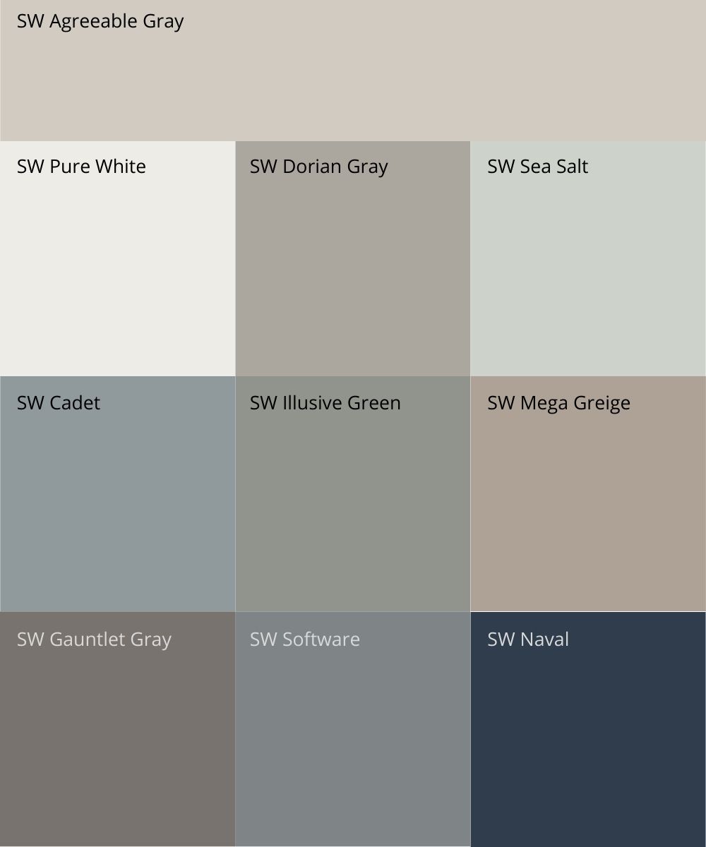
If you need a great white trim color to pair with Agreeable Gray, I recommend SW Extra White or SW Pure White. Both of these work great with the undertones of Agreeable Gray. I don’t love pairing SW Alabaster with Agreeable Gray because neither color ends up looking great next to the other, so avoid that one. Here are a few of my favorite Sherwin-Williams colors to pair with Agreeable Gray. Use these popular colors to create your own custom color scheme, with Agreeable Gray as a perfect greige anchor.
- Pure White (SW 7005)
- Dorian Gray (SW 7017)
- Sea Salt (SW 6204)
- Cadet (SW 9143)
- Illusive Green (SW 9164)
- Mega Greige (SW 7031)
- Gauntlet Gray (SW 7019)
- Software (SW 7074)
- Naval (SW 6244)
Similar Colors to Agreeable Gray
Does Agreeable Gray work for you? When it comes to neutral paint colors, you may find that some colors will work well in your lighting conditions, and some may not. If Agreeable Gray is close, but not quite right, you should try a few similar-but-different colors. One of the following greige shades may end up being the perfect paint color for your home, while still giving you the “agreeable gray look”.
- Benjamin Moore Collingwood (OC-28) – slightly lighter and grayer than Agreeable Gray
- Benjamin Moore Revere Pewter (HC-172) – a true classic in the interior design world! Revere Pewter is a touch darker, and leans slightly more green than Agreeable Gray
- Sherwin-Williams Accessible Beige (SW 7036) – leans more toward beige than Agreeable Gray. Great option if Agreeable Gray looks too gray.
- Sherwin-Williams Worldly Gray (SW 7043) – a hair darker and warmer than Agreeable Gray
- Sherwin-Williams Repose Gray (SW 7015) – grayer than Agreeable Gray. Good choice if Agreeable Gray looks too warm or beige to you.
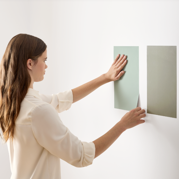
Hopefully now you can see why Sherwin Williams Agreeable Gray is one of the most popular light greige paint colors of all time! If you need a versatile, neutral wall color for your home, you should definitely give Agreeable Gray a try. Just be sure to thoroughly test all paint colors in your home before committing to one, so that you can be sure to end up with the right paint color for your space. My favorite way to test paint colors is to use Samplize peel-and-stick samples! They are inexpensive, and super easy to move around the room. Get your peel-and-stick paint samples of Agreeable Gray and complementary colors from Samplize HERE.
Want more paint color recommendations?
For more paint color ideas, check out my Favorite Paint Colors eBook! It’s filled with all of the best paint colors in every color family from Benjamin Moore and Sherwin Williams, plus my exclusive list of the best colors for primary bedrooms and kitchen cabinets. Never again will you have to waste time searching the internet for the best colors…just imagine the time (and stress) you will save yourself! Get your copy HERE.


Loving these colors! I have SW Snowbound trim. Will Agreeable Gray look ok in a room with north and south windows? I had SW Extra White trim before and it was soooo stark! I’m in love with Evergreen Fog, and Dorian gray too!
In a room with both north and south facing light, your paint could look slightly different in different areas of the room. It’s a good idea to go with a paint color that has some warmth to it. Agreeable Gray may have enough warmth to overcome your north-facing light, but always be sure to sample first. If it pulls too gray, give Accessible Beige a try.
A south facing room would make it look more gray? My living room windows are facing the south.
We like the SW agreeable grey and SW pure white.
Can you give us the names of those in the BM products, as our painter uses that brand.
Also, what color would you recommend to redo kitchen cabinets?
Thank you, Sherry
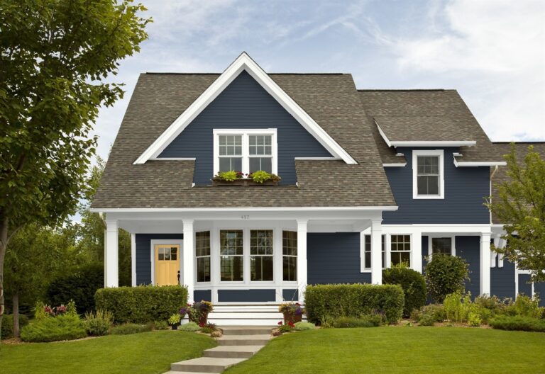
On the house above, I know Ageeable Gray is on the exterior walls, what is the color on the trim and the brown on the shutters and garage?
According to the builder/source, the trim is painted Shinto CLC 1275A by Kwal. It’s pretty close to SW Backdrop.
Hi,
This is my dilemma.., I live in the Caribbean surrounded by a lot of Trees , country side. I am renovating and I have painted the whole exterior with BM Chantilly Lace . I just wanted a white canvas since I was not sure how these surroundings affect the undertones ; and not sure the type of greige I should choose to have a subtle contrast with the Chantilly crisp white.
Now , I need to decide the color to paint my windows and doors along with a focal wall on the facade… I just want a minimal but yet noticeable contrast to provide dimension to my two stories mediterranean( spanish style home)
Furthermore, I have decided to add also a greige color on the spanish iron ornaments (for plants and flowers) below the windows.
1. Which color for Aluminum Windows and Doors: … a warmth white or light greige in contrast with crisp white from interiors and exteriors ?
2. Which greige to combine with Chantilly Lace on the exterior
A) one for the focal wall
B) one for the iron ornaments below the windows in the facade
Thank you 💕