Decorating a living room can sometimes feel overwhelming, especially when it comes to deciding how to use your color palette. Interior designers use a simple and easy guideline to achieve balanced and harmonious color schemes in a room, and I want to share it with you today. It’s called the 60-30-10 color rule. This classic design principle is easy to use, and will help you create a cohesive look in your living room.

What is the 60-30-10 Rule?
The 60-30-10 rule is a timeless decorating rule that dictates how to distribute colors in a room. Here’s the breakdown:
- 60%: Dominant color (primary color)
- 30%: Secondary color
- 10%: Accent color
These proportions will ensure your living pace has the right balance of colors, making it look visually appealing and cohesive.
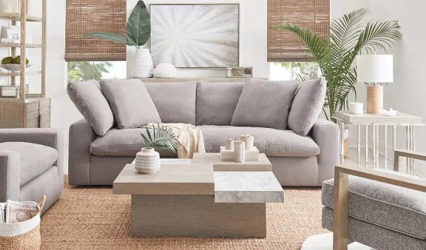
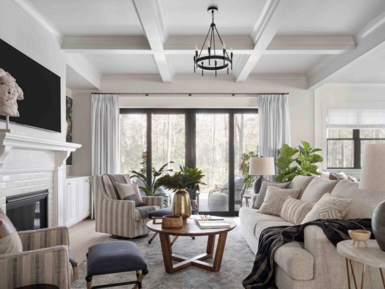
Here’s a great example of a room that uses the 60-30-10 color rule. The primary color is gray, showing up on the walls, sofa, and pillows. The secondary color is white, which you can see about half as much as the primary color, in the curtains, built-in bookcases, pillows, and art. The accent color is blue, as seen in the art, throw pillows, and decorative items. The result is a beautiful room that feels nicely balanced and well put together.

Applying the 60-30-10 Rule in your Living Room
Let’s explore how to use the 60-30-10 rule to decorate your living room.
60% Primary Color
The primary color should cover about 60% of the room, serving as the anchor of your design. When you enter the living room, it should be the most noticeable color in the room, but shouldn’t overwhelm the space. This dominant color sets the tone and vibe for the entire room. Common primary color applications in the living room include walls, large pieces of furniture (like a sofa), and area rugs. Neutral colors often work best for a primary color because they provide a versatile foundation for your room, allowing you to change up your accent colors without a complete overhaul.
Examples:
- Walls: Use a paint color in your dominant hue for your living room walls (e.g. white walls).
- Sofa: Choose a large sofa in your primary color. The sofa could also be a lighter or darker shade of your primary color, as long as it’s in the same color family.
- Area Rug: Select a large area rug that mostly includes your primary color
30% Secondary Color
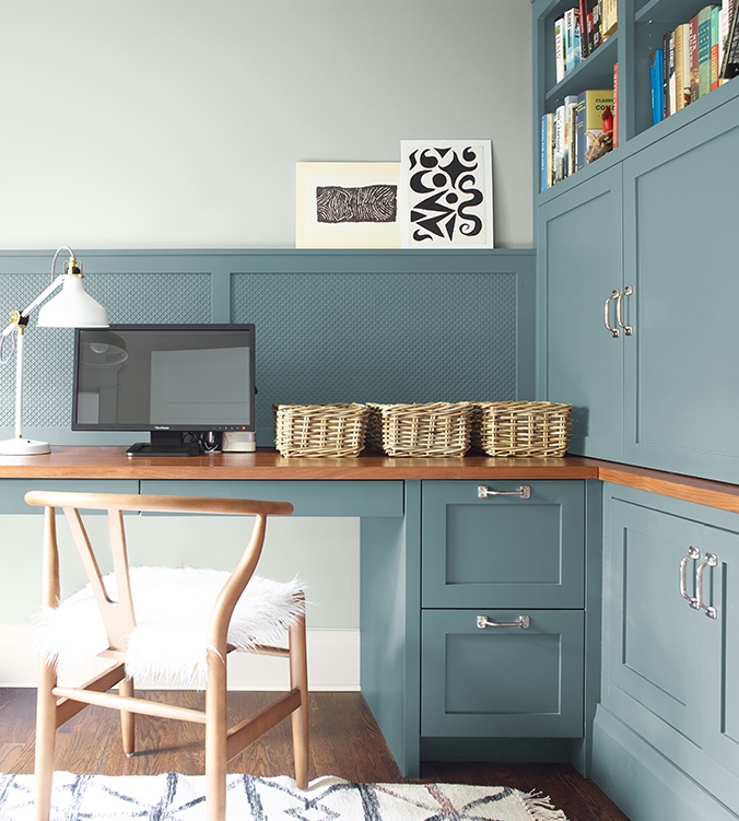
The secondary color should make up 30% of the room. This color supports the primary color while providing contrast and visual interest to the living room’s color scheme. Think about this color showing up half as much as your main color. This secondary color can be used for things like window treatments, accent chairs, and accent walls.
Examples:
- Window Treatments: Hang curtains or drapery panels in your secondary color to frame your windows
- Accent Furniture: Use this color for accent furniture pieces, like accent chairs or ottomans.
- Feature Wall: Use your secondary color to create an accent wall in the room
10% Accent Color
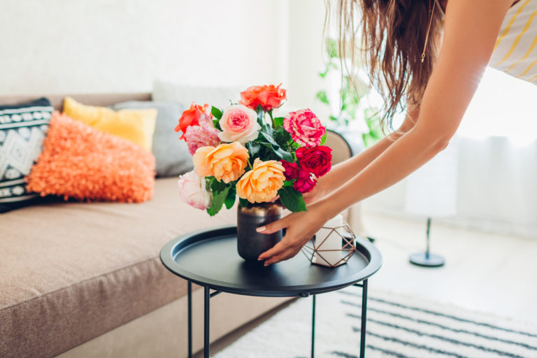
The accent color is where you can have fun and inject your personality into the room. It makes up 10% of the room and can be as bold or as subtle as you like. This third color adds character and can draw the eye to focal points throughout the living room. Accent colors can be incorporated through throw pillows, decorative accessories, and artwork.
Examples:
- Throw Pillows: Use 1-3 throw pillows in your accent color on the sofa.
- Decorative Accessories: Add vases, books, picture frames, or lamps in your accent shade.
- Artwork: Hang art that incorporates your accent color to tie the room together, and keep the eyes moving around the room.
Pro Tip for Using Accent Colors
For your accent color, experimenting with wall art and throw pillow covers is a great way to play with different colors without making a long-term commitment. You can also swap out these items easily for seasonal changes and holidays.
Examples of Using the 60-30-10 Rule in the Living Room
To see the 60-30-10 rule in action, let’s look at some examples!
Example 1: Neutral and Calm
- Primary Color (60%): Soft gray walls, a light gray sofa, and a gray area rug.
- Secondary Color (30%): White curtains, a white coffee table, and white side chairs.
- Accent Color (10%): Blue throw pillows, blue vases, and blue artwork.

Example 2: Bold and Vibrant
- Primary Color (60%): Rich navy walls, a navy rug, and a dark blue sofa.
- Secondary Color (30%): Mustard yellow curtains, pillows, and accent chair, and yellow-toned hardwood floors
- Accent Color (10%): Magenta throw pillows, and magenta in the artwork and area rug

Example 3: Earthy Modern
- Primary Color (60%): White walls, creamy area rug, white throw pillows and blankets
- Secondary Color (30%): Hardwood floors, leather sectional, wood coffee table
- Accent Color (10%): Dark teal accent chairs, plants, blue-green throw pillows and art

Choosing the Right Colors for your Living Room
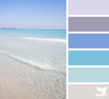
When it comes to picking your three colors, choosing a color scheme based on your favorite color or the color wheel is a great way to start. The color wheel is a great tool for choosing your living room’s color palette. It provides a visual representation of how different colors relate to each other, helping you choose combinations that work well together.
Here are three options to consider:
- Monochromatic: Use varying shades of a single color. This works well with both colors and neutrals (gray, brown, or white).
- Complementary: Choose two colors opposite each other on the color wheel. One will be warm and the other cool, creating a nicely balanced color palette. This is a great way to choose an accent color!
- Analogous: Select three colors next to each other on the color wheel, with the middle color being the dominant one.

Do Your Floors Count as One of the Colors?
Your floors CAN count as one of the colors in the 60-30-10 rule, but they don’t have to. Let’s dig deeper into this. Your flooring covers large areas of the room, so it’s only natural for the floor color to be included as part of the 60% dominant color. If you have carpet or tile, you should take the color into account for creating a nice color balance in the room, especially if the rest of your room complements this tone. However, if your floors are more neutral or subdued, you can essentially “ignore” them for the sake of the 60 30 10 rule.
For example, if you have light hardwood floors in a neutral tone, they probably won’t dominate the color scheme, but can still contribute to the room’s overall style and feel. In that case, you wouldn’t take your hardwood floors into account when determining color usage. On the other hand, if your floors are very dark or have a bold color tone, like cherry wood, you should take them into account for the 60-30-10 rule.
Are there alternatives to the 60-30-10 decorating rule?
Yes! Interior design rules are really more like guidelines, and you can break the rule if you’re feeling adventurous. Here are three alternate approaches to the 60-30-10 rule for using color:
- Use a Second Accent Color: Add a fourth color, creating a 60-30-5-5 scheme with two accent colors.
- Add More Shades of the Same Color: Use varying shades of one color to add dimension. You can do this with your primary color, or your secondary for a more sophisticated look.
- Choose Your Own Percentages: Use any combination that feels right to you, such as 40-30-20-10 or 75-15-10. Just ensure you maintain balance to avoid a chaotic look.
Final Thoughts
The 60-30-10 design rule is a simple way to distribute colors in a living room and ensure you end up with a nicely balanced color scheme. You can stick to the rule exactly or bend it to suit your preferences, but understanding the basics of color distribution will help you create a living room that looks more cohesive and feels balanced.
For more interior design tips on creating a luxurious looking living room without breaking the bank, check out my FREE guide, “10 Designer Secrets for a Luxury Home on a Budget.” This comprehensive guide will help you create a home you love at an affordable price point.