When choosing a gray paint color for your home, Sherwin Williams Repose Gray (SW 7015) stands out as a top choice. Known for its balanced undertones and versatility, Repose Gray works well in virtually any space, whether you’re updating your living room walls, adding a modern touch to your kitchen, or creating a relaxing retreat in your bedroom.
With so many gray shades available to choose from, it can be a challenge to find the perfect gray paint color for your home. In this post, I’ll cover everything you need to know about Sherwin-Williams Repose Gray—from its undertones to using it in different rooms in your home. I’ll also compare it with some of the most popular gray paint colors to help you make a good decision. Finally, I’ll offer up the best colors to pair with Repose Gray, so you can create a cohesive color scheme for your home.
Note: This post contains affiliate links for your convenient paint sample shopping.
What Makes Sherwin-Williams Repose Gray So Popular?
Repose Gray is a light-to-medium warm gray paint color. It’s a very popular color, due to it versatility and balanced undertones, and is well-loved by interior designers. SW Repose Gray adapts well to various lighting conditions and works with most decorating styles, making it a perfect paint color for walls, trim, and even cabinets.
With a Light Reflectance Value (LRV) of 58, Repose Gray sits in the sweet spot, reflecting enough light to keep your room from looking too dark, while still providing some contrast against white trim. Its subtle warmth ensures that it doesn’t feel too cold, even in spaces with lower natural light, making it a good choice for any room in your home.
The Undertones of Repose Gray
One of the reasons SW Repose Gray is so appealing is that is has nicely balanced undertones. With a soft gray base and subtle hints of beige, Repose Gray comes across looking light, neutral, and slightly warm. That little bit of warmth prevents this gray from feeling too cool or sterile. In certain lighting, you may even notice that Repose Gray leans slightly green, but it’s generally very subtle and won’t overpower the space. If you’re searching for a neutral backdrop that complements both cool and warm decor, Repose Gray is an easy choice.
How Repose Gray Compares to Other Popular Grays
Gray paint colors can vary widely, which is why it can be so dang hard to find the perfect gray color for your home. Let’s compare SW Repose Gray with some other popular grays, so you can determine if Repose Gray is the best fit for you.
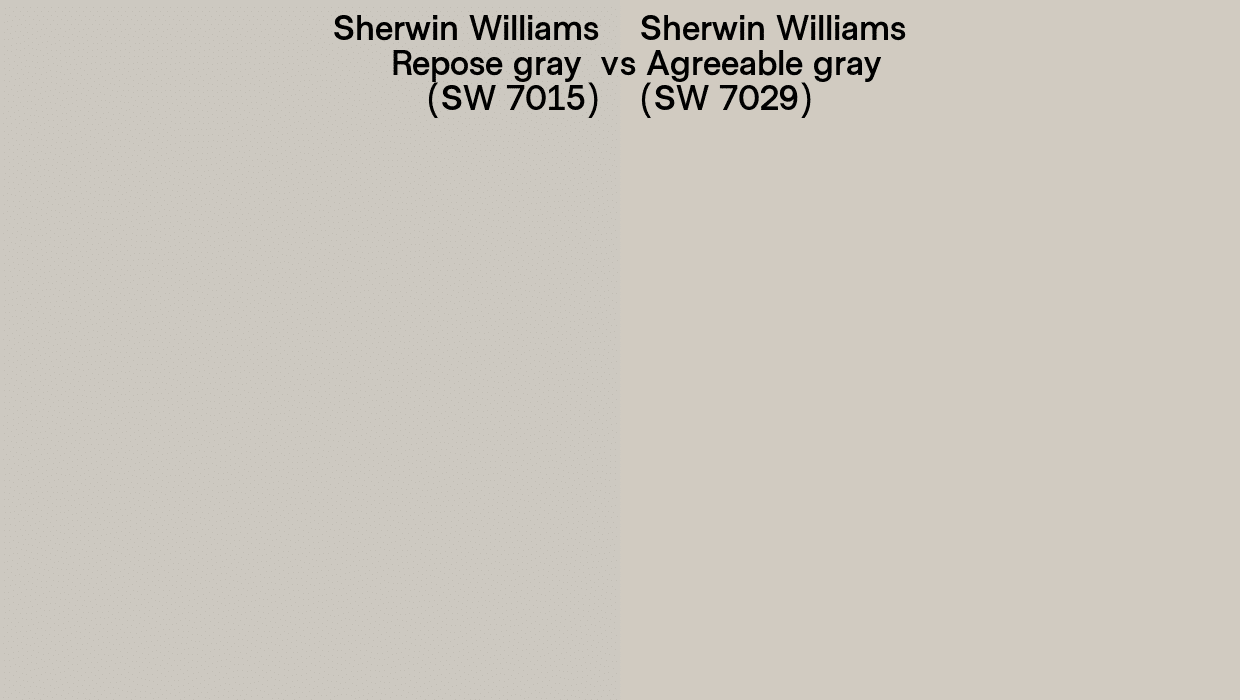
Sherwin Williams Agreeable Gray (SW 7029)
SW Agreeable Gray is slightly warmer than Repose Gray, with stronger beige undertones, making it feel more greige in appearance. If you want a warmer gray that leans more toward beige, Agreeable Gray is a solid option. However, if you’re looking for a true gray with just a hint of warmth, Repose Gray is the better choice.
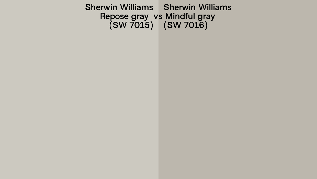
Sherwin Williams Mindful Gray (SW 7016)
Mindful Gray is one shade darker than Repose Gray, and has some trickier undertones. While it still has some warmth, it’s more likely to show violet undertones in certain lighting conditions. Mindful Gray is one that needs to be thoroughly tested before committing, but can be a great choice if you want to go a bit darker. For a lighter, more neutral gray, stick with Repose Gray.
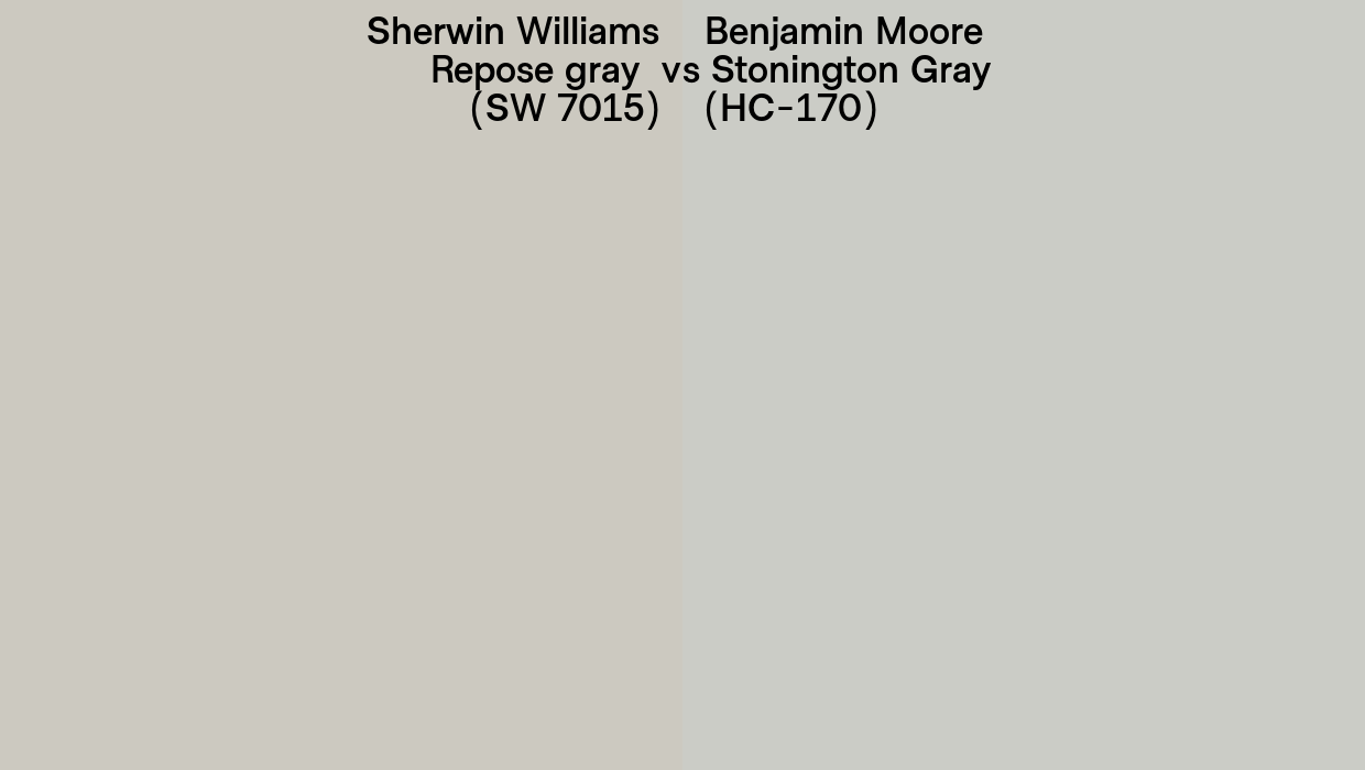
Benjamin Moore Stonington Gray (HC-170)
BM Stonington Gray is a light gray with a slight blue undertone, making it feel cooler and crisper than Repose Gray. In a north facing room, Stonington Gray’s blue undertones will be more pronounced, whereas Repose Gray’s warmer side will appear more neutral. If you’re looking for a warmer, more neutral gray, Repose Gray is a better fit.
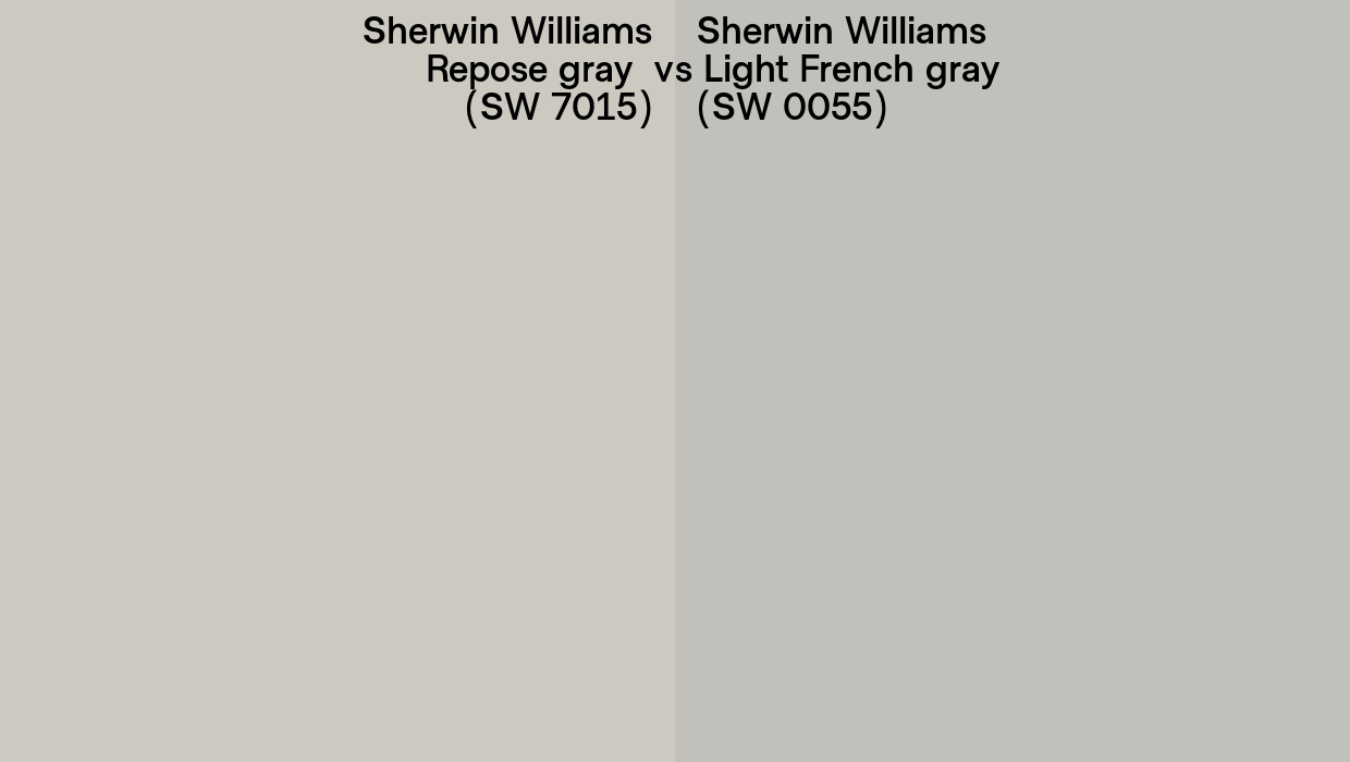
Sherwin Williams Light French Gray (SW 0055)
SW Light French Gray is a cooler gray with minimal undertones, making it feel more modern and crisp. It works well in spaces with a lot of natural light but can feel a bit cold in darker rooms. Repose Gray offers a more adaptable, warmer option for spaces that need a bit more light and warmth without sacrificing the neutral gray look.
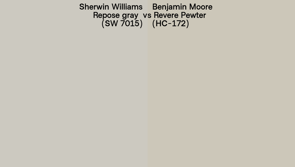
Benjamin Moore Revere Pewter (HC-172)
BM Revere Pewter is similar to Agreeable Gray, being a beautiful blend of beige and gray. Revere Pewter has a more noticeable green undertone, and is a tad darker than Repose Gray. It works well in spaces with a lot of natural light but can sometimes look a bit murky in darker rooms. Repose Gray is lighter and will appear more gray than Revere Pewter.
For more gray paint color ideas, check out my post on the 10 Best Benjamin Moore Grays.
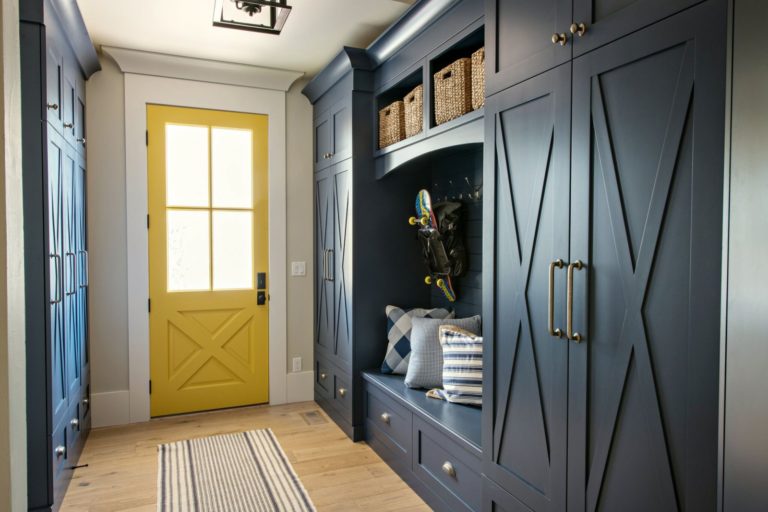
Where to Use Sherwin-Williams Repose Gray in Your Home
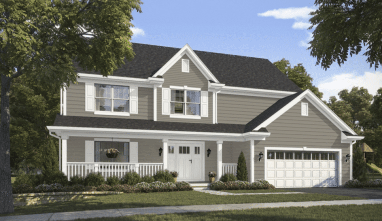
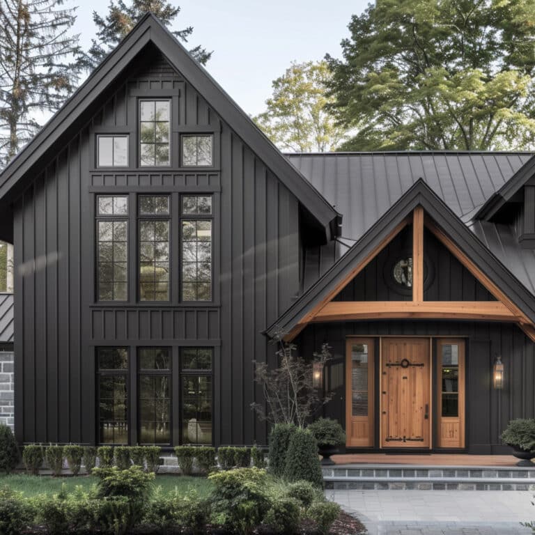
Thanks to its flexible nature, Repose Gray can be used in almost any room of the house, from the living room to bedrooms and kitchens. Here are some beautiful pictures of SW Repose Gray in action:
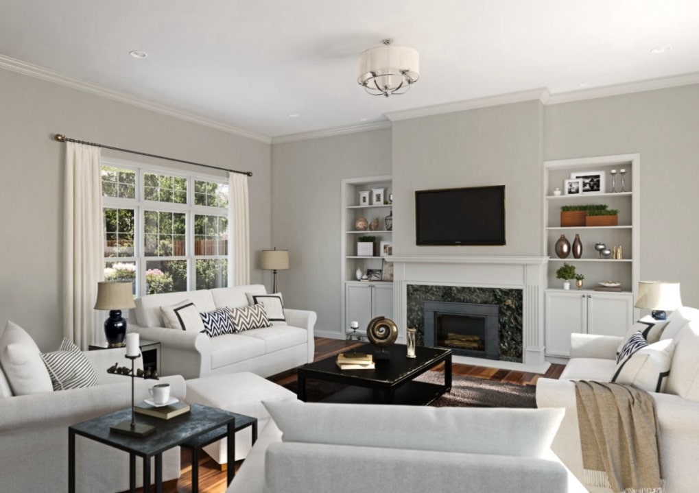
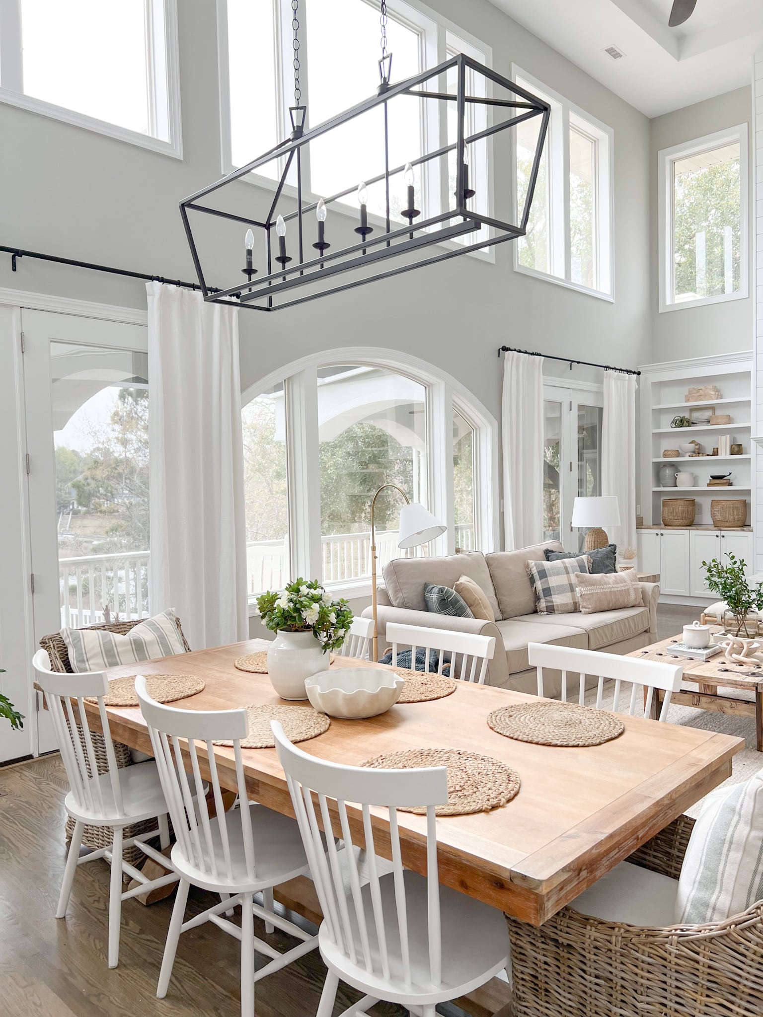
Repose Gray as a Whole-House Color
Repose Gray has become a very popular color to use throughout the entire house. It’s light, airy look and warm undertones make it the perfect shade for the main areas of your home (e.g.,great room, hallways, dining room, etc.). It’s one of my favorite colors to use as a whole-house color, because it typically looks soft and neutral in any lighting, even in north-facing rooms.
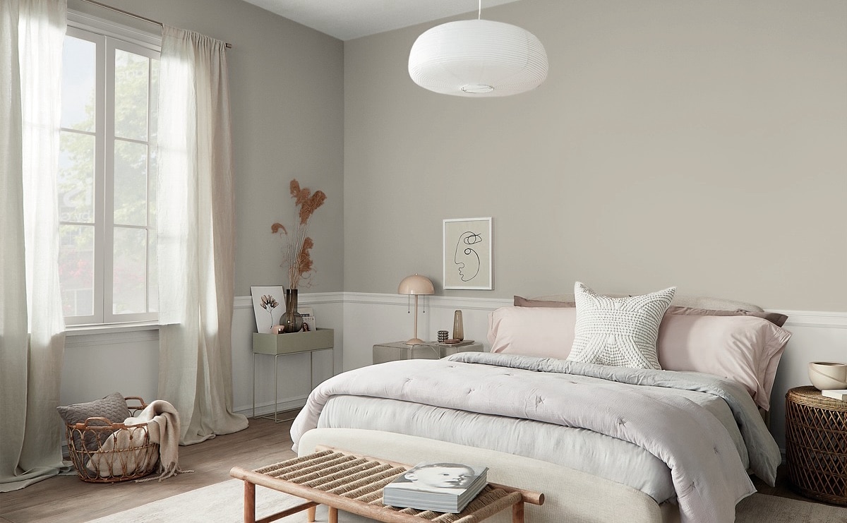
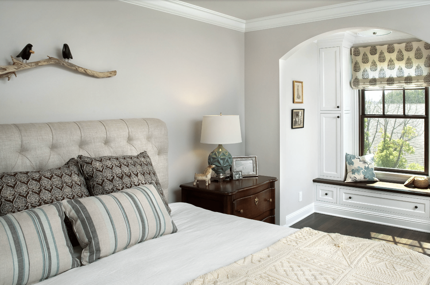
Repose Gray for Bedroom Walls
As a bedroom wall color, Repose Gray is an excellent neutral backdrop for a range of design styles. Light gray walls work well with most bedding options and furniture, and the warmth of Repose Gray will keep your room from feeling too cold.
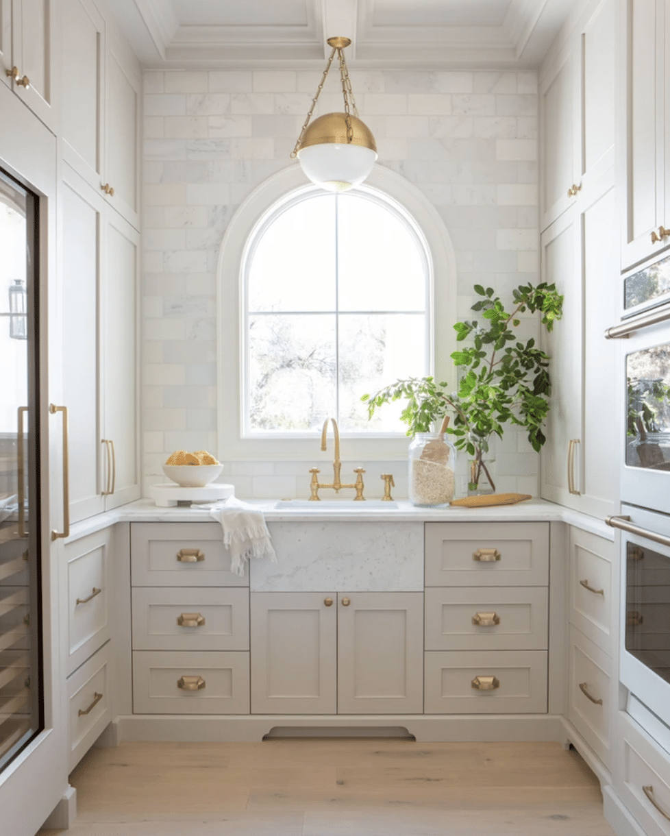
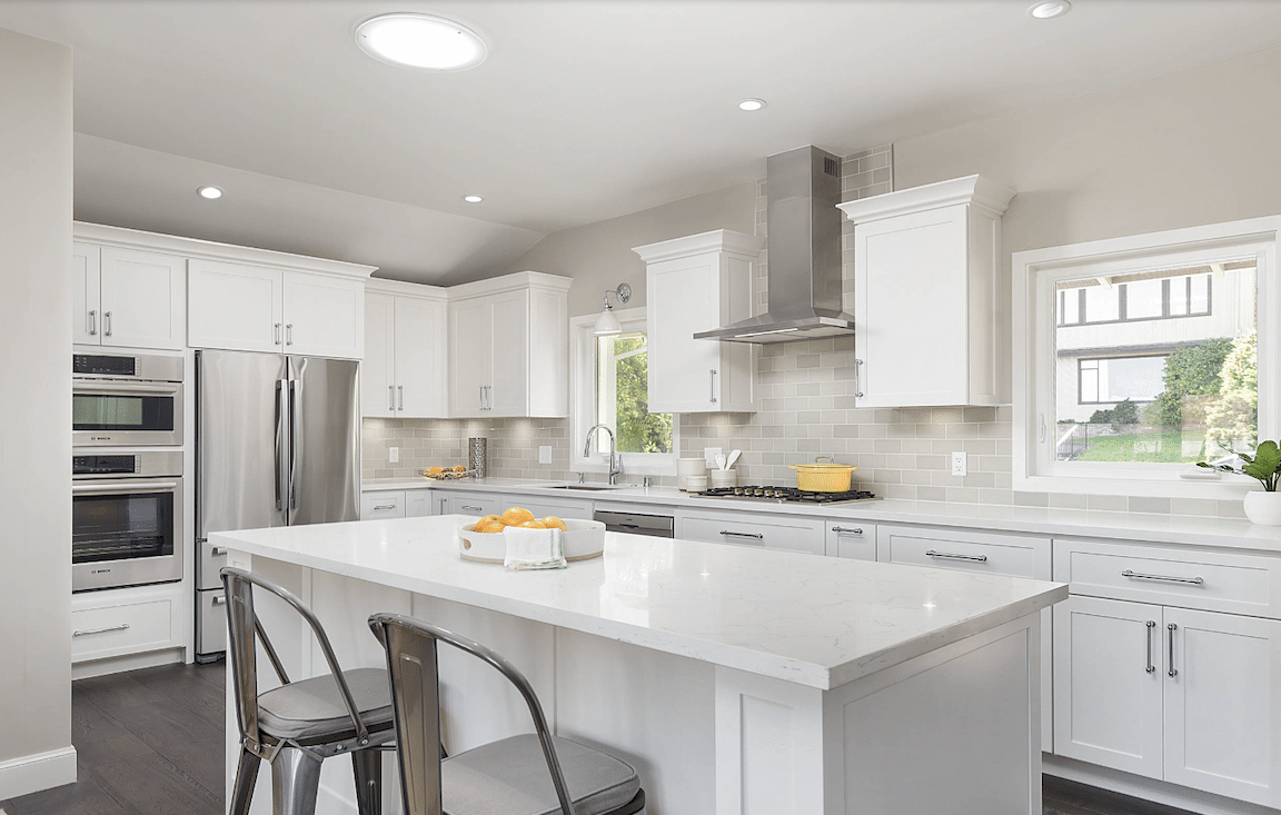
Repose Gray in the Kitchen
For a modern take on cabinetry, Repose Gray can be a stunning option for kitchen cabinets. Its neutral undertones pair well with many countertop options, from marble to granite, and it looks great with a range of hardware finishes, such as brushed nickel or antique brass.
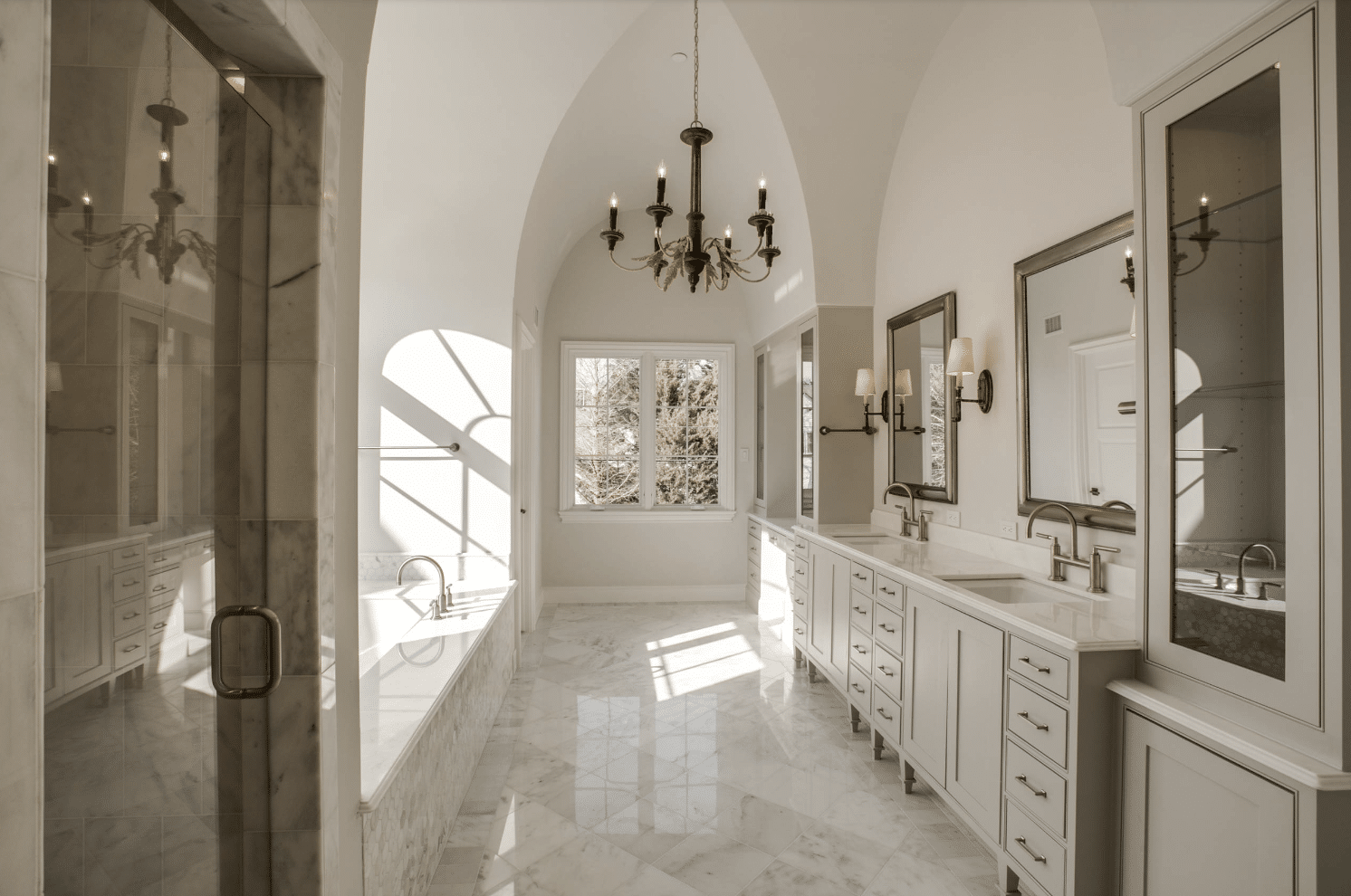
Repose Gray in Bathrooms
Repose Gray is ideal for creating a peaceful retreat in a bathroom. Paint it on the walls paired with crisp white trim, or use it on cabinets for a modern touch. Either way, the soft warmth of Repose Gray can create a calm, restful vibe. Another bonus? Repose Gray tends to work great with the colors found in natural stone tile and granite countertops.
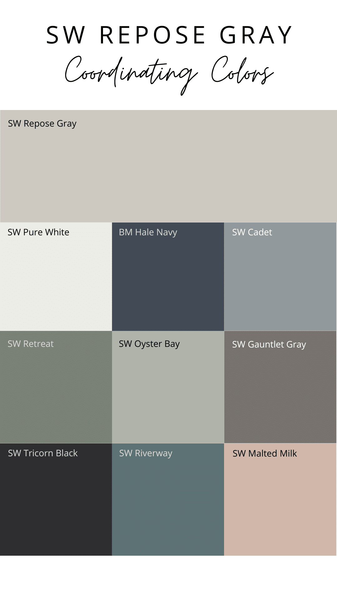
Recommended Paint Colors to Pair with Sherwin-Williams Repose Gray
Building a cohesive color palette around Repose Gray is easy, thanks to its neutral and flexible nature. Here are some complementary colors that look fantastic with Repose Gray in a color scheme. Click on the links below to order a peel-and-stick sample sheet, and see how they look in your home.
- Sherwin Williams Pure White (SW 7005) – clean white with a hint of warmth. Great for trim and ceilings.
- Benjamin Moore Hale Navy (HC-154) – deep navy blue, perfect for a dramatic accent wall
- Sherwin Williams Cadet (SW 9143) – beautiful medium blue-gray
- Sherwin Williams Retreat (SW 6207) – muted green with soft blue-gray undertones
- Sherwin Williams Oyster Bay (SW 6204) – a medium gray-green, with a hint of blue, Great for creating a relaxed, coastal look
- Sherwin Williams Gauntlet Gray (SW 7019) – a dark neutral color with warm greige undertones
- Sherwin Williams Tricorn Black (SW 6258) – deep, pure black for a bold contrast
- Sherwin Williams Riverway (SW 6222) – a dark blue-green that can change color throughout the day
- Sherwin Williams Malted Milk (SW 6057) – dusty pink with muted orange tones
Is Repose Gray the right color for your home?
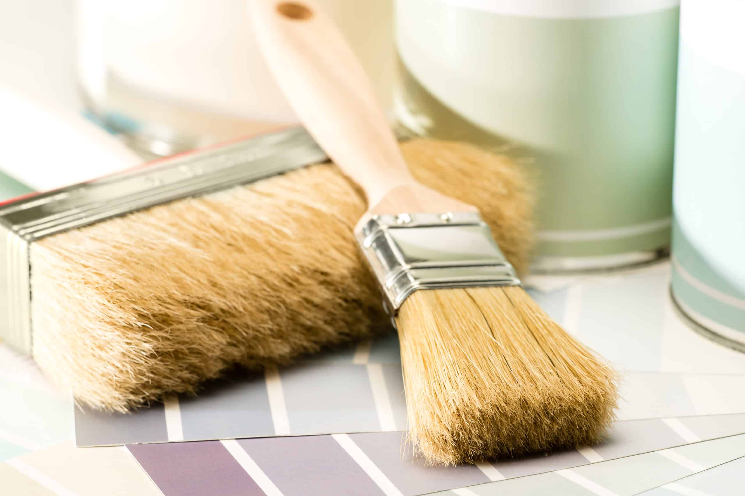
The only way to know if Repose Gray is the right gray paint color for your home is to get a sample of it, and test it in your space. My go-to source for paint samples is Samplize. They offer affordable, large, peel-and-stick paint samples of all of the colors mentioned in this post. Order samples of all of your favorite colors and place them on your walls to see how they look. The color that looks best throughout the day, and works well with your fixed materials (e.g., tile, flooring, furniture) is the right color for your home.
Final Thoughts
Sherwin-Williams Repose Gray (SW 7015) is a versatile, neutral gray that can work in almost any space. Its balanced undertones and moderate LRV make it adaptable to a variety of lighting conditions, while its warmth ensures that it never feels too cold or sterile. Whether you’re painting an entire room, updating your cabinetry, or looking for the perfect trim color, Repose Gray offers a stylish and timeless choice for any home.