Farrow & Ball paint is a favorite amongst interior designers and homeowners due to its highly pigmented, superior quality paint, and its beautiful, luxurious colors. However, it’s a bit expensive – almost twice as mush as other brands. If your budget is tight, you may not want to use it for every room in your home, but it’s well worth the splurge for a single room, cabinetry, accent wall, and smaller projects that call for a high-end finish and deep, rich color. Here are my picks for the best Farrow and Ball paint colors

Railings
Farrow & Ball’s Railings is a soft black that leans strongly blue. It’s a great alternative to black and has a dark, mysterious quality to it. My favorite place to use Railings is on an accent walls or cabinetry, to create eye-catching contrast with a lighter trim or wall color. Buy a peel-and-stick sample sheet of Railings HERE.
If you like the idea of a dark, moody room, Railings is a sophisticated option to keep in mind. It gives a subtle hint of color for a unique look, and its blue undertones work great with leather, brass or copper accents.

The next two images show how beautiful Railings can be on cabinetry. It’s a great choice for a kitchen island, creating a strong contrast when paired with white cabinets. In rooms with a lot of natural light, you’ll really see the blue tones come to life, whereas in darker rooms, Railings will look more like a black.


Elephant’s Breath
Elephant’s Breath is a popular, warm, medium gray with a contemporary feel to it. With its subtle warm undertones of pink/magenta, Elephant’s Breath is one of those subtle neutrals that really needs to be sampled to make sure it works well in your lighting conditions. Buy a peel-and-stick sample sheet of Elephant’s Breath HERE.
Elephant’s Breath looks great next to soft white trim, and is lovely when paired with earthy colors, like browns and greens. In west-facing rooms, you’ll see more of the pinky undertones, while in a north- or east-facing room it will look a bit more neutral.

In this beautiful living room, you can see a hint of the pink undertones shining through, but that works really well as an opposite color to the teal sofa and ottoman.

Hague Blue
Farrow & Ball’s Hague Blue is a gorgeous, deep, dark blue with green undertones that gives it more of a teal look. It’s a fantastic accent color that looks beautiful with soft whites and grays. I love this color for front doors, and I even painted a sideboard in my dining room Hague Blue for a dramatic look. Buy a peel-and-stick sample sheet of Hague Blue HERE.

Hague Blue looks great with jewel tones, reds, gold/brass accents, and leather. It’s also gorgeous on cabinetry and built-ins, like in this stunning living room.

Hague Blue is also the perfect bridge color between bold blues and greens. In the next living room picture, check out how nicely Hague Blue ties together the bright green sofa with the blue ottoman. Brass and brown tones provide a beautiful complementary, or opposite, color for the room.

Skimming Stone
Farrow & Ball Skimming Stone is an off-white with light gray undertones to it. Skimming Stone is soothing and versatile enough to be used in any room of your home. It’s dark enough to show contrast against white trim, yet light enough to keep your walls looking bright and neutral. Buy a peel-and-stick sample sheet of Skimming Stone HERE.

Depending on the lighting in your room, Skimming Stone will look more gray (like in the picture above) or more like a greige (like in the picture below). Be sure to sample it in your space to ensure you get the overall look you want.

Sulking Room Pink
When it comes to pinks, Sulking Room Pink is a rare gem. It has a muted, dusty look to it, so it’s not overly pink. Designers love this pink for its romantic, warm, rosy appearance, and the fact that it looks amazing next to a variety of colors (especially greens). If you’re looking for an elegant, luxurious pink for your bedroom, be sure to give this one a try. Buy a peel-and-stick sample sheet of Sulking Room Pink HERE.

Take a look at how amazing Sulking Room Pink looks with the black and green accents in these next two pictures…simply gorgeous!


Stiffkey Blue
If you’re looking for an inky, navy blue, Farrow & Ball’s Stiffkey Blue is a good one to try. In rooms with a lot of natural light, Stiffkey Blue will appear much brighter and bluer, so if you’re after a dark navy, this may not be the one for you. However, the coloring of Stiffkey Blue is beautiful and timeless, and will look fantastic as a dramatic wall color with white trim, as an accent wall, or in a kids room. Buy a peel-and-stick sample sheet of Stiffkey Blue HERE.
In this living room picture, you can see how bright and blue Stiffkey Blue can appear. Whenever you use a dark wall color, you can keep things light and airy by counteracting the rich dark hues with light furnishings and mirrors.

I love Stiffkey Blue for a child’s bedroom or play space. It’s not overly dark, so it looks bold, yet youthful. In these spaces, you can pair Stiffkey Blue with a light gray or pale blue on other walls, and red or orange as a fun accent color.

Opposite blue on the color wheel is orange, and you can see just how striking this combination is when used in a living room with Stiffkey Blue on the walls and a caramel/toffee colored leather sofa.

Card Room Green
Farrow & Ball Card Room Green is a beautiful dark, gray-green. When paired with creamy whites or other warm neutrals, Card Room Green really shines. Not only is this lovely green a great option for walls, but it looks fantastic on kitchen and bath cabinets, as well. Buy a peel-and-stick sample sheet of Card Room Green HERE.
Card Room Green really comes to life against the soft white furnishings in this beautiful bedroom. It’s a timeless shade, but also looks contemporary because gray-greens are so popular today. If you’re looking for something slightly darker than Card Room Green, take a look at Farrow & Ball Green Smoke.

Card Room Green really makes this staircase a statement piece, and adds major wow factor to this entry as a trim color.

Here’s another beautiful entry space that looks bright and fresh with creamy white trim and Card Room Green on the walls.

Inchyra blue
Looking for a dramatic, dark blue gray that will inject some color and personality into your room? Farrow & Ball’s Inchyra Blue may be just the answer. Inchyra Blue is a bit of a chameleon color. Depending on the lighting, it can read more blue, more charcoal gray, or even green. This color was inspired by the Inchyra House exterior barn doors, and it is a gorgeous option for your front door. Indoors, it can be used to create a dark, intimate, moody vibe. Buy a peel-and-stick sample sheet of Inchyra Blue HERE.


Inchyra Blue makes a beautiful statement on exterior doors, and is a perfect paint complement to red brick.

Ammonite
Farrow & Ball’s Ammonite is an understated, light grey. It’s very neutral, in that it doesn’t lean too warm or cool, but rather sits in the middle. Ammonite is bright enough to read like a white, but you’ll still be able to see a subtle contrast against white trim. Ammonite is flexible, with a serene, calming quality to it, and works equally well in bedrooms and main areas of your home. Buy a peel-and-stick sample sheet of Ammonite HERE.
Look how beautiful Ammonite looks in this living room, with Farrow & Ball Railings on the fireplace surround!

In this pretty bedroom, you can see how light Ammonite is on the walls, yet it still stands apart when you see it next to the bright white sheets and white accessories on the nightstand. If you like the look of Ammonite, but want to go one shade darker, Cornforth White is a great choice.


French Gray
Farrow & Ball French Gray is a relaxing gray-green that leans much more green than gray, but can shift between the two depending on the lighting conditions and time of day. French Gray is a popular hue in the F&B line of paint colours because of its soft, soothing, timeless quality. Use French Gray on any of your walls, cabinets, and built-ins, and also keep it in mind as an exterior accent color (shutters and/or front door). Buy a peel-and-stick sample sheet of French Gray HERE.

In both of these pictures, I love the way French Gray offers a seamless transition between white and black. It’s also beautiful when paired with browns and wood tones.

Down Pipe
Down Pipe is a dark lead gray with an assertive blue undertone, for a look that is both unique and dramatic. It’s beautiful on your walls, and a favorite for kitchen cabinets, due to the complexity of its charcoal-blue coloring. Down Pipe pairs wonderfully with the cool tones of marble, brass hardware or fixtures, wood tones, and whites. Buy a peel-and-stick sample sheet of Down Pipe HERE.

In the living room picture below, you can really see the blue undertones when you look at the gray sofa next to Down Pipe on the walls. Down Pipe also creates a fabulous backdrop for art, creating a dark contrast that can help highlight your favorite masterpiece.

Pigeon
Farrow & Ball Pigeon is a medium blue-gray that is soft and cozy. It’s a great alternative to pure gray, offering a slightly more traditional look, and is incredibly popular for kitchen islands and other cabinetry. Pigeon is a good option for darker rooms, offering a strong blue-gray color without overwhelming the space. In well-lit rooms, it will look lighter and bluer for a more delicate look. Buy a peel-and-stick sample sheet of Pigeon HERE.
In the light and bright room below, you can see how Pigeon looks soft and blue on the paneling and fireplace mantel.

Here in this beautiful entry, where there isn’t as much natural light, Pigeon appears darker and more dramatic.

Farrow & Ball’s Pigeon can also look more gray, or more like a gray-green in certain lighting. Be sure to sample your colors thoroughly before committing to one, so you can see how it will look in your room’s unique lighting conditions.

🎨 Free Resource for You!
Struggling to choose the perfect paint color? Grab my free guide: 5 Steps to Choosing the Perfect Paint Color and learn the exact process I use as a designer to select colors that actually work in real homes.
No more guessing. No more swatch overload. Just confidence!
👉 Click here to download it now
There’s no doubt Farrow & Ball colors are stunningly beautiful, with unique depth of color, and a luxurious finish to them. Their superior quality paints contain high levels of pigment, which ensures a stellar result with deep, rich color. With their mix of contemporary neutrals and dark inky hues, it’s no wonder Farrow & Ball is so beloved in the world of design.
Be sure to keep these popular Farrow and Ball paint colors in mind for your next painting project to create a sophisticated statement on your walls or cabinets. And, since different colors can be chameleons in different lighting, I strongly recommend sampling each color before committing. It’s the best way to ensure you get the look you want in your space.
Looking for a beautiful Farrow & Ball trim color?
The most popular Farrow & Ball white paint color for trim is Wimborne White. It’s slightly softer than a pure white, with the smallest amount of warm yellow pigment to create a versatile color that works with almost any other shade. Buy a peel-and-stick sample sheet of Wimborne White HERE.
What’s the best paint finish to use for my home?
Farrow & Ball paint offers eco-friendly paints with a range of paint finishes from Dead Flat to Full Gloss. You can see examples of their interior paint finishes if you pick up a free F&B color card from your local paint retailer. Dead Flat is an ultra-matte, durable finish, but if you want something slightly more washable (e.g., you have kids or pets), go with their Modern Emulsion.
The Modern Emulsion finish is more of an eggshell finish, and can be used in moisture-prone rooms, like bathrooms and kitchens. They also offer a Modern Eggshell finish that has a bit more shine to it than their Modern Emulsion finish. It is referred to as a “satin” finish, which I know is confusing because it has “eggshell” in the name, but this shinier sheen can work really well for your doors and trim, and is super durable.
Can you use Farrow & Ball paints for exteriors?
Yes! Farrow & Ball offers a range of finishes for your exterior walls, as well. Their Exterior Eggshell is the perfect finish for exterior wood and metal, and has a beautiful satin finish that is appropriate for all exterior surfaces. If you want a shiny front door, you can use their exterior Full Gloss sheen.
I do want to caution you that Farrow & Ball paint is more expensive than other brands. So, if your budget is tight, consider using your favorite Farrow & Ball color only on exterior doors and/or shutters, and use a different paint brand on the larger body of the house.
Want more paint color recommendations?
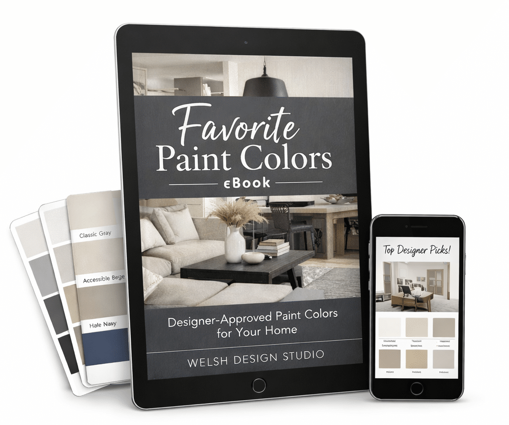
If you’re overwhelmed by endless paint swatches, I’ve already done the narrowing for you. My Favorite Paint Colors eBook includes my go-to designer picks in every color family — complete with specific names and codes from Sherwin-Williams and Benjamin Moore.
Instead of sorting through hundreds of options, you can start with colors that are tried, tested, and consistently beautiful in real homes.
👉 See what’s inside the eBook here.
Explore the Paint Hub Page
If you’re researching paint colors, undertones, or whole-home palettes, I’ve organized all of my best paint resources in one place.
From white paint guides to exterior color combinations, you can find everything inside my Paint Hub page.