Every year in the Fall, paint color manufacturers start announcing their ‘paint colors of the year’ for the year ahead. These colors are chosen by color experts and designers to represent interior color trends, and can give us a good idea of the wall colors that might be popular in the years to come. Let’s take a look at the manufacturer’s chosen paint colors for 2023 and then I’ll share my predictions for paint color trends for the new year.
Benjamin Moore’s Color of the Year for 2023
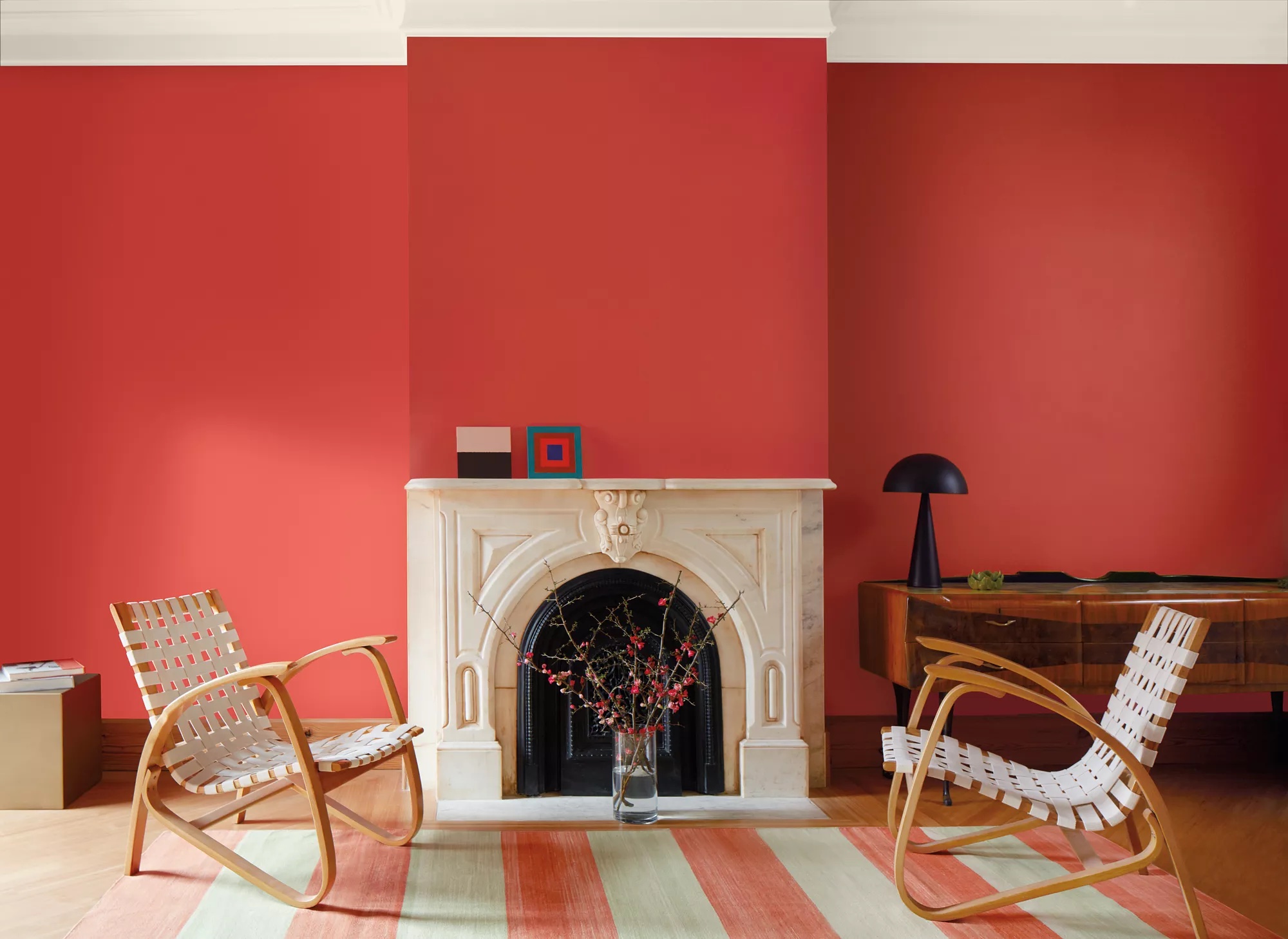
Back in October, Benjamin Moore announced their paint color of the year for 2023, and it’s…bright! Not everyone is gonna love this one, so let’s talk about Benjamin Moore’s color of the year for 2023 – Raspberry Blush.
Raspberry Blush is a very saturated red-orange. This color is pretty much the opposite of the previous year’s trend of calming, restorative green and blue colors. Raspberry Blush is lively, and is meant to convey a positive, stimulating vibe for 2023. Benjamin Moore believes that we’re ready to bring color back into our homes, and move outside of our color comfort zones.
How should you use Raspberry Blush?
Raspberry Blush is a very vibrant color, and isn’t necessarily going to work well for traditional design styles. But, it could be a great choice for bohemian, southwestern, or eclectic styles. Raspberry Blush can add bold color as an accent wall for your dining room, or as an allover color in your powder room. You can also try Raspberry Blush in smaller doses by painting a side table or chair.
What colors go with Raspberry Blush?
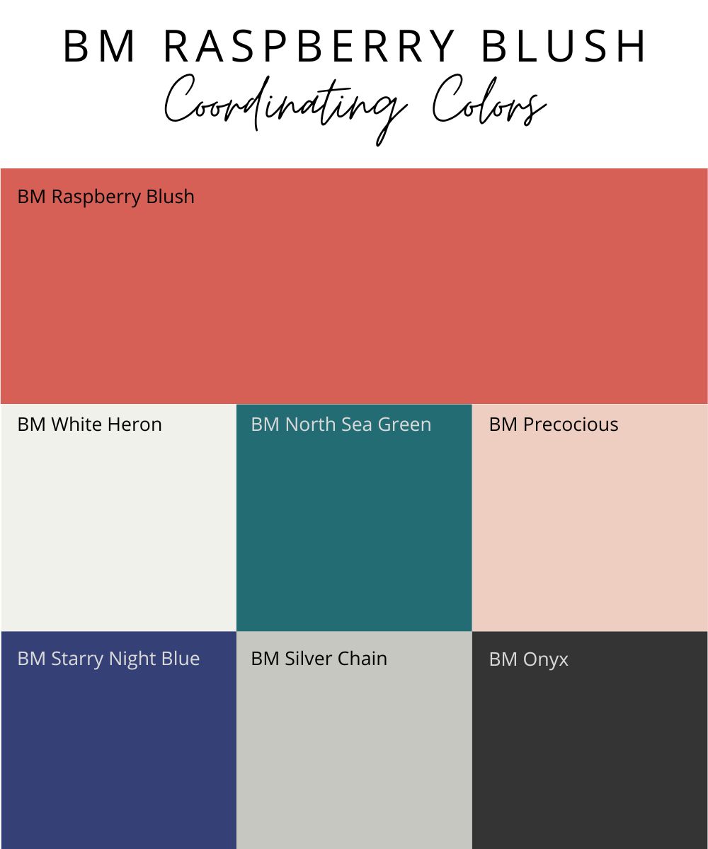
Raspberry Blush makes a statement all on its own, so it’s best to combine it with simple neutral colors, like black and white. However, if bold color is what you’re after, Raspberry Blush will look fantastic with a bright teal, bold blue, or light blush.
Here’s a graphic image (below) with my favorite Benjamin Moore coordinating paint colors to go with Raspberry Blush.
Coordinating colors with Raspberry Blush:
- BM White Heron – soft white
- BM North Sea Green – vibrant teal
- BM Precocious – blush
- BM Starry Night Blue – bold blue
- BM Silver Chain – light, neutral gray
- BM Onyx – soft black
If you’re ready to embrace this bold color in your home, grab a sample of Raspberry Blush and any other paint colors you’re considering from Samplize. I LOVE their peel-and-stick vinyl sample sheets because they are large, super easy to use, and inexpensive.
My Take on Raspberry Blush
I think Benjamin Moore is correct that we’ll see more color come into our homes in 2023, but I think they’re off the mark with their color choice. Instead, I see color being introduced in darker, richer shades, and more muted earth tones.
What do you think of BM Raspberry Blush? I’ll be honest, I won’t be putting it on my walls anytime soon, because it doesn’t work with my design style, but what about you? Leave me a comment and let me know.
Sherwin Williams Paint Color of the Year for 2023
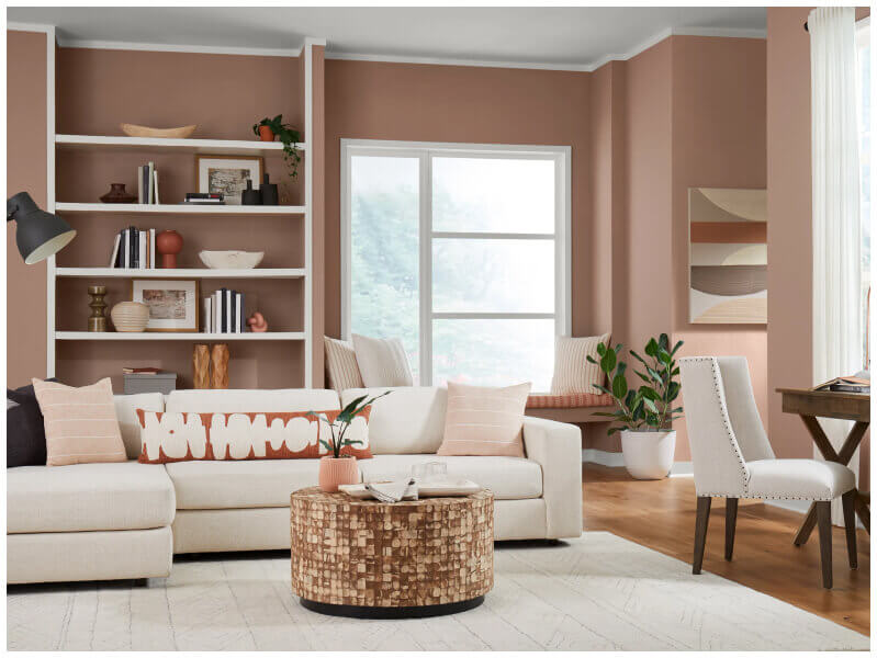
Sherwin-Williams 2023 color of the year is Redend Point, and it’s a lot more subtle than Benjamin Moore’s pick. Grab a sample of Redend Point HERE.
Redend Point is a warm, pinky-beige neutral. This color continues the trend we’ve been seeing over the past several years toward warm, earthy colors. But, it sits on the opposite end of the color wheel from the restorative blues and gray-greens we saw in 2022.
How should you use Redend Point?
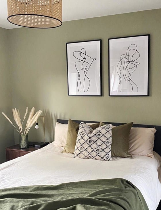
Redend Point is a great choice for bedrooms because of its calming nature. It will look fantastic paired with natural textiles, wood accents, plants, and clay or terracotta materials. It’s also a great color choice for any room with a desert-like southwestern style.
What colors go with Redend Point?
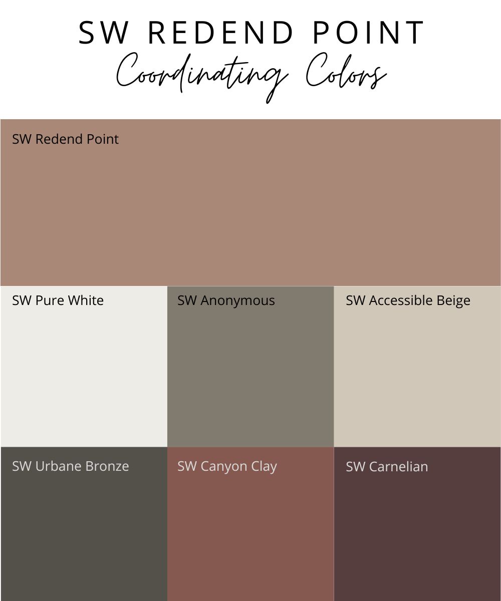
Redend Point looks gorgeous next to gray-greens, crisp whites, and other warm neutrals, like beiges and greiges. For a monochromatic look, you can pair it with other shades in the same color family, from a light blush all the way to a dark burgundy.
I’ve put together a little graphic image (below) with my favorite Sherwin-Williams coordinating paint colors to go with Redend Point.
Here are my top picks for colors that coordinate well with Redend Point:
- SW Pure White – soft white
- SW Anonymous – medium-dark gray
- SW Accessible Beige – light, warm greige
- SW Urbane Bronze – dark, warm charcoal
- SW Canyon Clay – rich terracotta
- SW Carnelian – deep red with a touch of purple
My Take on Redend Point
I think Redend Point is a great color choice for 2023, and I think we will see variations of beiges like this emerge in room designs in 2023 (especially in bedrooms and office spaces). It will be a beautiful complement to the gray-greens that were so popular in 2022.
Your turn…would you use SW Redend Point in your home? Tell me what you think in the comments.
Behr’s 2023 Color of the Year
Behr’s pick for their color of the year is Blank Canvas.
Blank Canvas is a warm, off-white that can serve as a neutral backdrop for any room in your home, and works with practically any color palette. It’s not a statement color, but rather a subtle, cozy, soothing shade.
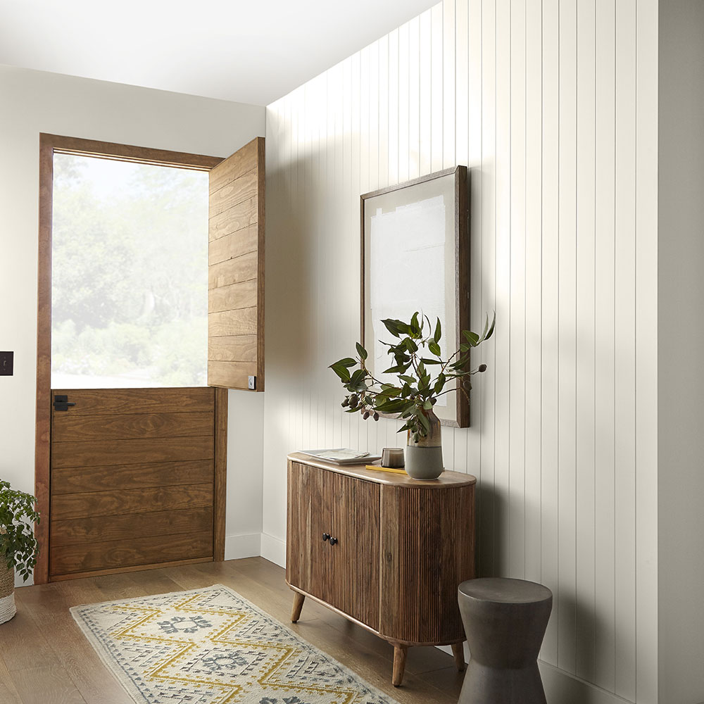
How should you use Blank Canvas?
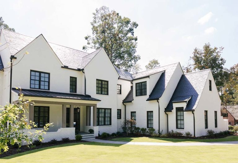
Blank Canvas is a great option for a whole-house color, bedrooms, or an office…anywhere you want to have a clean, soft, relaxed look. It’s a flexible paint color that can work with any design style and a wide range of colors. You could also use Blank Canvas as a subtle contrast color on trim and cabinetry/built-ins with a brighter white on the walls. It’s also an excellent pick for an exterior white, due to the fact that it’s warm and not overly bright.
What colors go with Blank Canvas?
Blank Canvas is a subtle neutral color that will work with almost any other paint color. Because it’s a warm white, it will look great with other warm hues, like beiges, reds, and browns. Blank Canvas is also beautiful when paired with darker blues, blacks, grays, and greens.
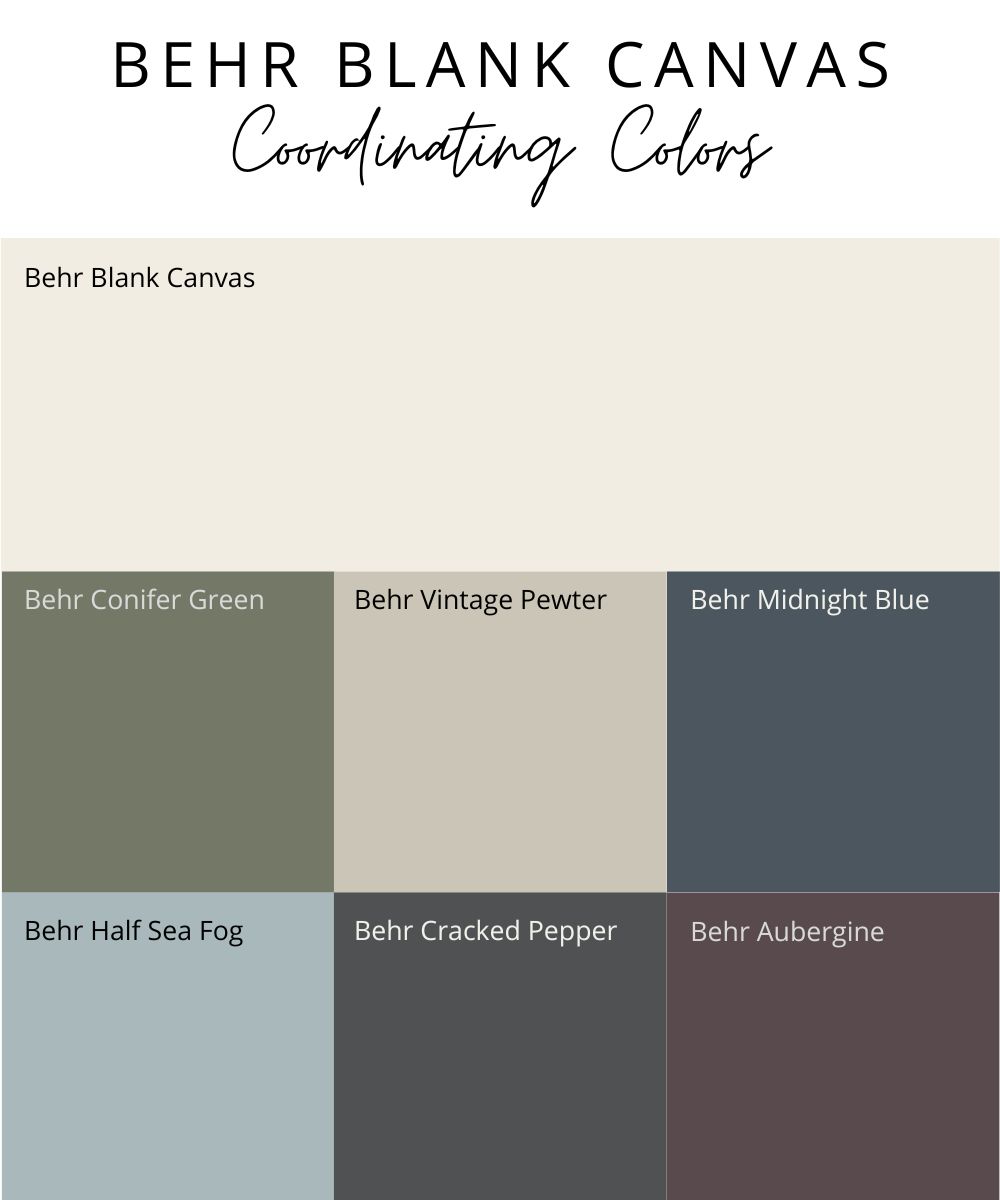
Here are some of my favorite coordinating colors to use with Behr’s Blank Canvas:
- Behr Conifer Green – medium-dark, gray green
- Behr Vintage Pewter – medium greige
- Behr Midnight Blue – dark navy
- Behr Cracked Pepper – off-black
- Behr Half Sea Fog – muted aqua
- Behr Aubergine – deep, dark purple
My Take on Behr’s Blank Canvas
Blank Canvas is a solid, yet safe, choice for 2023. This is a color that will be popular in 2023 and can be used in any room. It’s also a great option for a whole-house color. Blank Canvas is a safe choice in that it’s already a color that homeowners are using today, so it doesn’t exactly push the envelope or establish a new trend.
What do you think of Behr’s choice for 2023?
PPG Color of the Year for 2023
PPG’s color of the year is Vining Ivy. This is a color that packs a punch, while still having a timeless sophisticated quality to it. Grab a sample of Vining Ivy HERE.
Vining Ivy is a deep, dark aqua. It has the ability to energize the room, while still having a relaxed, grounded quality to it. Vining Ivy can work with a wide range of styles, from industrial to bohemian and even traditional. If you’re ready to add some bold color to your home, Vining Ivy (or similar) is a great place to start.
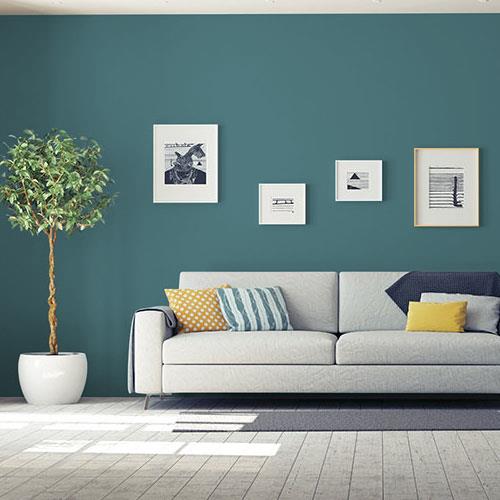
How should you use Vining Ivy?
Vining Ivy would be a great choice for an accent wall in any room where you want to add a little drama or wow factor. You can use Vining Ivy in traditional or transitional bedrooms, paired with crisp white linens and stained wood furniture for a sophisticated look. To keep things more modern, Vining Ivy can add the perfect pop of color to a streamlined black and white color palette.
Other rooms that are perfect for a dark dramatic color are powder rooms, dining rooms, and the office. You could also add a little color to your exterior by using Vining Ivy on your front door.
What colors go with Vining Ivy?
Vining Ivy works well with warm shades of beige, brown, rust, and terracotta. It will pop against a crisp white, and looks fantastic with both light and dark wood tones. Pair it with white and a light aqua for a monochromatic look.
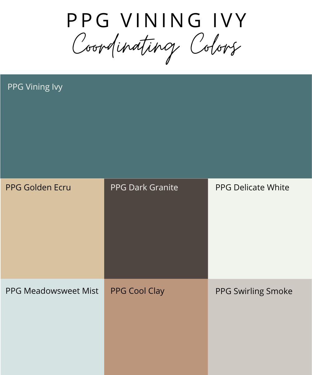
Some great colors to pair with PPG Vining Ivy include:
- PPG Golden Ecru– soft beige
- PPG Delicate White – pale, true, winter white
- PPG Dark Granite – dark, rich brown
- PPG Meadowsweet Mist – barely-there aqua
- PPG Cool Clay – subdued, pinkish brown
- PPG Swirling Smoke – warm, light gray
My Take on Vining Ivy
I’m a fan of Vining Ivy as the PPG color of the year for 2023. As people start to embrace color in their homes a little more, a dark aqua or teal like Vining Ivy is a great first step. It’s a color that can work with a wide range of design styles, so it won’t be too difficult to incorporate it into your home. Vining Ivy is a bold color, without being too much of a departure from the dark, gray-greens and blues we’ve been seeing in the design world since 2020.
My 2023 Paint Color Trend Predictions
Here are my predictions for trending paint colors for 2023.
Prediction #1: We’ll continue to see whites being a go-to wall color, but not the bright, crisp whites that have been so popular the last couple of years. Instead, we’ll see more off-whites and very light greiges and beiges being used.
Prediction #2: Dark, dramatic wall colors are going to be everywhere…especially paired with traditional wood accents. You’ll see variations of deep blues and greens, teals, and off-blacks that have a hint of color to them. These colors will be used in living rooms, dens, the office, bedrooms, dining rooms, and on kitchen cabinets
Prediction #3: Warm colors will start to emerge back into the mainstream, starting with subtle beiges and some darker earth tones, like terracotta and clay. Muted, pinky-beiges could show up in bedrooms in 2023, but probably won’t be a long-lasting color trend.
To sum it all up, here’s what will be in and out when it comes to paint colors for 2023
IN: Off-whites, teals, smoky dark greens and blues, blacks with a hint of color, muted beiges and warm earthy colors
OUT: Shades of cool gray, neutral charcoals, bright whites

Redend Point literally makes me want to vomit. I’d take Raspberry over that in a heartbeat.
Have to agree, not a fan either.
Resent Point and Rasberry blush… no to both!
I m going to use the Rasberry blush as an accent wall in my BR. Even though accent walls are seeming to leave the scene of popularity,. I have pillows with this color and think it will really bring the BD together in a fun way.
Love it!
Melissa, do you have any new favorite smokey dark greens and blues that would look great in a powder bathroom? I have a floating walnut vanity….. and I’m thinking a dark earthy color!
How about a pale orange on a fireplace?