White paint seems like it should be one of the easiest colors to choose. After all, it’s white. How different could one shade possibly be from another? Quite different, as it turns out.
If you place several white paint chips next to one another, you’ll start to see hints of yellow, gray, green, beige, or blue. Those subtle undertones can determine whether a white feels crisp and fresh, soft and welcoming, or slightly “off” once it’s on your walls.
Lighting, your existing finishes in the room, and Light Reflectance Value (LRV) all affect how a white paint color looks, too. A color that looks warm and inviting in one home could look a lot cooler, or much creamier, in another home.
In this post, I’ll walk you through 10 of the best BEHR white and off-white paint colors, including their undertones, light reflectance values, and where I’d recommend using each one. More importantly, I’ll help you narrow down which kind of white makes sense for your home.
What Are the Best BEHR White Paint Colors?
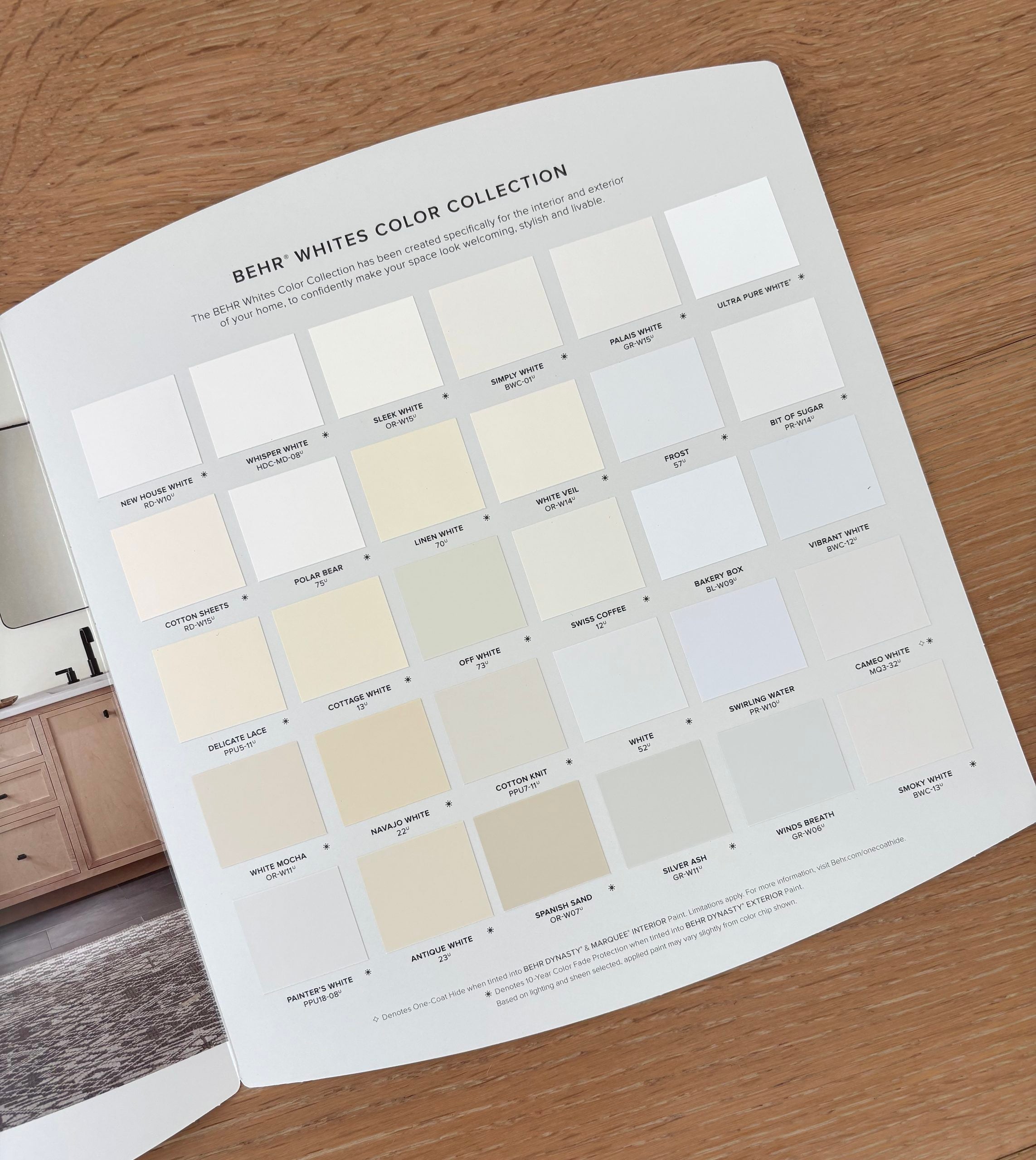
For this list, I selected ten BEHR white and off-white paint colors that represent a range of options…from a clean, bright white to warmer creams, muted neutrals, and a cooler off-white. Rather than choosing ten colors that look nearly identical, I wanted to give you the best options for different lighting conditions, finishes, and decorating styles.
Here’s a quick list of my favorite BEHR white and off-white paint colors:
- BEHR Ultra Pure White® UPW
- BEHR Polar Bear 75
- BEHR Frost 57
- BEHR Swiss Coffee 12
- BEHR Silky White PPU7-12
- BEHR Smoky White BWC-13
- BEHR Painter’s White PPU18-08
- BEHR Cotton Knit PPU7-11
- BEHR Soft Focus T18-09
- BEHR Winds Breath GR-W06
In the following sections, we’ll look at the undertones, Light Reflectance Value (LRV), and best uses for each color. More importantly, I’ll help you narrow down which one makes the most sense for your home.
Why Is Choosing White Paint So Difficult?
A white paint color is rarely just white. In fact, every white falls somewhere along a color spectrum and has subtle undertones that can sometimes be difficult to detect. Some whites are very bright and relatively neutral. Others have enough yellow, beige, gray, green, or blue pigment to noticeably affect the way they look in a room.
As an interior designer, I never choose a white paint color based on popularity or a paint chip. I always research its undertones and light reflectance value (LRV), consider how it will respond to natural light in the room, and compare it with the room’s fixed finishes. Those comparisons tell me so much more about whether the color will work in that room than the color name or a photograph ever could.
Why Do White Paint Colors Look So Different?
White paint colors can be roughly divided into three groups, based on their undertones:
Warm whites
Warm whites have undertones such as yellow, cream, beige, or occasionally a hint of pink. They tend to feel softer, cozier, and more traditional.
Warm whites often look best with:
- Warm wood tones
- Beige tile and warm stone
- Brown and beige upholstery
- Warm metals, like brass or bronze
- Earthy color palettes
- Traditional or organic decorating styles
Cool whites
Cool whites typically have blue, gray, green or purple undertones. They generally feel crisper, fresher, and a little more modern.
Cool whites can work well with:
- Cooler gray finishes and flooring
- Blue or green color palettes
- Marble and cooler stone
- Silver-toned metals
- Modern interiors
Neutral (or balanced) whites
A neutral or balanced white doesn’t really have a strong warm or cool identity. It can still have undertones, but they aren’t immediately obvious or bossy. These whites can be easier to use throughout multiple rooms because they’re so versatile and can adapt to a variety of colors and finishes.
The important thing to understand is that no undertone is inherently good or bad. The question is whether that undertone relates well to the other colors already in your room, and works with your lighting conditions.
What Does LRV Mean for White Paint?
LRV stands for Light Reflectance Value. It measures how much visible light a paint color reflects on a scale from 0 to 100. A higher LRV means the color reflects more light and generally looks brighter. A lower LRV means it absorbs more light and has greater depth.
Most “white” paint colors have an LRV in the 80s or 90s. Once you move into the 70s, the color usually starts to read as an off-white, or very light neutral, rather than a crisp white.
However, LRV doesn’t tell you everything about a paint color. Two whites can have similar LRVs and still look very different because of their undertones. LRV tells you how bright a color is, but its undertone tells you how that color will relate to the rest of your room.
How I Compare White Paint Colors
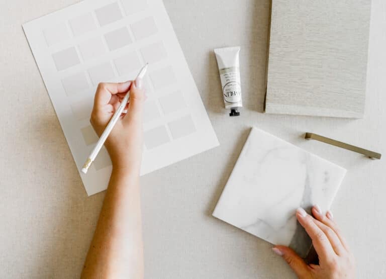
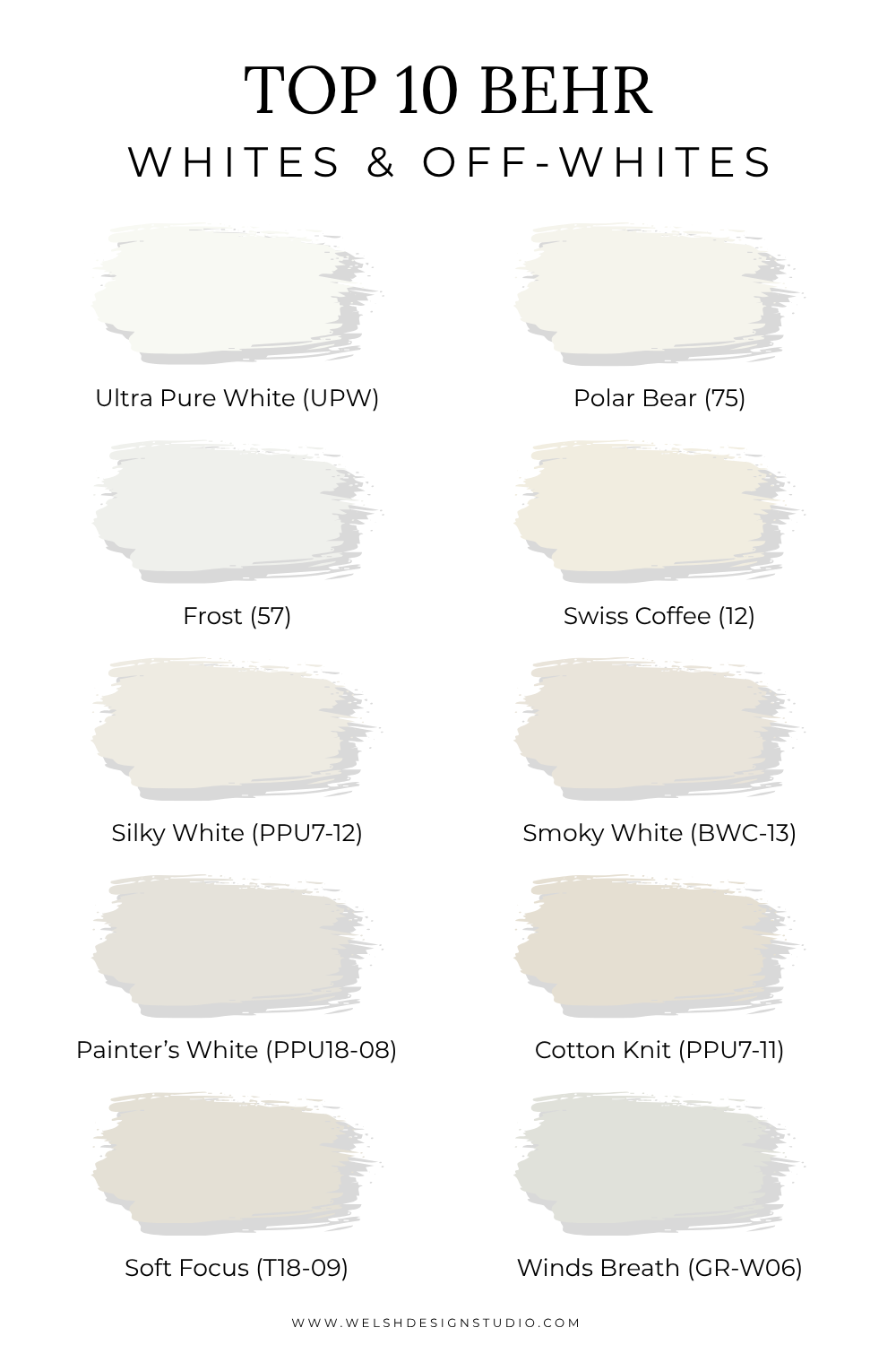
I like to compare white colors side by side rather than evaluating each paint chip individually. That’s one of the easiest ways to reveal their undertones and notice the subtle differences among whites.
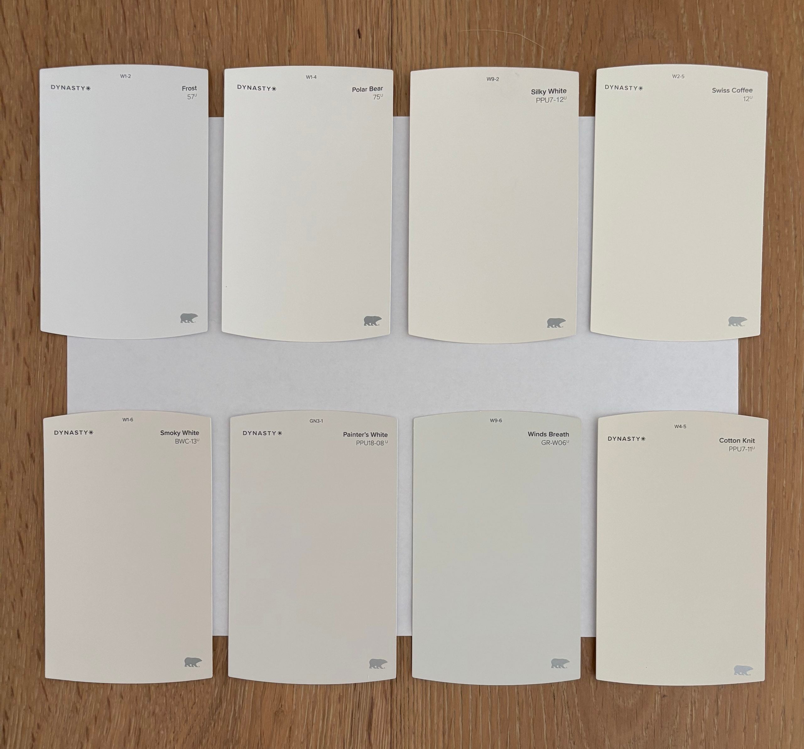
Another great way to evaluate a white paint sample is to compare it to plain white paper. You can really start to see the undertones jump out at you.
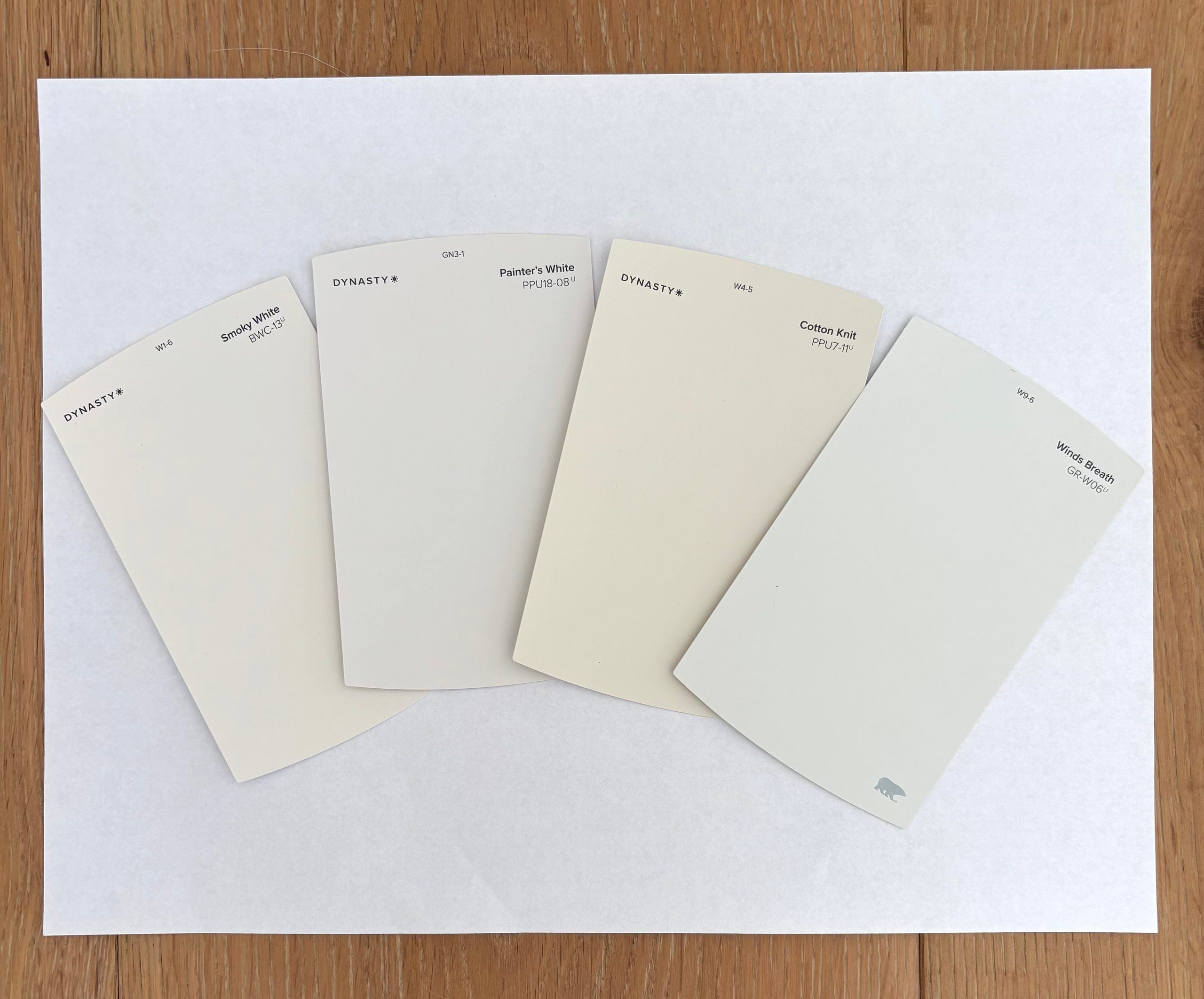
I also like to move the samples into different lighting conditions. This is important because a white that looks perfectly balanced in bright natural light could look much warmer, cooler, or more muted in another part of the house.
Quick Reference Guide of the Best BEHR Whites & Off Whites
With so many white paint color options out there, it can be hard to know where to start. We’ll cover each paint color in detail in the sections below, but if you just want a quick guide to help you narrow it down, I’ve created a summary to help you pinpoint which colors might be best for your home.
| If you want… | Start with… | Why |
| The brightest, cleanest white | BEHR Ultra Pure White | Very high LRV and minimal visible undertone |
| A versatile white for walls | BEHR Polar Bear | Bright with just enough warmth to avoid feeling stark |
| A cooler white | BEHR Frost | Subtle blue-gray undertones can help balance warm sunlight |
| A creamy warm white | BEHR Swiss Coffee | Noticeable warmth works well with creamy tile, countertops, and warm wood. |
| A soft natural white | BEHR Silky White | Warm and comfortable without looking overly creamy |
| A muted warm-gray off-white | BEHR Smoky White | Softer and more sophisticated than a pure white |
| A balanced neutral off-white | BEHR Painter’s White | Quiet gray-beige undertones, not overly creamy |
| A cozy beige off-white | BEHR Cotton Knit | The warmest and darkest option in the group |
| A warm, muted off-white | BEHR Soft Focus | Works well with greige and organic finishes |
| A cooler off-white | BEHR Winds Breath | Silvery green-gray undertones pair nicely with cooler finishes |
The Best BEHR White Paint Colors
Let’s start with the five lightest colors in this roundup.
1. BEHR Ultra Pure White (UPW)
LRV: 94
Undertone: Minimal or neutral
Best for: Trim, doors, cabinets, ceilings, and crisp contrast
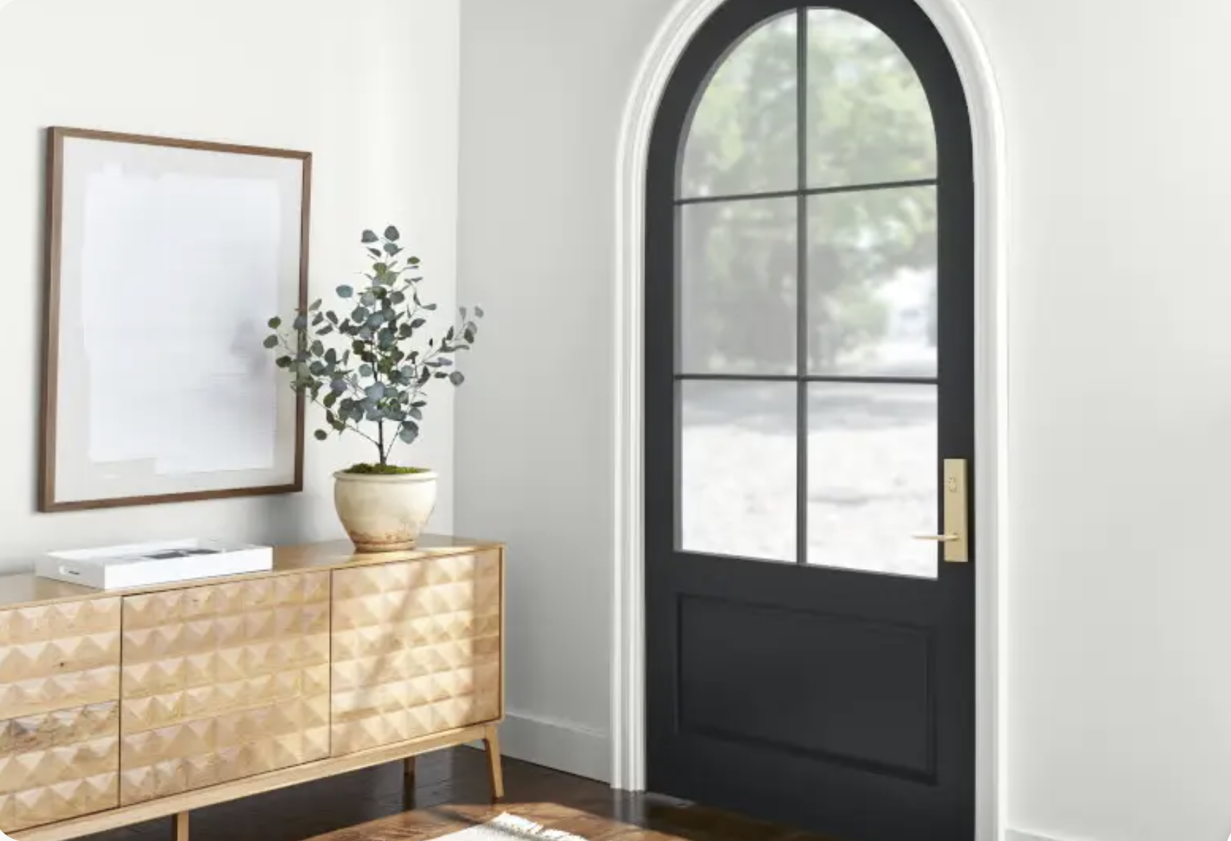
BEHR Ultra Pure White is the brightest and cleanest looking white in this group. With an LRV of 94, it reflects a significant amount of light and creates a crisp contrast against most wall colors.
This is my go to white paint color for trim and doors, or when I want white walls that look crisp and bright rather than soft or creamy.
Where Ultra Pure White works best
- Trim and baseboards
- Interior doors
- Ceilings
- Cabinets
- Modern or high-contrast color palettes
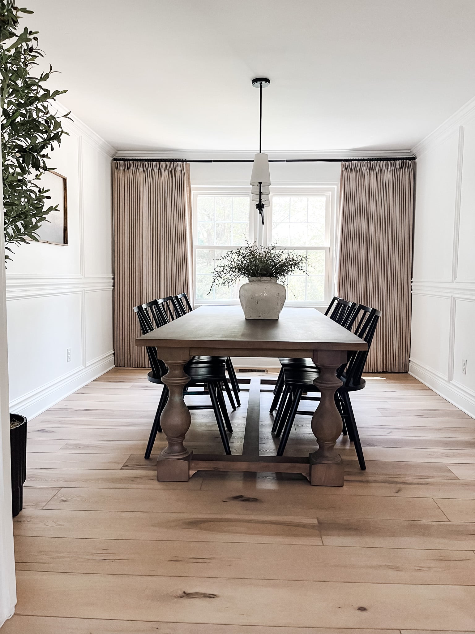
Ultra Pure White also works well for walls, but it gives a very bright art-gallery look. In a room with minimal natural light, such a clean white can actually appear flatter or cooler than you might expect.
When to be cautious with Ultra Pure White
BEHR Ultra Pure White can feel a little stark on large expanses of wall, or next to creamy countertops, beige tile, or warm white cabinetry. Those finishes can suddenly look more yellow when placed next to such a bright white. It can also reflect colors from its surroundings. Cool daylight, green landscaping outside the window, colorful furnishings, and your light bulbs can all influence how it appears.
Choose Ultra Pure White if:
- You want crisp, bright trim.
- You want more contrast with a light wall color.
- Your finishes include clean whites rather than creams.
- You like a modern, high-contrast look
2. BEHR Polar Bear (75)
LRV: 90
Undertone: Faint creamy-yellow
Best for: Walls, kitchens, living rooms, hallways, and whole-house color
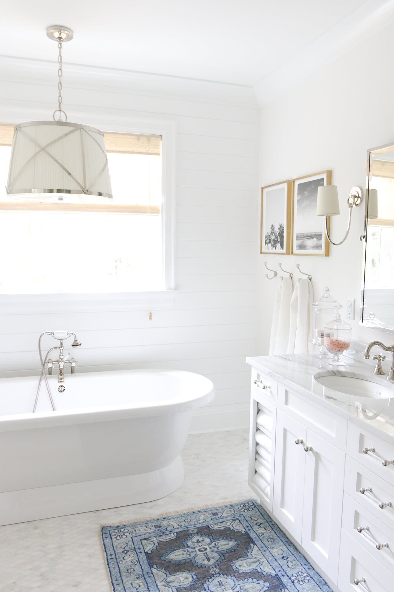
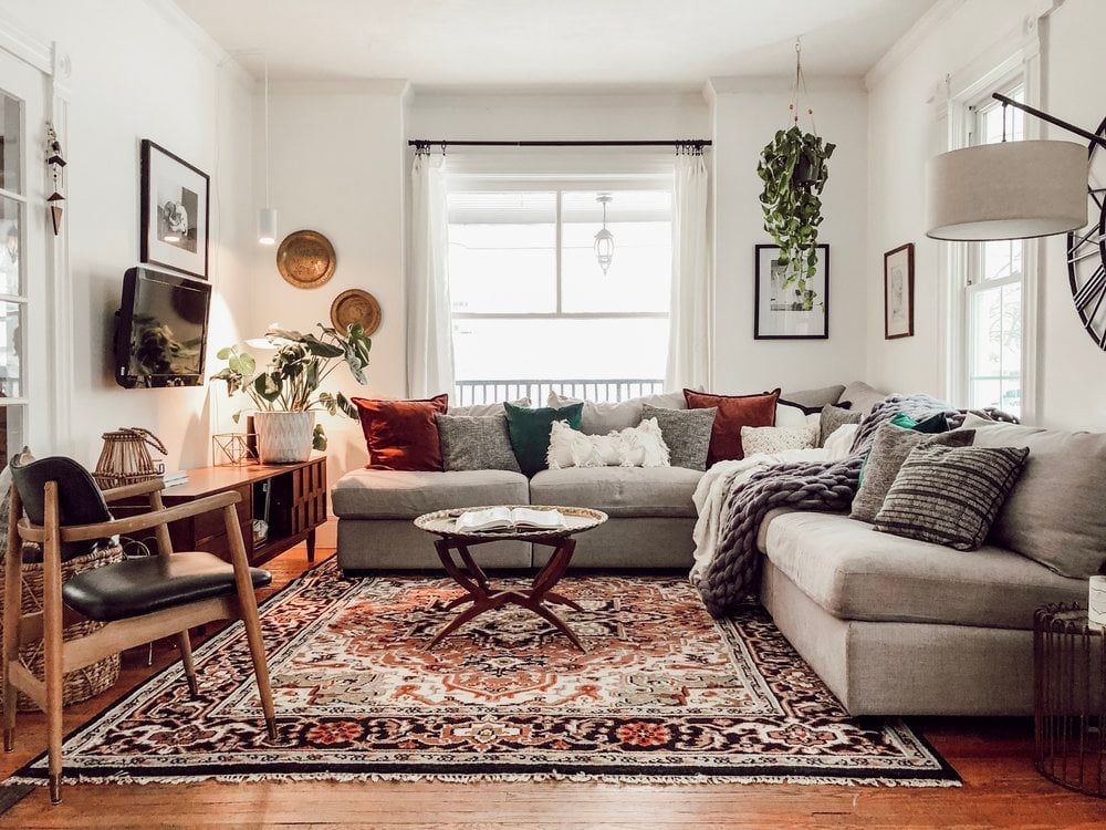
BEHR Polar Bear is a bright, slightly creamy white. Because of its high LRV, it feels clean and fresh, but its small amount of warmth keeps it from looking as crisp as Ultra Pure White.
That subtle softness makes Polar Bear a little more approachable than a nearly pure white. It gives you the freshness people often want from white walls without feeling overly cold
Of all the whites on this list, Polar Bear is one of the most versatile choices for homeowners who want white walls without an obviously creamy or gray appearance.
Where Polar Bear works best
- Living rooms
- Kitchens
- Hallways
- Open-concept spaces or whole-house
- Walls paired with warm wood or natural materials
- Rooms where you want brightness without a stark appearance
When to be cautious with Polar Bear
Although Polar Bear is warmer than Ultra Pure White, it’s still quite bright. In a dim north-facing room, it may not provide as much warmth as a creamier white would.
Polar Bear is pretty adaptable, but you should still compare it next to your permanent finishes. For example, if you’re planning to use it next to pure white countertops or cabinets, it could look slightly creamy. Small differences in undertones are often much more noticeable when two similar whites sit next to each other.
Choose Polar Bear if:
- You want a bright white with a hint of softness.
- You’re looking for a very versatile white wall color.
- You don’t want the room to feel obviously creamy or cool.
- You need something gentler than Ultra Pure White, but still bright.
3. BEHR Frost (57)
LRV: 87
Undertone: Cool with subtle blue and gray
Best for: South- or west-facing rooms, modern interiors, and cooler finishes
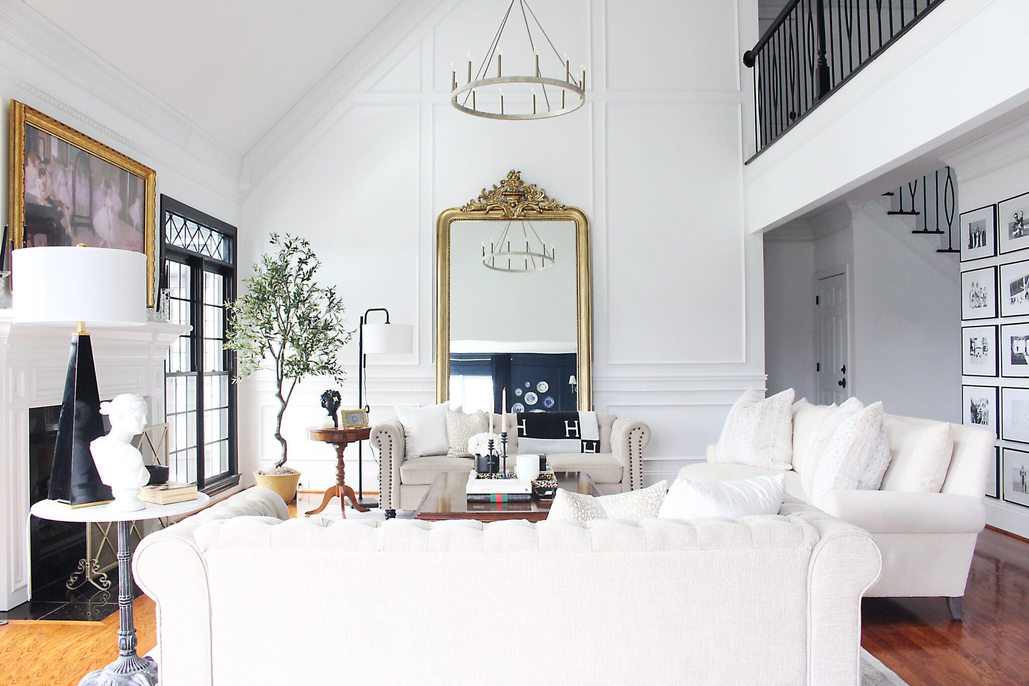
BEHR Frost is a cool white paint color with subtle blue-gray undertones. It can feel clean and fresh, but has a slightly more icy look than Ultra Pure White.
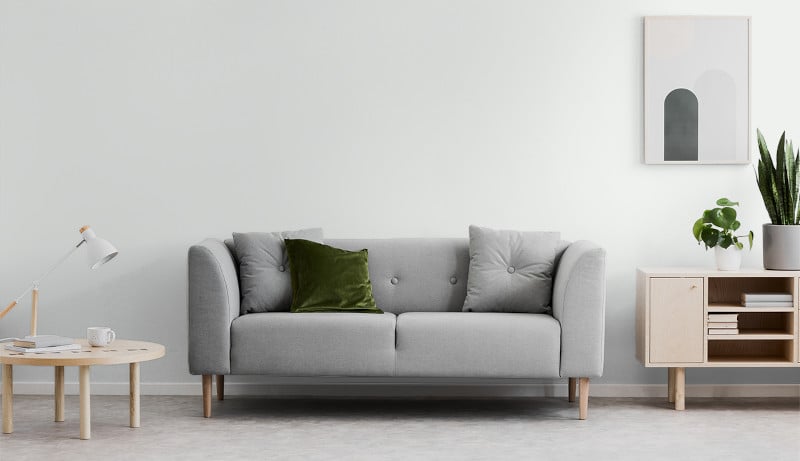
In west-facing rooms, the cool undertones in Frost can help balance out warm, golden afternoon light. So, if every white seems to look too creamy or yellow in your space, give Frost a try. It’s also a fantastic trim color to use with cooler fixed materials (like cool-toned gray flooring).
Where Frost works best
- West-facing or south-facing rooms with warm afternoon light
- Modern interiors
- Rooms with blue, gray, or cool green wall colors
- Spaces with cool stone or countertop finishes
- Rooms with cool-toned gray flooring
When to be cautious with Frost
Cool whites can look more noticeably blue or gray in north-facing rooms, which already receive cooler natural light. That doesn’t automatically make it the wrong choice, but just be aware that the room could feel cooler than you intended.
Frost can also look too icy next to finishes or wall colors that have strong cream, yellow, or beige undertones.
Choose Frost if:
- Your room gets strong warm sunlight.
- Your finishes lean cool.
- You want a fresh, clean white with subtle blue-gray undertones.
- Warm whites tend to look too yellow in your home.
4. BEHR Swiss Coffee (12)
LRV: ~84
Undertone: Warm, creamy yellow
Best for: Warm palettes, traditional interiors, and rooms that need softness
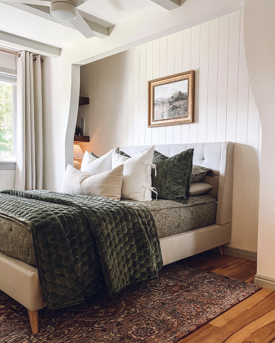
BEHR Swiss Coffee is a very popular warm, creamy white paint color with a more noticeable depth of color than Polar Bear or Frost. It can make any room feel cozy and inviting, and works especially well with warm wood tones, creamy stone, beige upholstery, and traditional finishes.

Because Swiss Coffee is softer and warmer than a bright white, it can make a room feel more relaxed and established, and less…clinical. This is the perfect white color to use when the room’s other materials and colors also lean warm.
Where Swiss Coffee works best
- Warm wood flooring
- Traditional, transitional, or timeless interiors
- Cream, tan, and beige furnishings
- Warm stone and tile
- North-facing rooms that need added warmth
- Bedrooms, living rooms, whole-house, and home offices
- Cabinets or trim when the palette supports a creamy look
When to be careful with Swiss Coffee
The creamy undertone can be more noticeable in rooms with warm south-facing or west-facing light. In those rooms, Swiss Coffee could look more yellow than expected, so be sure to test it.
I would also avoid using Swiss Coffee next to cool marble, bright white countertops, or tile with a strong gray undertone. This is a situation where things can easily clash, making Swiss Coffee look much more yellow, or making those cooler finishes look too stark.
Choose Swiss Coffee if:
- Your finishes are creamy, beige, or golden.
- You want an inviting, traditional white.
- Your room needs obvious warmth.
- A bright white feels too stark.
5. BEHR Silky White (PPU7-12)
LRV: ~83
Undertone: Soft, natural warmth
Best for: Comfortable whole-house color and understated interiors
BEHR Silky White is a soft white with a natural, slightly warm appearance. It has more depth than Polar Bear and feels more relaxed than a crisp white paint color, but it isn’t as overtly creamy as Swiss Coffee.
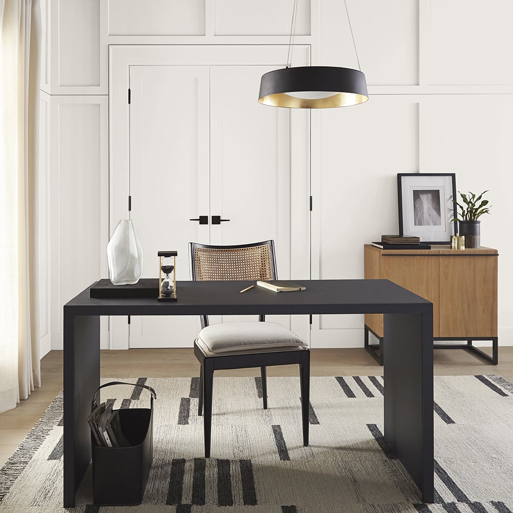
This makes Silky White a great option for homeowners who want warmth and coziness without creating a distinctly creamy or yellow-white room. It works especially well in rooms with light wood tones, natural stone, linen, and other organic elements. And if you’re looking for a single color to use on baseboards, trim, doors and walls, this is a great option. You can use Silky White on both the walls and trim, changing only the sheen to create a subtle contrast without introducing another white that might compete with it.
Where Silky White works best
- As a whole-house color
- Living rooms and bedrooms
- Homes with a lot of natural wood and organic elements
- Warm-neutral color palettes
- When you want a single color for walls, trim, and ceilings (in different sheens)
- Rooms where a brighter white feels too stark
- Relaxed transitional interiors
When to be cautious with Silky White
Although Silky White is softer than a bright white, its warmth might not work with cool gray or blue-white surfaces, so be sure to compare it with your permanent finishes (countertops, flooring, tile, cabinetry, etc.)
Also, if you want to use Silky White on the walls with an existing white trim color, be sure to compare the two colors before deciding. Alternatively, re-paint your trim Silky White in a different sheen for a sophisticated, monochromatic look.
Choose Silky White if:
- You want a soft, natural white.
- You like warm whites but don’t want a strong cream color.
- Your room includes linen, light wood tones, and natural elements.
- You want a comfortable, low-contrast look.
The Best BEHR Off-White Paint Colors
The next five colors have LRVs in the 70s, which puts them in the off-white category. They’ll still look very light in a room, but they have more visible color and depth to them than a true white. Off-whites are a great choice when you want a softer look, or something with a little more character than a white, but you still want a paint color that looks bright and subtle. Here are my top picks.
6. BEHR Smoky White (BWC-13)
LRV: 76
Undertone: Warm gray with subtle softness
Best for: Living rooms, bedrooms, kitchens, and exteriors
BEHR Smoky White is a very versatile off-white with a warm gray undertone. It doesn’t look as creamy as some other warm whites, but it has a little more depth and complexity than a crisp bright white.
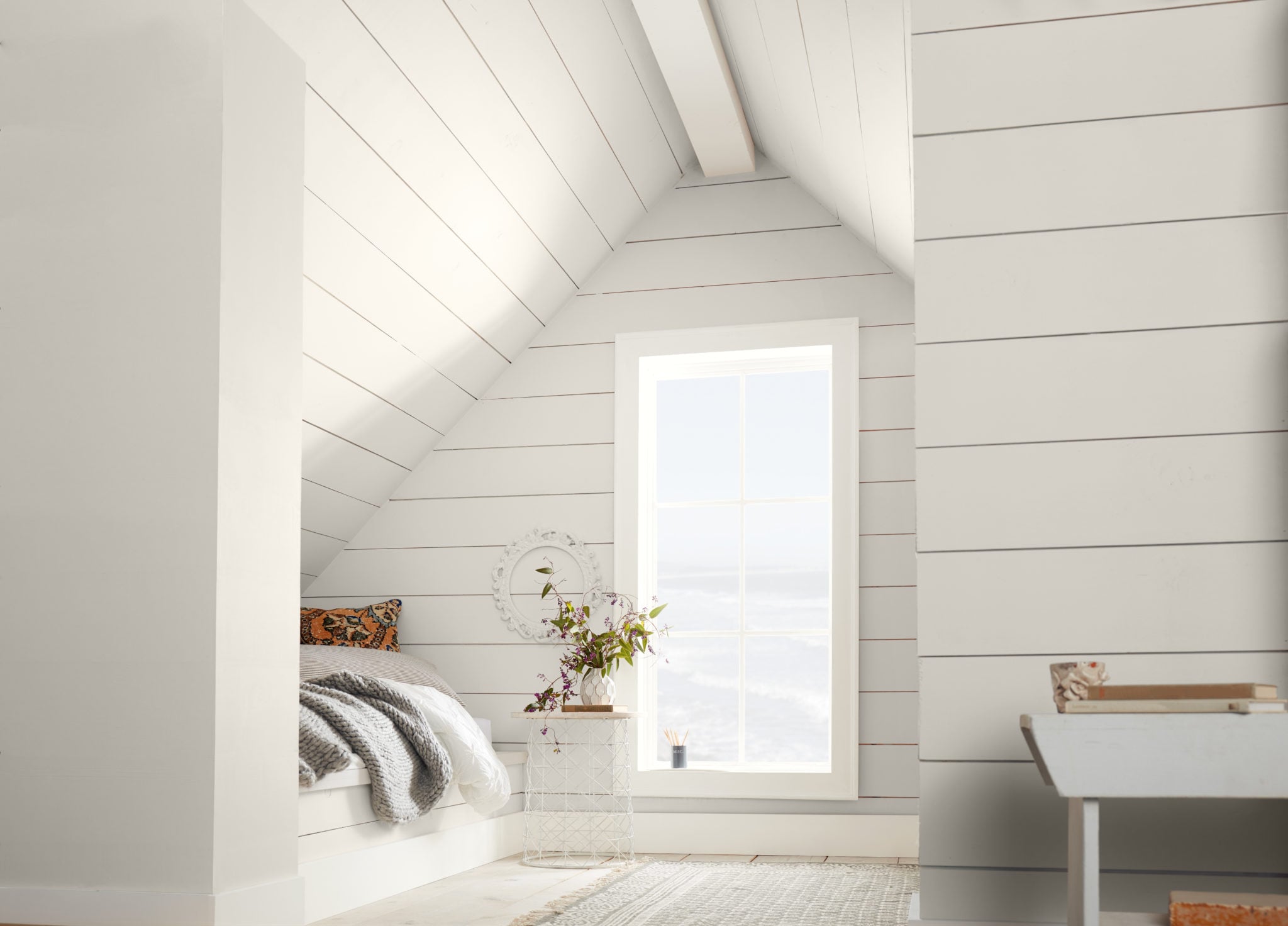
Because of its muted tones, Smoky White is a color that can help bring together warm and cool colors within the same room, which makes it extremely flexible. It can give you a nice neutral background color for a wide range of color palettes and decorating styles.
Where Smoky White works best
- Living rooms
- Bathrooms
- Bedrooms
- Transitional interiors
- Natural stone and muted finishes
- Rooms where you want a soft, velvety backdrop
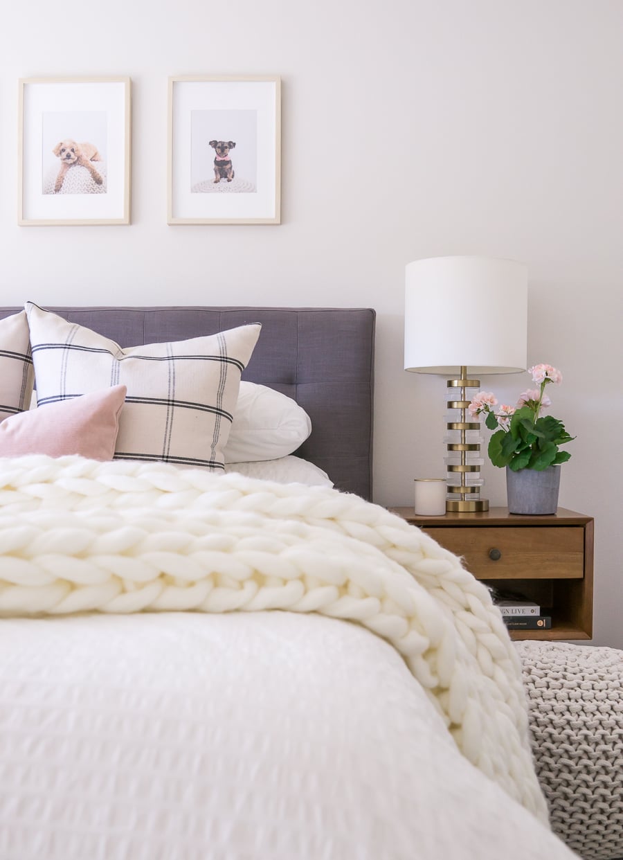
When to be cautious with Smoky White
Smoky White has subtle undertones that can sometimes shift with its surroundings. In some rooms, you could see more warmth from it, and in others, the gray tones might look stronger. If you want to use it as a whole-house color, be sure to test it in multiple places to see how the color shifts in different lighting before committing.
Choose Smoky White if:
- You want a muted off-white with a touch or warm gray.
- You want a wall color that gives a soft contrast with bright white trim.
- Your room leans more transitional or contemporary than traditional.
- Brighter whites feel too harsh.
7. BEHR Painter’s White (PPU18-08)
LRV: 76
Undertone: Neutral gray-beige
Best for: Neutral whole-house color, adding a hint of warmth to spaces with gray materials.
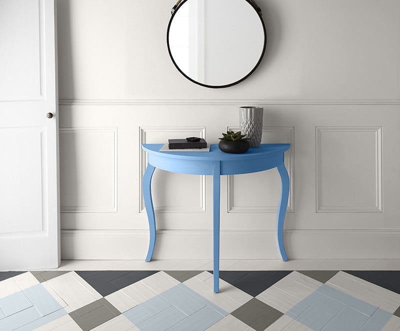
BEHR Painter’s White is a lovely off-white paint color with a quiet greige (gray + beige) undertone. This is one of the most balanced off-whites in my list. It can work really well when you want something softer than a bright white, but you don’t want the walls to look yellow or creamy.
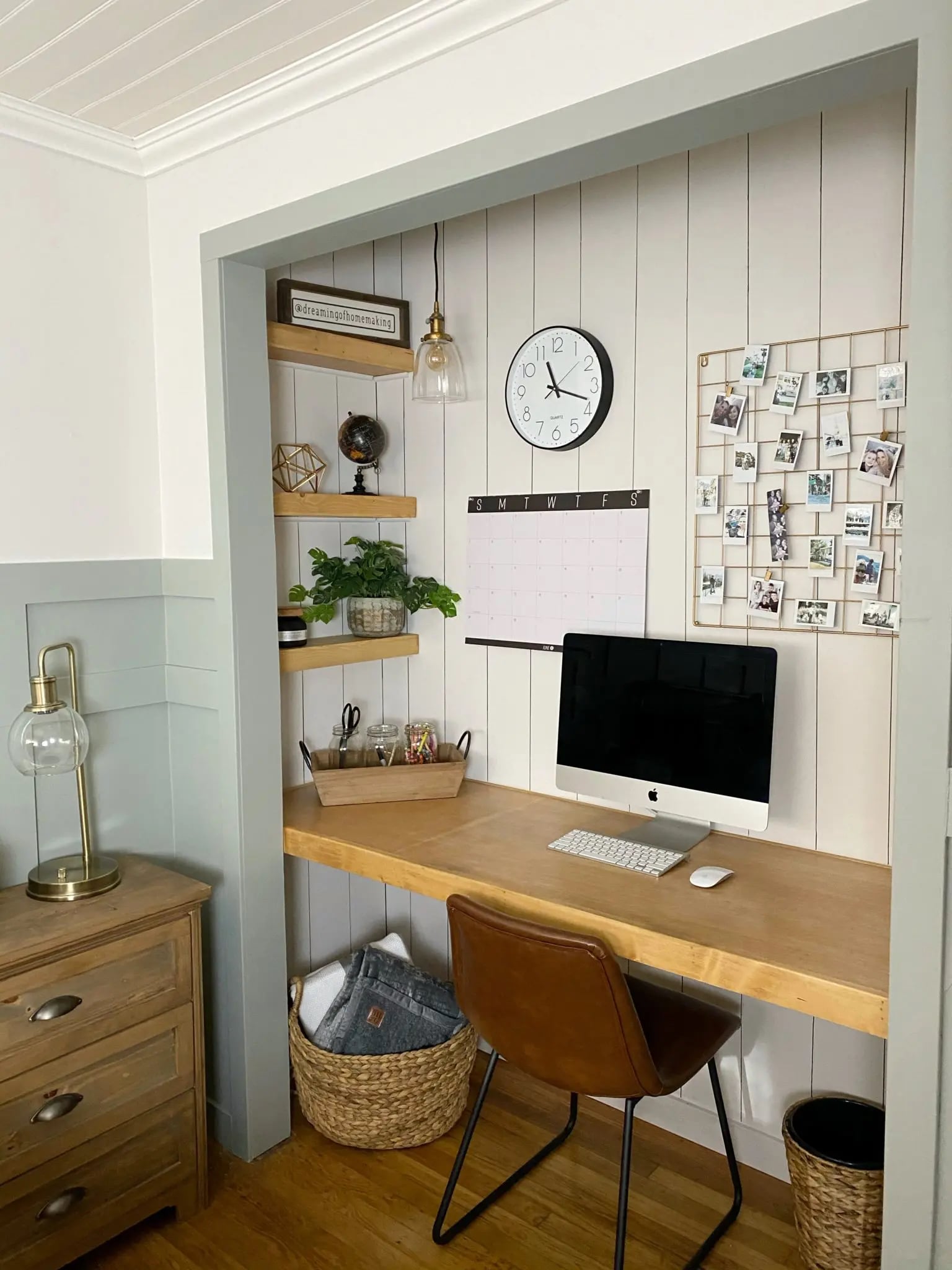
If you have a home with a lot of gray colors and finishes, Painter’s White can be a great way to add subtle warmth while still connecting with the gray tones. And if you have a west-facing room that gets a lot of warm afternoon sunlight, Painter’s White can be a good alternative to creamier off-whites that tend to look too yellow.
Where Painter’s White works best
- Open-concept living areas
- Transitional interiors
- Rooms with mixed warm and cool neutrals
- Homes with gray finishes
- Walls paired with lighter white trim
When to be careful with Painter’s White
Painter’s White can look grayer in cool northern light and warmer next to cool white finishes. Test it next to your flooring, countertops, and trim to see which side of the color becomes more noticeable.
Choose Painter’s White if:
- You want an off-white that looks more neutral in warm lighting
- You need a wall color that can work well with gray finishes
- You want the walls to have more depth than white.
- You’re trying to bridge warm and cool materials.
8. BEHR Cotton Knit (PPU7-11)
LRV: ~72
Undertone: Cream and beige
Best for: Cozy rooms, north-facing spaces, and warm natural materials
BEHR Cotton Knit is one of the warmest and deepest off-white paint colors in my list. It has a creamy beige undertone that gives it a more traditional, cozy quality.
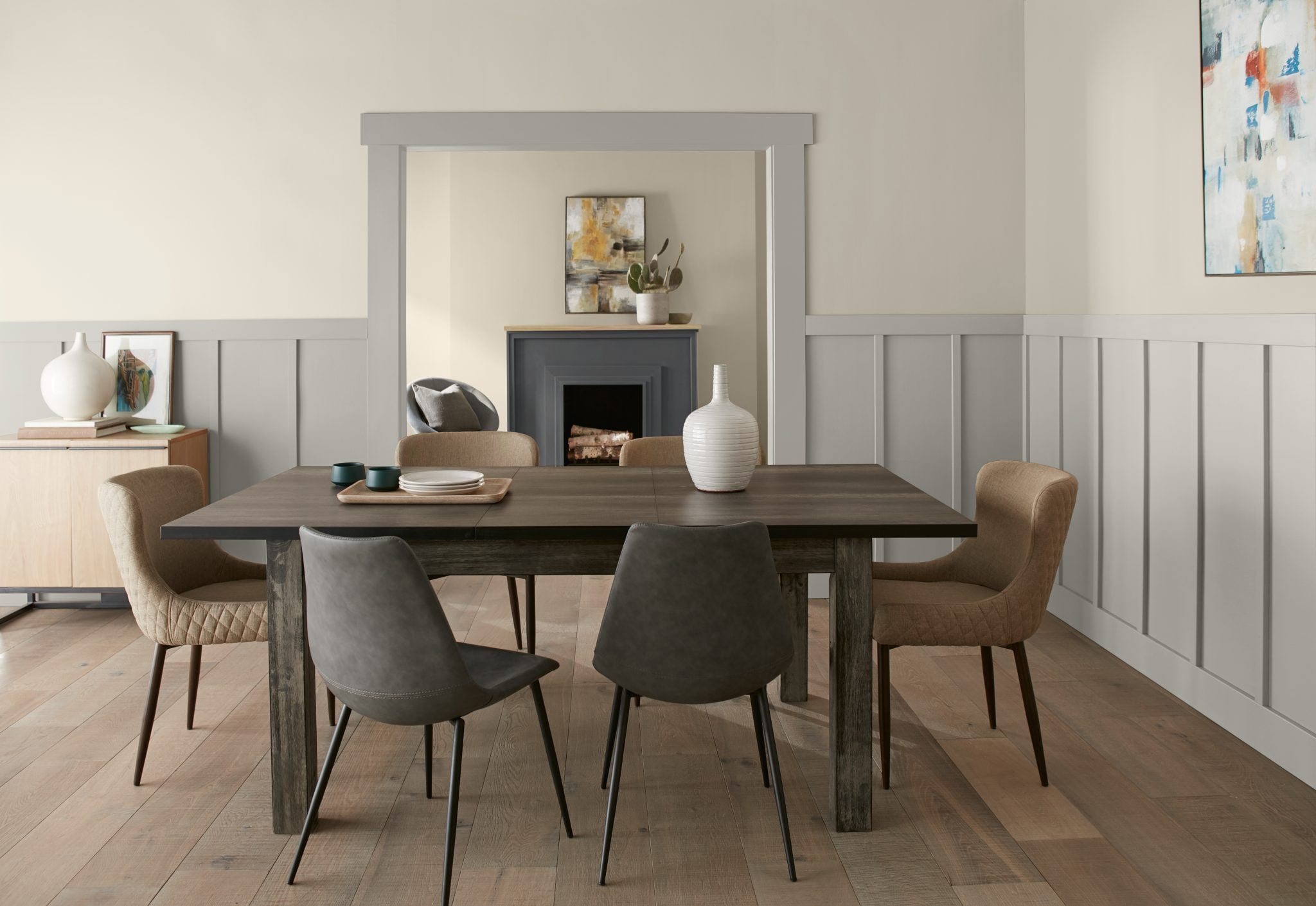
This is a good option when you want the room to feel light but don’t necessarily want it to look white. In many cases, Cotton Knit will read more like a really light beige than a traditional white.
Its warmth can be especially helpful in a north-facing room, where you need a warmer white to overcome the cooler light that comes into the room.
Where Cotton Knit works best
- North-facing rooms
- Bedrooms
- Cozy living spaces
- Warm wood floors, and darker wood tones
- Warm or beige stone and tile
- Traditional color palettes with beige, cream, or brown
When to be careful with Cotton Knit
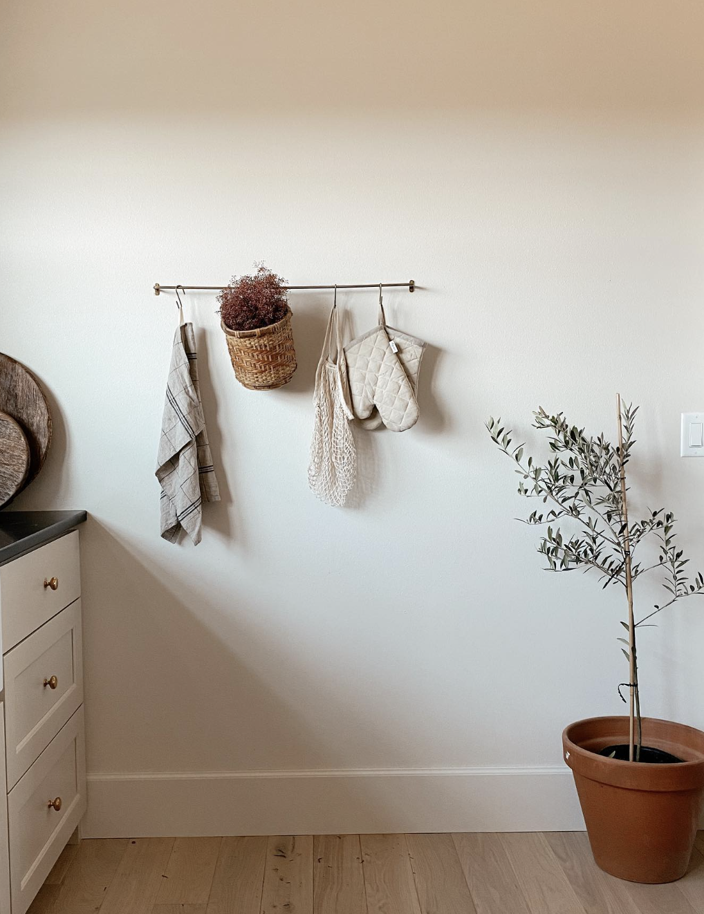
BEHR Cotton Knit can often look too warm with cool gray floors, blue-white tile, or crisp white quartz countertops. It can also look a little too beige and creamy in rooms with warm directional light (like south-facing and west-facing rooms). Choose Cotton Knit if you want to see some warmth in your room, not because you expect it to look like a true white.
Choose Cotton Knit if:
- You want a cozy, noticeably warm off-white.
- Your room faces north.
- Your finishes have a lot of warm tones (warm wood, cream, beige, or brown)
- You’re comfortable with the walls reading as a very light beige.
9. BEHR Soft Focus T18-09
LRV: ~75
Undertone: Warm, greige with a hint of green
Best for: Relaxing bedrooms, living rooms, and bathrooms
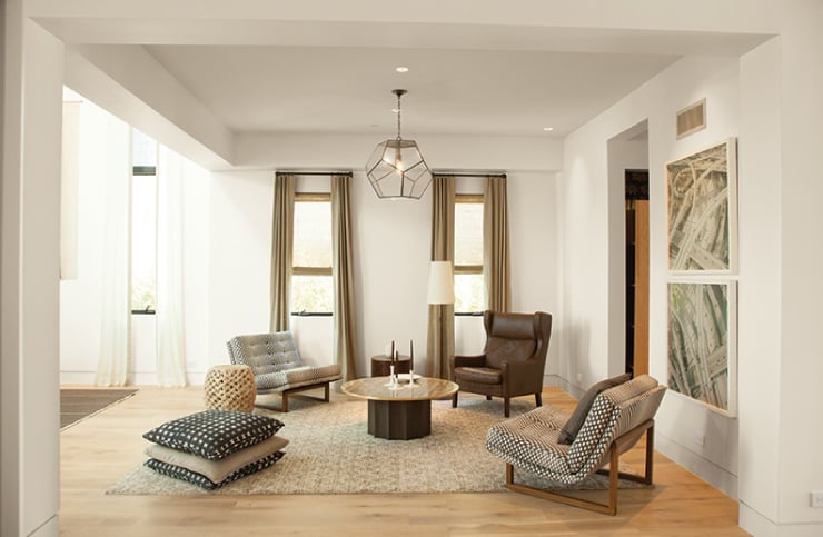
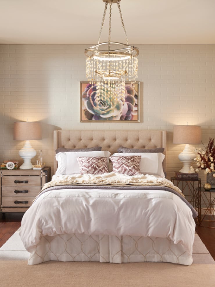
BEHR Soft Focus is a muted off-white with predominantly greige undertones, but it does have a very slight green undertone, as well. It sits in a sweet spot between a white and a light greige, so it can offer a subtle wall color that still stands out against white trim.
This is a color that feels grounded and quiet, so it works really well in bedrooms and cozy living spaces. Soft Focus also pairs well with weathered wood, natural textiles, greige stone, and other finishes that have a more muted white look.
Where Soft Focus works best
- Living rooms
- Bedrooms
- Calm, nature-inspired interiors
- Warm gray, beige, and greige palettes
- Rooms with natural or slightly weathered materials
When to be careful with Soft Focus
Soft Focus can flash a hint of green in some lighting conditions, and could look a little dull or dingy next to cool white surfaces. It works better with finishes and materials that share its softer, greige undertones.
Choose Soft Focus if:
- You like warm greige and muted neutral palettes.
- Your home has a lot of weathered or natural materials.
- You want a light neutral with a little more substance than a bright white.
- Your finishes are more greige than crisp white or creamy beige
10. BEHR Winds Breath GR-W06
LRV: 75
Undertone: Silvery green-gray
Best for: Cooler materials, subtle color, and fresh neutral interiors
BEHR Winds Breath is the coolest off-white paint color in this collection. It has silvery green-gray undertones that give it a fresh, serene vibe, without making it look overtly green.
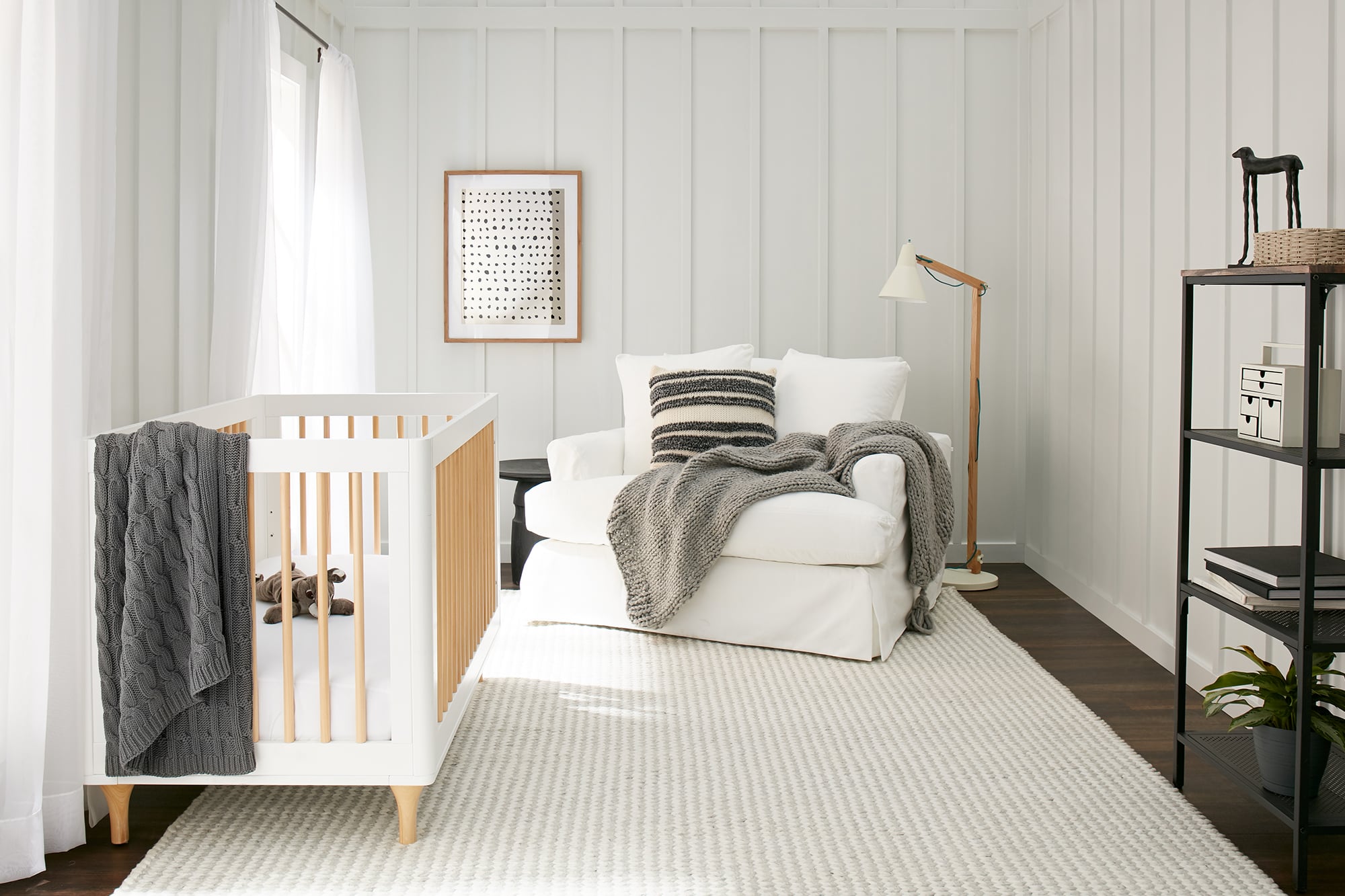
This can be a good choice when warmer off-whites are clashing with your room’s fixed finishes (tile, carpet, etc.) Because it has a cooler undertone, it can pair beautifully with cool stone or tile, blue-green accents, and some gray finishes. It’s a great alternative if you want an off-white wall color, but don’t want it to look too creamy or beige.
Where Winds Breath works best
- Rooms with cool stone or gray finishes
- Blue and green color palettes
- Calm bedrooms and bathrooms
- Fresh, modern interiors
- Spaces where creamy whites look too yellow
When to be careful with Winds Breath
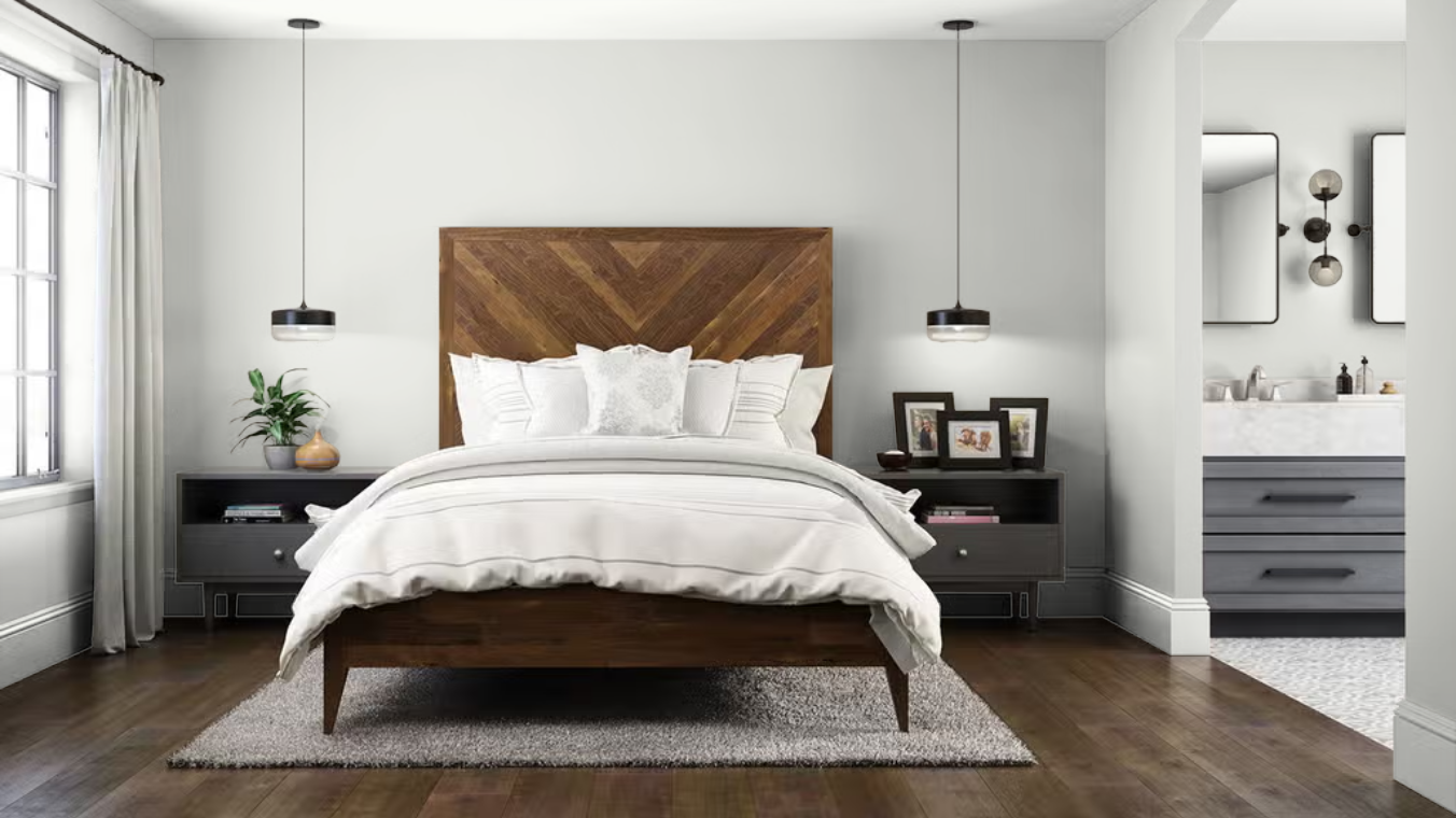
Green undertones can clash next to materials that have pink, red, or violet undertones. For example, if your beige or taupe carpet, tile, or countertop has a pink cast, you’ll want to avoid Winds Breath. It can also feel a little too cool for most north-facing rooms, unless you’re deliberately trying to find a wall color that works with cooler finishes.
Choose Winds Breath if:
- You want a cooler off-white.
- Your materials and color palette have more gray, blue, or green tones.
- Creamy whites look too yellow in your space.
- You want a subtle wall color that doesn’t look like an obvious gray or green.
Which BEHR White Is Right for Your Home?
Choosing a white paint color for your home can be challenging, because every home is different, with different lighting conditions. That’s why you just can’t go with the most popular white, or the white that looks great in a picture. Instead, you need to think about how you want your white to look, what lighting conditions are like in your home, and what will work best with your fixed materials.
How Natural Light Changes White Paint
The light coming into your windows has its own color, and that color changes throughout the day. It can also heavily influence how paint colors look in your room.
North-facing rooms
North-facing rooms generally receive cooler, blue-toned light. This can make cool whites look grayer or bluer and can make a very bright white feel less inviting. Warmer options like BEHR’s Cotton Knit or Swiss Coffee can help offset that cool light. BEHR Polar Bear or Silky White could also work well if you want something lighter and less creamy.
South-facing rooms
South-facing rooms get warmer, more consistent light. That warmth can intensify yellow and cream undertones. So, neutral or cooler whites like BEHR’s Frost or Polar Bear could be better balanced options in those rooms.
East-facing rooms
East-facing rooms get soft, slightly warm morning light and cooler, dimmer light later in the day. A more balanced white, or one with subtle warmth is often the best choice because it needs to work under two different lighting conditions. I recommend testing BEHR’s Polar Bear, Silky White, or Painter’s White in these rooms.
West-facing rooms
West-facing rooms get strong, golden light later in the day, and can make paint colors look significantly warmer in the afternoon. You’ll want to be careful with creamy whites in these rooms, and it’s usually better to go with a slightly cooler white, or one with greige undertones. BEHR’s Frost, Polar Bear, or Winds Breath could be a good starting point.
Don’t Choose White Paint Without Considering Your Fixed Finishes
Lighting matters, but your home’s fixed finishes matter just as much. Before choosing a white, you need to look carefully at your flooring, countertops, tile, stone, existing cabinets, and trim. Try to identify whether those materials lean warm, cool, or neutral.
A warm white can coordinate beautifully with creamy quartz and warm oak floors, but look too yellow next to cool marble. On the flip side, a cooler white could look great with cool marble or gray tile, but look a little dirty or flat next to warm beige carpet or tile.
One common mistake I see homeowners make is choosing their white paint color in isolation. They don’t check to see if the white color they’re considering actually coordinates with their fixed materials. So, you want to ask yourself, “Does this white look good with the materials already in this room?”
Can You Use the Same White on Walls and Trim?
Yes! Using one white on the walls and trim can create a beautifully cohesive look, and is sometimes easier than trying to choose two separate whites for walls and trim.
The easiest way to do this is to change the sheen of the paint:
- Use a flat or matte finish on ceilings.
- Use matte or eggshell on walls.
- Use satin or semi-gloss on trim and doors.
The higher sheen reflects more light, so the trim will still look slightly brighter even though the paint color is the same.
The best whites to use for both walls and trim are BEHR’s Ultra Pure White, Polar Bear, and Swiss Coffee. I typically don’t recommend using off-whites for trim because it can make the trim look dingy next to some wall colors.
If you want visible contrast with your white walls and trim, I recommend pairing an off-white wall color such as BEHR’s Painter’s White, Soft Focus, or Cotton Knit with Ultra Pure White trim. Just be sure to always sample the colors next to each other first.
How to Test a White Paint Color
I cannot emphasize this enough…never choose a white paint color based only on an online photograph or a small paint chip! White paint is highly influenced by lighting and surrounding colors. Even an accurate photograph can’t show you exactly how a color will look in your house. That’s why it’s so important to test or sample the colors in your home before committing.
Here’s the process I recommend:
- Try to narrow your choices to three or four colors.
- Use Samplize peel-and-stick sample sheets, or test each color on a large white sample board (leave a white border around each sample, if possible)
- Move the samples around the room.
- View them in morning, afternoon, and evening light.
- Turn on the lamps and overhead lighting you use at night.
- Compare them directly with your flooring, tile, countertops, and fabrics.
Don’t paint several small swatches side by side on the wall. The existing wall color and neighboring samples can influence how you perceive each one. A large movable sample lets you evaluate the color in multiple areas, and makes the entire process easier.
Frequently Asked Questions
Ultra Pure White is BEHR’s brightest white, with an LRV of 94. It has minimal discernible undertone and works especially well for trim, doors, cabinets, ceilings, and high-contrast color schemes.
The best warm white depends on how much warmth you want. BEHR Polar Bear offers gentle warmth, Silky White feels soft and natural, and Swiss Coffee has a more noticeable creamy undertone. For an even warmer, deeper option, consider Cotton Knit.
BEHR Frost is the clearest cool white paint color in this collection, with subtle blue-gray undertones. It works great as a trim color with cooler wall colors. Winds Breath is a deeper cool off-white with silvery green-gray notes.
A warmer white or off-white paint color can help balance the cool natural light in a north-facing room. Cotton Knit, Swiss Coffee, Silky White, and Polar Bear are good colors to sample, depending on how much warmth you want.
BEHR Ultra Pure White is my top choice when you want crisp, noticeable contrast. For a softer look, Polar Bear is a great option. Swiss Coffee can also work well in more traditional homes, paired with warm wall colors.
White paint can reflect the light that’s already present, but it can’t create more natural light. In a very dark room, a stark white could look strangely dull. A softer white or off-white with warm undertones can give a darker room a more welcoming look.
Final Thoughts
There isn’t one white paint color that works in every home. The best BEHR white paint color for your space depends on the look you want, the direction and direction and amount of natural light coming into the room, and the undertones in your existing flooring, countertops, tile, and furnishings.
Start by deciding whether your room needs a bright white, a soft white, or an off-white. Then narrow your choices by their undertones:
- For crisp contrast, start with Ultra Pure White.
- For a versatile, slightly soft white, try Polar Bear.
- For a cooler white, consider Frost.
- For creamy warmth, sample Swiss Coffee.
- For a natural, understated white, look at Silky White.
- For a warmer off-white, compare Cotton Knit and Soft Focus.
- For a more balanced off-white, try Smoky White or Painter’s White.
- For a cooler off-white, consider Winds Breath.
Once you have a short list of whites, test the samples in your own home. That final step is what turns a good recommendation into the right paint color for your room.
Want More Help Choosing Paint Colors?
Choosing the right paint color becomes much easier when you know what to look for. In my How to Choose Paint Colors with Confidence course, I’ll teach you how lighting, undertones, fixed finishes, and surrounding colors work together, so you can narrow your options and choose colors for your home without relying on guesswork.

This post is sponsored by BEHR® Paint. I selected the featured colors and developed all opinions and recommendations based on my own design expertise and color evaluation.