Choosing paint colors for west-facing rooms can be tricky because the light in the room changes so dramatically throughout the day. A paint color that looks soft and neutral in the morning might look significantly warmer by the late afternoon. That beautiful creamy white you loved at the paint store could suddenly look yellow, while a cool gray that looks perfect in the afternoon could look too drab and dull in the morning.
For west facing rooms, the challenge isn’t necessarily finding a paint color that looks exactly the same all day. It’s finding one that looks good as the light changes. As an interior designer, I always take into consideration the direction a room faces when choosing paint colors. But I also look at the room’s flooring, furnishings, fixed finishes, and how the space is used.
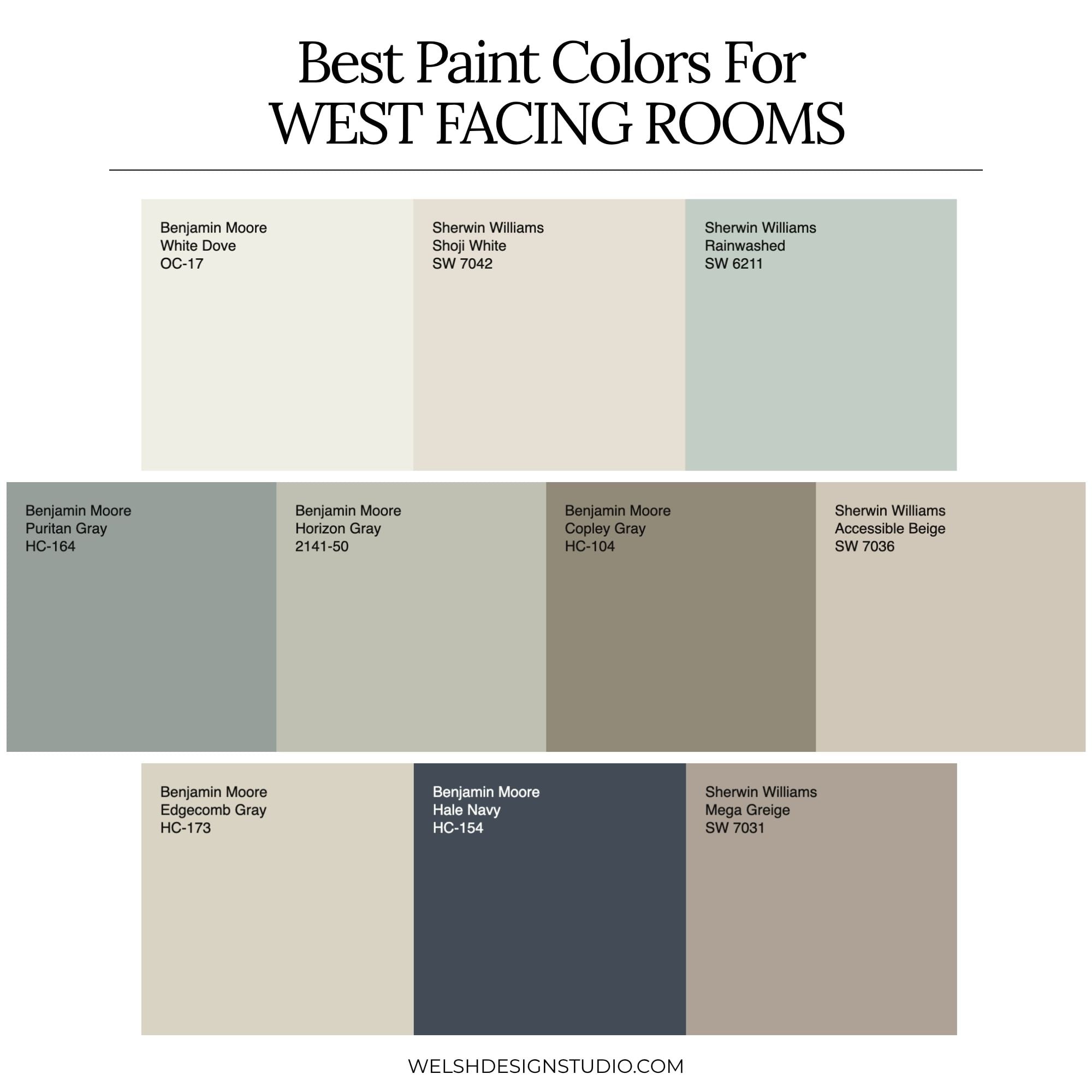
In this post, I’ll explain how west-facing light affects paint colors, which undertones tend to work best, and share 10 of my favorite paint colors for west facing rooms from Benjamin Moore and Sherwin-Williams.
Why Are West-Facing Rooms Challenging?
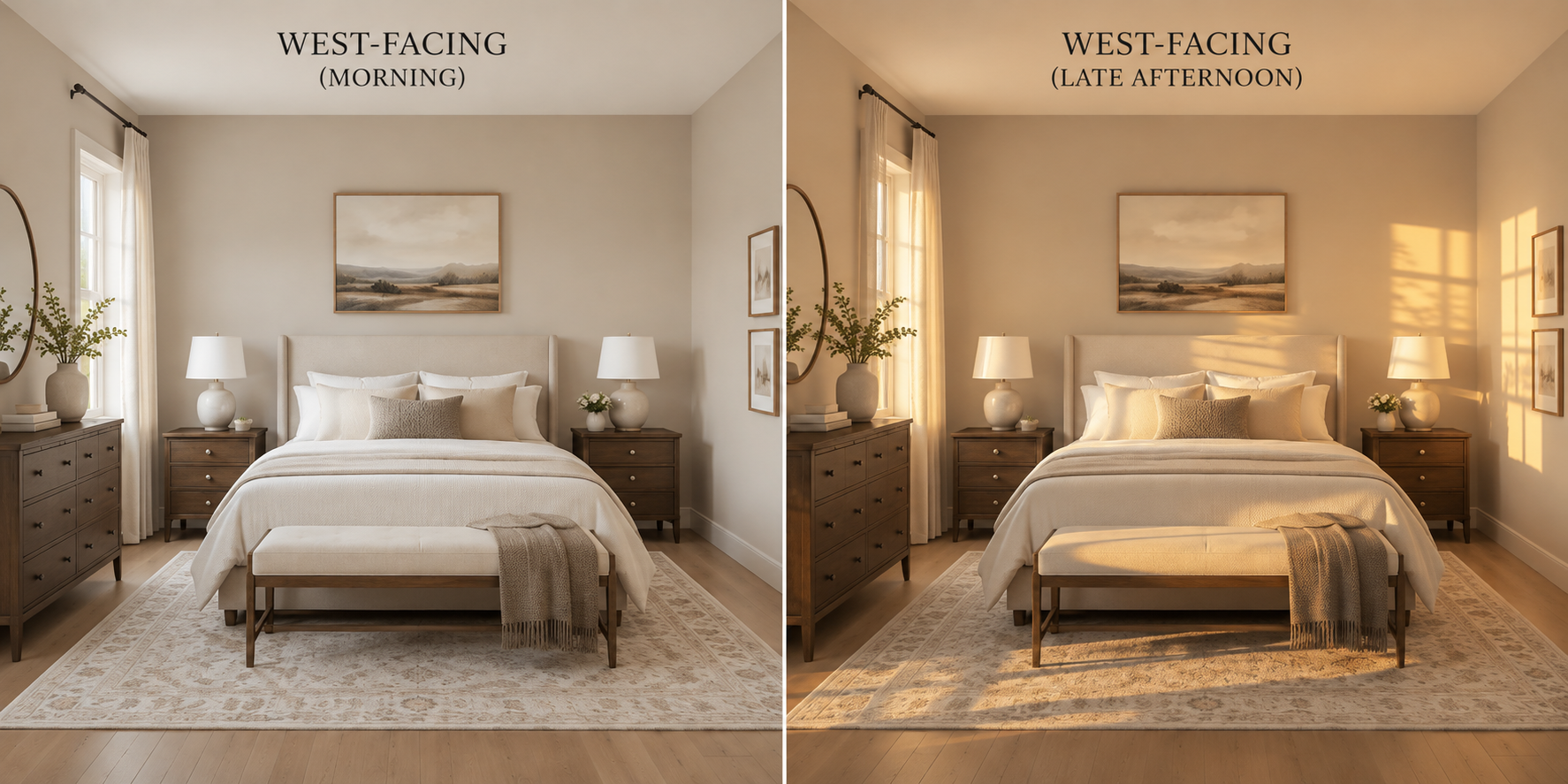
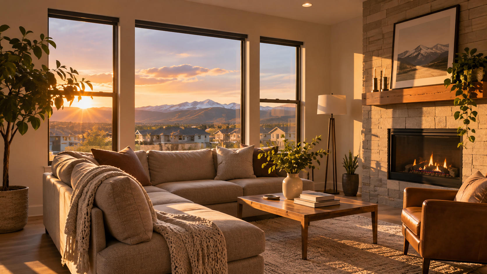
West-facing rooms get their strongest direct sunlight in the afternoon and early evening. That means the intensity and color of the natural light can change quite a bit throughout the day, making it a challenge to find paint colors that look good all day long.
Here’s what typically happens:
- Morning: West-facing rooms usually get indirect natural light. Colors can look cooler, grayer, or more subdued.
- Midday: As the sun moves across the sky, the room gradually becomes brighter, and paint colors can start to look warmer.
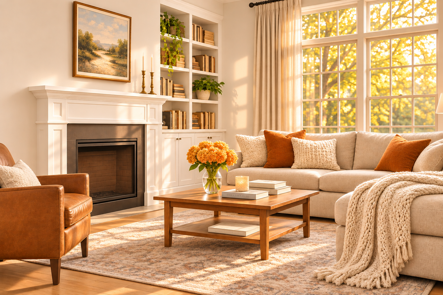
- Late afternoon: Direct western sunlight can be strong and golden, which emphasizes warm undertones and changes how colors look.
- Evening: As natural light fades, your artificial lighting takes over and influences the way the paint color appears.
This is why a paint color can look completely different at 9 a.m. than it does at 5 p.m. And it’s also why I don’t recommend choosing a paint color for a west-facing room based on a single paint sample that you look at once during the day (more on that later).
Not All West-Facing Rooms Have the Same Lighting
Before we talk about specific paint colors, there’s something important to understand. Two west-facing rooms can have very different lighting conditions.
You could have a large living room with several west-facing windows that receives hours of intense afternoon sunlight. Or, you might have a smaller bedroom with just one window, a covered patio outside, or trees blocking the sun, and it doesn’t get a lot of natural light.
The amount of light coming into your room depends on several things:
- The number, size, and location of your windows
- Trees, landscaping, and neighboring buildings/houses
- Roof overhangs and covered porches
- The time of year
- Window treatments
- The room’s other direcitonal exposures (if it has windows on more than one wall)
These details matter because a color that looks beautiful in a bright west-facing living room might look too dark or muddy in a smaller room with limited natural light.
Designer Tip: When choosing colors for a west-facing room, pay attention to how much direct afternoon sunlight actually enters the space. The direction the room faces tells you what to expect overall, but the room itself tells you how much of an impact that western exposure will be.
What Paint Colors Work Best in West-Facing Rooms?
The best paint colors for west-facing rooms are generally soft, muted colors that can handle both cooler morning light and warm afternoon sunlight.
Some of my favorite options include:
- Soft whites and off-whites with greige undertones
- Muted beiges and neutral greiges
- Warm grays without strong yellow or orange undertones
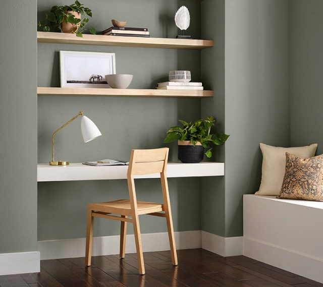
- Soft blue-greens and sage greens
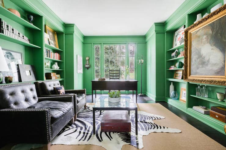
- Deeper, muted colors that create a cozy or dramatic atmosphere
That doesn’t mean you have to avoid warm colors altogether. In fact, warm neutrals can look absolutely beautiful in west-facing rooms! The key is understanding how much warmer a color might look when the afternoon sunlight hits it.
For example, a beige with strong yellow undertones could look much more golden than you want. A softer greige might work better, maintaining a more balanced look throughout the day. And, a muted blue or green could be a fantastic choice because the warm afternoon light will probably soften its cooler tones.
The truth is, there isn’t one perfect undertone for every west-facing room. Your mission (should you choose to accept it) is to find a color that you enjoy, as it changes its appearance throughout the day.
Which Paint Undertones Should You Avoid in West-Facing Rooms?
I can’t honestly say that there are paint colors you should never use, but you should be careful with certain undertones when you’re choosing paint colors for a west-facing room.
Strong Yellow and Orange Undertones
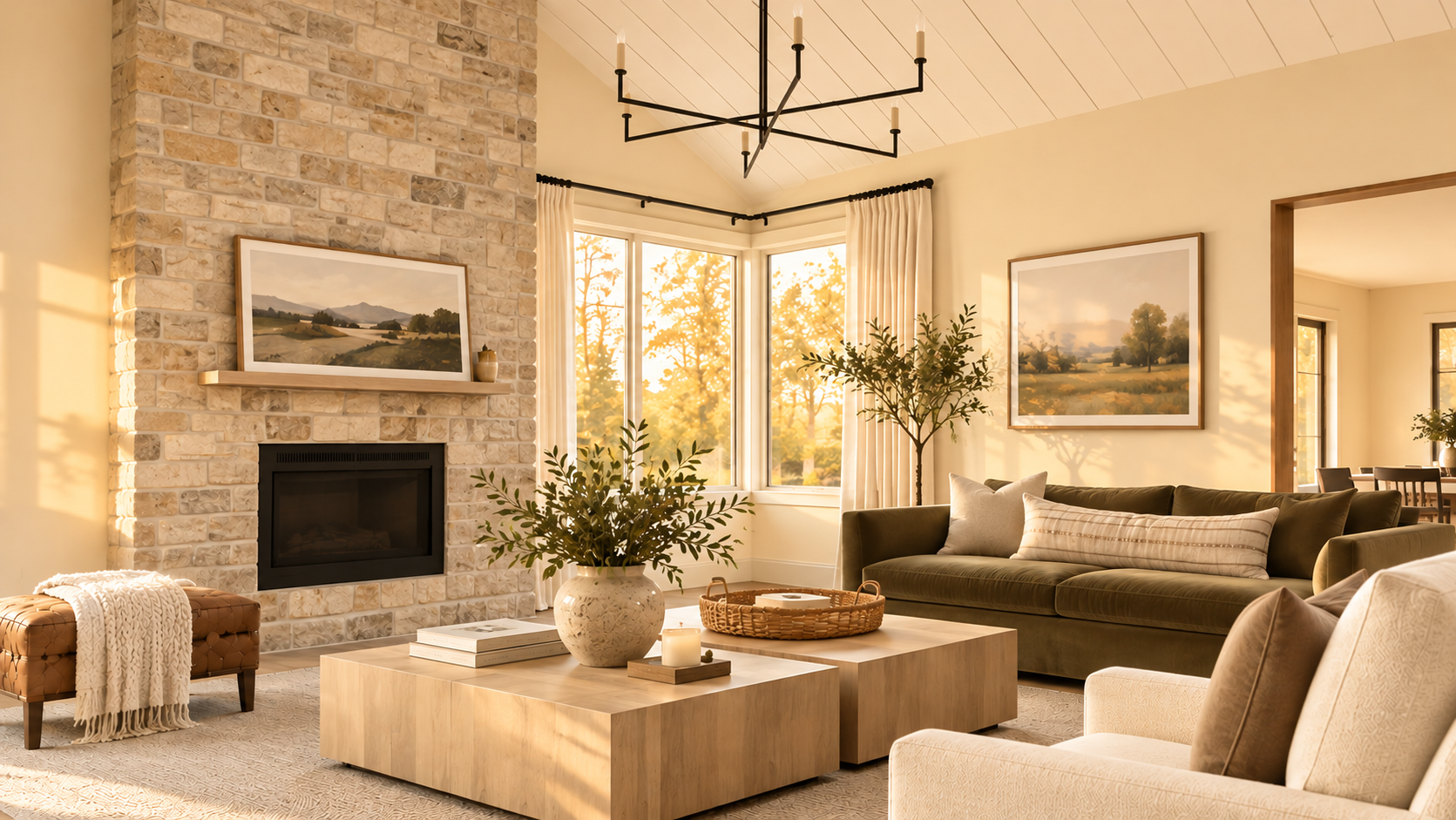
Because west-facing rooms receive warm, golden afternoon sunlight, yellow or orange undertones in a paint color will be amplified. This can be really challenging if you’re considering a creamy white or a warm beige for your room. A paint color that looks like a soft cream in the morning could look a lot more yellow in the afternoon.
That doesn’t necessarily make these colors a bad choice. If you want a warm, cozy room, that extra golden warmth might be exactly what you’re looking for. But if you’re hoping for a fairly neutral look throughout the day, I’d be pretty careful choosing a color with strong yellow or orange undertones.
Pink and Peach Undertones
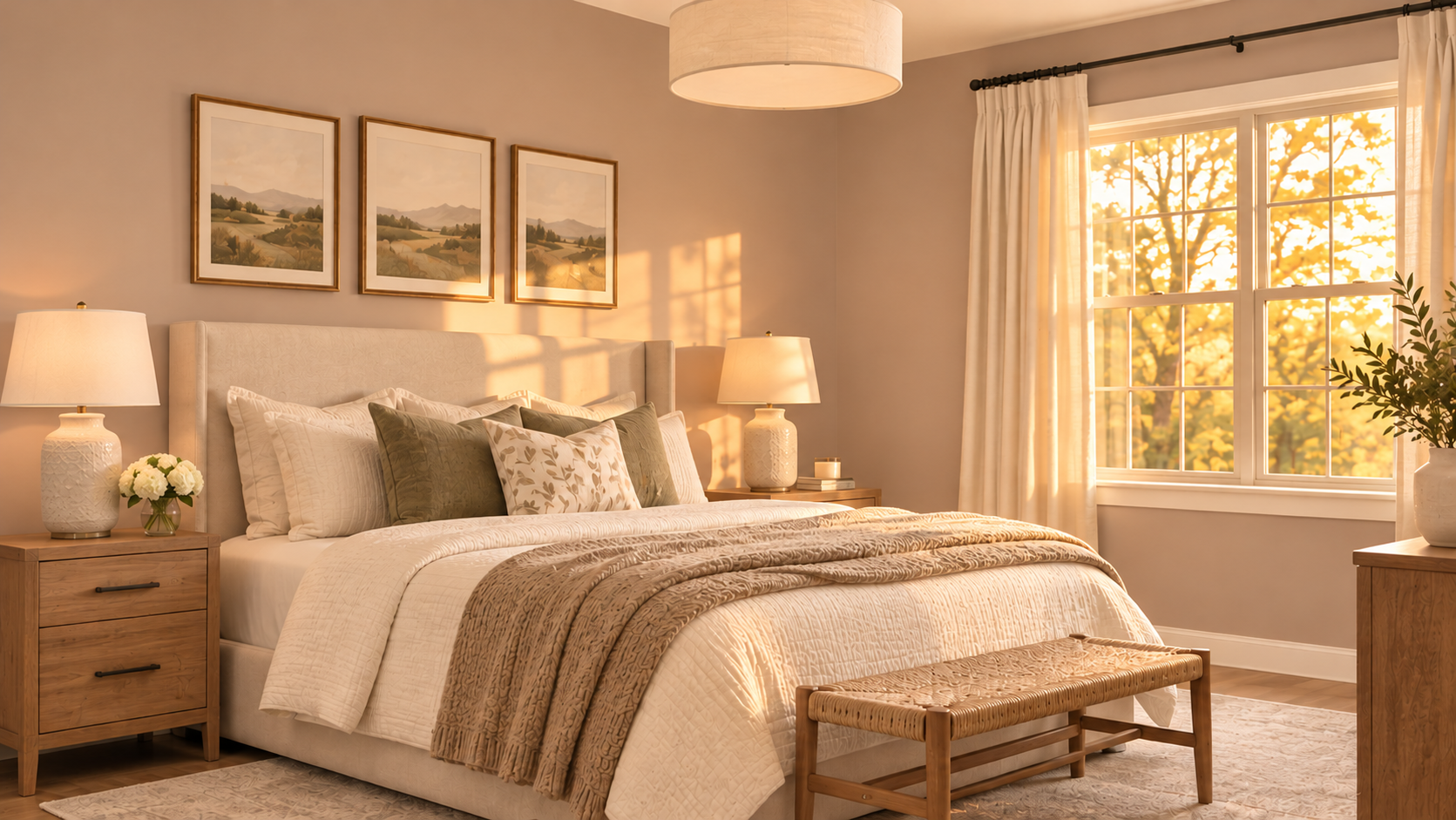
Some beige, taupe, and off-white paint colors have subtle pink or peach undertones. In warm afternoon sunlight, those undertones will become much more noticeable. Sometimes those undertones can work, but other times, they can make the room feel a lot pinker or peachier than you want.
Very Cool Grays
Cool grays can actually work well in west-facing rooms, especially when you want to balance or neutralize warm afternoon sunlight. But there’s a tradeoff.
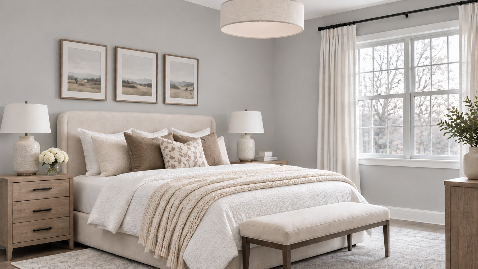
Because west-facing rooms get cooler, indirect light in the morning, a cool gray wall color could end up looking flat, icy, or slightly blue during those hours. If your room doesn’t get a lot of natural light until late afternoon, that cooler appearance could dominate much of the day. This is why I often lean toward grays that have a little warmth or softness rather than extremely cool, crisp grays.
If you want to learn more about how undertones affect paint colors, read my guide to understanding paint undertones.
Should You Choose Warm or Cool Paint Colors for West-Facing Rooms?
Here’s where choosing paint colors for west-facing rooms gets interesting because you can make a good argument for both warm and cool colors.
Warm paint colors can help a west-facing room feel more inviting during the morning hours (with cooler light coming in). However, they could become significantly warmer than desired in the afternoon.
Cool paint colors can balance the golden afternoon sunlight and create a softer, more modern look. However, they could feel much cooler or more gray than you want in the morning.
Neither choice is automatically better. Instead, think about the time of day when you use the room most often.
If You Use the Room Mostly in the Morning
Go with a soft warm neutral that won’t feel too cool when the room receives indirect light. Colors like Benjamin Moore Edgecomb Gray or Sherwin-Williams Accessible Beige are worth testing.
If You Use the Room Mostly in the Afternoon
Choose a balanced neutral or muted cooler color that can handle strong golden sunlight. Sherwin-Williams Rainwashed, Benjamin Moore Horizon Gray, and Benjamin Moore Puritan Gray are intriguing options because their cooler undertones create a beautiful contrast with warm afternoon light.
If You Use the Room Throughout the Day
I’d start with a muted, relatively balanced neutral. Something like Benjamin Moore White Dove, Sherwin-Williams Accessible Beige, and Benjamin Moore Edgecomb Gray are all good options to sample. The important thing is to evaluate how each color changes throughout the day, rather than expecting it to stay exactly the same.
How Does LRV Affect Paint Colors in West-Facing Rooms?
Another important consideration is a paint color’s Light Reflectance Value (LRV). LRV measures how much visible light a paint color reflects on a scale from 0 to 100.
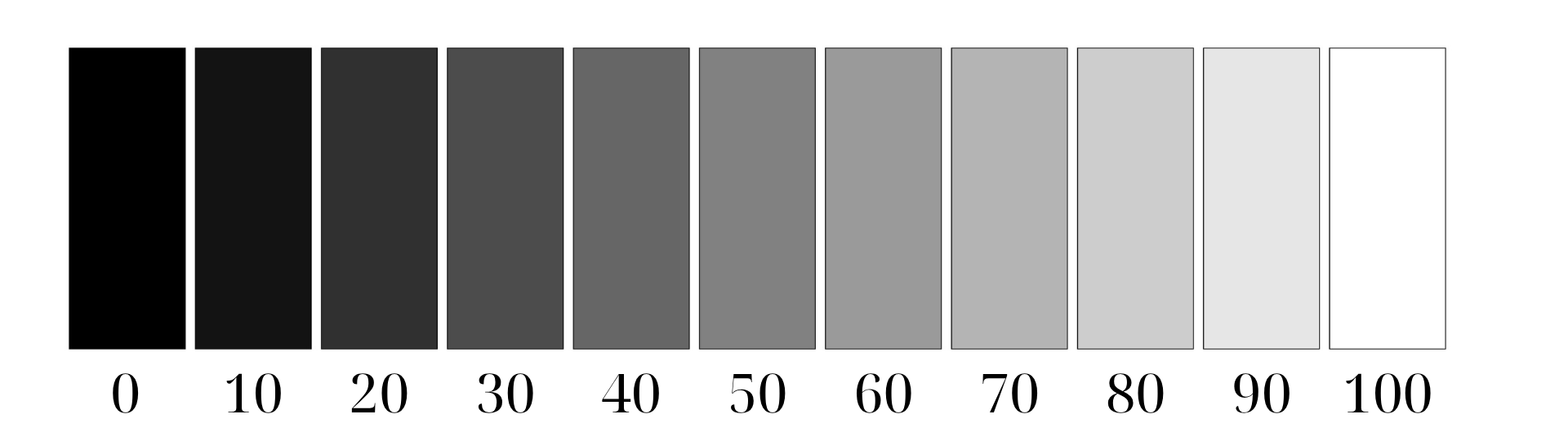
- LRV 0: Black, reflects almost no light
- LRV 100: Bright white, reflects nearly all light
- Higher LRV: Lighter colors that reflect more light
- Lower LRV: Darker colors that absorb more light
In a west-facing room, LRV can influence how a paint color feels at different times of day. A high-LRV white can look bright and airy when the afternoon sun pours into the room. But in a room with limited morning light, it might look more muted than you expected.
A medium-LRV greige could look cozy in the morning, but then become significantly brighter when direct sunlight reaches the walls in the afternoon. And a deep navy blue might look almost like a charcoal gray in low light, but then reveal more of its blue tones in stronger sunlight.
What LRV Is Best for West-Facing Rooms?
There isn’t a single perfect LRV for western exposure. Instead, I’d use the amount of natural light and the mood you want to create as a guide.
| LRV Range | What to Expect |
|---|---|
| 70+ | Light, airy colors that reflect plenty of light |
| 55–70 | Light to medium colors that offer some softness and depth |
| 35–55 | Medium-depth colors that can feel cozy and grounded |
| Below 35 | Darker colors that create a more dramatic, moody look |
If you have a small west-facing bedroom that stays dim until late afternoon, you might want to go with a lighter wall color (higher LRV). But if you have a bright living room with large windows, a medium or even dark color could be beautiful.
You can learn more in my complete guide to Light Reflectance Value (LRV) and paint colors.
The 10 Best Paint Colors for West-Facing Rooms
Now that you know more than you ever wanted to know about how western light affects paint colors, let’s look at some specific paint color recommendations.
I’ve included a range of whites, off-whites, warm neutrals, muted greens and blues, and deeper colors. For each one, I’ll explain its undertones, how it may look in a west-facing room, and where I think it works best.
Remember that these are colors I recommend putting on your list of colors to sample…they’re not guaranteed perfect wall colors for every room. Your flooring, furnishings, lighting, and other surrounding colors can all affect the final appearance of a wall color, so testing is key!
1. Benjamin Moore White Dove (OC-17)
Benjamin Moore White Dove is a soft, warm white with subtle creamy and gray tones. It’s one of my favorite white paint colors because it has enough warmth to avoid looking stark, but it doesn’t have the heavy yellow look of some traditional creamy whites.
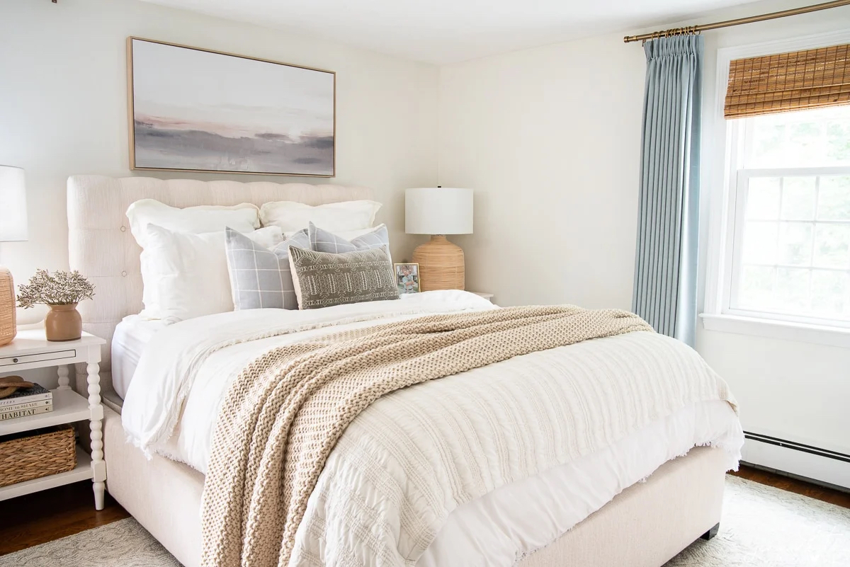
LRV: 83
Undertones: Soft warm, creamy undertones with a subtle gray influence.
In a west-facing room: White Dove will look like a gentle, slightly muted white in the morning. As the afternoon sunlight becomes warmer, its creamy tones can become more noticeable. Because it’s a fairly soft white, I think it’s a good option for homeowners who want a bright, inviting room without choosing a crisp, cool white. However, in rooms with very strong golden sunlight, you’ll still want to make sure it doesn’t look creamier than you want.
Best For: Living rooms, bedrooms, kitchens, and homeowners who want a soft white that feels welcoming rather than stark.
For more details, see my Benjamin Moore White Dove paint color review.
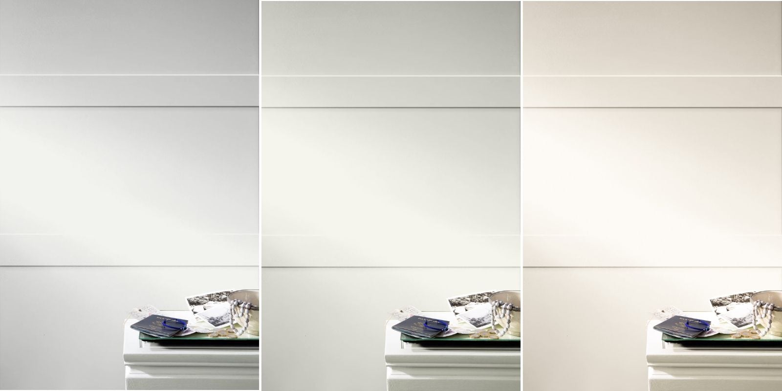
2. Sherwin-Williams Shoji White (SW 7042)
Sherwin-Williams Shoji White is a warm, muted off-white with beige and gray undertones. Compared with White Dove, Shoji White has a little more depth to it (it’s darker). It’s a great choice when you want light walls but don’t necessarily want them to look white-white.

LRV: 74
Undertones: Warm beige and greige, with subtle earthy influences.
In a west-facing room: Shoji White could look more greige in the morning, then warmer and creamier in the afternoon. Its muted quality keeps the color from looking too bright or stark when strong sunlight enters the room.
Best For: Living rooms, bedrooms, and open-concept spaces where you want a soft, warm off-white with more depth than a traditional white.
For more about Shoji White, see my Sherwin-Williams Shoji White paint color review.
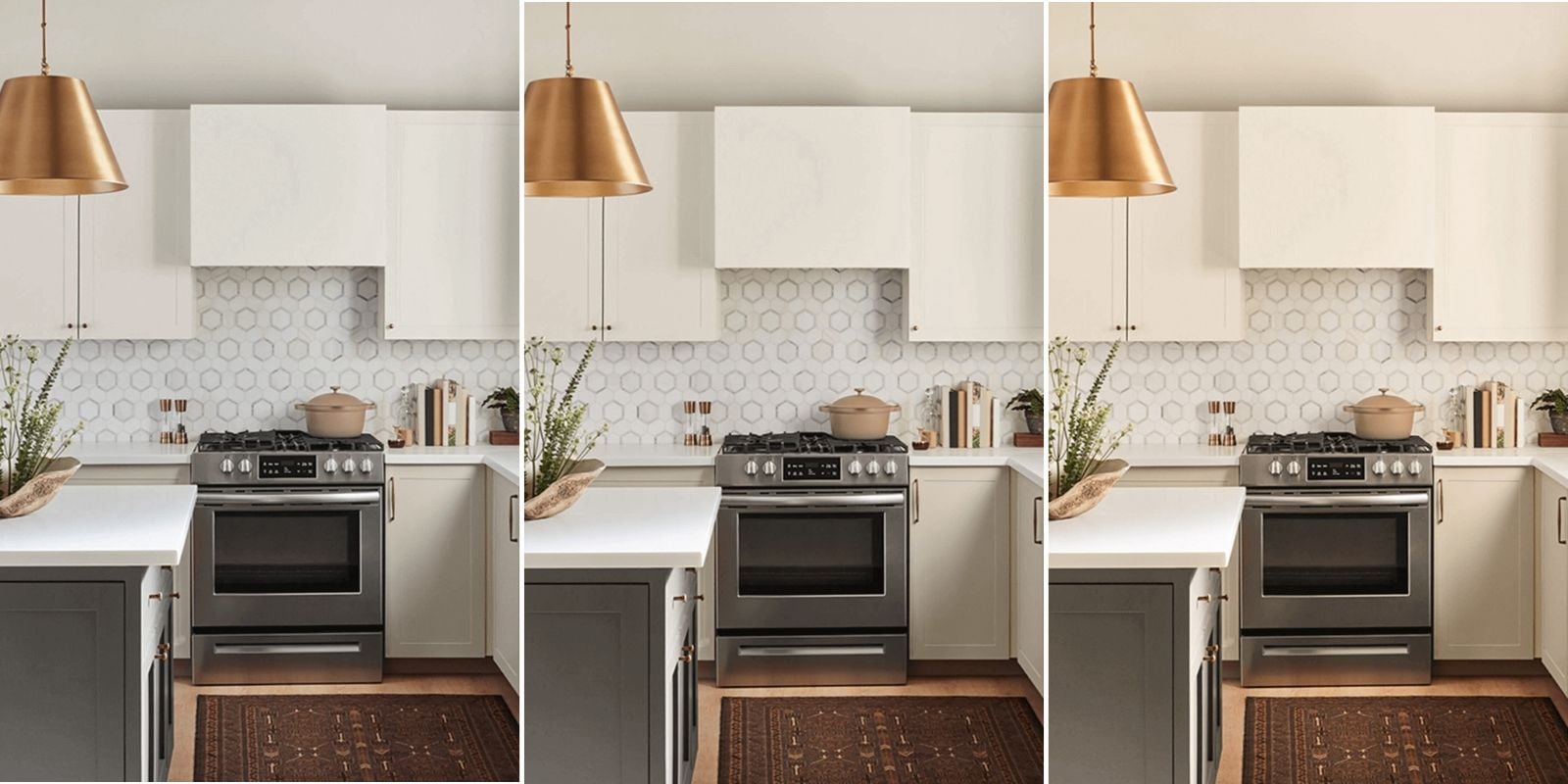
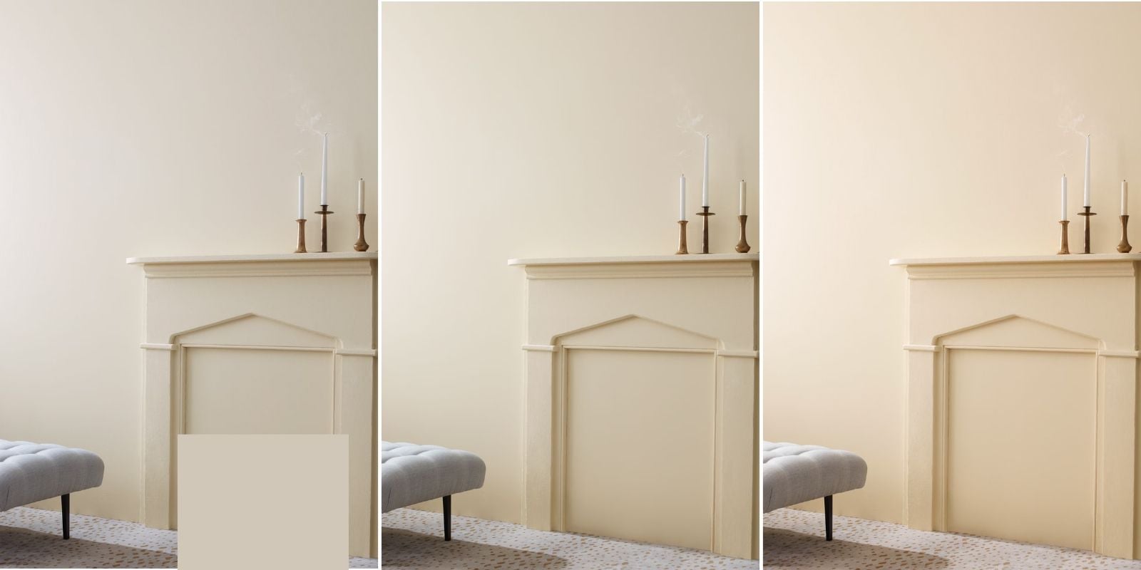
3. Benjamin Moore Edgecomb Gray (HC-173)
Benjamin Moore Edgecomb Gray is a light, warm greige that sits somewhere between gray and beige. It’s one of those versatile neutrals that can look slightly different depending on the lighting and surrounding colors.
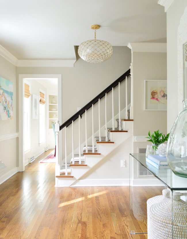
LRV: 63
Undertones: Warm beige-gray.
In a west-facing room: Edgecomb Gray could look a little grayer or more muted in the morning. As the afternoon sunlight becomes warmer, its beige undertones will become more noticeable. I recommend Edgecomb Gray for homeowners who want a warm, easy-going neutral without choosing a traditional yellow-beige. However, it can still look quite warm in strong western sunlight, so I would definitely test it during the late afternoon.
Best For: Living rooms, bedrooms, hallways, and homeowners who want a light greige that feels soft and inviting.
You can read more in my Benjamin Moore Edgecomb Gray paint color review.
4. Sherwin-Williams Rainwashed (SW 6211)
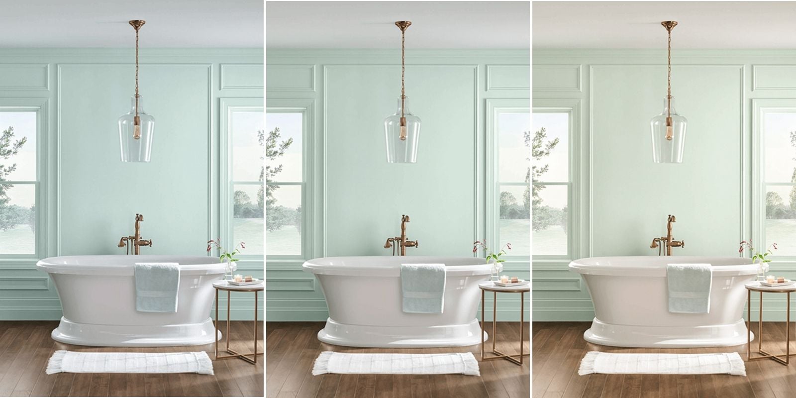
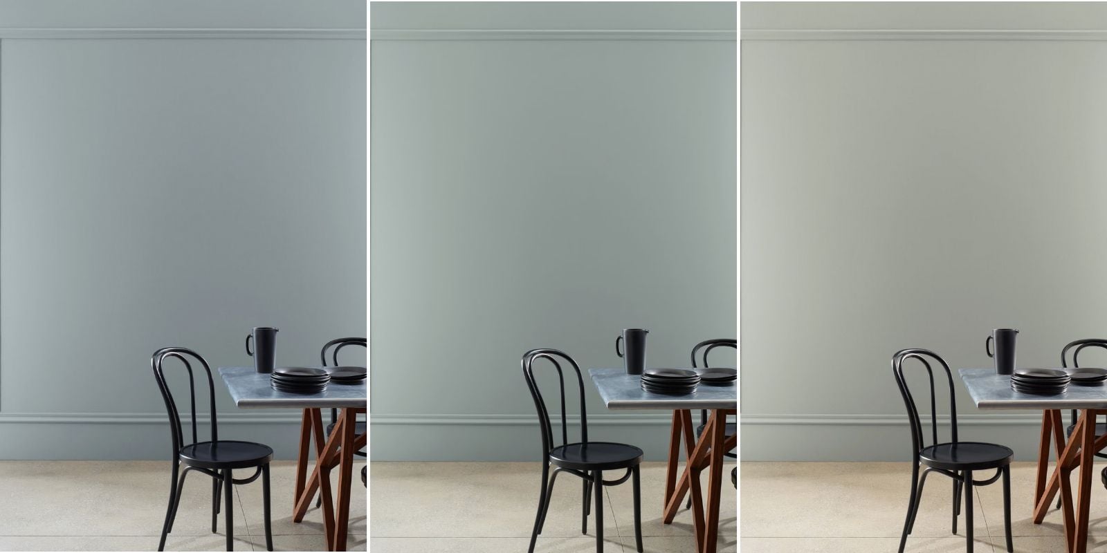
Sherwin-Williams Rainwashed is a soft blue-green with gray undertones. It’s a beautiful option for homeowners who want to add some color without making the room feel bold or overly saturated.
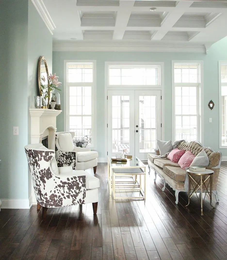
LRV: 59
Undertones: Muted blue-green with a soft gray influence.
In a west-facing room: Rainwashed can look cooler and more blue-gray in the morning. As the golden afternoon light enters the room, it will soften the blue tones and make the green tones a little more noticeable.
This is a great example of how a cooler paint color can balance warm western sunlight. Rather than making the room feel cold, the combination of a muted blue-green and warm natural light can create a soft, relaxing atmosphere. Just keep in mind that your room’s lighting and finishes might call for a color that leans more blue or more green to get the best overall look.
Best For: Bedrooms, bathrooms, living rooms, and homeowners who want a calm, subtle blue-green.
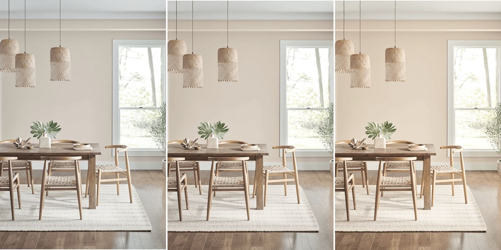
5. Sherwin-Williams Accessible Beige (SW 7036)
Sherwin-Williams Accessible Beige is a warm greige with beige, gray, and very subtle green undertones. It’s darker than Edgecomb Gray, making it a good option for homeowners who want a slightly richer neutral.

LRV: 58
Undertones: Warm beige-gray with a very subtle green influence.
In a west-facing room: Accessible Beige can look more greige in the morning. In golden afternoon sunlight, its warm beige undertones can become more pronounced. What I like about Accessible Beige is that its gray undertones can help keep it from looking like a traditional golden beige.
Best For: Living rooms, dining rooms, bedrooms, and homeowners who want a warm neutral with a little more depth.
For a closer look at this color, read my Sherwin-Williams Accessible Beige review.
6. Benjamin Moore Horizon Gray (2141-50)
Benjamin Moore Horizon Gray is a muted gray-green. It’s more neutral and earthy than Rainwashed, making it a great choice for homeowners who like green but don’t necessarily want their walls to look distinctly green.
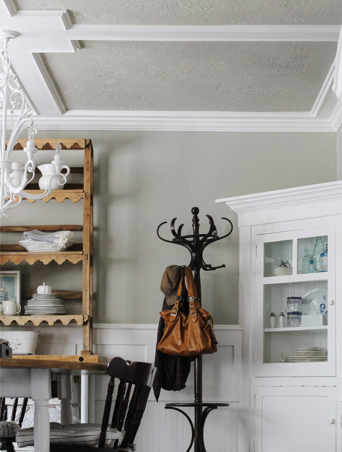
LRV: 51
Undertones: Soft sage green with a strong gray influence.
In a west-facing room: Horizon Gray may look more gray than green in the morning. In golden afternoon sunlight, its green undertone may take on a warmer, earthier look, potentially leaning toward a muted olive or khaki-sage.
I like Horizon Gray because it offers an alternative to the usual beige and greige neutrals while still feeling understated. However, this is one color I’d make sure to test next to flooring and fixed finishes. Warm western light and yellow-toned wood floors could make the green appear more olive than you intended.
Best For: Bedrooms, home offices, living rooms, and homeowners who want a subtle, earthy sage green.

7. Benjamin Moore Copley Gray (HC-104)
Despite its name, Benjamin Moore Copley Gray is not what I’d consider a traditional cool gray. It’s a deep, earthy gray-brown neutral with a soft green cast. That combination gives it a cozy, grounded look that can sometimes lean toward olive or khaki. It’s also darker than the lighter neutrals on this list, which makes it a solid pick for homeowners who want a wall color with a little more personality.
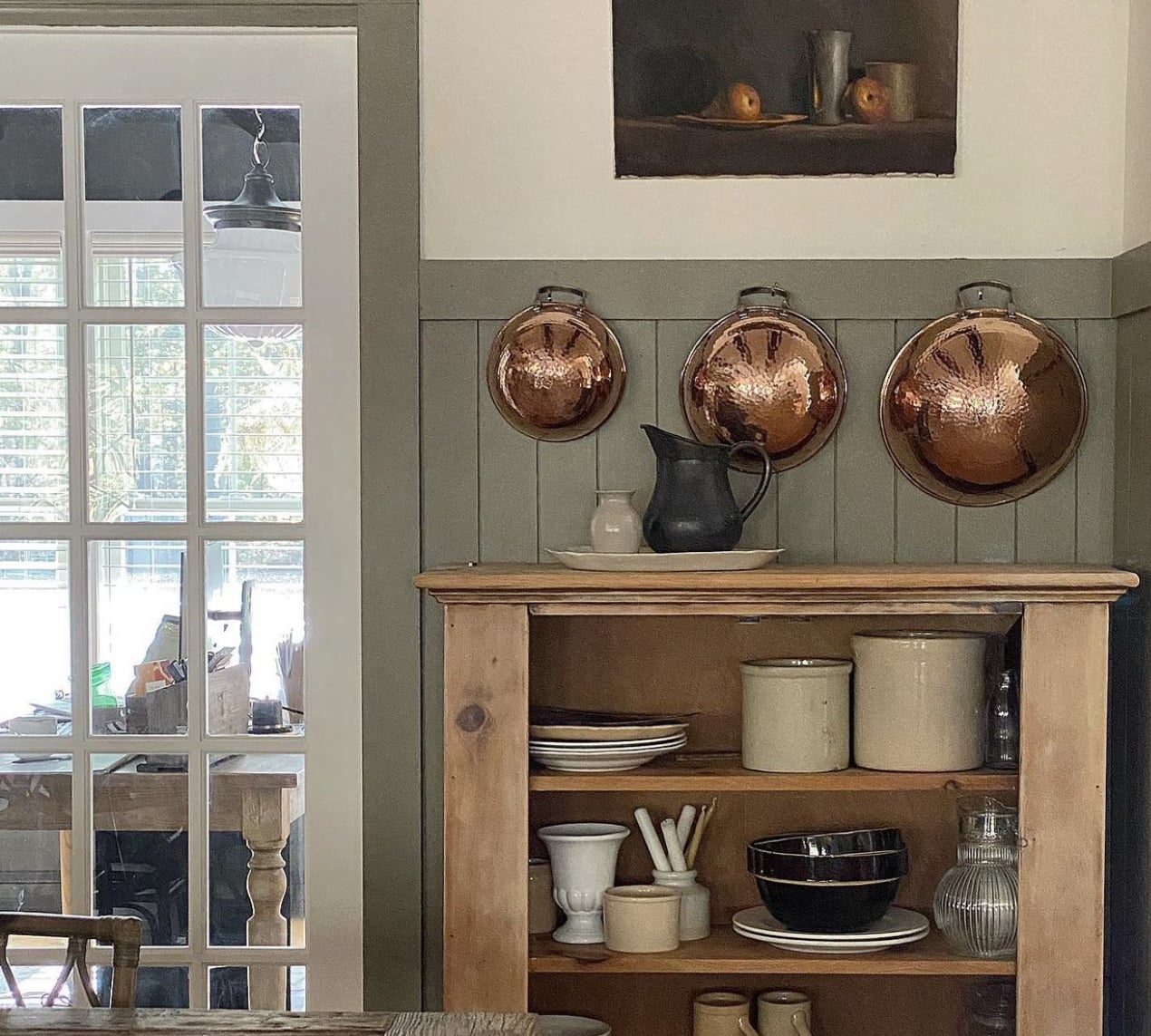
LRV: 26
Undertones: Warm earthy brown and gray with a muted green influence.
In a west-facing room: In the morning, Copley Gray could look darker, grayer, and more muted. As the warm afternoon sunlight enters the room, its brown and olive undertones will become stronger.
I love the idea of using this color when you want to embrace the warmth of western light rather than fight against it. However, its green undertone deserves attention. If you have yellow-orange wood flooring or warm beige tile, Copley Gray could look more olive or muddy than you want in the afternoon.
Best For: Dining rooms, bedrooms, home offices, accent walls, and homeowners who want a rich, earthy neutral with a subtle green character.
Designer Note: Copley Gray is a great example of why you shouldn’t choose paint colors based on their names. Although it has “gray” in its name, this color has a warm, earthy appearance that is quite different from a typical neutral gray.
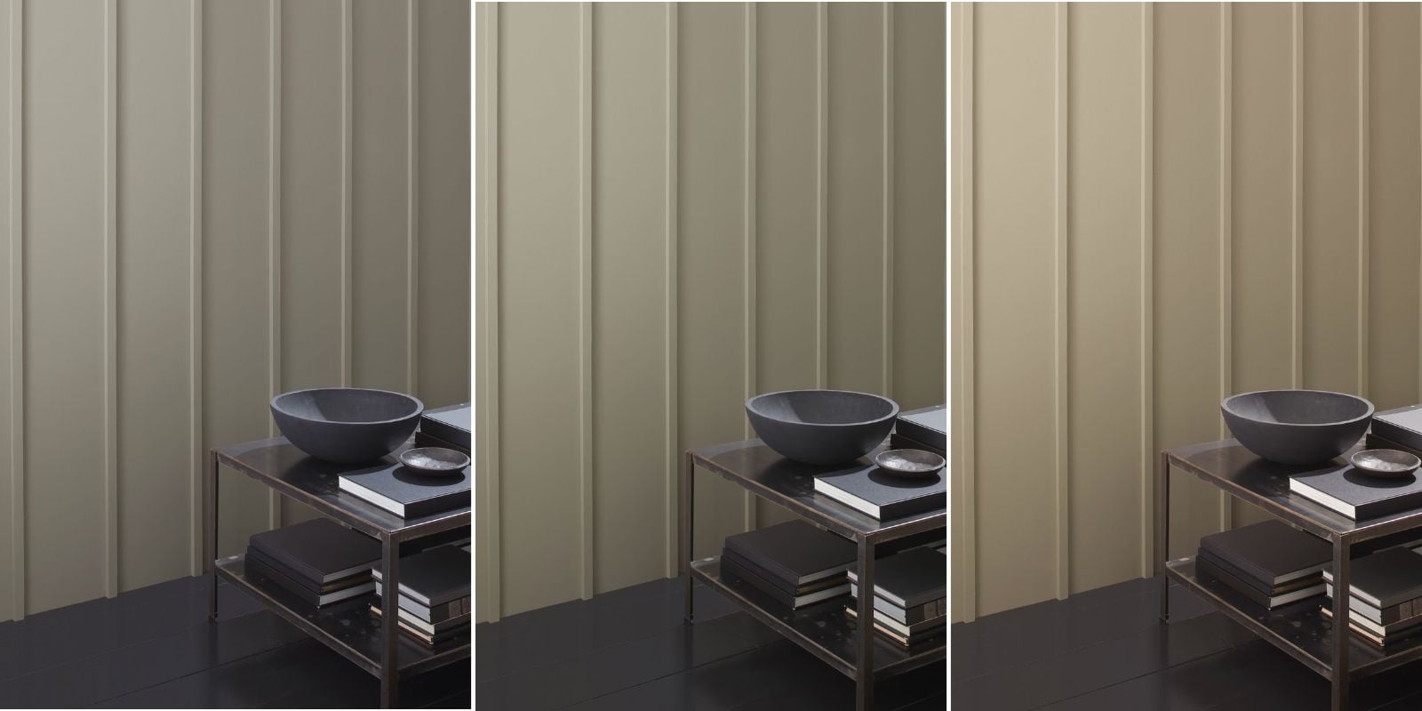
8. Benjamin Moore Puritan Gray (HC-164)
Benjamin Moore Puritan Gray is a muted, medium-dark blue-gray. Unlike Copley Gray, which leans earthy and warm, Puritan Gray has a much cooler blue undertone. It’s a beautiful option when you want more depth and color than a light gray but don’t want to commit to a dramatic navy.
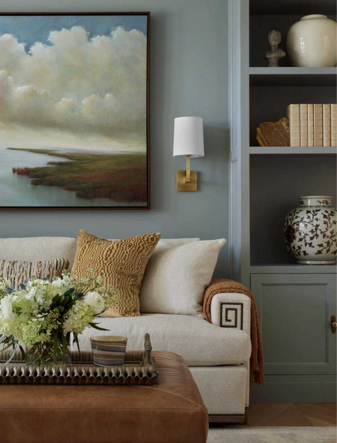
LRV: 34
Undertones: Muted blue-gray with a soft, smoky appearance.
In a west-facing room: Puritan Gray will look cooler and grayer in the morning. As warm afternoon sunlight enters the room, it can soften the gray tones and create a sophisticated, balanced look. One thing to watch for is how Puritan Gray looks in rooms with limited natural light. Because it has a relatively low LRV, it could look darker and moodier than expected in some rooms.
Best For: Bedrooms, dining rooms, home offices, and living rooms where you want a muted blue-gray with some depth.
Designer Note: If you love the idea of a blue room but worry about choosing something too bold or colorful, Puritan Gray is worth a look. Its gray undertones will keep the blue feeling sophisticated and understated.
9. Sherwin-Williams Mega Greige (SW 7031)
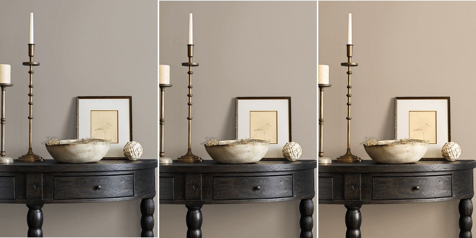
Sherwin-Williams Mega Greige is a medium-depth warm greige with noticeable brown and beige undertones. It is significantly darker than Accessible Beige or Edgecomb Gray, making it a good option for homeowners who want a richer, more grounded neutral.

LRV: 37
Undertones: Warm brown, beige, and gray influences.
In a west-facing room: Mega Greige will look darker and more gray during morning hours, especially in rooms without much a lot of natural light. In the afternoon, the color will look brighter, warmer, and browner.
I recommend Mega Greige for homeowners who want a cozy, earthy vibe rather than a light, airy room. However, I wouldn’t choose it if your goal is to minimize warmth. In a room with strong golden sunlight and orange-toned wood floors, Mega Greige could become warmer and browner than you expect.
Best For: Living rooms, dining rooms, bedrooms, and accent walls where you want a medium-depth warm neutral.
10. Benjamin Moore Hale Navy (HC-154)
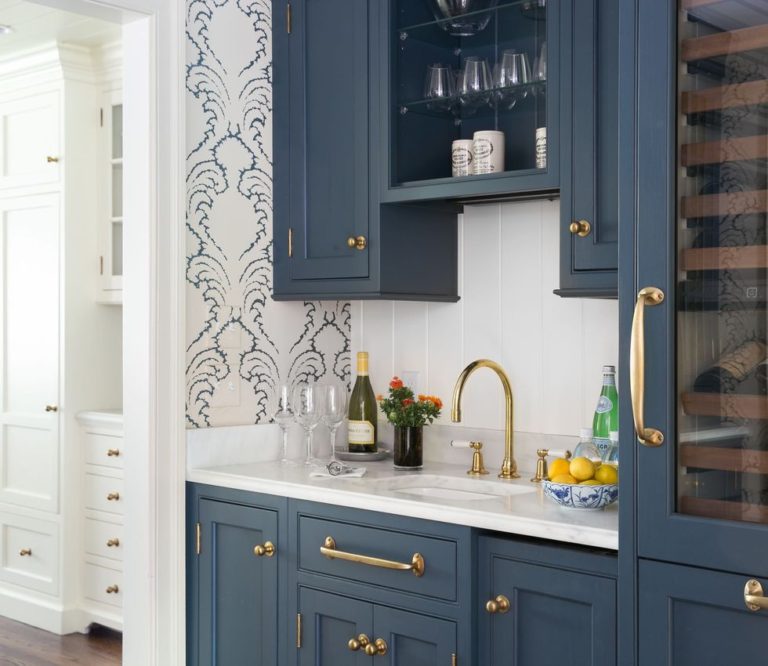
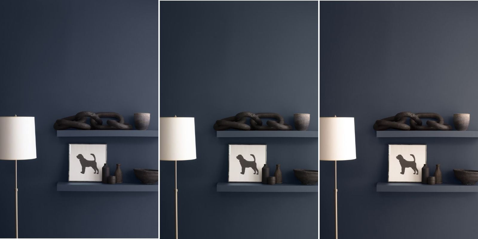
Benjamin Moore Hale Navy is a classic, deep, muted navy blue. It’s much darker than the other colors on this list, but I wanted to include it because west-facing rooms don’t have to be painted only light colors.

LRV: 8
Undertones: Deep blue with gray undertones.
In a west-facing room: Hale Navy could look very dark and more gray or even a little flat in the morning (especially if your room doesn’t get a lot of natural light). In the afternoon, Hale Navy will look more blue and is beautiful in rooms with warm golden light.
I really like the idea of Hale Navy in a west-facing dining room, bedroom, or home office where you want a cozy, dramatic look. Just remember that a color with such a low LRV will absorb a lot of light. If the room is already dark, Hale Navy will make it feel even more cave-like. Of course, that’s not necessarily a problem if you’re intentionally creating a moody space.
Best For: Bedrooms, dining rooms, home offices, accent walls, and homeowners who want a rich, dramatic navy.
You can read more about Hale Navy in my Benjamin Moore Hale Navy paint color review post.
Quick Reference: Which Paint Color Is Right for Your West-Facing Room?
Here’s a quick comparison of the ten colors to help you narrow down your options.
|
Paint Color |
LRV |
Best For |
|
BM White Dove |
83 |
A soft, bright white |
|
SW Shoji White |
74 |
A muted, warm off-white |
|
BM Edgecomb Gray |
63 |
A light, warm greige |
|
SW Rainwashed |
59 |
A calming blue-green |
|
SW Accessible Beige |
58 |
A warm greige with more depth |
|
BM Horizon Gray |
51 |
An earthy sage gray-green |
|
BM Copley Gray |
26 |
A deep, earthy gray-green neutral |
|
BM Puritan Gray |
34 |
A muted, medium-dark blue-gray |
|
SW Mega Greige |
37 |
A rich, warm greige |
|
BM Hale Navy |
8 |
A dramatic, deep navy |
My Quick Recommendations
- If you want a soft white: Start with BM White Dove.
- If you want a warm off-white: Try SW Shoji White.
- If you want a light greige: Consider BM Edgecomb Gray.
- If you want a slightly deeper warm neutral: Try SW Accessible Beige.
- If you want a subtle blue-green: Try SW Rainwashed.
- If you want a muted sage green: Consider BM Horizon Gray.
- If you want a deeper earthy neutral: Try BM Copley Gray.
- If you want a medium-dark blue-gray: Consider BM Puritan Gray.
- If you want a rich warm greige: Try SW Mega Greige.
- If you want a dark, dramatic color: Consider BM Hale Navy.
These recommendations are starting points. The right choice for your home still depends on your room’s lighting, finishes, and overall color palette.
Can You Use Dark Paint Colors in West-Facing Rooms?
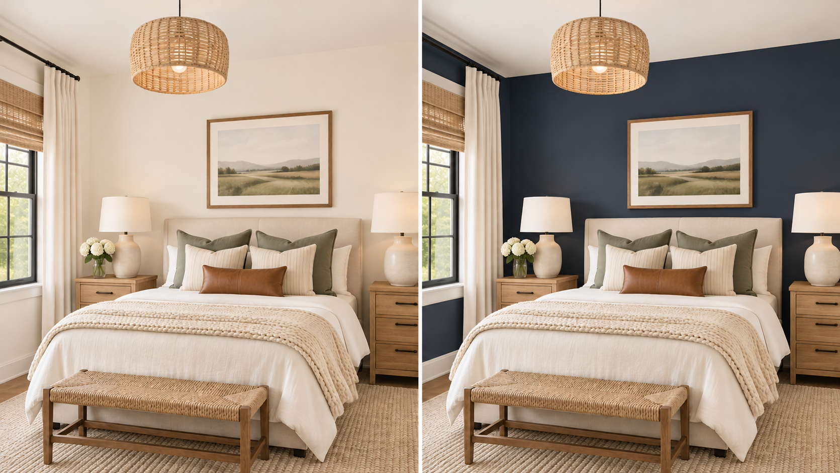
Absolutely! One of the most common decorating myths is that dark rooms should always be painted light colors. But light paint doesn’t automatically make a room feel bright, and dark paint doesn’t automatically make a room feel smaller in a bad way. A darker color can create a warm, cozy, moody feeling in a room.
In a west-facing room, dark paint colors can also change dramatically throughout the day.
- A deep navy like Hale Navy could look almost like a charcoal in the morning, then unveil more of its blue tones when the afternoon sun comes into the room.
- A muted blue-gray like Puritan Gray could look more blue in the morning, and then feel softer and more gray later in the day.
- And an earthy neutral like Copley Gray can become warmer and richer when the golden afternoon light enters the room.
The important question isn’t whether a dark paint color is okay to put in a west-facing room…it’s whether the look created by that darker color is what you want. If you’re decorating a bedroom, dining room, or home office, a darker color might be a great choice. If you’re decorating a small room where you want a bright, airy feeling throughout the day, you’ll probably want something lighter.
For more ideas about decorating a smaller space, read my post about how to make a room look bigger.
How to Choose the Best Paint Color for Your West-Facing Room
Now that we’ve covered the paint colors, let’s talk about how to narrow down your choices. When I’m choosing paint colors for a room, I don’t automatically choose colors that are the most popular. I start by taking a good look at the room itself. Here are five questions I’d recommend asking yourself before making your final decision.
1. When Do You Use the Room Most Often?
This is a really important question for west-facing rooms. If you spend most of your time in the room during the morning, you’ll want to choose a color that looks good in cooler, indirect light. If you use the room mostly in the afternoon or early evening, warm western sunlight becomes a bigger factor. And if you use the room throughout the day, you’ll want a color that you enoy in both lighting conditions. There’s no reason to optimize a room for beautiful afternoon sunlight if you’re rarely home to enjoy it.
2. How Much Natural Light Does the Room Receive?
Not every west-facing room is bright. Look at the size and number of windows, nearby trees, roof overhangs, and anything else that might block the sunlight. A bright west-facing living room can handle a wider range of paint depths (light vs dark). But, a small bedroom with one window might need a lighter color.
3. What Colors Are Already in the Room?
This is one of the most important questions, and it’s something homeowners frequently overlook. Your paint color needs to work with the elements that are staying in the room. That includes things like your:
- Flooring
- Countertops
- Tile
- Cabinets
- Carpet
- Large pieces of furniture
For example, a warm greige might look beautiful in a room with neutral flooring but look unexpectedly green or gray next to orange-toned hardwood. Similarly, a muted sage green might look lovely with natural wood and warm whites but appear too cool next to certain yellow-beige finishes.
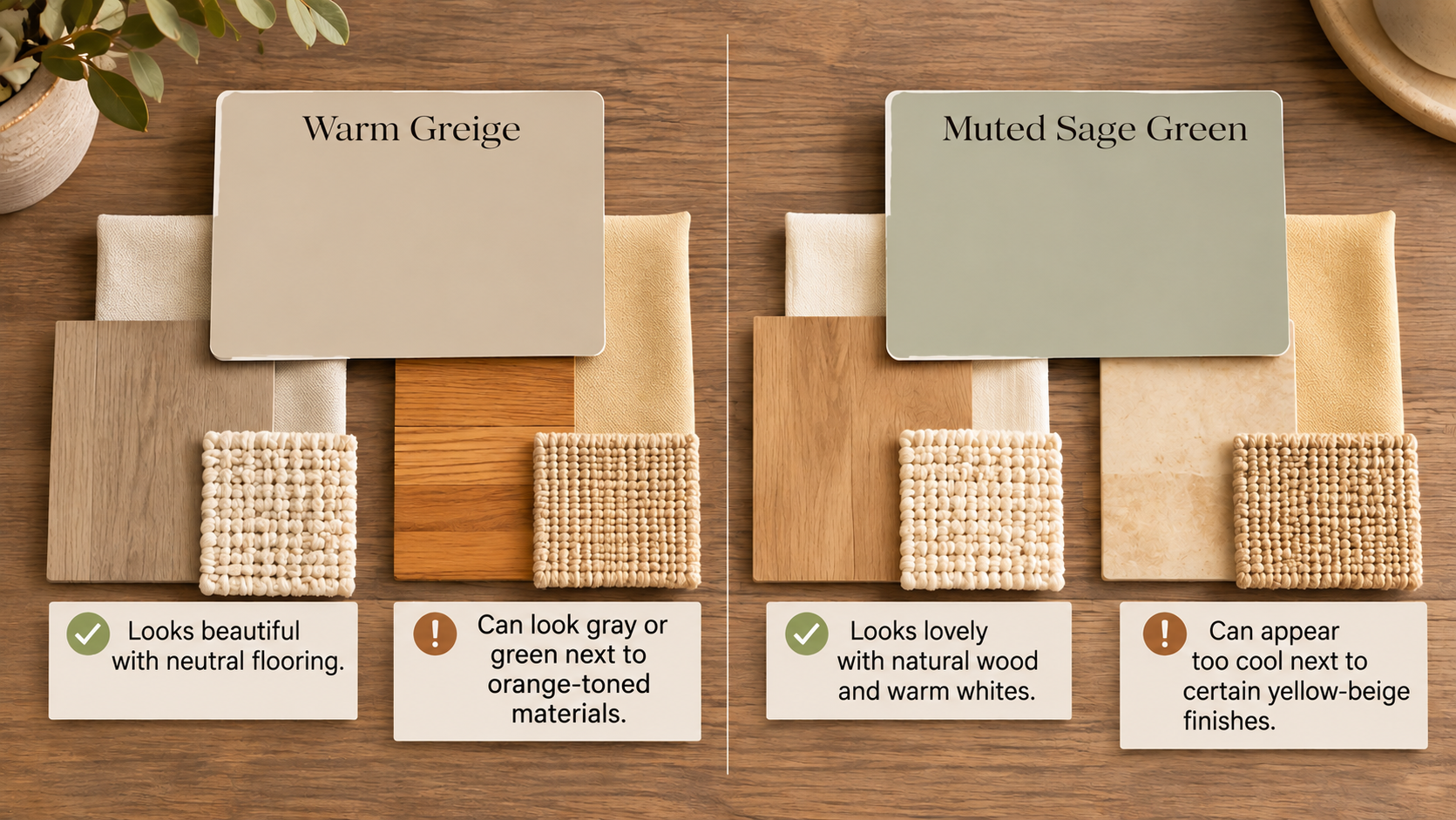
The best paint color isn’t just the one that works with your lighting. It’s the one that works with your entire room.
If you’re struggling with paint colors for gray flooring, my post about choosing wall colors with gray floors may help.
4. Do You Want the Room to Feel Light and Airy or Cozy and Grounded?
This is where LRV becomes especially helpful. If you want a bright, airy vibe in the room, I’d start with BM White Dove, SW Shoji White, or BM Edgecomb Gray. If you want something softer and more grounded, consider SW Accessible Beige, Rainwashed, or Horizon Gray. And if you’re hoping to create a cozy, dramatic space, Copley Gray, Puritan Gray, Mega Greige, or Hale Navy might be worth exploring.
Don’t choose a paint color based solely on how much light it reflects. Think about the feeling you want to create.
5. How Does the Color Work With Your Whole-House Palette?
If your west-facing room connects visually to other spaces nearby, think about how the colors will look together.You don’t necessarily need to paint every room the same color, but the colors should feel like they belong together, especially when you can see multiple rooms from the same vantage point.
For example, if the rest of your home has warm, earthy neutrals, a very cool blue-gray might feel disconnected. On the other hand, a muted blue-green like Rainwashed could provide some beautiful color while still coordinating with the overall palette.
For help creating a cohesive color scheme, see my guide to choosing a whole-house color palette.
How to Test Paint Colors in a West-Facing Room
Once you’ve narrowed your choices to two or three colors, it’s time to test them. And for west-facing rooms, this step is especially important. You need to see how the colors look in both the cooler morning light and the warmer afternoon sunlight. Here’s the process I recommend.

Step 1: Narrow Your Choices to Two or Three Colors
Don’t bring home fifteen paint samples and start putting them all over the walls. That’s a recipe for chaos and confusion. Instead, use what you’ve learned about undertones, LRV, and your room’s existing finishes to narrow your options. Then, choose two or three colors that seem like the best fit.
Step 2: Use Large Paint Samples
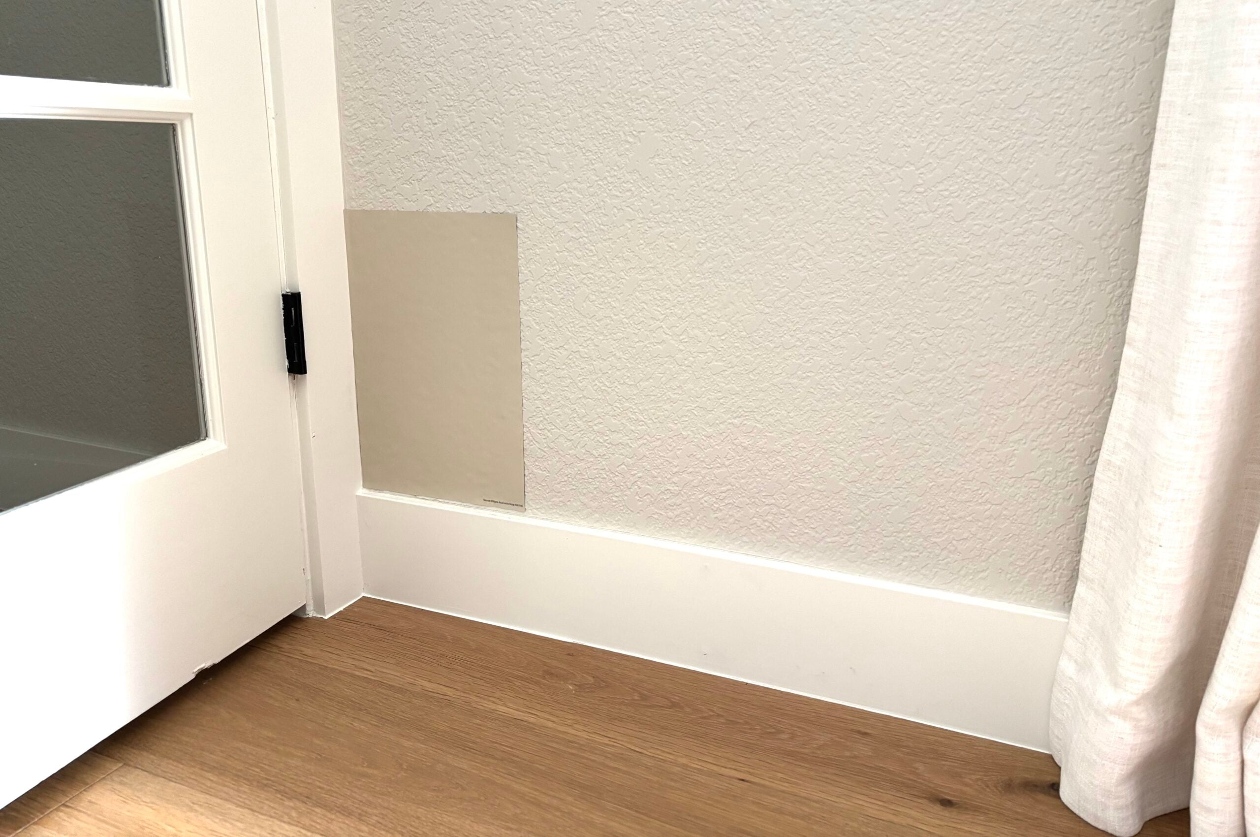
Tiny paint chips aren’t enough to evaluate how a color will look on an entire wall.I recommend using large painted sample boards or peel-and-stick samples. I highly recommend Samplize peel-and-stick paint samples because they’re zero mess and super easy to move around the room.
Step 3: Move the Samples Around the Room
Don’t evaluate a paint color in only one location. Place your samples near your flooring, next to trim, next to your furniture, and on different walls in the room. A color can look different on one wall in a room that gets more natural light than it does in a shaded area. Moving your samples helps you see those differences.
Step 4: Check the Samples Throughout the Day
This is the most important step for west-facing rooms. Look at your samples:
- In the morning, before direct sunlight enters the room
- Around midday
- In the late afternoon, when the western sunlight is strongest
- In the evening, with your artificial lights turned on
Pay attention to how the undertones change throughout the day. Does your warm beige become too yellow in the afternoon? Does your gray look too cool in the morning? Does your sage green turn more olive than you expected? These observations will help you make a much more confident decision.
Step 5: Compare the Colors With Your Fixed Finishes
Finally, look at the samples next to your flooring, countertops, cabinets, and other permanent finishes. A paint color might look beautiful by itself but clash with other undertones already in the room. This is why you never want to choose a paint color based only on an online picture.
How Does Artificial Lighting Affect West-Facing Rooms?
One more thing to consider is your artificial lighting. Once the sun goes down, your lamps and overhead fixtures become the primary light source. The color temperature of your light bulbs can really change how your paint looks.
For example:
- Warm white bulbs (around 2700K): Create a cozy, warm appearance and may emphasize creamy or yellow undertones.
- Soft white to neutral-warm bulbs (around 3000K): Often provide a slightly cleaner appearance while still feeling comfortable.
- Cooler bulbs (around 4000K): Can make colors appear cooler and may emphasize gray or blue undertones.
I always recommend warm or neutral-warm lighting (2700-3000K) in residential living spaces, but the best choice depends on the room and the look you’re trying to create. The important thing is to test your paint samples with the actual lighting you’ll be using.
For more information, read my post on how lighting affects paint colors.
Frequently Asked Questions About West-Facing Rooms
Benjamin Moore’s White Dove is one of my favorite whites for west-facing rooms. It has a soft, warm look without the starkness of a crisp white. However, strong golden afternoon sunlight could make its creamy undertones more noticeable, so it’s important to test it in your space.
There isn’t one perfect neutral that works best in every west-facing room. Benjamin Moore Edgecomb Gray and Sherwin-Williams Accessible Beige are good lighter options, while Mega Greige and Copley Gray offer more depth. The best choice depends on your room’s natural light, fixed finishes, and how much warmth you want.
Yes, gray paint colors can work well in west-facing rooms. The warm afternoon sunlight can soften or neutralize cooler grays, but those same colors can look colder or more gray in the morning. Because of this, I typically recommend grays that have some slight warmth to them.
When everything looks too yellow or golden, a cooler color might work best. Muted blue, blue-green, and green paint colors can all help create a cooler visual look in a west-facing room. Sherwin-Williams Rainwashed, Benjamin Moore Horizon Gray, and Benjamin Moore Puritan Gray are three strong options worth considering.
Absolutely! Dark colors can create a cozy, dramatic look in west-facing rooms. Benjamin Moore’s Hale Navy and Copley Gray are two good options to consider. Just remember that dark colors will look darker in low morning light, while direct afternoon sunlight typically reveals more of their underlying color.
West-facing rooms receive warm, golden sunlight in the late afternoon. This light can enhance yellow, cream, and orange undertones in a paint color. So, if your paint looks too yellow, you’ll want to try a more muted neutral (more gray in it).
Need More Help Choosing Paint Colors?
Understanding how lighting affects paint colors is an important part of the process, but it’s only one piece of the puzzle. You also need to understand undertones, coordinate your fixed finishes, and create a color palette that works throughout your home.
That’s exactly what I teach in my How to Choose Paint Colors With Confidence course.
It’s designed to help you stop guessing at paint colors and learn a step-by-step process for choosing the right colors for your home.
Learn more about the How to Choose Paint Colors With Confidence course.

Or, if you’re just getting started, grab my FREE guide, 5 Steps to Choosing the Perfect Paint Color, for a simple process you can follow in your own home.
Get the free paint color guide.

Final Thoughts
Choosing the best paint colors for west-facing rooms doesn’t have to be complicated once you understand how the light behaves. The biggest challenge is that west-facing rooms often look cooler and more subdued in the morning, then much warmer and brighter in the afternoon. That means the paint color you choose needs to work with both lighting conditions…or at least look beautiful during the hours when you use the room most.
Start by evaluating your natural light, existing finishes, and the mood you want to create. Then narrow your options to a few colors and test them throughout the day. And remember, you don’t have to choose a white or beige just because your room faces west. Soft blues, muted greens, warm greiges, and even deep navy colors can all be beautiful choices.
The goal isn’t to find a paint color that never changes. It’s to find one that changes over the day in a way you love.
For more paint color advice and detailed color reviews, visit my Paint Help resource page.