It’s that time of year again! At this time every year, leading paint manufacturers announce their picks for ‘paint colors of the year’. They work with color experts and designers to choose colors they believe will reflect home decorating trends for the new year. This is a great way to get some insight into color trends, and find some beautiful inspiration and fresh ideas for painting your home. Let’s take a look at the 2025 paint colors of the year, and see what they can tell us about color trends in the new year.
Benjamin Moore Color of the Year 2025
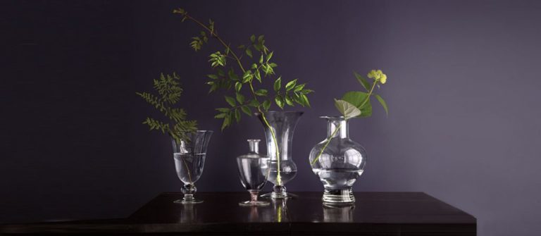
Benjamin Moore has chosen Cinnamon Slate (2113-40) for their 2025 paint color of the year. BM Cinnamon Slate is a muted plum shade with hints of brown. It’s a calm, yet confident color, which is the theme for the new Benjamin Moore Color Trends 2025 palette. This is a great color for a bedroom, sitting room, or feminine office, and makes a statement without overwhelming the space. Click here for a peel-and-stick sample sheet of Benjamin Moore Cinnamon Slate.

What colors pair well with BM Cinnamon Slate?
Pair Benjamin Moore’s Cinnamon Slate with dark greens or light gray greens, brass tones, and crisp whites for a gorgeous combination that will transform any room into a showstopper. Here are some of my favorite Benjamin Moore paint colors to pair with BM Cinnamon Slate:
- BM White Dove (OC-17) – a fabulous, warm white. See my full review of BM White Dove.
- BM Ashwood Moss – dark graphite gray with green tones
- BM Rosepine (461) – medium shade of forest green
- BM Calm (2111-70) – a crisp white with lavender-gray undertones
- BM Porcelain (2113-60) – a dusty lilac that is a few shades lighter than Cinnamon Slate
- BM Jackson Tan (HC-46) – rich, historic looking tan with a slightly rosy tone
Sherwin Williams Color of the Year 2025
Sherwin Williams did something different this year and released a 2025 Color Capsule of the Year, rather than just one single color. The color capsule consists of 9 colors that celebrate color with a fresh take on some classic favorites. The colors are:
- Grounded (SW 6089)
- Sunbleached (SW 9585)
- Chartreuse (SW 0073)
- Rain Cloud (SW 9639)
- Clove (SW 9605)
- Malabar (SW 9110)
- Bosc Pear (SW 6390)
- White Snow (SW 9541)
- Mauve Finery (SW 6282)
You can click on any of the links above to get a peel-and-stick sample sheet to test the colors in your home.
Of the 9 colors, I’d like to highlight 3 designer-favorites that I think are really worth a mention.
Sherwin Williams Sunbleached
SW Sunbleached is an off-white that has greige undertones, and is similar to the ever popular Benjamin Moore Seapearl. It’s fairly neutral, sitting in between warm and cool tones, and is slightly darker than a white. It’s a great option if you want a subtle, light wall color that will provide just a hint of contrast with white trim. Sunbleached can be a bit of a chameleon, however, so be sure to test it in your room before committing.
Sherwin Williams Rain Cloud
SW Rain Cloud is a gorgeous deep blue-gray with subtle green undertones. With its hints of green, this lovely blue-gray will never look purple, and it a very soothing shade. Pair it with crisp whites and wood tones for a sophisticated, timeless look.

Sherwin Williams Clove
SW Clove is a gorgeous dark brown that borders on being a black. It’s an enticing, welcoming color that looks stunning with brass accents, soft whites, and lighter wood tones. Great as an accent wall, or use it to create drama in a powder room or home office. If you like SW Urbane Bronze, but want something a little richer and warmer, this is a great option.
Behr Color of the Year 2025
Behr’s choice for their 2025 paint color of the year is Rumors (MQ1-15). This deep ruby red is a bold color choice, and won’t be right for every design style. It can add a touch of drama and sophistication to spaces, making it a wonderful choice for accent walls. In smaller doses, Rumors would also work well for a front door or painted furniture.
What colors pair well with Behr Rumors?
Rumors is a bold hue that will work with best paired with neutrals. I particularly love it with brass tones, link dusty pinks, and dark bronzes. Here are my favorite paint colors to pair with Behr Rumors:
- Behr Blank Canvas (DC-003) – warm, welcoming white
- Behr Very Navy (M500-7) – classic, dark navy blue
- Behr Cameo Stone (N160-1) – light and delicate dusty pink
- Behr Eastern Bamboo (PPU9-25) – rich green with hints of olive-brown
- Behr Pinecone Path (HDC-CL-14) – deep brown
🎨 Free Resource for You!
Struggling to choose the perfect paint color? Grab my free guide: 5 Steps to Choosing the Perfect Paint Color and learn the exact process I use as a designer to select colors that actually work in real homes.
No more guessing. No more swatch overload. Just confidence!
👉 Click here to download it now
Dunn-Edwards Color of the Year 2025
Dunn-Edwards has chosen Carmelized (DET687) for its 2025 color of the year. Carmelized is a medium, terracotta with warm brown tones. It’s a lovely color for southwest style homes (especially exteriors), and looks great paired with dark wood tones and warm whites. Carmelized feels a bit nostalgic, like it belongs in another decade, but it has a natural, contemporary feel that makes it relevant today.
What colors pair well with Dunn-Edwards Carmelized?
Some of the best colors to pair with DE Carmelized are warm whites, dark grays, dark greens and smokey blues. Here are some of my favorite Dunn-Edwards coordinating colors for Carmelized:
- DE Pueblo White (DET675) – off-white with subtle warmth
- DE Summer Night (DET5811) – dark blue-green
- DE Charcoal Sketch (DET628) – dark, charcoal gray color with neutral undertones
- DE Greenland (DE6286) – a medium, cool green
Valspar Color of the Year 2025
Valspar chose Encore (8002-45G) for its color of the year 2025. Encore is a very bold, very vibrant shade blue with hints of violet. If you’re looking for a statement-making blue, Encore could work well for you. Try it on your front door, kid spaces, or in a color-drenched office. Keep in mind, this is a bossy blue, so be sure it works with your decorating style before choosing it for your home.
What colors pair well with Valspar’s Encore?
Encore is bold, so you’ll want to tone it down with soft neutrals to create a balanced looking space. Pair it with whites, blacks, gray-greens, and wood tones for a classic look. Here are some beautiful Valspar options that will work well with Encore
- Valspar Sprig of Sage (8004-28D) – lovely sage green
- Valspar Silver Dust (7004-19) – cool-toned, off-white
- Valspar Chimney Smoke (4010-1) – a black with cool undertones
- Valspar Blue Prism (8002-45B) – light blue that is several shades lighter than Encore
PPG/Glidden Color of the Year 2025
PPG selected Purple Basil (PPG1046-7) as their color of the year for 2025. Ready for another bold color option? Purple Basil is a dark purple with a nice balance of warm and cool tones. This is a statement-making hue that would look great as an accent wall, or in a dramatic powder room. Once again, we’re seeing a big departure from the subdued colors of previous years, and this color won’t work for everyone. But, if you favor vibrant colors, and love purple, this is a beauty. Click this link for a peel-and-stick sample sheet of PPG Purple Basil.
What colors pair well with PPG Purple Basil?
When it comes to purples, PPG Purple Basil is quite flexible and works with a wide range of other colors. It’s beautiful paired with light neutrals, like beiges and off-whites. It also looks great with sage greens and blush pinks. Here are some of my favorite PPG paint colors to pair with Purple Basil:
- PPG Ostrich Feather (PPG14-32) – midtone, golden greige (gray meets beige)
- PPG Lotus Petal (PPG1073-1) – pale, neutral, peach with a subtle brown undertone
- PPG Happy Trails (PPG1084-4) – medium beige
- PPG Starless Sky (PPG0995-7) – soft, neutral black
- PPG Aquamarine Dream (PPG1135-4) – midtone green with blue undertones
Is one of these 2025 paint colors of the year right for your home?
The best way to know if a paint color is right for your home is to get a sample, and test it in your space. Every home has its own unique lighting conditions, which can alter the appearance of a paint color. This is why you should never just choose a paint color from a picture, and hope it will look good in your room. It’s super important to get a sample and check to see how it looks in your home before committing. I highly recommend the easy-to-use sample sheets from Samplize.
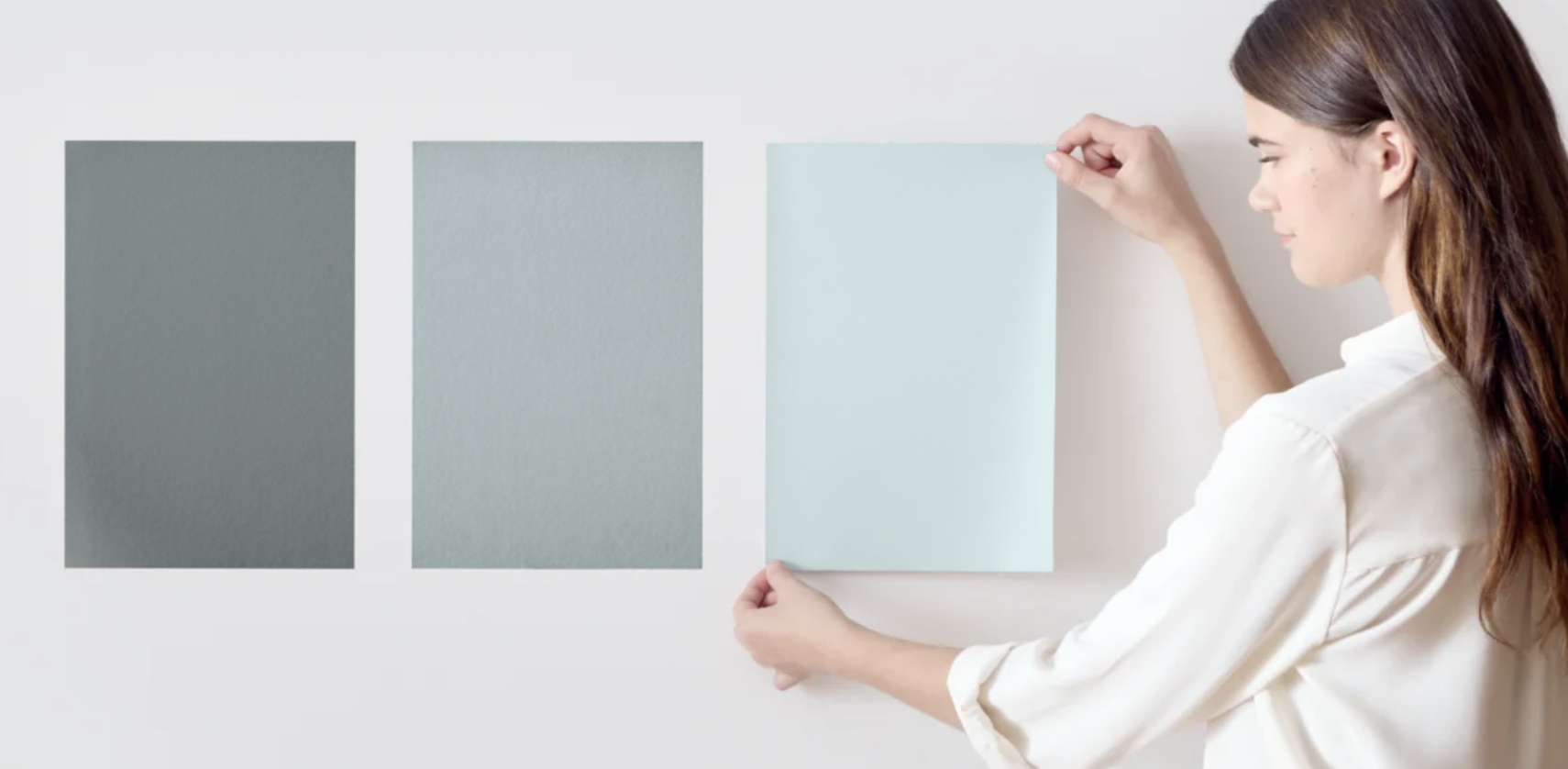
The paint colors of the year for 2025 are quite a departure from the serene blues and greens of years past. If you love bold color, especially reds and purples, this is your year! Check out these vibrant colors, experiment with samples, and see if the paint colors of 2025 can breathe new life into your home’s design. With these dramatic colors, you can set the tone for a bold and stylish new year.
Want to know the colors from past years? Check out my posts on the paint colors of the year for 2024 and 2023 for more color inspiration.
Note: This post contains affiliate links. See my full Privacy Policy for details.



This introduction sets the stage perfectly for exploring 2025’s color trends, blending expert insight with practical inspiration. It’s an exciting read for anyone looking to refresh their home with timely and stylish paint ideas.