Blue gray paint colors are timeless, relaxing, and work with a wide range of design styles, which is probably what makes them so popular! They can be used in any room of your home, from bedroom accent walls to bathroom vanities and your front door, to create a sophisticated and soothing vibe. And, they’re an excellent choice for exteriors, too! Whether you’re looking for a gray that has a hint of blue to it, or a blue gray that leans more blue, I’ve got you covered! Read on for my list of the best blue gray paint colors, and download my FREE cheat sheet at the bottom of this post to take with you next time you visit the paint stores.
Let’s dive in and unveil the popular blue gray paint colors that interior designers swear by, listed from lightest to darkest color.
No 1 – Benjamin Moore Quiet Moments
Benjamin Moore Quiet Moments (1563) is the lightest blue gray paint color on my list. It’s a beautiful, soft, blue-green-gray that is subtle and relaxing in any space. Quiet Moments is great for bedrooms and living rooms, and can even be used as a whole-house color. I love how relaxing this bedroom feels with Quiet Moments on the walls, crisp white accents, and neutral beiges. Get your peel-and-stick sample of BM Quiet Moments HERE.
No 2 – Sherwin Williams Misty
Misty (6232), by Sherwin Williams, is another light blue-gray, but this one leans a little more toward blue than Quiet Moments. The great thing about Misty is that even though it’s a light blue, it has enough gray (and a hint of green) in it to look sophisticated, rather than looking like a baby blue. In certain lighting it will look very gray and neutralized, while in other lighting conditions blue will be the dominant color. Pair Misty with whites and grays, or darker blues, and include some warmer elements like wood to soften the look. Get your peel-and-stick sample of SW Misty HERE.
No 3 – Sherwin Williams Krypton
Sherwin Williams Krypton (6247) is on a paint strip with some other very popular blue-grays. The reason these colors are so popular is because they’re all perfectly balanced blue-gray colors, and tend to look gorgeous wherever they’re used. Check out this beautiful kitchen with the island and pantry door painted with SW Krypton…such a gorgeous coastal vibe. Get your peel-and-stick sample of SW Krypton HERE.

5 Steps to Choosing the Perfect Paint Color
If you’re feeling unsure about your paint choice, you’re not alone. Most people pick colors out of order — and that’s when regret sets in. I put together a simple guide that walks you through the exact 5 steps to choosing the perfect paint color (without second-guessing yourself at the paint counter).
👉 Download the free guide here.
No 4 – Sherwin Williams Jubilee
You know how I just said that SW Krypton was on the same paint strip with other fabulous blue-grays? Well, Jubilee (6248) is one of them! Jubilee is one shade darker than Krypton, but so fantastic that it deserved its own spot on my list. This medium blue-gray looks beautiful in any room, and is a great place to start when you’re sampling blue-gray paint colors. Just look at how gorgeous Jubilee looks on the cabinets in the kitchen pic below. Get your peel-and-stick sample of SW Jubilee HERE.

No 5 – Benjamin Moore Solitude
As we venture into the medium blue-grays, Benjamin Moore’s Solitude (AF-545) is one to talk about. This paint color has a touch more blue in it than some of the others on my list, but enough gray in it to still keep it refined and relaxing. It’s a beautiful, popular, classic color from Benjamin Moore, and worth a sample, for sure. Get your peel-and-stick sample of BM Solitude HERE.
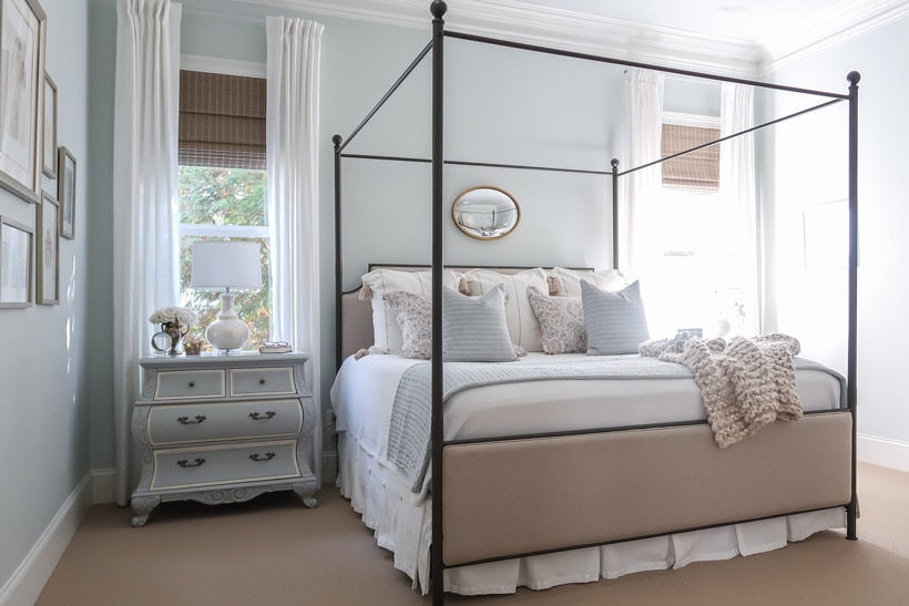
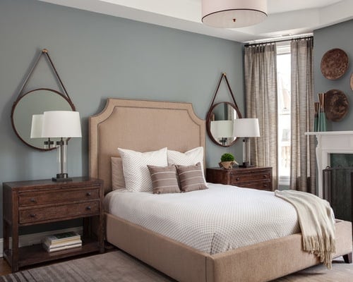
No 6 – Benjamin Moore Boothbay Gray
Boothbay Gray (HC-165) is one of my all-time favorite blue gray paint colors, because it just looks amazing wherever it’s used. It’s a bit of a chameleon in that it can look more gray or more blue-green-gray, depending on the lighting. It’s also one of my go-to colors for coastal exteriors, exterior shutters, and front doors. It has a luxurious and timeless quality to it, which is probably why it was chosen to be part of Benjamin Moore’s Historical Collection. Take a look at how stunning Boothbay Gray looks in this bedroom! Get your peel-and-stick sample of BM Boothbay Gray HERE.

No 7 – Benjamin Moore Puritan Gray
BM Puritan Gray (HC-164) is a little darker than Boothbay Gray, and has a bit more green to it. It’s really beautiful on cabinetry and doors, and can be a soothing color in an office or bedroom. If your blue-gray is shifting too blue or purple in your space, give Puritan Gray a try! Get your peel-and-stick sample of BM Puritan Gray HERE.
Choose Paint Colors with Confidence
If you want a deeper, step-by-step system for choosing paint colors that actually work in your home — lighting, undertones, coordinating rooms and all — I created a full course called How to Choose Paint Colors with Confidence.
Inside, I walk you through how designers approach color so you can stop guessing and start choosing with clarity.
👉 Learn more about the course here.
No 8 – Benjamin Moore Gibraltar Cliffs
Benjamin Moore’s Gibraltar Cliffs (1587) is a medium blue-gray. It’s really closer to a gray, but has some serious blue undertones that will really show themselves once you paint. Pair Gibraltar Cliffs with soft whites to keep things light and airy, and warm elements like wood or copper to balance out this cool color. This kitchen is a beautiful example of all of those elements working well together. Get your peel-and-stick sample of BM Gibraltar Cliffs HERE.

No 9 – Benjamin Moore Brewster Gray
As we move into some darker colors, Brewster Gray (HC-162) is another timeless hue from Benjamin Moore’s Historical Collection. It’s a medium-dark blue gray that is quite elegant, and pairs beautifully with rich wood furniture pieces, due to its subtle green undertones. Brewster Gray is a great choice for bedrooms…not too light and not too dark…and will look fantastic if you have darker stained wood floors or furniture in your room. Get your peel-and-stick sample of BM Brewster Gray HERE.
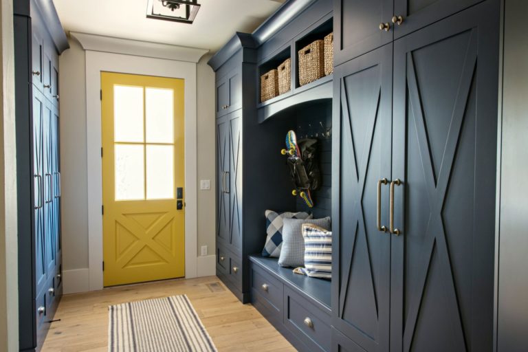
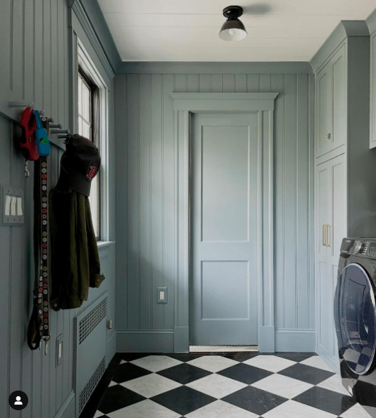
No 10 – Benjamin Moore Van Courtland Blue
Benjamin Moore’s Van Courtland Blue (HC-145) has been a really popular blue-gray paint color for years! On the paint chip, it looks like the perfect blend of blue and gray, but just know that it can tend to look more saturated and blue than expected when painted on walls. I recommend Googling images of Van Courtland Blue to see its many variations in color, and always sampling the color on your walls before committing. Check out this fabulous laundry room showcasing Van Courtland Blue on the walls, doors, cabinetry and trim. Get your peel-and-stick sample of BM Van Courtland Blue HERE.
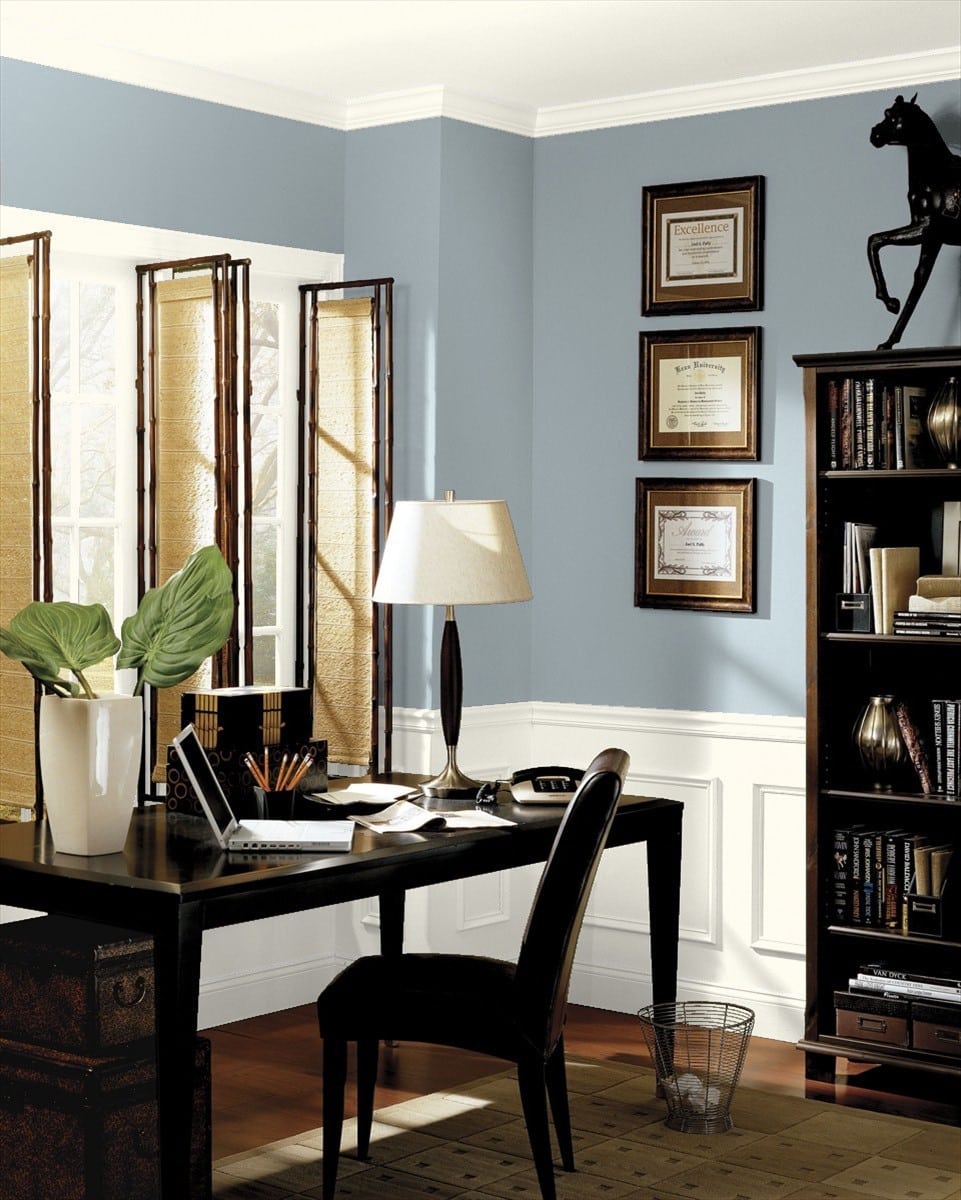
No 11 – Sherwin Williams Serious Gray
Serious Gray (6256) is a medium-dark gray with blue undertones. Depending on your lighting, Serious Gray can look very gray, because its blue undertones are more subtle. I love using Serious Gray for cabinetry and exteriors, and it works best in well-lit spaces. But, it can also be a great option for creating that dark, moody feel in a den or office. Look how pretty Serious Gray looks in this living room as an accent wall and backdrop with these built-in bookcases! Get your peel-and-stick sample of SW Serious Gray HERE.

No 12 – Sherwin Williams Software
Like Serious Gray, SW Software (7074) is another medium-dark cool gray with blue undertones. Because it’s fairly dark and very gray, I recommend pairing Software with lighter wood tones and crisp whites, and it also really works great with pinks and blush colors. In a well-lit space, like the dining room below, Software can create a beautiful, dramatic look. Get your peel-and-stick sample of SW Software HERE.

No 13 – Benjamin Moore Normandy
Normandy (2129-40) is a classic medium blue-gray that leans slightly more toward the blue side. It’s a great blue gray color for traditional homes, and a solid choice for an office. I’ve seen it used on kitchen cabinets, and it’s quite blue, but could be a fun way to make a statement in your kitchen. In this entryway, Normandy makes a great statement and provides visual contrast with the other wall colors. Get your peel-and-stick sample of BM Normandy HERE.

No 14 – Benjamin Moore Wolf Gray
Wolf Gray (2127-40) by Benjamin Moore is a medium-dark gray with cool blue undertones, and has become one of my favorites for both interiors and exteriors. It strikes a beautiful balance between its gray and blue tones, and works well paired with a range of colors. Wolf Gray looks equally gorgeous on kitchen and bath cabinets as it does on bedroom walls. Here’s a lovely kitchen from CC & Mike showing BM Wolf Gray on the cabinets. Get your peel-and-stick sample of BM Wolf Gray HERE.

No 15 – Sherwin Williams Smoky Blue
Sherwin Williams Smoky Blue (7604) is a darker blue-gray with teal undertones. It can be a nice dramatic shade for an office or dining room, but is more saturated than other blue-grays I would normally recommend for cabinetry. Take a look at this adorable Boho bathroom with Smoky Blue on the wainscoting…gorgeous! Get your peel-and-stick sample of SW Smoky Blue HERE.

No 16 – Sherwin Williams Cyberspace
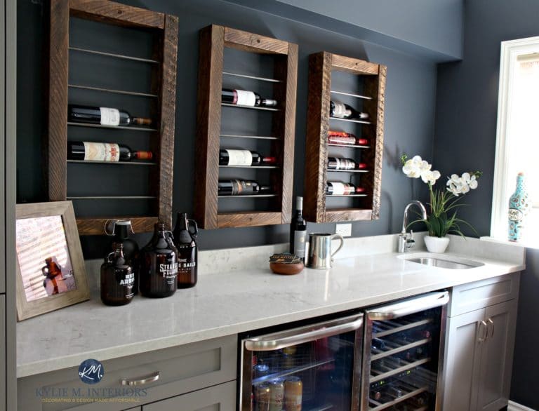
Cyberspace (7076) by Sherwin Williams is a very dark navy blue with strong gray undertones. The gray undertones desaturate this color such that the blue notes are more subtle. Cyberspace is also gorgeous for exteriors (body color and accents) and a great choice for cabinetry. I love to pair Cyberspace with lighter grays, like in the wet bar picture below. Get your peel-and-stick sample of SW Cyberspace HERE.
So many gorgeous blue gray paint colors to choose from! But hopefully, I’ve given you some great ideas to start with. Tell me in the comments, what’s your favorite color from this list or one that you’ve used in your own home?
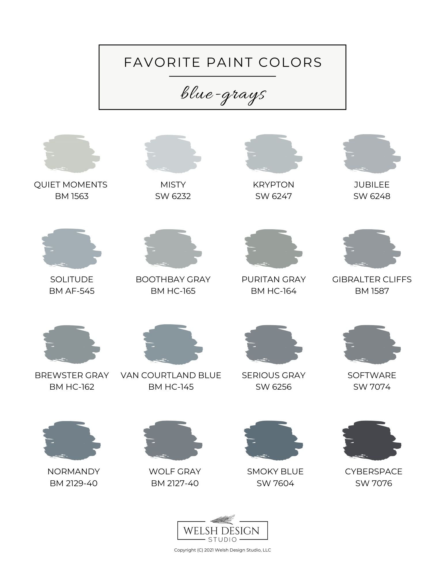
To make your life easier, I created this handy little cheat sheet of the best blue-gray paint colors for you to print out next time you’re headed to the paint store. Just click on the image and print your FREE guide!
How do you choose the right blue gray paint color for you?
The best and right way to choose paint colors is to sample them in your home! You just cannot choose a paint color based on a picture, no matter how beautiful it looks. Instead, you’ll need to view the samples at various times throughout the day to see how different lighting affects the color in your space. The color that looks best in all lighting conditions is the right one for your room.
My favorite source for paint samples is Samplize! These peel-and-stick paint samples are large (12″x12″), inexpensive, and super easy to move around the room. Order several samples today, and they’ll arrive on your doorstep in just a few days. Why not save yourself a trip to the paint store, and get your samples delivered?

Favorite Paint Colors eBook
If you’re overwhelmed by endless paint swatches, I’ve already done the narrowing for you. My Favorite Paint Colors eBook includes my go-to designer picks in every color family — complete with specific names and codes from Sherwin-Williams and Benjamin Moore.
Instead of sorting through hundreds of options, you can start with colors that are tried, tested, and consistently beautiful in real homes.
👉 See what’s inside the eBook here.
Explore the Paint Hub Page
If you’re researching paint colors, undertones, or whole-home palettes, I’ve organized all of my best paint resources in one place.
From white paint guides to exterior color combinations, you can find everything inside my Paint Hub page.
*Note: this post contains affiliate links for your shopping convenience.