If you’re searching for a soft, warm neutral that’s as elegant as it is versatile, Benjamin Moore Pale Oak (OC-20) might be your perfect match. Loved by interior designers and homeowners alike, this subtle greige paint color offers the perfect balance between warm beige and cool gray. Whether you’re decorating a cozy living room, designing a bright kitchen, or choosing a whole-house color palette, Pale Oak creates a light, sophisticated backdrop that complements a wide variety of styles and finishes.
In this post, you’ll learn everything you need to know about Benjamin Moore Pale Oak, from its undertones, to how it behaves in different lighting, which colors pair beautifully with it, and when you might want to choose something else. By the end, you’ll know exactly whether Pale Oak is the right color for your home.
Why Is Benjamin Moore Pale Oak So Popular?
There’s a reason so many design professionals and homeowners love Pale Oak OC-20. This neutral paint color sits right between gray and beige (often described as a greige), and has a refined, gentle warmth that gives rooms an inviting, airy feel. It’s light enough to keep a room feeling open and bright, yet it has enough pigment to avoid looking too bland, or washed out.
With a Light Reflectance Value (LRV) of 69, Pale Oak reflects a lot of light, which makes it a good choice for rooms where you want a soft, fresh look without veering into bright white territory. It pairs beautifully with both warm finishes (like wood floors or brass hardware) and cool finishes (like marble countertops or stainless steel).
Designers love Pale Oak because it feels timeless. It’s the kind of light neutral that works across color palettes and design styles, from modern farmhouse to transitional, and even traditional. If you’re looking for a color that plays well with others, Pale Oak is one of Benjamin Moore’s most flexible and crowd-pleasing options.
👉 Click here to order a sample of Benjamin Moore Pale Oak from Samplize to test it in your own home. Samplize offers large, peel-and-stick paint samples that make testing paint colors a breeze!
What Is the Undertone of Pale Oak?
BM Pale Oak is technically a greige, which means it sits right between gray and beige, with a soft taupe tone that prevents it from feeling cold or sterile. Its primary undertones are warm gray with a hint of pink or purple (the taupe side), depending on the lighting.
In north-facing rooms or spaces with cool, grayish light, Pale Oak can lean slightly more gray, showing off its calm, cool side. In south-facing or west-facing rooms filled with warm sunlight, those warm, taupe undertones are going to be more noticeable, giving the color a cozy warmth.
If you don’t like the idea of pink undertones, let me reassure you that Pale Oak’s warmth is subtle and rarely looks rosy. In fact, I’ve never seen it look pink – just a nice subtle greige with great depth of color.
Pro Tip: To see Pale Oak’s undertones accurately, view it against a white background. Be sure to move your sample sheet around the room throughout the day. This helps you see how natural light and artificial lighting affect the color changes.
What Is the Light Reflectance Value (LRV) of Pale Oak?
The LRV of Benjamin Moore Pale Oak is 69, placing it in the “light” category. That means it reflects a lot of light, helping smaller rooms feel more open and airy.
In bright, sun-filled rooms, it can look almost off-white, while in darker rooms it reads as a soft, muted greige. Pale Oak offers just enough contrast against bright white trim (like Benjamin Moore’s Chantilly Lace) to add definition.
If your space receives a lot of light, Pale Oak could wash out slightly. Try pairing it with richer furnishings or slightly darker colors for balance. In rooms with limited natural light, it will lean a bit darker and cozier, but still maintain its sophisticated neutral vibe.
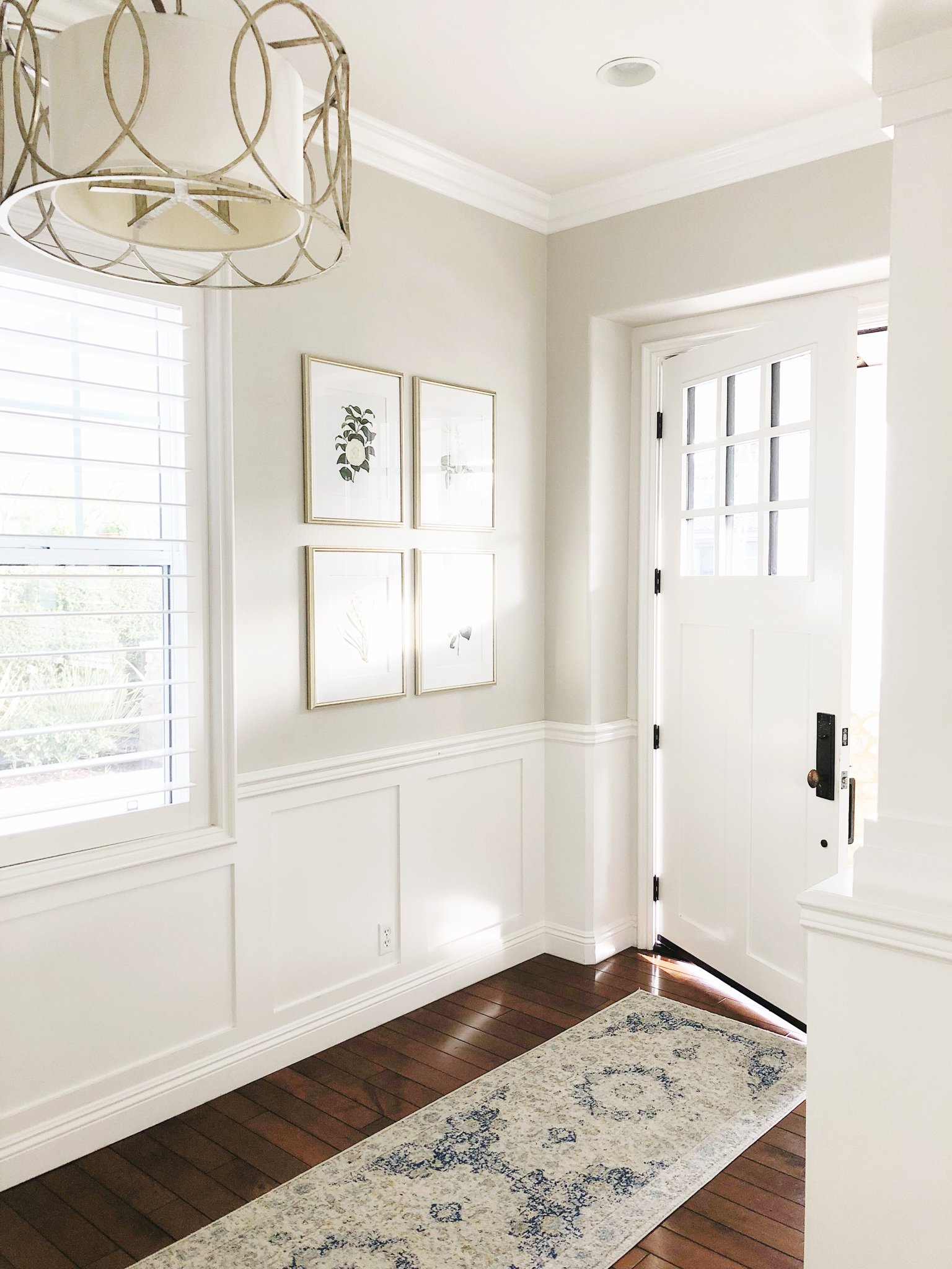
Where to Use Benjamin Moore Pale Oak
Thanks to its versatility, Pale Oak can work beautifully in almost any room of your home. Here’s how designers often use it:
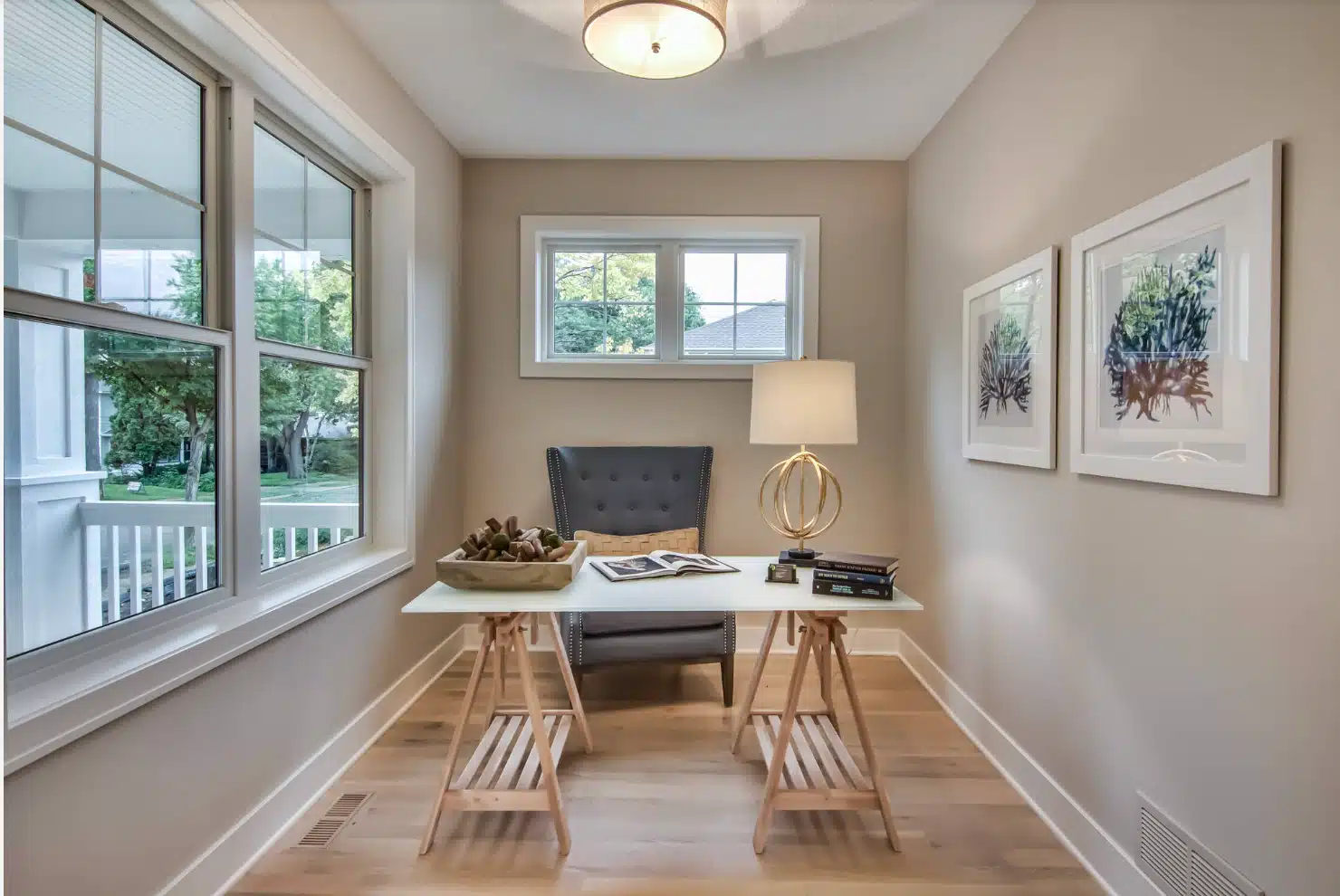
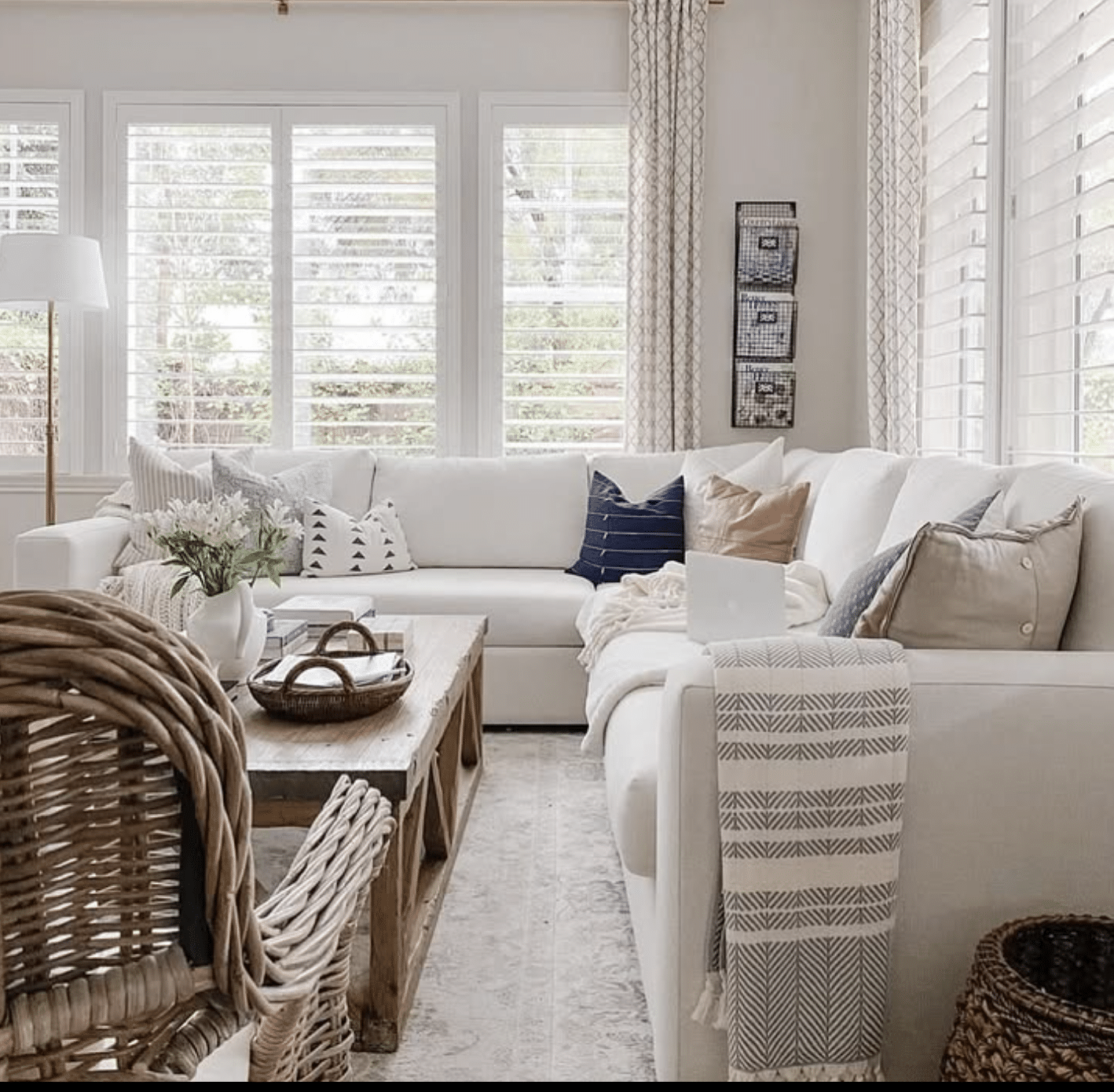
Living Room
Painting Benjamin Moore Pale Oak in your living area will make it feel light, relaxed, and welcoming. It’s an excellent backdrop for soft furnishings, layered textures, and both warm and cool accent colors. Pair it with creamy white trim, natural wood tones, and a few touches of navy blue or black for contrast.
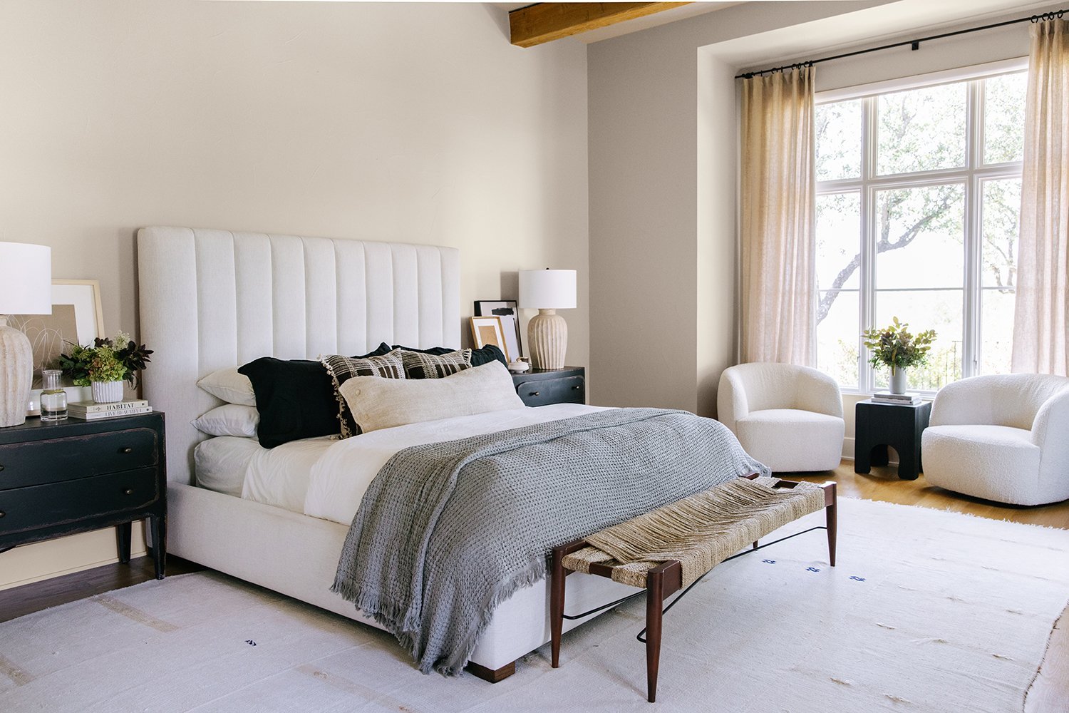
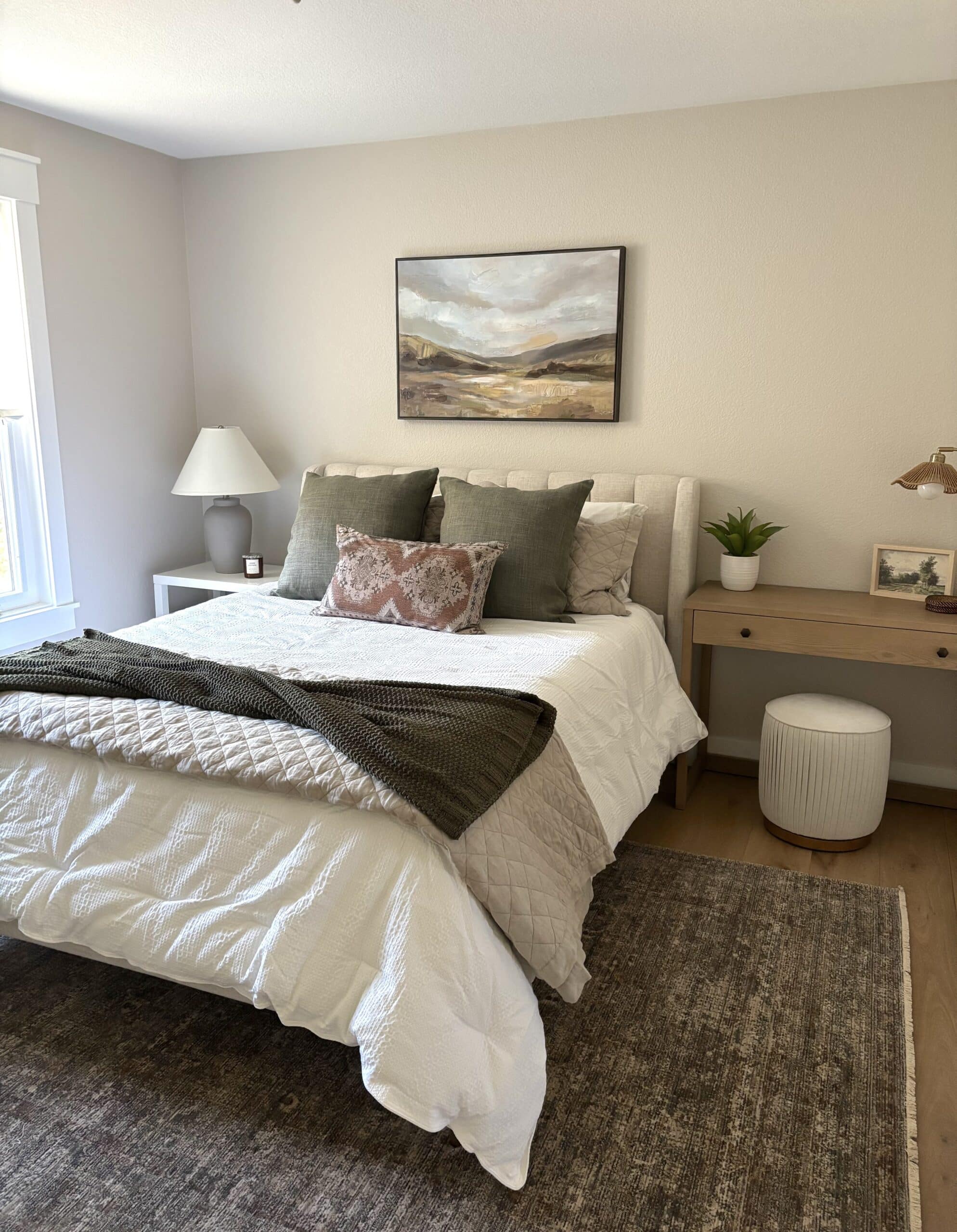
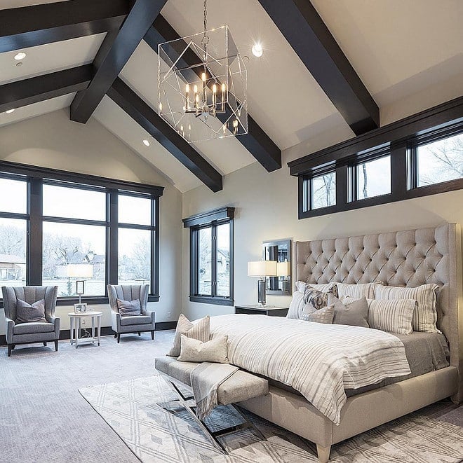
Bedrooms
In bedrooms, Pale Oak creates a calm, soothing retreat. The warm greige undertones add softness without feeling too beige. It looks stunning with white bedding, light oak furniture, earthy colors, and neutral decor for a relaxed vibe.

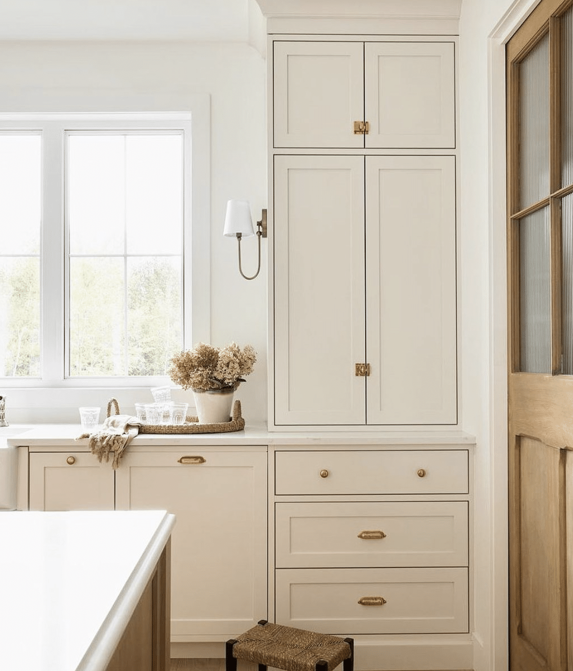
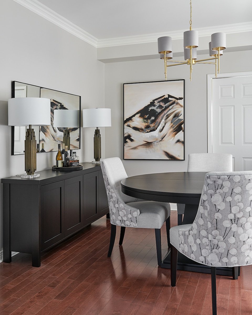
Kitchen and Dining Room
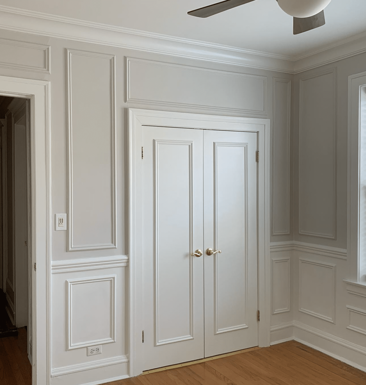
Pale Oak kitchen cabinets or walls will give your kitchen a sophisticated, timeless look. It’s beautiful with marble or quartz countertops and complements both brass and nickel hardware. Pale Oak is also an ideal wall paint color to go with white cabinets. We paired BM Pale Oak with BM White Dove cabinets in our new kitchen (pic below), and the combo is gorgeous!

In dining rooms, it feels elegant paired with medium-tone woods, black chairs, or a classic white wainscoting.
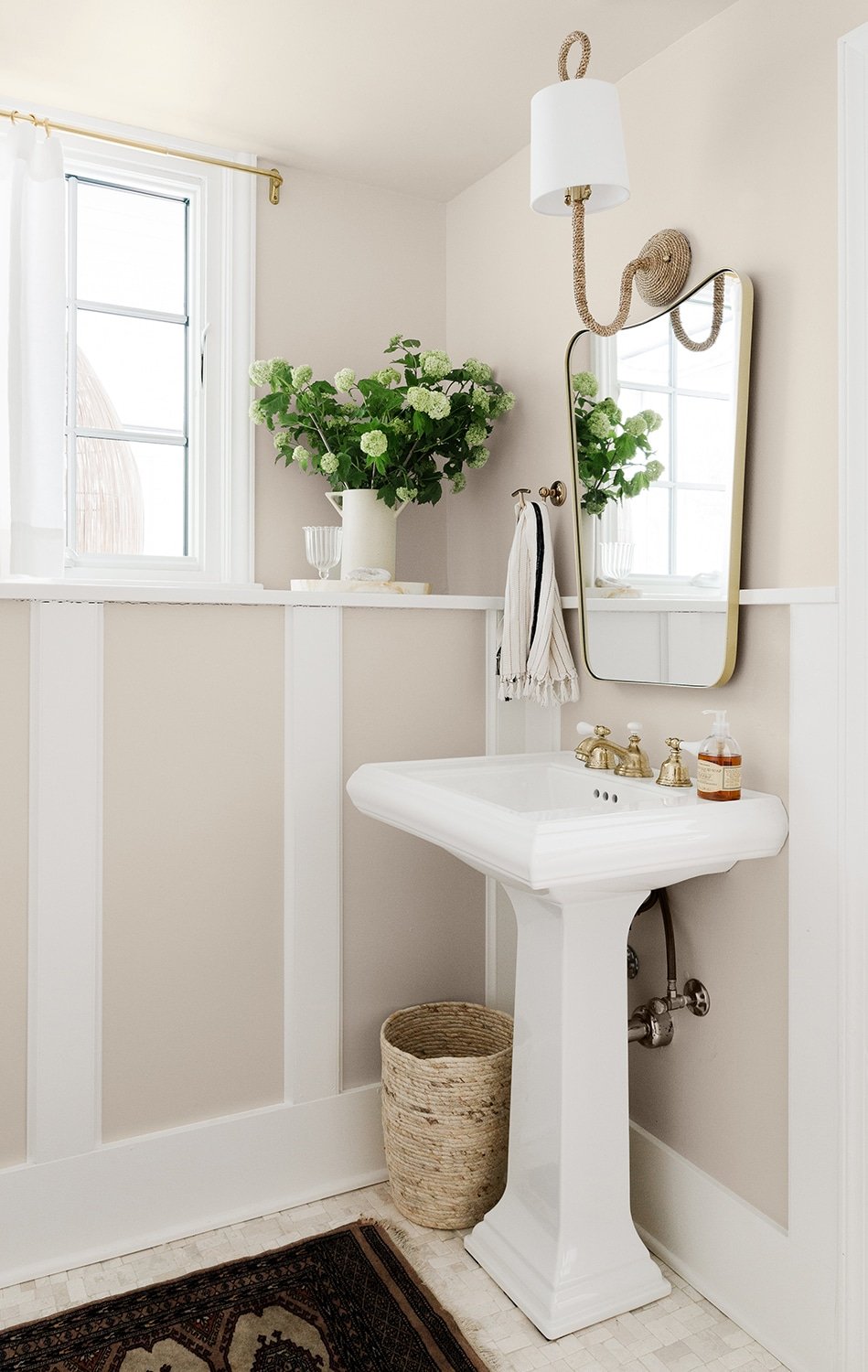
Bathrooms
For bathrooms, Pale Oak delivers a neutral look that balances beautifully with white fixtures (tubs, toilets, sinks, etc.), and any metal finish you choose. It’s a favorite of interior designers because it works so well with the gray and beige tones so often found in tile products and natural stone. It doesn’t compete with other finishes in the room, but still adds warmth and depth to the space.
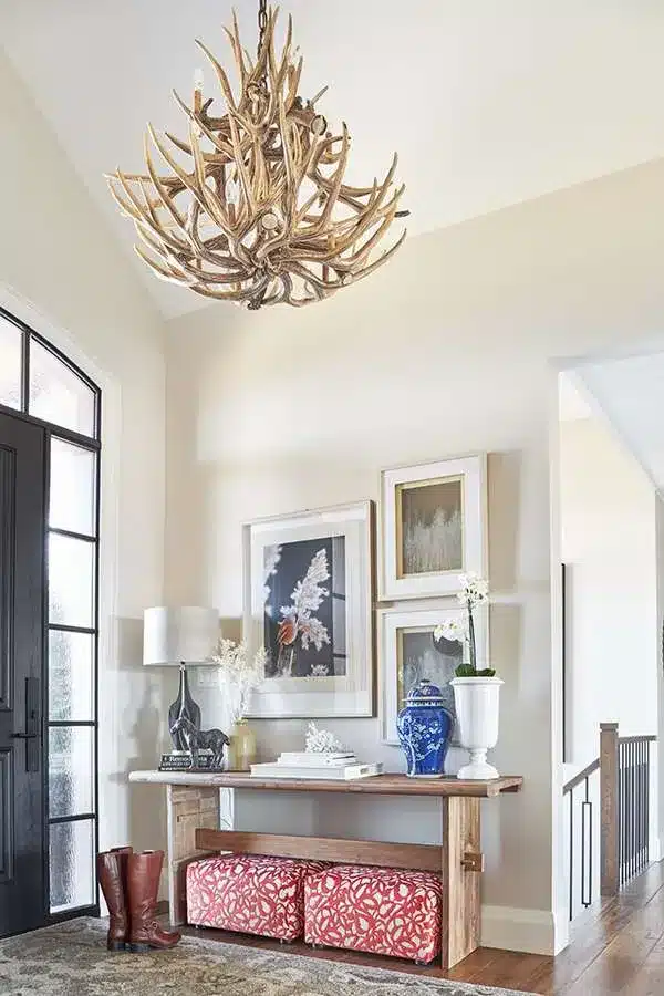
Whole-House Color
Because of its flexibility and adaptability in different lighting, Pale Oak is a fantastic whole-house paint color. It flows easily from room to room, pairing effortlessly with white trim, natural wood flooring, and both cool and warm accent colors. We chose Pale Oak for the main areas of our new home, and it goes with everything – we love it!

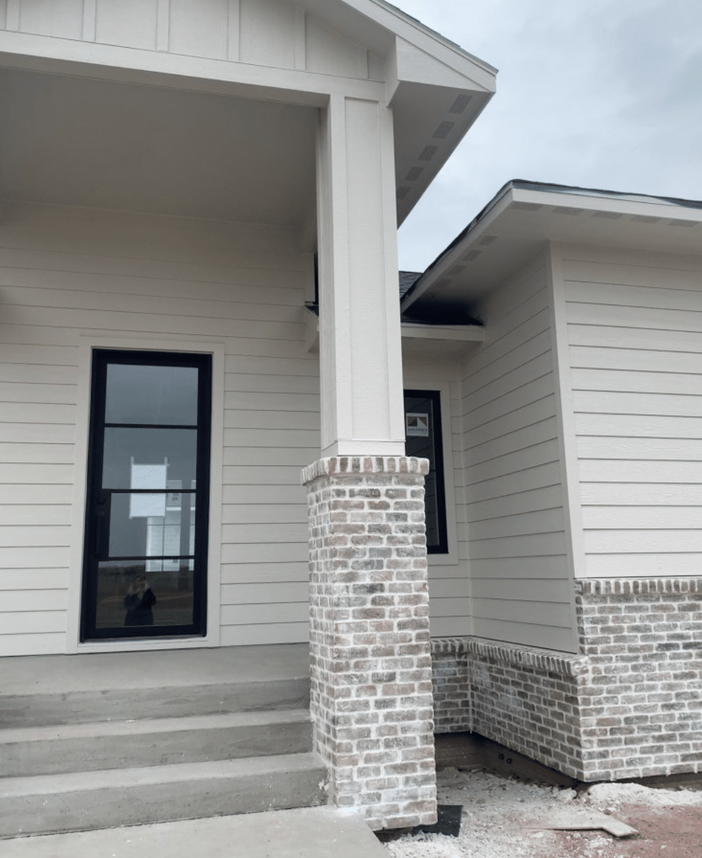
Exteriors
While Pale Oak is most commonly used inside, it can also be a lovely exterior paint color. Just remember: in direct sunlight, it will look lighter, more like a warm off-white. Pair it with black shutters or a bright white trim for crisp contrast.
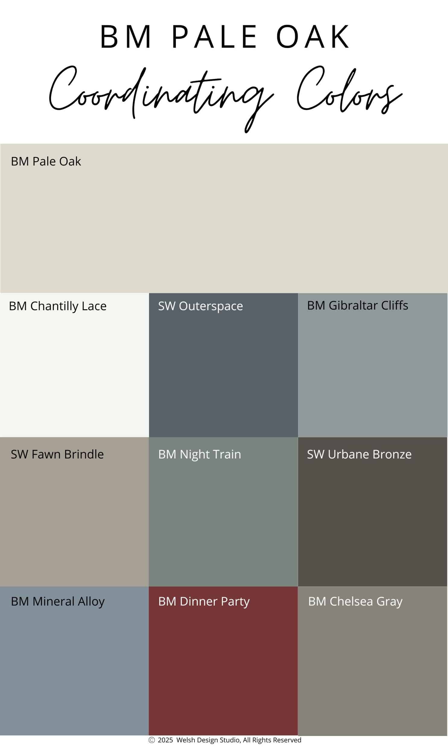
What Colors Go Well With Pale Oak?
When it comes to pairing colors, Benjamin Moore Pale Oak plays well with both neutrals and bold accents. Here are a few designer-favorite combinations:
- Benjamin Moore Chantilly Lace (OC-65) – A bright white that’s perfect for trim or ceilings.
- Sherwin-Williams Outerspace (6251) – A deep, mysterious blue with plenty of gray undertones
- Benjamin Moore Gibraltar Cliffs (1587) – A beautiful shade of blue with gray tones, and a small hint of green
- Sherwin-Williams Fawn Brindle (7640) – A beautiful greige with green-gray undertones
- Benjamin Moore Night Train (1567) – An alluring blend of blue, green and gray
- Sherwin-Williams Urbane Bronze (7048) – An earthy, sophisticated brownish-gray
- Benjamin Moore Mineral Alloy (1622) – A mid-tone blue with a hefty dose of gray
- Benjamin Moore Dinner Party (AF-300) – A deep, classic, understated red.
- Benjamin Moore Chelsea Gray (HC-168) – A deeper warm gray with a hint of greenish-brown
Whether you’re aiming for an all-neutral palette or layering in color, Pale Oak pairs beautifully with muted blues, greens, grays, and whites.
Pale Oak vs. Other Popular Greige Paint Colors
It’s always helpful to compare similar paint colors side by side. Here’s how Benjamin Moore Pale Oak stacks up against other popular greige paint colors.
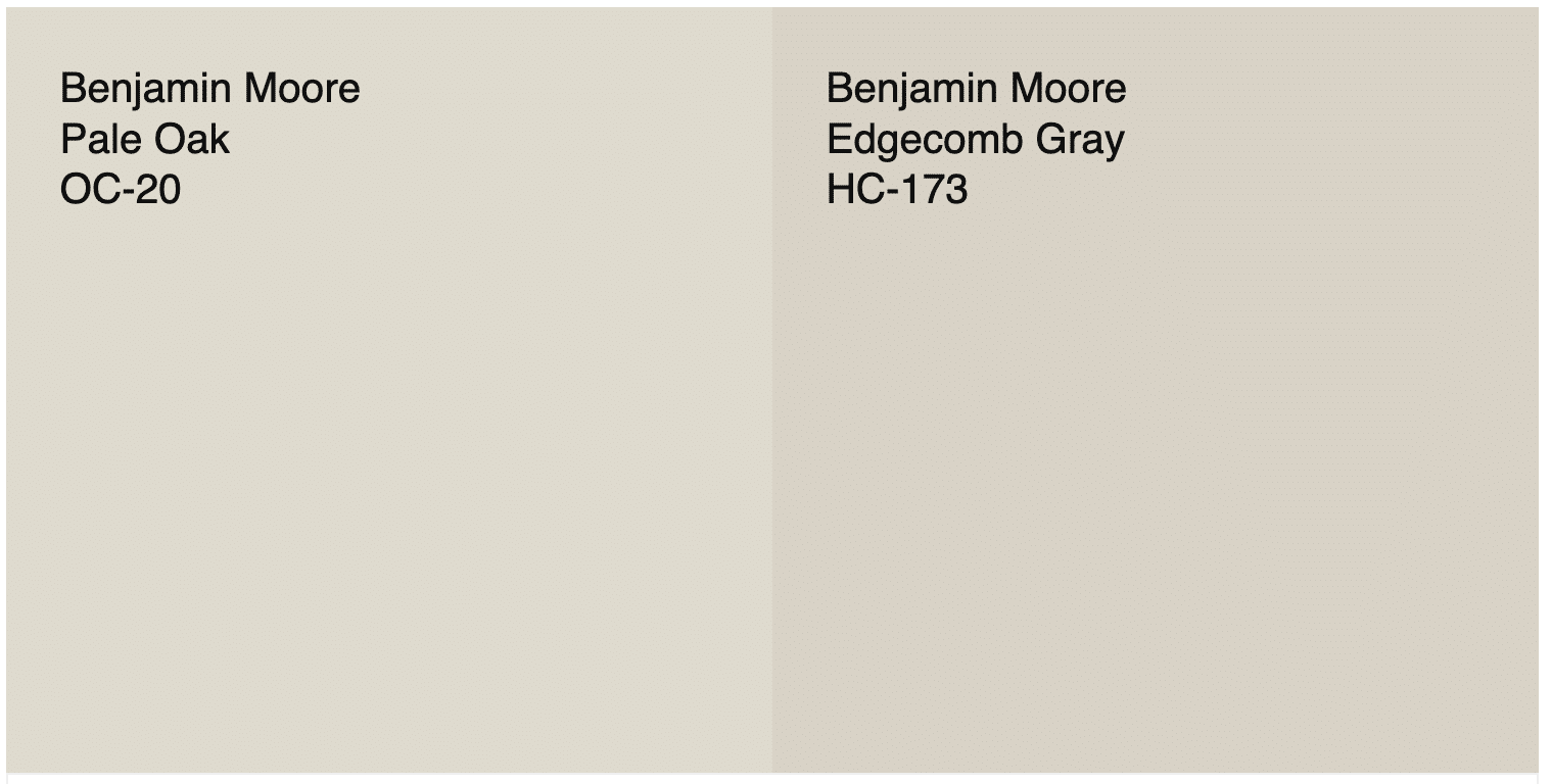
Pale Oak vs. Edgecomb Gray
Edgecomb Gray (HC-173) is slightly darker and has more beige undertones, while Pale Oak is lighter and leans more toward gray-taupe. If you want a slightly cooler, airier feel, choose Pale Oak. For a bit more warmth and depth, Edgecomb Gray is a fantastic alternative. Check out my full review of Edgecomb Gray for more details.
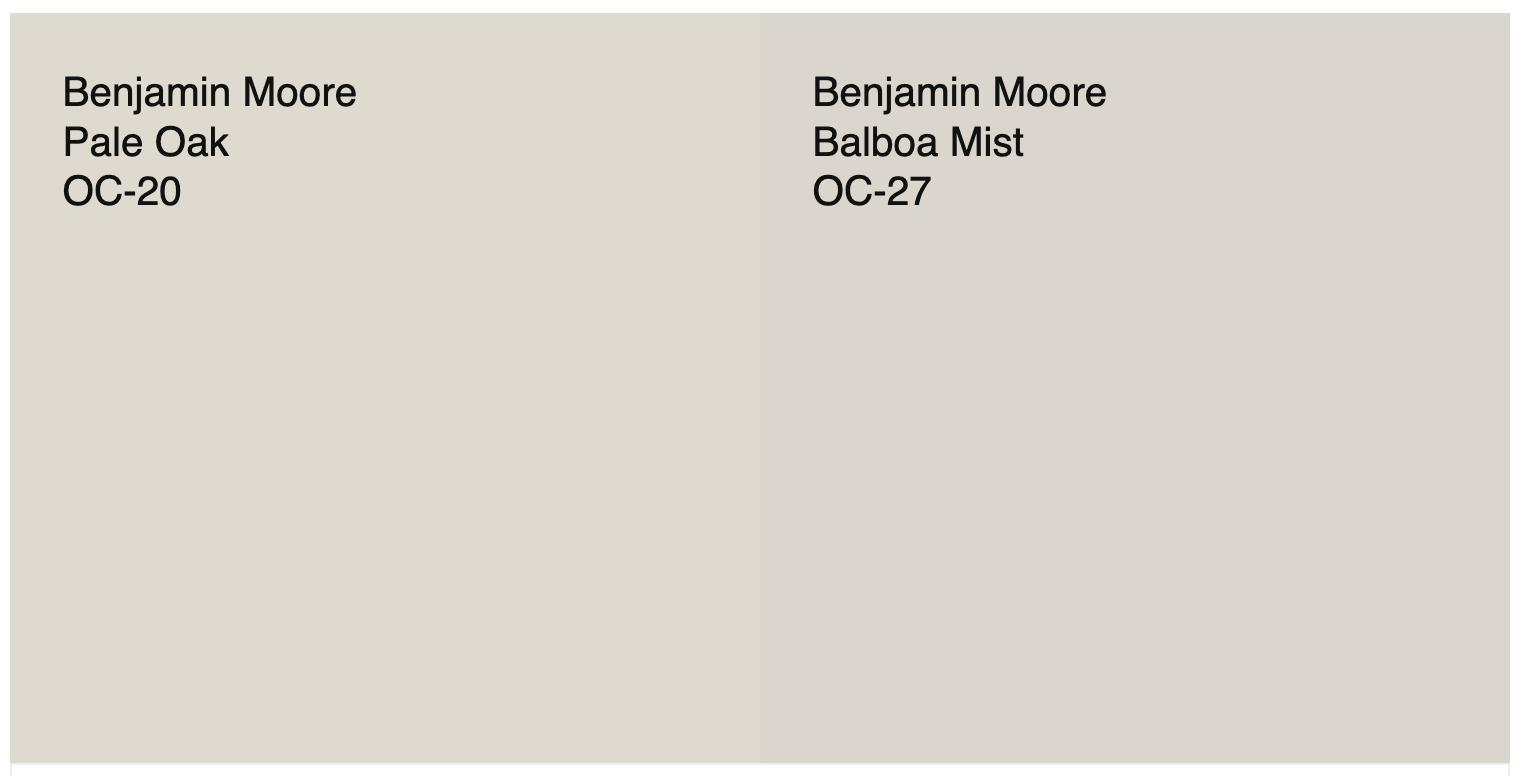
Pale Oak vs. Balboa Mist
Balboa Mist (OC-27) is very close to Pale Oak but has a touch more gray, giving it a cooler feel. Pale Oak feels a bit warmer and softer. Both are beautiful, light greiges, but Pale Oak adds a touch more warmth and versatility. Balboa Mist can be a bit more unpredictable than Pale Oak, so I typically recommend Pale Oak more often to my clients.
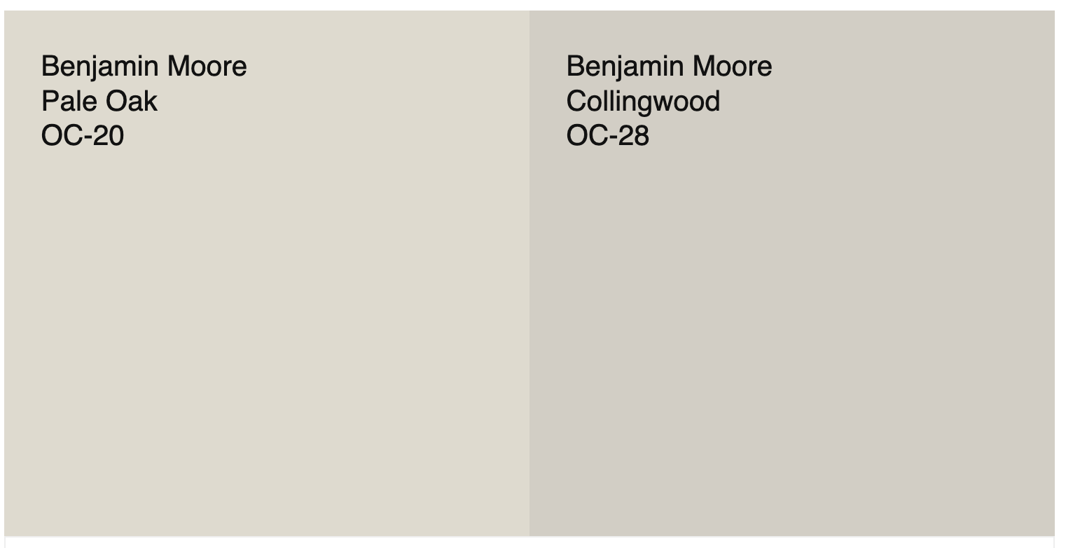
Pale Oak vs. Collingwood
Collingwood (OC-28) is deeper and grayer than Pale Oak, with a stronger violet undertone. If your room gets a lot of natural light and you want more contrast, Collingwood could be the better choice. But for a light neutral that feels airy and serene, Pale Oak wins.
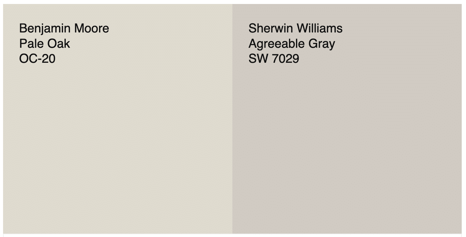
Pale Oak vs. Agreeable Gray
Sherwin-Williams Agreeable Gray (SW 7029) is slightly darker and more gray than Pale Oak, with fewer pink undertones. Agreeable Gray can feel a little cooler, especially in north-facing rooms, while Pale Oak has a warmer, softer appearance. Read my full review of Agreeable Gray for an in-depth look.
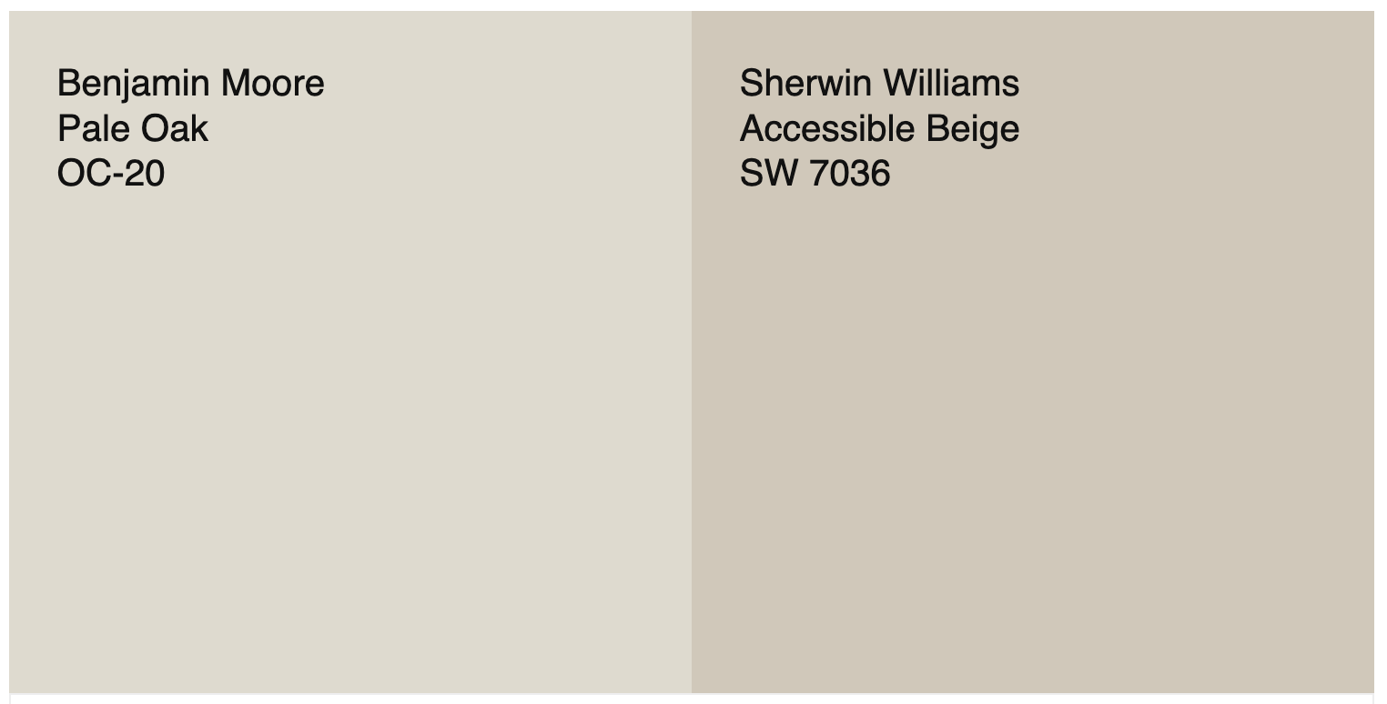
Pale Oak vs. Accessible Beige
Sherwin-Williams Accessible Beige (SW 7036) is warmer, deeper, and more beige than Pale Oak. If you want a cozier, more traditional feel, Accessible Beige might be your pick. But if you prefer something lighter and more contemporary with a touch of gray sophistication, Pale Oak is the winner. Take a look at my review of Accessible Beige for more info about this gorgeous color.
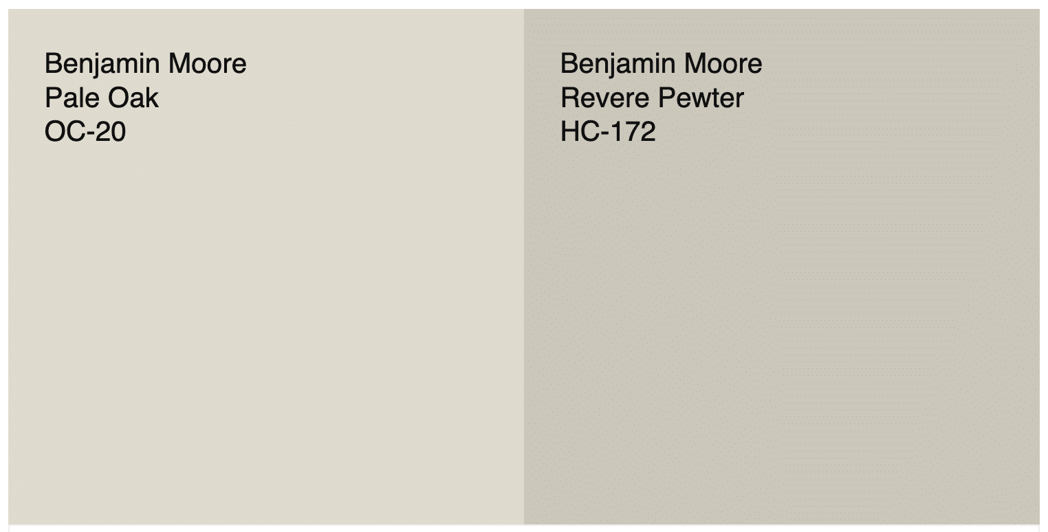
Pale Oak vs. Revere Pewter
Benjamin Moore Revere Pewter (HC-172) has more depth and a slight green undertones, while Pale Oak is lighter and softer. Revere Pewter is better suited for medium-tone walls or rooms needing contrast, whereas Pale Oak is perfect for bright, open interiors. See my full review of Revere Pewter to see why this is a designer favorite.
What White Trim Colors Go With Pale Oak?
Because of its warm undertones, Pale Oak looks best with warm or balanced whites rather than overly cool ones. Here are a few designer favorites:
- Benjamin Moore Chantilly Lace (OC-65) – Clean, bright white for a crisp contrast.
- Benjamin Moore Simply White (OC-117) – A versatile, brighter white with soft yellow undertones.
- Benjamin Moore White Dove (OC-17) – Soft and warm, this trim color has similar undertones to Pale Oak, and perfectly complements it. Read my full review of White Dove.
For ceilings, Chantilly Lace creates a bright, airy lift to your room. White Dove offers a more cozy, seamless transition if you want a softer look for your ceiling.
When Not to Use Pale Oak
While Pale Oak is a crowd favorite, there are times it might not be the best choice.
- Low-Light Rooms: In dark rooms with little natural light, Pale Oak can look dull or slightly muddy.
- Paired with Pink or Red Woods: Cherry, mahogany, and reddish oak can amplify Pale Oak’s pink undertones in an unflattering way.
- Creamy Cabinets or Trim: Pale Oak doesn’t pair well with strong yellow or creamy whites. It looks best with neutral or bright white accents.
- If You Want a True Gray: Pale Oak’s warmth keeps it from being a true gray; choose Benjamin Moore’s Balboa Mist or Collingwood if you want something cooler.
When not to use Pale Oak: Avoid it in dark rooms or spaces with strong red or yellow undertones, as it can shift too warm or pink. If you’d prefer a crisp gray look, stick with cooler greiges or a true gray.
Is Benjamin Moore Pale Oak Right for Your Home?
If you’re looking for a neutral paint color that feels elegant, light, and adaptable, Benjamin Moore Pale Oak is a beautiful choice. It’s warm without feeling yellow, and gray without feeling cold – perfect for creating a cohesive, timeless home.
Design professionals love it because it acts like a chameleon, adjusting beautifully to the lighting and finishes around it. Whether you’re pairing it with white trim, oak flooring, or black accents, Pale Oak always delivers a sophisticated, fresh look.
If you’re still undecided, order a Samplize peel-and-stick paint sample of Pale Oak OC-20 and see how it looks in your space before committing.
👉 Click here to order a Samplize sample of Benjamin Moore Pale Oak.
Be Sure to Test Before You Commit
Like every interior paint color, lighting plays a huge role in how Pale Oak appears. Always test it on multiple walls in your space, and observe it throughout the day as the light changes. That’s the only way to truly know if it’s right for your space.
🎨 Free Resource for You!
Struggling to choose the perfect paint color? Grab my free guide: “5 Steps to Choosing the Perfect Paint Color” and learn the exact process I use as a designer to select colors that actually work in real homes.
👉 Click here to download it now.

Final Thoughts
Benjamin Moore Pale Oak is one of those rare colors that feels timeless, inviting, and endlessly versatile. Whether you’re designing a cozy living room, updating kitchen cabinets, or choosing a whole-house palette, it’s a light neutral that brings warmth, balance, and sophistication to any interior.
It’s no surprise that a lot of people (including design professionals), consider Pale Oak one of the best neutral paint colors Benjamin Moore has ever made.
Try it, test it, and you might just fall in love with this effortlessly beautiful greige.
*This post contains affiliate links. As an Amazon and Samplize affiliate, I may earn from qualifying purchases. See my full disclosure for details.